Adapting toolbar elements to the Liquid Glass Design System
Explore how to design and implement toolbars in iOS 26 using Apple’s new Liquid Glass.

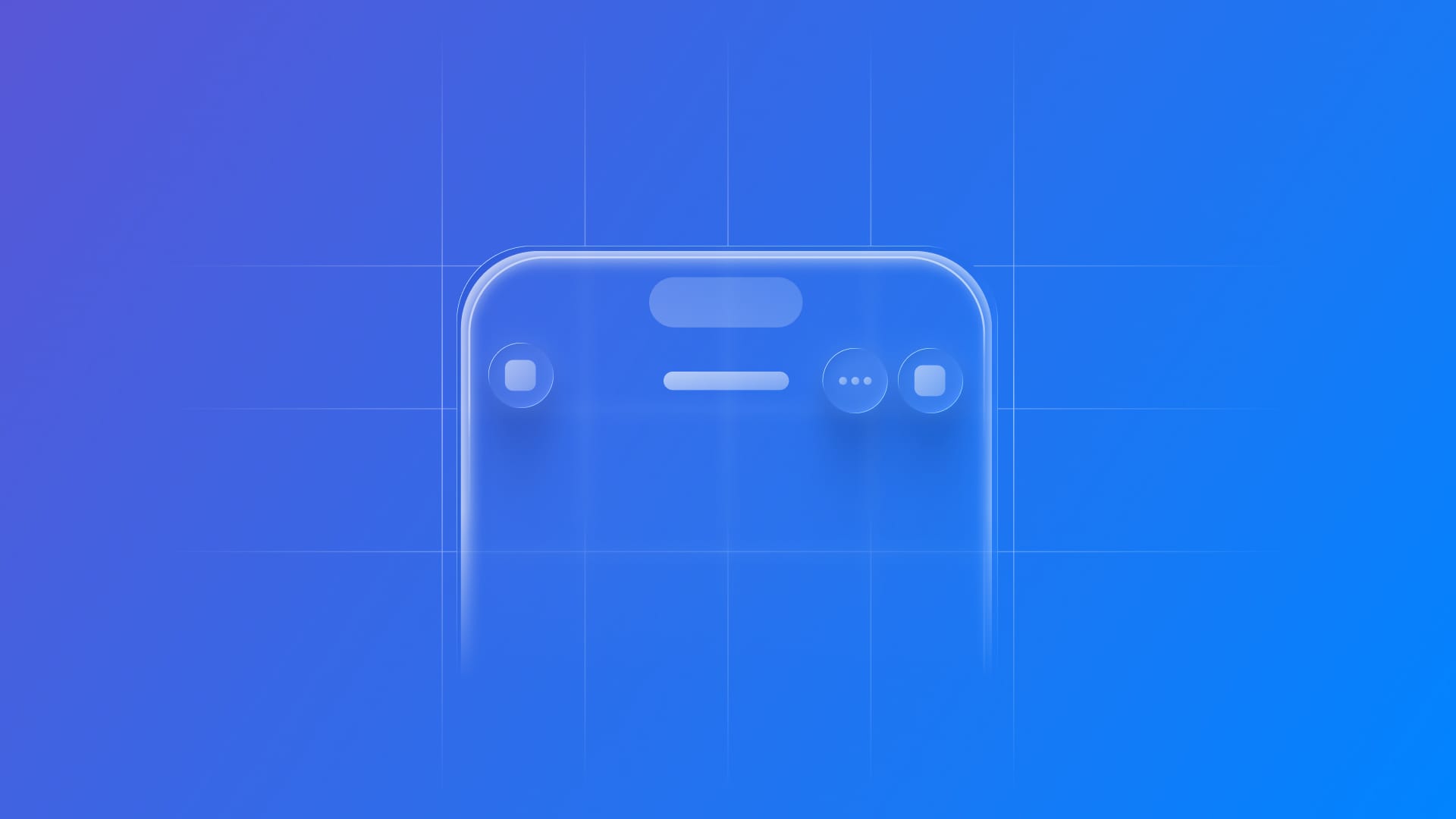
The introduction of the Liquid Glass system introduces a new visual hierarchy to the interface by distinctly separating elements into two layers. Toolbars, tab bars, and menus now form an overlaying layer that sits above the content, enhancing the overall visual clarity of the Liquid Glass design.
Within this structure, toolbar items assume an even greater significance in enhancing the user experience. They feature a translucent background that blends with the underlying content, prioritizing symbol-based buttons, contributing to a cleaner aesthetic.
Here’s an example that demonstrates how the updated toolbar is presented in iOS 26:
import SwiftUI

struct ContentView: View {

    var body: some View {
        NavigationStack {
            VStack {
                ContentUnavailableView {
                    Label("Adapting toolbar elements to the Liquid Glass Design System", systemImage: "tray.fill")
                } description: {
                    Text("Explore how to design and implement toolbars in iOS 26 using Apple’s new Liquid Glass.")
                        .padding()
                }
            }
            .navigationTitle("Items")

            .toolbar {
                ToolbarItem(placement: .cancellationAction) {
                    Button("Cancel", systemImage: "xmark") {
                        // Button action here
                    }
                }
                ToolbarItem(placement: .confirmationAction) {
                    Button("Done", systemImage: "checkmark") {
                        // Button action here
                    }
                }
            }

        }
    }

}
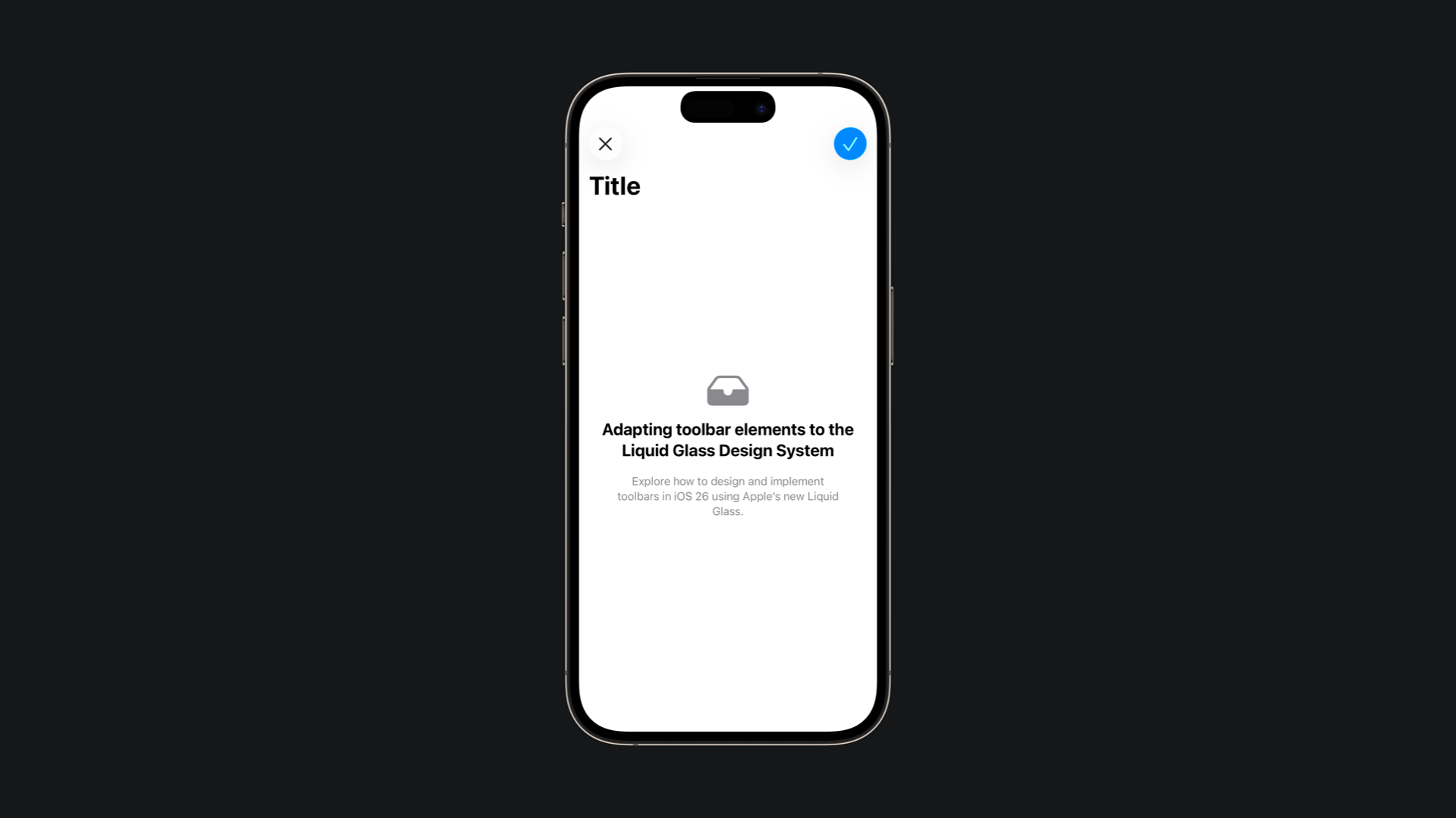
In the example above, we can see how the system prioritizes the symbol over the button label, reflecting the new emphasis on symbols introduced with Liquid Glass.
In this context, the placement of a ToolbarItem has even greater importance, as it not only defines the button’s position but also automatically applies context-specific styles, such as the .glassProminent style for key confirmation actions.
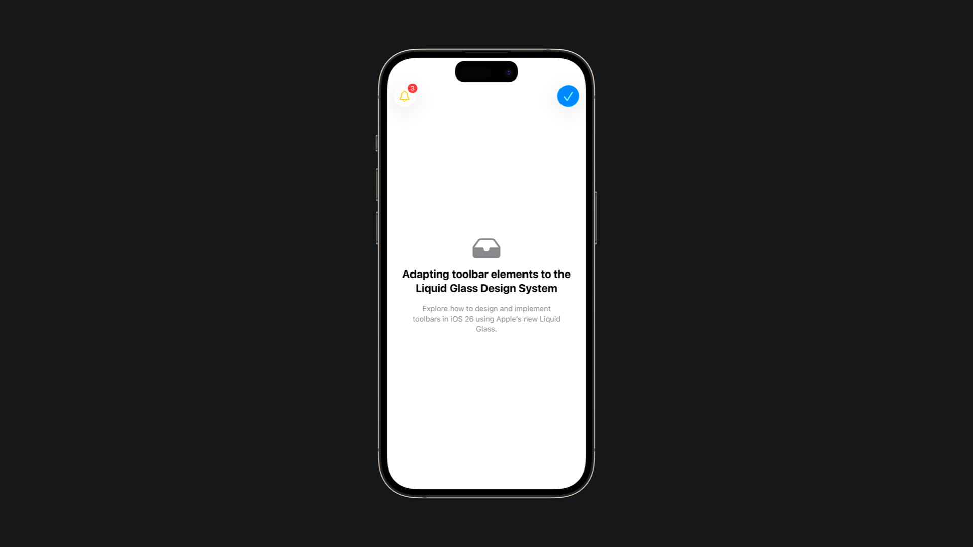
Additional customization options, such as tint(_:) for color adjustments and badge(_:) for highlighting important states, provide even more flexibility in refining the toolbar’s appearance and behavior.
import SwiftUI

struct ContentView: View {

    var body: some View {
        NavigationStack {
            VStack {
                ContentUnavailableView {
                    Label("Adapting toolbar elements to the Liquid Glass Design System", systemImage: "tray.fill")
                } description: {
                    Text("Explore how to design and implement toolbars in iOS 26 using Apple’s new Liquid Glass.")
                        .padding()
                }
            }

            .toolbar {
                ToolbarItem(placement: .confirmationAction) {
                    Button("Done", systemImage: "checkmark") {
                        // Button action here
                    }
                }
                ToolbarItem(placement: .topBarLeading) {
                    Button("Alerts", systemImage: "bell") {
                        // Button action here
                    }
                    .tint(.yellow)
                    .badge(3)
                }
            }
        }
    }

}
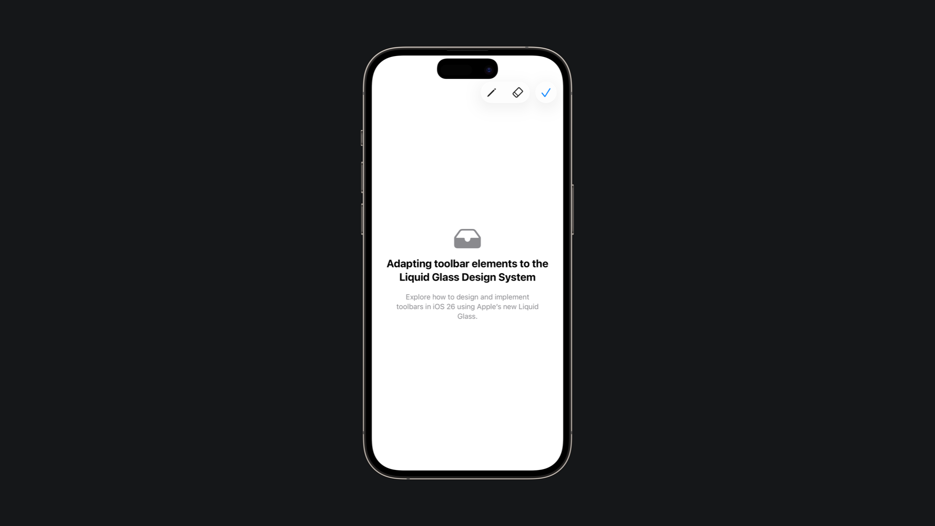
When a tint needs to be applied to the entire button rather than just parts of it, the appropriate approach is to use the glassProminent button style. This ensures that the tint is applied consistently across the whole surface of the button, maintaining a clear and uniform appearance.
import SwiftUI

struct ContentView: View {

    var body: some View {
        NavigationStack {
            VStack {
                ContentUnavailableView("Toolbars", systemImage: "swift")
            }

            .toolbar {
                ToolbarItemGroup(placement: .topBarTrailing) {
                    Button("Draw", systemImage: "pencil") {
                        // Button action here
                    }

                    Button("Erase", systemImage: "eraser") {
                        // Button action here
                    }
                }

                ToolbarSpacer(.fixed, placement: .topBarTrailing)

                ToolbarItem(placement: .topBarTrailing) {
                    Button("Save", systemImage: "checkmark") {
                        // Button action here
                    }
                    .buttonStyle(.borderedProminent)
                    .tint(Color(.systemBlue))
                }
            }
        }
    }

}
The new design system includes new options for organizing toolbar content with the addition of ToolbarItemGroup and ToolbarSpacer. These APIs make it easier to create clear, logical groupings of related actions while also giving developers precise control over spacing and alignment within the toolbar.
import SwiftUI

struct ContentView: View {

    var body: some View {
        NavigationStack {
            VStack {
                ContentUnavailableView {
                    Label("Adapting toolbar elements to the Liquid Glass Design System", systemImage: "tray.fill")
                } description: {
                    Text("Explore how to design and implement toolbars in iOS 26 using Apple’s new Liquid Glass.")
                        .padding()
                }
            }

            .toolbar {
                ToolbarItemGroup(placement: .topBarTrailing) {
                    Button("Draw", systemImage: "pencil") {
                        // Button action here
                    }

                    Button("Erase", systemImage: "eraser") {
                        // Button action here
                    }
                }

                ToolbarSpacer(.fixed, placement: .topBarTrailing)

                ToolbarItem(placement: .topBarTrailing) {
                    Button("Save", systemImage: "checkmark") {
                        // Button action here
                    }
                    .tint(Color(.systemBlue))
                }
            }
        }
    }

}
ToolbarSpacer can be fixed or flexible, giving you precise layout control, perfect for separating primary and secondary actions. The first one will use a default spacing determined by the system and the context in which the spacer is used, while the second will expand to accommodate as much space as it is given in the current context.
When organizing a toolbar, buttons should be grouped by function and frequency of use, for example, keeping navigation controls together while separating primary actions like Save or Done. Additionally, text-labeled buttons should be placed apart from symbol-based buttons, as mixing them side by side can create confusion and reduce clarity for users.