Adapting your widgets for visionOS
Learn how to adapt your widgets for visionOS by rethinking layout, typography, and depth to make them clear, engaging, and natural in the environment.

In the Apple ecosystem, widgets play a crucial role by giving users quick access to relevant information from an app at a glance. With visionOS 26, widgets extend into augmented reality, allowing users to place them directly within their physical environment.
This integration enriches the experience by anchoring digital elements to real-world objects, enabling contextual information to appear precisely where it’s most useful. The result is an environment seamlessly enhanced with interactive, location-aware widgets that blend the digital and physical worlds.
Sizes and styles
Smaller widgets are perfect for glanceable information, but in augmented reality, there’s often room for larger, content-rich surfaces that feel more like interactive posters or panels in the environment.
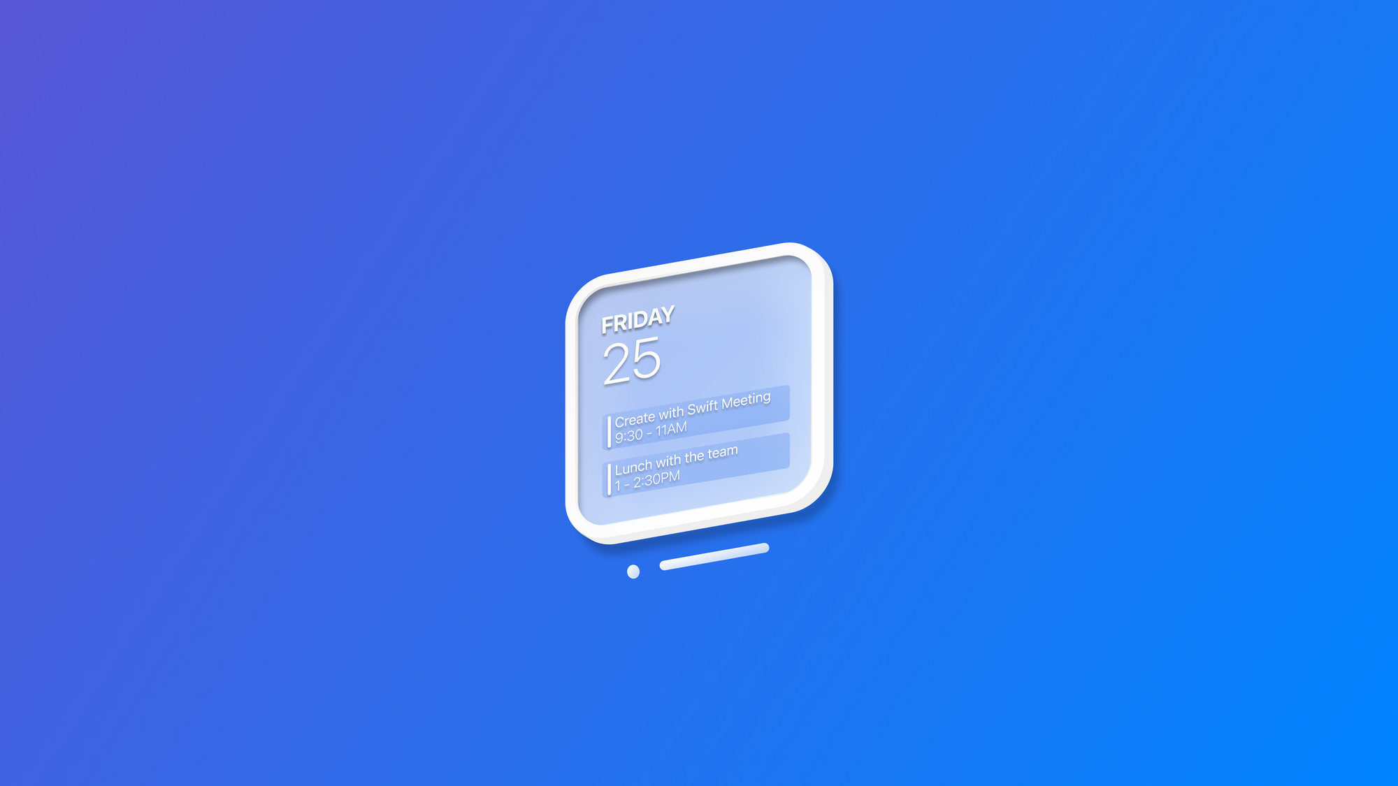
By introducing an extra-large portrait size, Apple enables developers to design widgets that can serve as focal points in a space, not just quick utility views, thereby expanding their role from passive information snippets to active elements of the user’s environment.
And as developers, to support the new sizes, we just need to include the new size systemExtraLargePortrait in the supportedFamilies(_:) modifier of the widget:
import WidgetKit
import SwiftUI

struct BookTrackingWidget: Widget {
    let kind: String = "BookTrackingWidget"

    var body: some WidgetConfiguration {
        StaticConfiguration(kind: kind, provider: Provider()) { entry in

            BookTrackingWidgetView(entry: entry)
                .containerBackground(.white, for: .widget)

        }
        .configurationDisplayName("Book Tracker")
        .description("Track your reading progress and statistics.")
        .supportedFamilies([.systemSmall, .systemMedium, .systemLarge, .systemExtraLargePortrait])
    }
}
In addition to the new exclusive size, widgets on visionOS also support the tinting mode that we already saw from other Apple platforms. This allows both the content and the frame to adapt to the selected tint, ensuring a consistent and customizable appearance across the experience.
Placing a widget in the environment
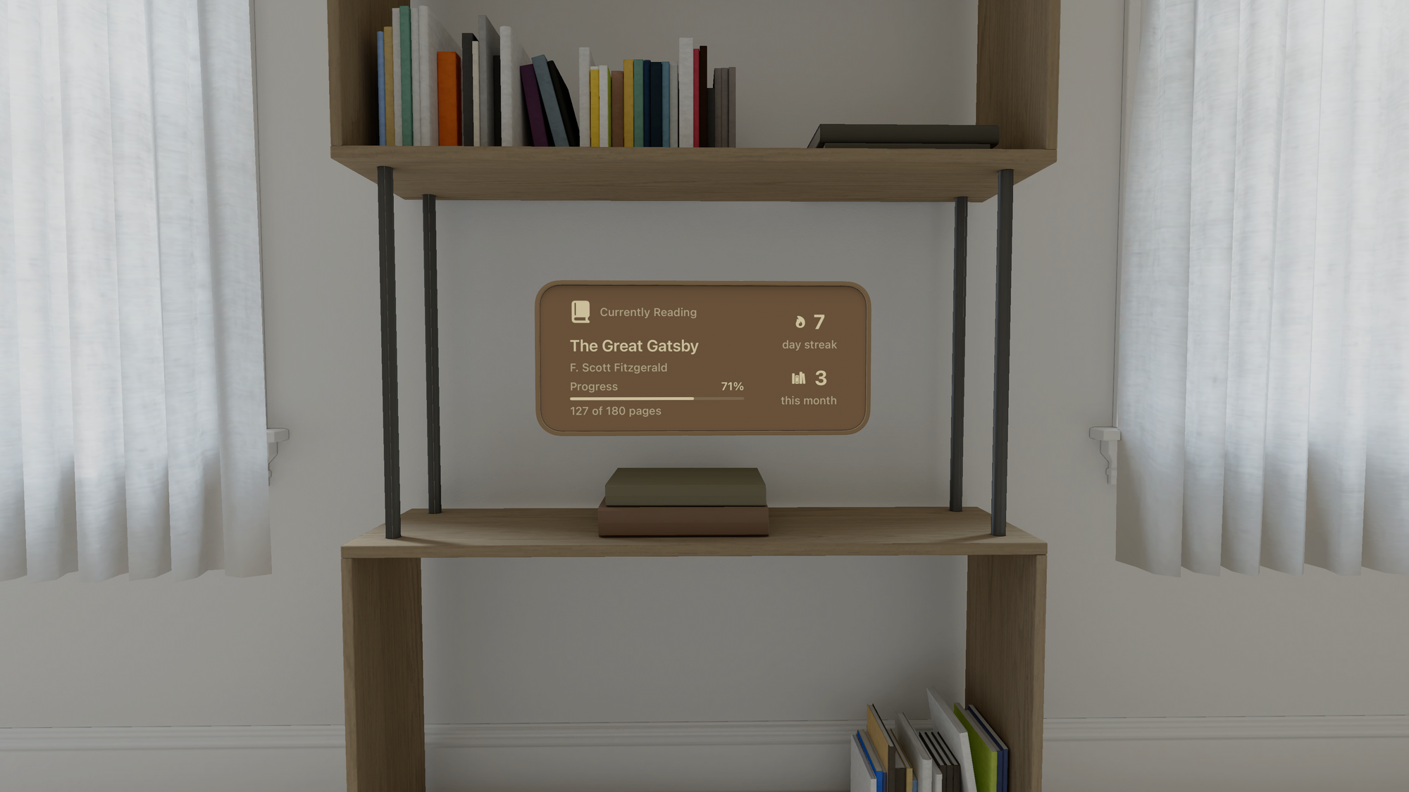
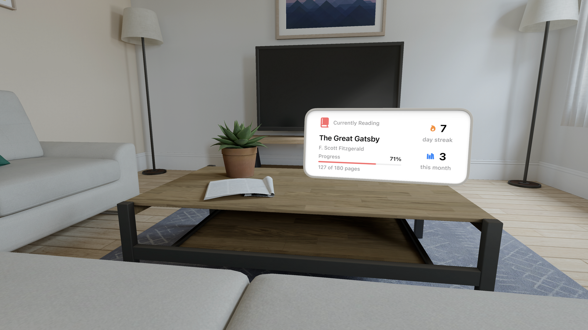
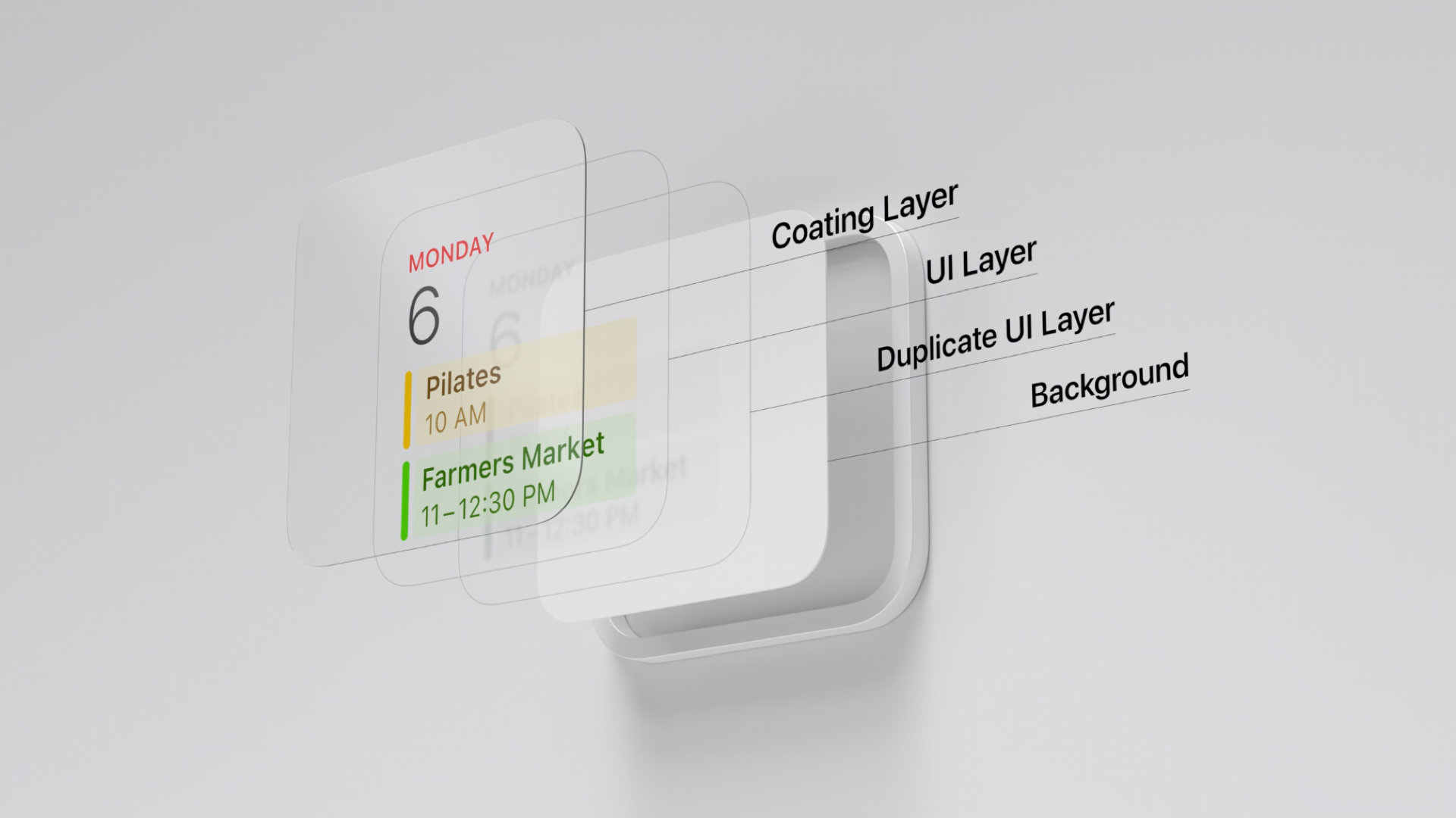
Users can place widgets in the environment or anchor them on a horizontal or vertical surface using the Widgets app. Most importantly, these widgets are visible only in augmented reality and not in full immersion, reinforcing the concept of digital elements connected to the real environment.
On a horizontal surface like a table, the widget tilts slightly for better legibility and casts a subtle shadow for added realism. It takes on the look of a picture frame, with customizable frame width and overall tint. When anchored to a wall, the widget can either resemble a picture frame or create the illusion of a recessed cutout, making it ideal for experiences that emphasize depth and spatial immersion.
We can control this kind of behavior using the supportedMountingStyles(_:) modifier for specifying the type of mounting styles our widgets need to support: elevated and recessed.
import WidgetKit
import SwiftUI

struct BookTrackingWidget: Widget {
    let kind: String = "BookTrackingWidget"

    var body: some WidgetConfiguration {
        StaticConfiguration(kind: kind, provider: Provider()) { entry in

            BookTrackingWidgetView(entry: entry)
                .containerBackground(.fill.tertiary, for: .widget)

        }
        .supportedMountingStyles([.recessed, .elevated])
        .configurationDisplayName("Book Tracker")
        .description("Track your reading progress and statistics.")
        .supportedFamilies([.systemSmall, .systemMedium, .systemLarge])
    }
}
Materials and appearance
When designing a widget, we can think of it like choosing a piece of furniture: different materials create different impressions in a space. That's why Widgets come in two stylistic treatments, Paper and Glass, each with its own character and way of responding to the environment.
Paper has a grounded, print-like quality, solid and tangible, blending naturally with ambient light as if it truly belongs in the room.
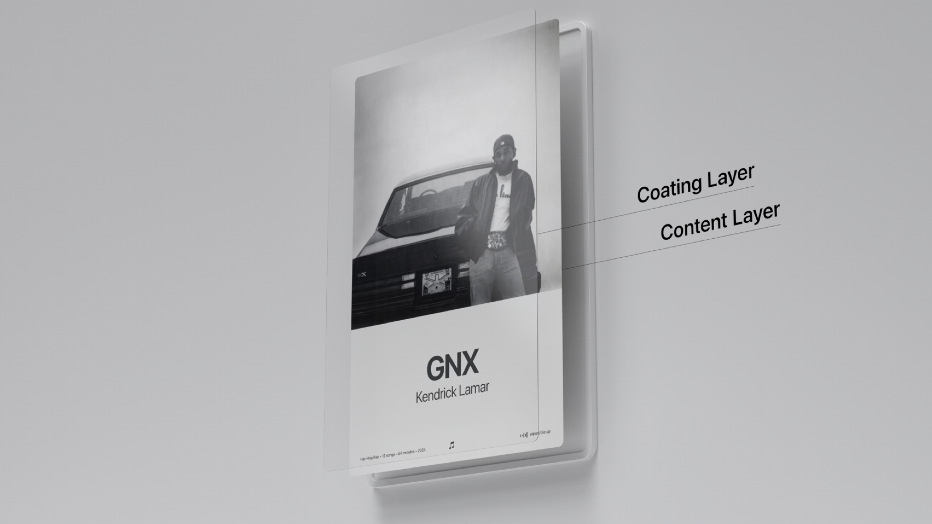
Glass feels lighter and layered, adding depth and separation between foreground and background, much like a translucent surface that catches the light.
Both treatments shape how the widget sits in its surroundings, helping you reinforce the kind of experience you want to create.
Depending on our needs and the context in which we imagine our widget placed in our users' environment, we can decide to implement one material over another, simply by adding the widgetTexture(_:) passing a parameter of WidgetTexture type among paper and glass.
import WidgetKit
import SwiftUI

struct BookTrackingWidget: Widget {
    let kind: String = "BookTrackingWidget"

    var body: some WidgetConfiguration {
        StaticConfiguration(kind: kind, provider: Provider()) { entry in

            BookTrackingWidgetView(entry: entry)
                .containerBackground(.white, for: .widget)

        }
        .supportedMountingStyles([.recessed, .elevated])
        .widgetTexture(.glass)
        .configurationDisplayName("Book Tracker")
        .description("Track your reading progress and statistics.")
        .supportedFamilies([.systemSmall, .systemMedium, .systemLarge])
    }
}
With visionOS, widgets evolve from simple glanceable elements into fully spatial experiences. Developers can leverage flexible sizing, immersive stylistic treatments, and adaptive tinting to create widgets that feel integrated into the user’s environment, whether on a table, anchored to a wall, or floating in space.
By combining these tools, widgets can move beyond static information panels to become dynamic, context-aware extensions of apps, enriching both functionality and the sense of presence in augmented reality.