Changing a button shape in visionOS
Learn how to change the shape of a button component in visionOS.

When running your application in visionOS buttons will have a specific style defined by the operating system. According to the needs of your user interface, you might need your buttons to have different shapes than the default ones.
To apply a new shape to a button use the modifier buttonBorderShape(_:) and the shape you define will be applied to the button's appearance.
Button(action: {
    // Button action here
}, label: {
    Label("Play First Episode", systemImage: "play.fill")
        .padding(.horizontal)
})
.foregroundStyle(.black)
.tint(.white)
.buttonBorderShape(.roundedRectangle)
Applying the .buttonBorderShape(_:) modifier
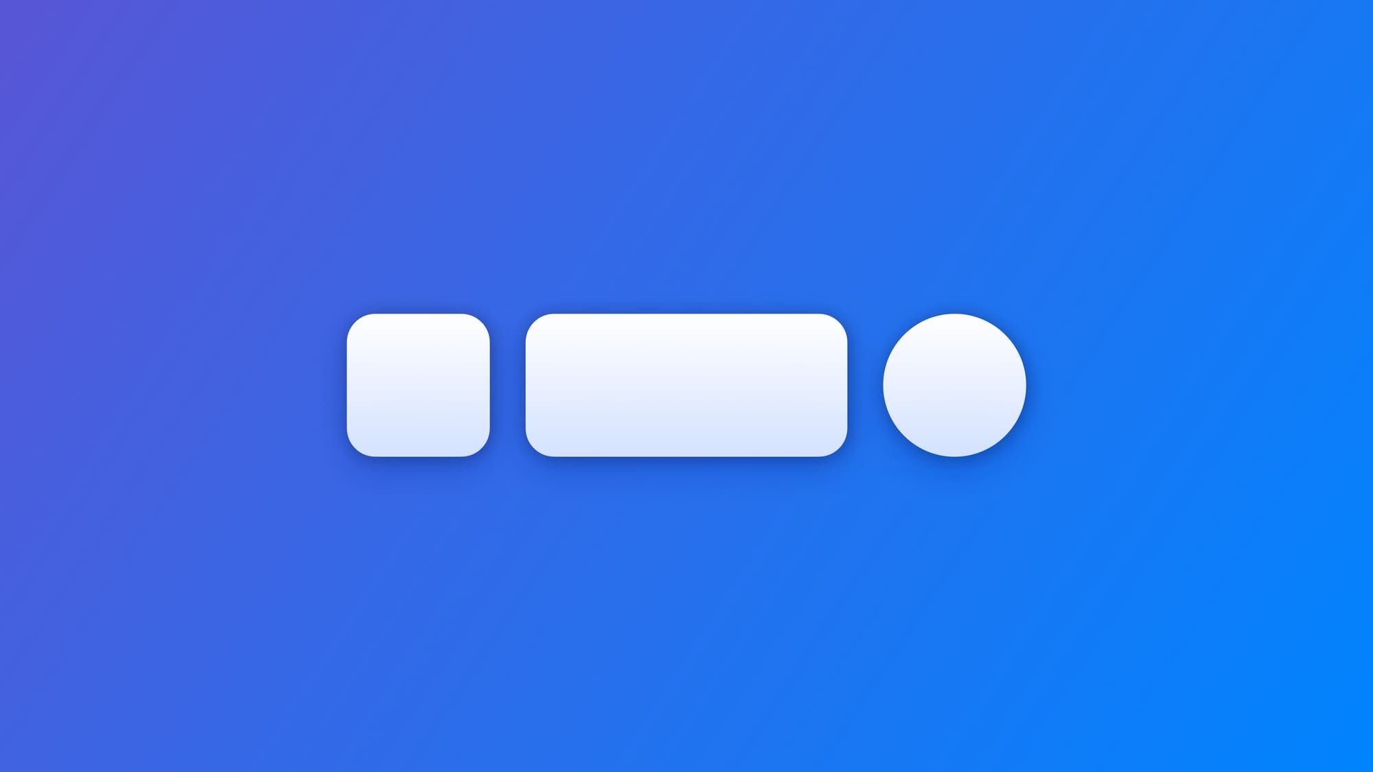
The shapes are defined by the type ButtonBorderShape and the predefined ones you can use are:
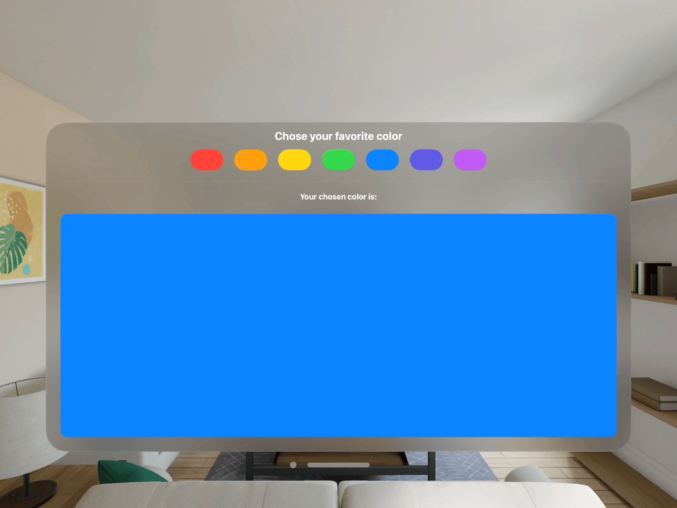
Consider the following example where the buttons to select the color have the default shape: a capsule.
struct ContentView: View {

    @State var availableColors: [Color] = [
        .red, .orange, .yellow, .green,
        .blue, .indigo, .purple
    ]

    @State var chosenColor: Color = .clear

    var body: some View {
        VStack {
            Text("Chose your favorite color")
                .font(.title)

            HStack(spacing: 24) {
                ForEach(availableColors, id: \.self) { color in
                    Button(action: {
                        withAnimation { chosenColor = color }
                    }, label: {
                        Text("").padding()
                    })
                    .tint(color)
                }
            }

            Divider().padding()

            Text("Your chosen color is:")
                .font(.headline)

            RoundedRectangle(cornerRadius: 15)
                .fill(chosenColor)
                .padding()
        }
        .padding()
    }

}
At the moment the button is using the system's default shape for buttons.
Button(action: { ... }, label: { ... })
.tint(color)
Applying the buttonBorderShape(_:) modifier to the Button view we can define a new shape for the buttons, making it look a bit more like color swatches, for example.
Button(action: { ... }, label: { ... })
.tint(color)
.buttonBorderShape(.roundedRectangle(radius: 10))
To create your button styles, Paul Hudson has a nice short guide for you:
 Paul Hudson twostraws