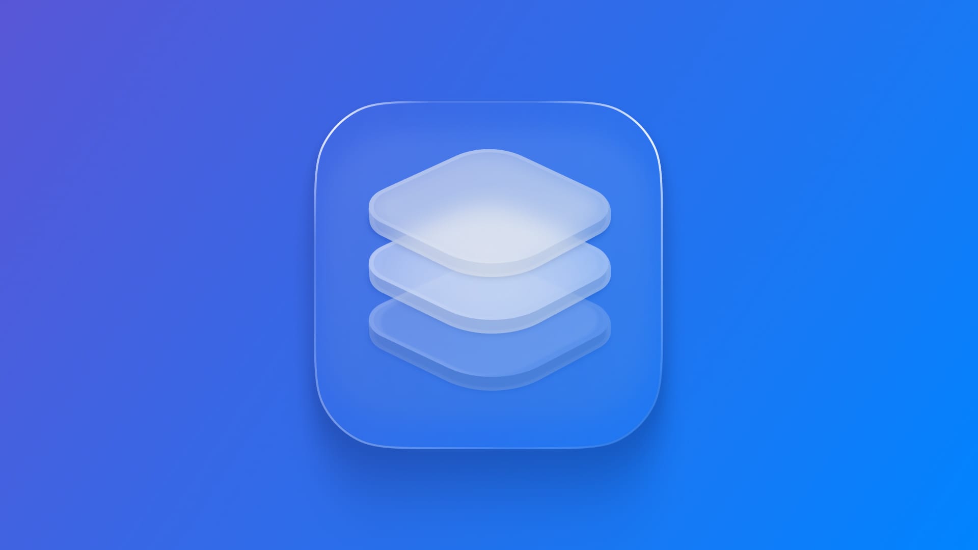
Crafting Liquid Glass app icons with Icon Composer
Learn how to build Liquid Glass App Icons with the help of Icon Composer.

WWDC25 was packed with significant updates, particularly in the design language, introducing a transformative new visual standard for interfaces and App Icons called Liquid Glass.
It brings translucency, depth, and realism through real-time effects like specular highlights, chromatic shadows, and material layering. It's adaptive, rendering interface elements and App Icons dynamically while maintaining clarity and recognizability.
These innovations aim to create a cohesive and expressive identity for apps across iPhone, iPad, Mac, and Watch. The shift simplifies workflows and enhances visual consistency while introducing new interactive and appearance-responsive materials.
One App Icon to rule them all
At the beginning of app development, app icons needed pixel-level optimization at multiple sizes. With the introduction of retina displays and the 2× and 3× resolutions, numerous files for various resolutions were necessary.
Recently, Apple updated the app icon requirement, so there was only a need for one full-resolution image of the app icon, which will be automatically resized to fit all the required resolutions where it is displayed.
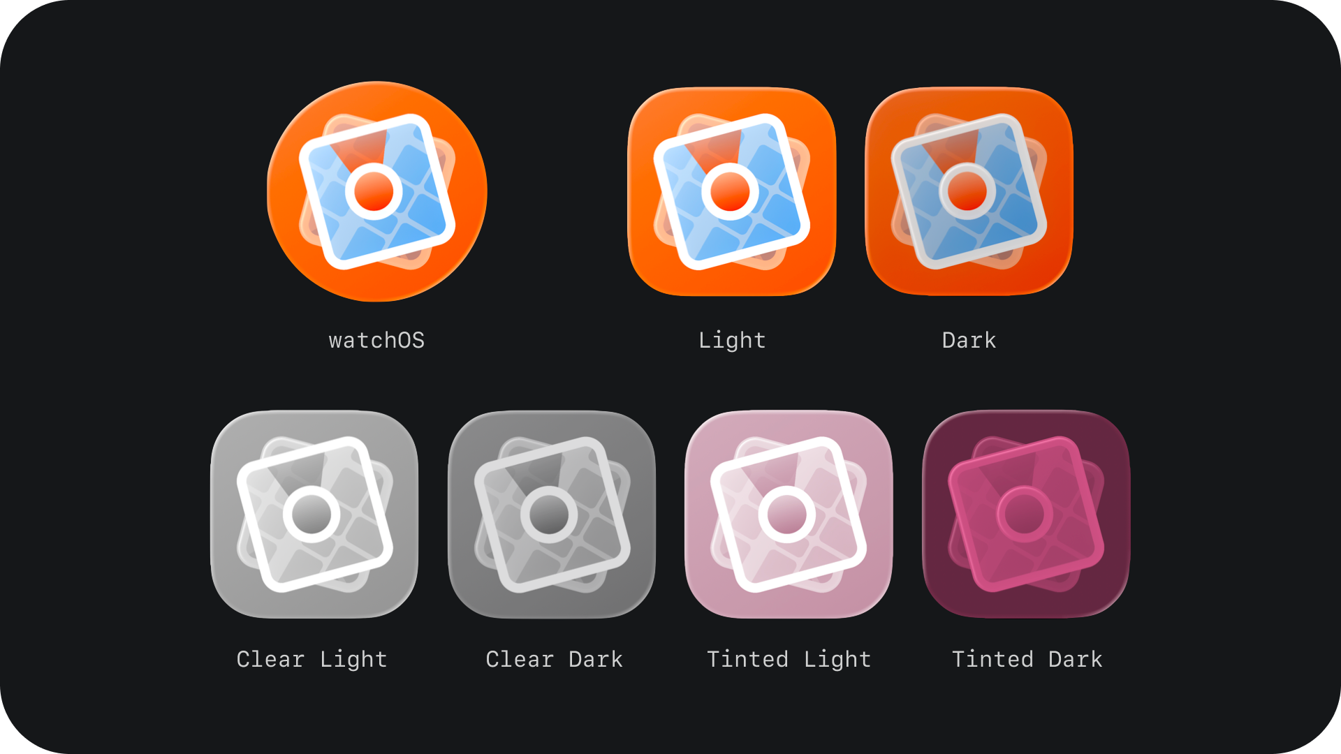
Now, with the newest version of its platforms (26) being announced, new appearance modes were introduced alongside the new unified design language, Liquid Glass. There are now multiple ways an app icon can be rendered, depending on the user's system appearance settings and how it interacts with the background content. They are Default, Dark, Clear Light, Clear Dark, Tinted Light and Tinted Dark.
Instead of forcing developers to create multiple variations of their app icons, Apple simplified the process once more, requiring one new file per icon. In a format that scales, adapts, and transforms across iOS, macOS, iPadOS, and watchOS, working seamlessly with the new appearances and naming conventions introduced for App Icons.
Inspired by the layering effect and materiality that visionOS App Icons already possess, Apple introduced a new software designed for developers called Icon Composer. It feels familiar for those who have already worked with the Parallax Previewer while creating app icons for visionOS and tvOS.
Introducing Icon Composer
Icon Composer is Apple’s new tool for assembling, customizing, and exporting app icons using Liquid Glass. It comes with Xcode 26 and works alongside your existing design tools, replacing multiple export pipelines with a single .icon file.
With Icon Composer, you can:
- Import vector (.svg) and raster (.png) layers.
- Apply system-optimized materials and customize them.
- Preview across platforms and modes.
- Export assets for marketing.
- Deliver directly to Xcode.
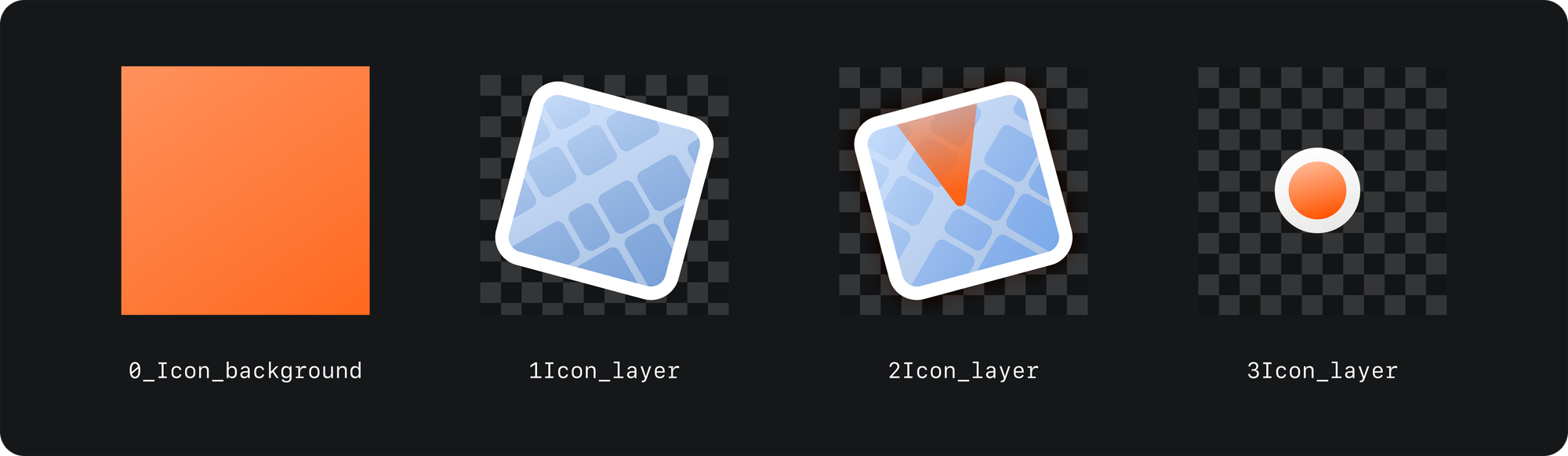
Preparing Your Design Assets
1. Start with your preferred design tool
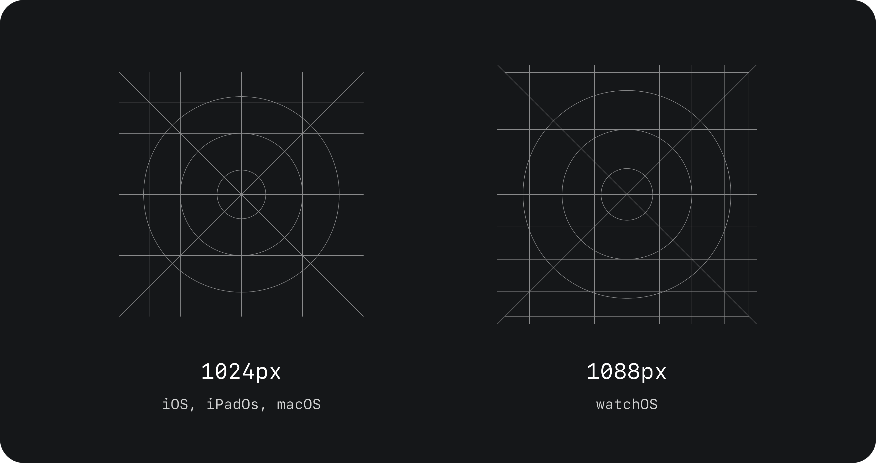
Utilize vector tools such as Figma, Illustrator or Sketch. Apple is introducing a new grid for designing app icons, sized at 1024px (iPhone, iPad, Mac) and 1088px (Watch). The official resources are available on the Apple Design Resources page as "App Icon Template" for Sketch, Photoshop and Illustrator.
2. Use layers for control
Structure your artwork in layers — one for each logical color or depth. More control means easier adjustment for appearance modes later.
Good practices for designing your icon are:
- Split foreground/background;
- Isolate color zones;
- Ensure that the different foreground layers have transparent backgrounds;
- Convert type to outlines (SVG doesn't retain fonts).
3. Exporting
When exporting the images that will compose the layers of your app icon within the Icon Composer tool, follow these principles:
- SVG for vectors (maintains scalability).
- PNG for rasterized images (e.g., blur, texture).
- Do not include the platform mask (circle or rounded rectangle).
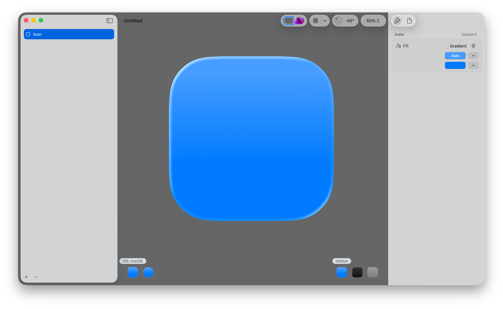
Using Icon Composer - Overview
Let's have an overview of the new Icon Composer tool, going through each of its elements and analyzing what is possible to achieve within them.
1. Preview Canvas (central & top)
The central area of the tool. There, you can:
- Preview the icon with the desired settings applied to it;
- Customize canvas color or background to test your icon in different contexts;
- Use Apple’s system grids and preset modes;
- Overlay the icon grid, zoom in and out;
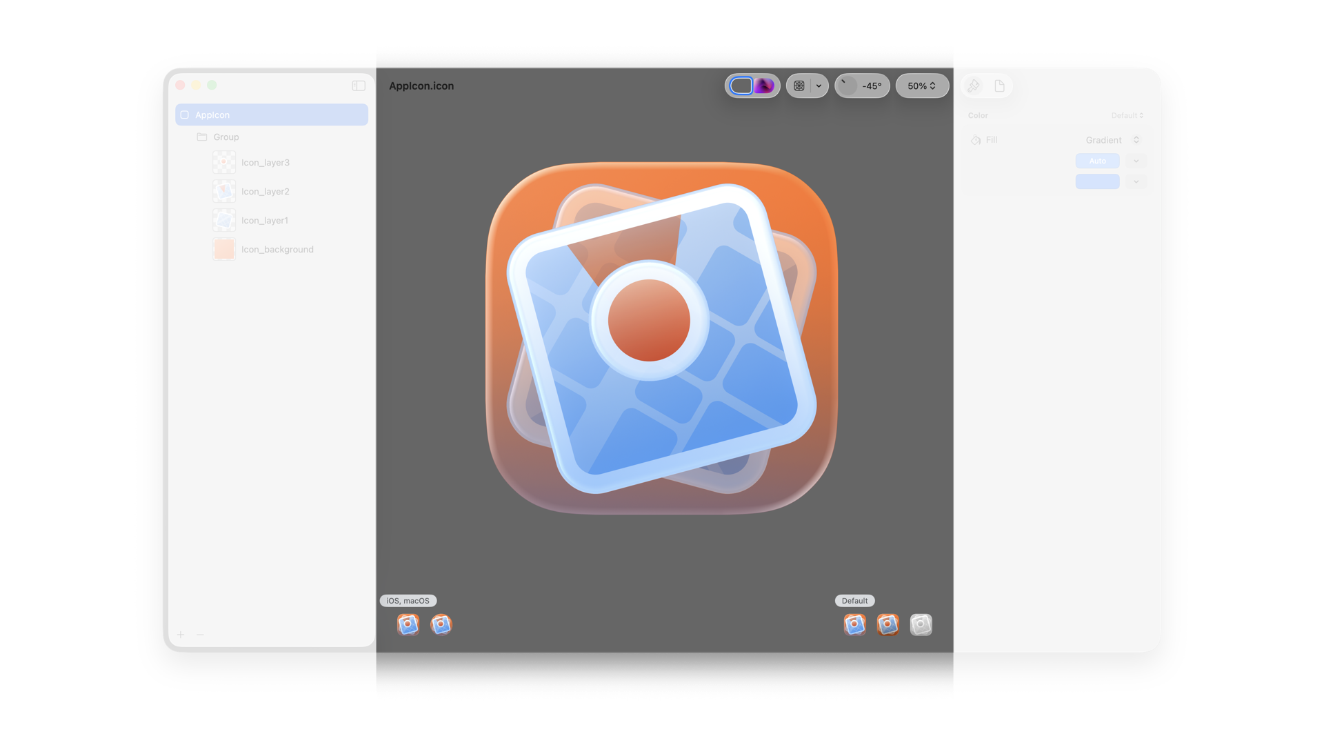
2. Sidebar
Used to manage the layers and groups of your app icon design. Here you can:
- Select layers and groups to customize them in the inspector;
- Reorder the layers, which initially appear in alphabetical order;
- Group layers by depth (up to 4 groups for complexity).
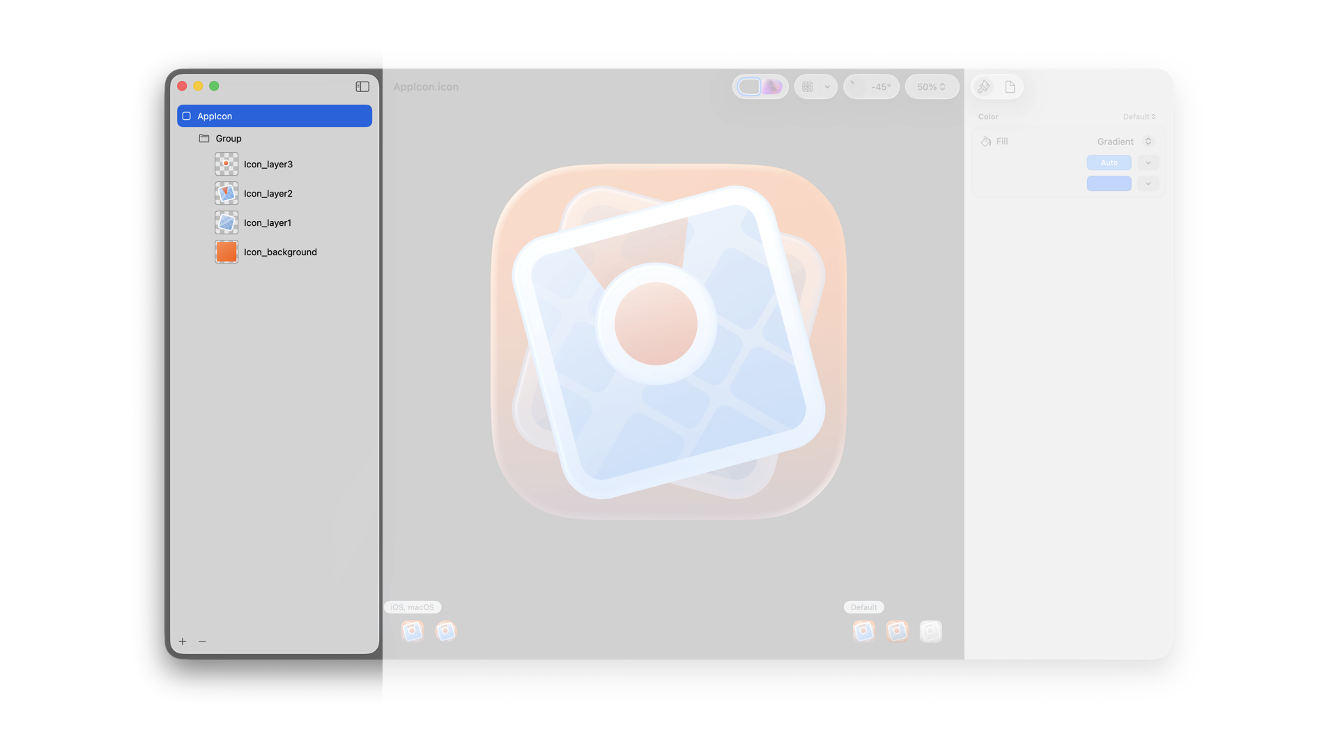
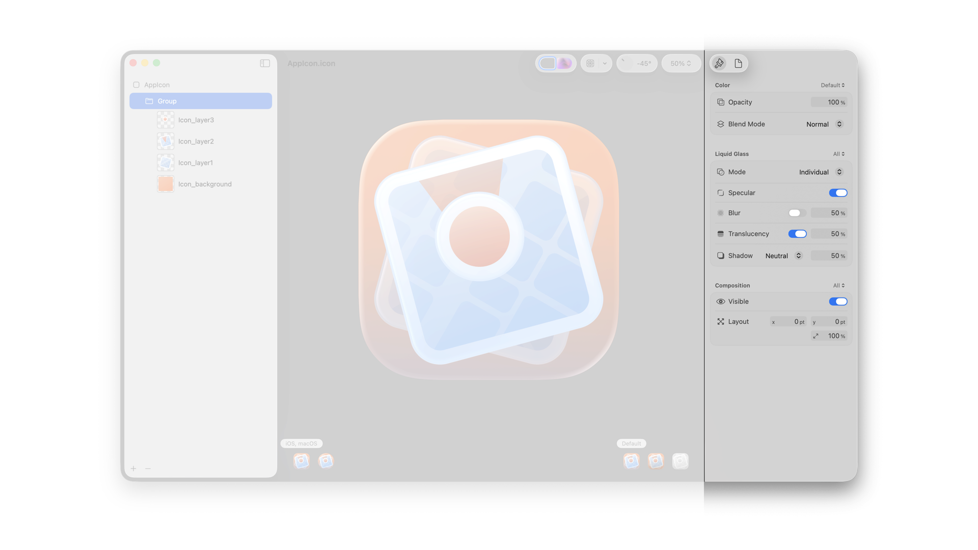
3. Inspector Panel
Customize and fine-tune specific layers for specific modes.
- When layers are imported, with the Group folder selected, you can control materials like:
- Liquid Glass toggle.
- Fill, opacity, blend mode.
- Specular highlights.
- Shadows (neutral or chromatic).
- Create per-appearance variants to fine-tune behavior in Dark or Tinted mode.
4. Appearance settings
Placed at the bottom of the app. Lets you:
- Select the platform for which you are previewing the icon.
- Pick the appearance you want to preview and adjust the chromatic effect in Mono appearance.
Tailoring your icon for Appearance Modes
Icon Composer handles many transitions automatically, but fine-tuning ensures clarity and recognizability. Here are some things to keep in mind when polishing your icon design to adapt to the different modes and locations it will appear in:
- Dark Mode Tips:
- Adjust fills to avoid elements fading into black.
- Boost contrast for key areas.
- Mono (Clear/Tinted) Modes:
- Set one layer containing full white.
- Map other colors to grayscale.
- Icon Composer offers auto-conversion + manual tuning.
- watchOS Considerations:
- The canvas is larger and uses a circular mask (1088px).
- Adjust composition optically (e.g., reposition edges or apply bleed).
- General advice for light effect:
- ni sharp corners in your artwork - light navigates better on rounded corners.
- Don’t overcrowd your levels with light effects that might conflict with the ones made by the Icon Builder.
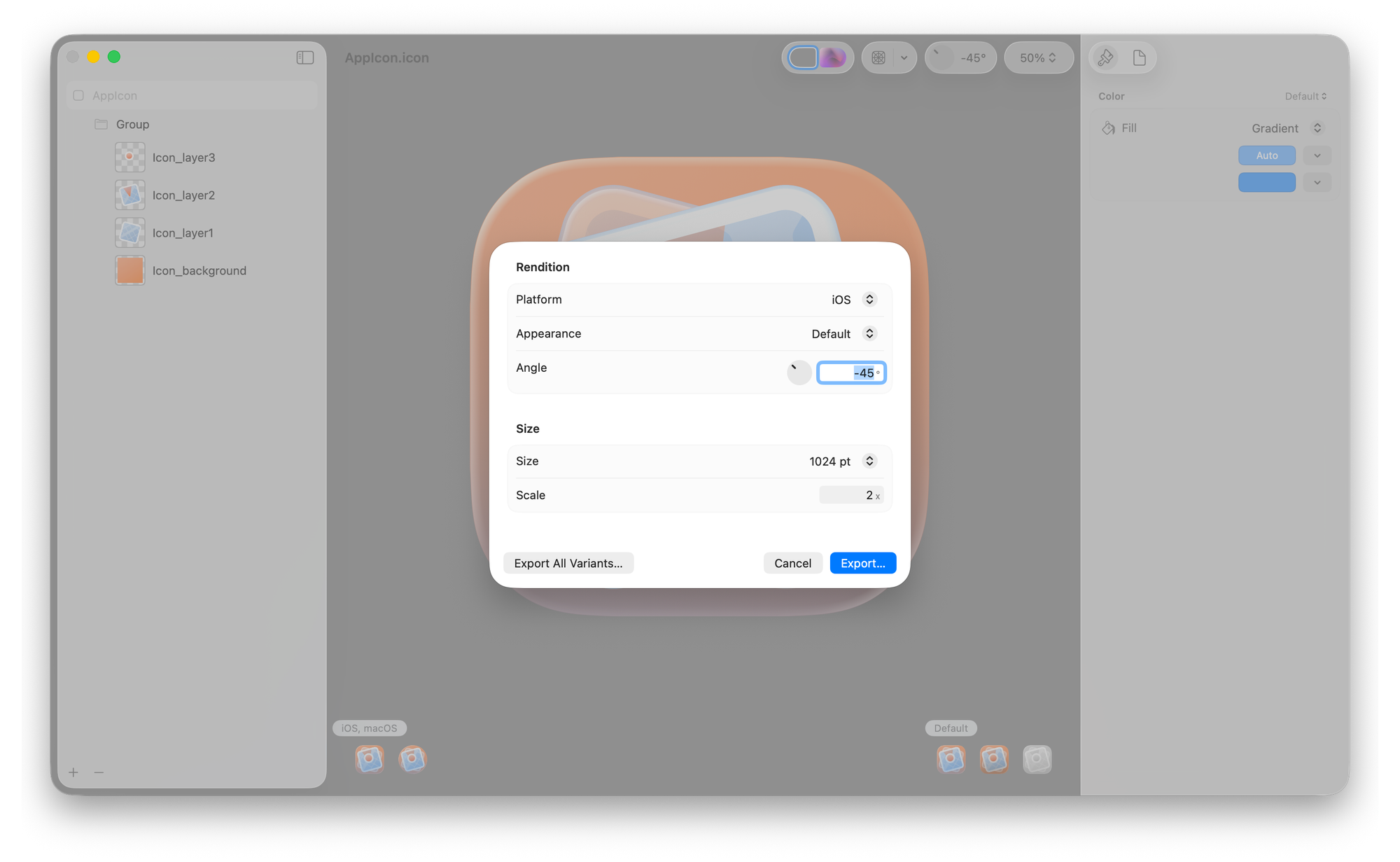
Export & import in Xcode
Once you are satisfied with the results, you can Save the app icon as a .icon file. This will enable you to utilize this unique asset as the source of all icon assets in your projects. You can also export different sizes, modes, and platform-specific icons to create assets for marketing purposes.
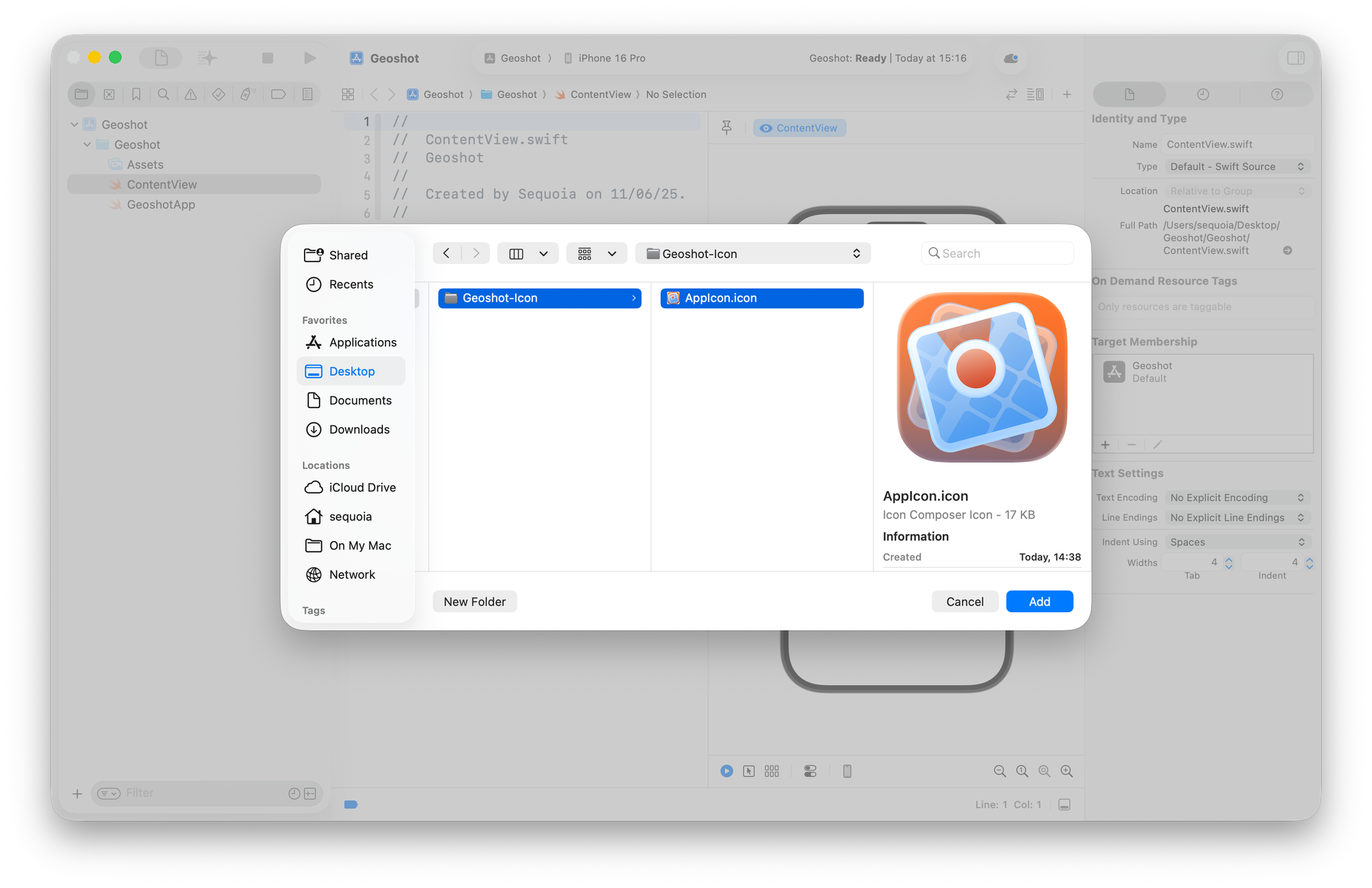
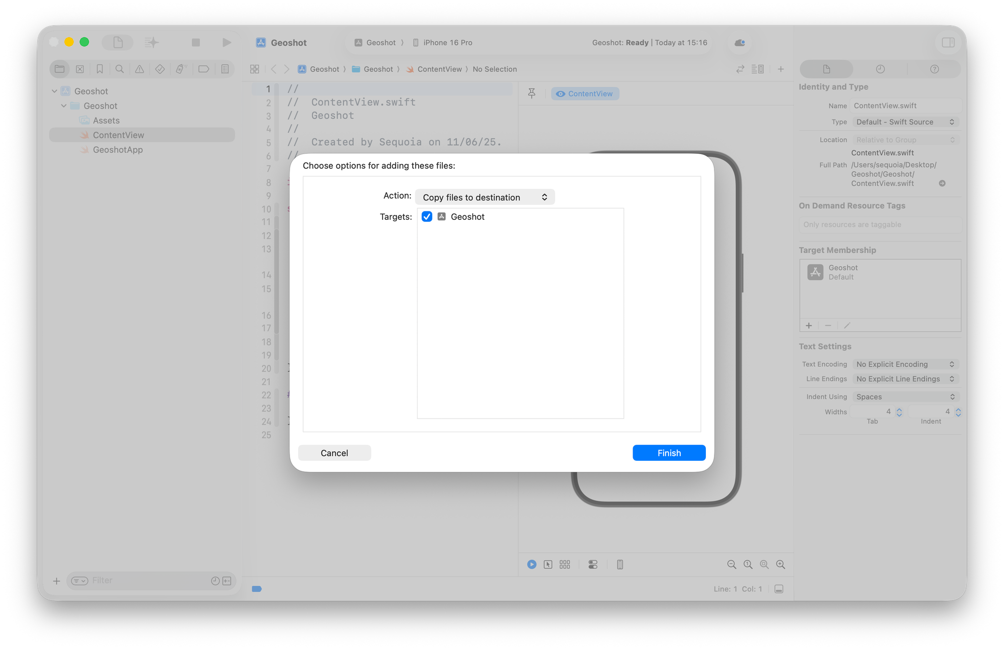
You can add the Icon Composer file (.icon) to your Xcode project at any time to view your app icon in the Simulator and on real devices. Just drag the Icon Composer file from Finder to the project navigator, and Xcode provides feedback on where to drop it in a target folder.
Alternatively, choose Add Files from the Add button at the bottom of the project navigator and select your Icon Composer file in the dialog that appears.
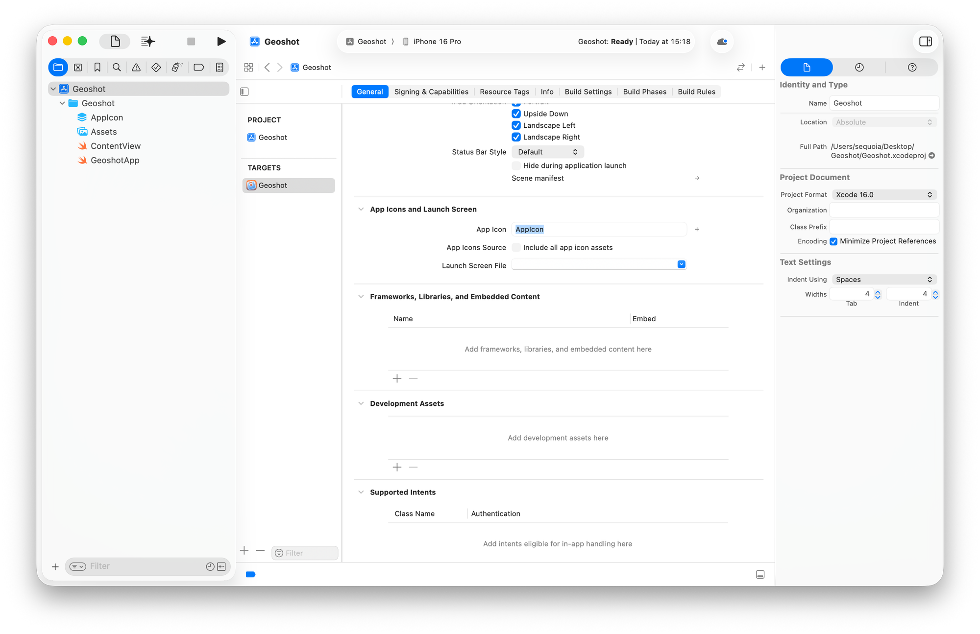
In the project editor, select the target and then the General tab. Under App Icons and Launch Screen, ensure that the name in the App Icon text field matches the name of the Icon Composer file without the extension.
You can have multiple Icon Composer files in your project but only one that matches the name in the App Icon text field.
App icons are no longer just static graphics. With the introduction of Liquid Glass, they’ve become layered, translucent, and responsive—shaped by light, context, and interaction.
This new design language invites a shift in mindset: from flat visuals to expressive surfaces. App Icons now adapt to appearance modes, reflect their environment, and feel more integrated across Apple platforms.
It’s not just about how they look, but how they feel. Richer, bolder, alive.
Resources
Alongside the announcement of Liquid Glass, Apple released several resources to support designers and developers in adapting their existing app icons to the new design language of Apple platforms and creating new icons for their future projects.
The session "Create icons with Icon Composer" gives a great overview of the tool and how to use it to bring your icons to life.
The session "Say hello to the new look of app icons" provides an overview of the various appearances your app icons can have and offers tips on how to maximize the benefits of each one.
The page for App Icon at the Human Interface Guidelines was also updated with all the principles, guidelines and tips on how to create app icons for all platforms.
In the developer documentation, the article "Creating your app icon using Icon Composer" provides a step-by-step overview of the tool and its usage.
