
Creating custom buttons and hover effects in visionOS
Use hover effects and visual feedback to enhance your app’s interactivity with system and custom buttons.


visionOS introduces innovative interaction methods distinct from traditional touch and pointer-based systems. A key interaction is the indirect tap gesture, where users look at a control and pinch their fingers together to perform a tap.
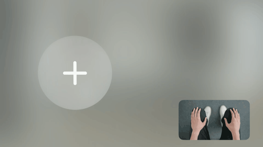
Let's delve deeper into this interaction. To select a button, the user first needs to look at it. To select a button, the user must first look at it, triggering a subtle visual highlight known as the hover effect. This effect provides visual feedback, indicating that the user has targeted a specific element and that it is interactive.
Using system buttons
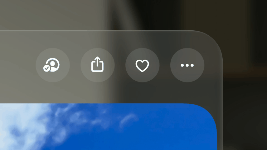
When developing applications for visionOS, it is highly recommended to use system buttons whenever possible. The main reasons are that system buttons include a hover effect and animation when users interact with them, adding visual feedback at no extra cost.
By using system buttons, developers can focus on creating unique features while keeping a consistent and polished interface that follows visionOS guidelines.
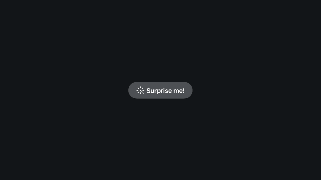
Here’s an example inspired by the Apple Music 100 Best Albums “Surprise Me” button:
import SwiftUI

struct SurpriseMeSystemButton: View {
    var body: some View {
        Button("Surprise me!", systemImage: "wand.and.rays") {
            print("🥳")
        }
    }
}
This simple example shows how to create a system button in SwiftUI that responds to user interaction with built-in visual feedback.
Implementing hover effects in SwiftUI
While system buttons offer a range of benefits, including built-in hover effects, animations, and adherence to visionOS design standards, there are times when custom-designed buttons are necessary. Custom buttons allow developers to create a unique look and feel that aligns with a specific brand identity or app aesthetic.
By designing custom buttons, developers can tailor the user experience to better meet the needs of their application and audience, ensuring that the interface not only performs well but also stands out visually.
import SwiftUI

struct SurpriseMeCustomButton: View {

    @State private var tapping: Bool = false

    var body: some View {
        HStack {
            Text("Surprise me")
            Image(systemName: "wand.and.rays")
        }
        .bold()
        .padding()
        .background(
            RoundedRectangle(cornerRadius: 10)
                .fill(Color.pink)
        )

        .onTapGesture {
            print("🥳")
        }
    }

}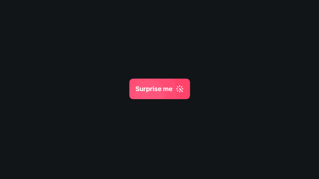
When developing custom buttons, adding hover effects and animations is essential to providing users with a responsive and engaging interface. The initial custom button example lacks these interactive features.
Let’s enhance the user experience by implementing a hover effect and a tap animation:
import SwiftUI

struct SurpriseMeCustomButton: View {

    @State private var tapping: Bool = false

    var body: some View {
        HStack {
            Text("Surprise me")
            Image(systemName: "wand.and.rays")
        }
        .bold()
        .padding()
        .background(
            RoundedRectangle(cornerRadius: 10)
                .fill(Color.pink)
        )
        .hoverEffect()
        .scaleEffect(tapping ? 0.95 : 1)
        .gesture(
            DragGesture(minimumDistance: 0)
                .onChanged({ value in
                    withAnimation(.smooth(duration: 0.2)) {
                        tapping = true
                    }
                })
                .onEnded({ value in
                    withAnimation(.bouncy(duration: 0.5)) {
                        tapping = false
                    }
                })
        )
        .onTapGesture {
            print("🥳")
        }
    }
}
Here’s why you should make this change:
- Visual feedback: the hover effect lets users know they are interacting with a clickable component, improving usability.
- Engagement: the tap animation provides immediate feedback when the button is pressed, making the interaction more satisfying and intuitive.
- Consistency: adding these effects ensures that your custom buttons offer a similar level of interactivity as system buttons, maintaining a consistent user experience across your app.
Customizing hover effects
When creating custom buttons, it's important to consider how the hover effect is applied because it significantly impacts the user's interaction experience. As stated before, hover effects serve as visual cues, indicating that an element is interactive. This feedback helps users navigate and interact with the application more intuitively.
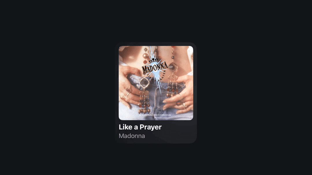
Using Apple Music album cards as an example, we can illustrate these points effectively. Here’s an example:
import SwiftUI

struct AlbumCoverButton: View {

    @State private var tapping: Bool = false

    var body: some View {
        Group {
            VStack(alignment: .leading) {
                Image("Like a Prayer")
                    .resizable()
                    .aspectRatio(contentMode: .fit)
                    .frame(width: 200, height: 200)
                    .clipShape(RoundedRectangle(cornerRadius: 10))
                Text("Like a Prayer")
                    .font(.title3)
                Text("Madonna")
                    .font(.headline)
                    .opacity(0.6)
                    .fontWeight(.regular)
            }
            .padding(10.0)
        }
        .hoverEffect()
        .scaleEffect(tapping ? 0.95 : 1)
        .gesture(
            DragGesture(minimumDistance: 0)
                .onChanged({ value in
                    withAnimation(.smooth(duration: 0.2)) {
                        tapping = true
                    }
                })
                .onEnded({ value in
                    withAnimation(.bouncy(duration: 0.5)) {
                        tapping = false
                    }
                })

        )
        .onTapGesture {
            print("🎵")
        }

    }
}
The code generates a button that matches the design shown in the left image. While there is a hover effect, it only appears on the album cover and the text labels (“Like a Prayer” and “Madonna”) below it. This design lacks sufficient visual feedback, making user interaction less intuitive.
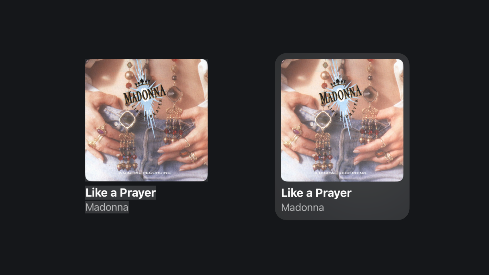
The design on the right features the same album cover and text labels but enhances the user experience with a distinct hover effect. When the user looks at the album cover, the entire component is highlighted with a subtle shadow and a rounded rectangle border, clearly indicating its interactivity.
To archive the design on the right we can use contentShape(). By applying .contentShape(.hoverEffect, RoundedRectangle(cornerRadius: 20.0)), we ensure that the hover effect and any associated animations are applied uniformly within the defined shape.
struct AlbumCoverButton: View {

    @State private var tapping: Bool = false

    var body: some View {
        Group {
            VStack(alignment: .leading) {
                Image("Like a Prayer")
                    .resizable()
                    .aspectRatio(contentMode: .fit)
                    .frame(width: 200, height: 200)
                    .clipShape(RoundedRectangle(cornerRadius: 10))
                Text("Like a Prayer")
                    .font(.title3)
                Text("Madonna")
                    .font(.headline)
                    .opacity(0.6)
                    .fontWeight(.regular)
            }
            .padding(10.0)
        }
        .contentShape(.hoverEffect, RoundedRectangle(cornerRadius: 20.0))
        .hoverEffect()
        .scaleEffect(tapping ? 0.95 : 1)
        .gesture(
            DragGesture(minimumDistance: 0)
                .onChanged({ value in
                    withAnimation(.smooth(duration: 0.2)) {
                        tapping = true
                    }
                })
                .onEnded({ value in
                    withAnimation(.bouncy(duration: 0.5)) {
                        tapping = false
                    }
                })

        )
        .onTapGesture {
            print("🎵")
        }

    }
}

#Preview(windowStyle: .automatic) {
    AlbumCoverButton()
}
In summary, incorporating hover effects and visual feedback significantly enhances the usability and aesthetic appeal of the user interface.
Conclusion
Developing for visionOS requires balancing system components and custom designs to ensure a cohesive and engaging user experience. System buttons offer consistent design, performance optimization, and accessibility, making them a reliable choice.
However, custom buttons are sometimes necessary for specific branding or unique functionalities. We should make sure to incorporate hover effects and animations to enhance interactivity and visual feedback for our custom buttons, improving usability and creating a polished look.
To learn more, check our article’s collection here:
 Create with Swift