Creating custom layouts with SwiftUI
Understand how to create custom layouts with the Layout protocol in SwiftUI.

When you find yourself struggling with GeometryReader to position views exactly where you want them, or when HStack and VStack just can't create the layout you're envisioning because you have complex positioning requirements that built-in layouts can't handle... maybe you need custom layouts.
Built-in layouts work great for common patterns, but they have limitations. For example, VStack and HStack only allow linear arrangements, LazyVGrid allows fixed column structures, ZStack is only about simple layering without intelligent positioning and GeometryReader can give performance issues and requires complex calculations.
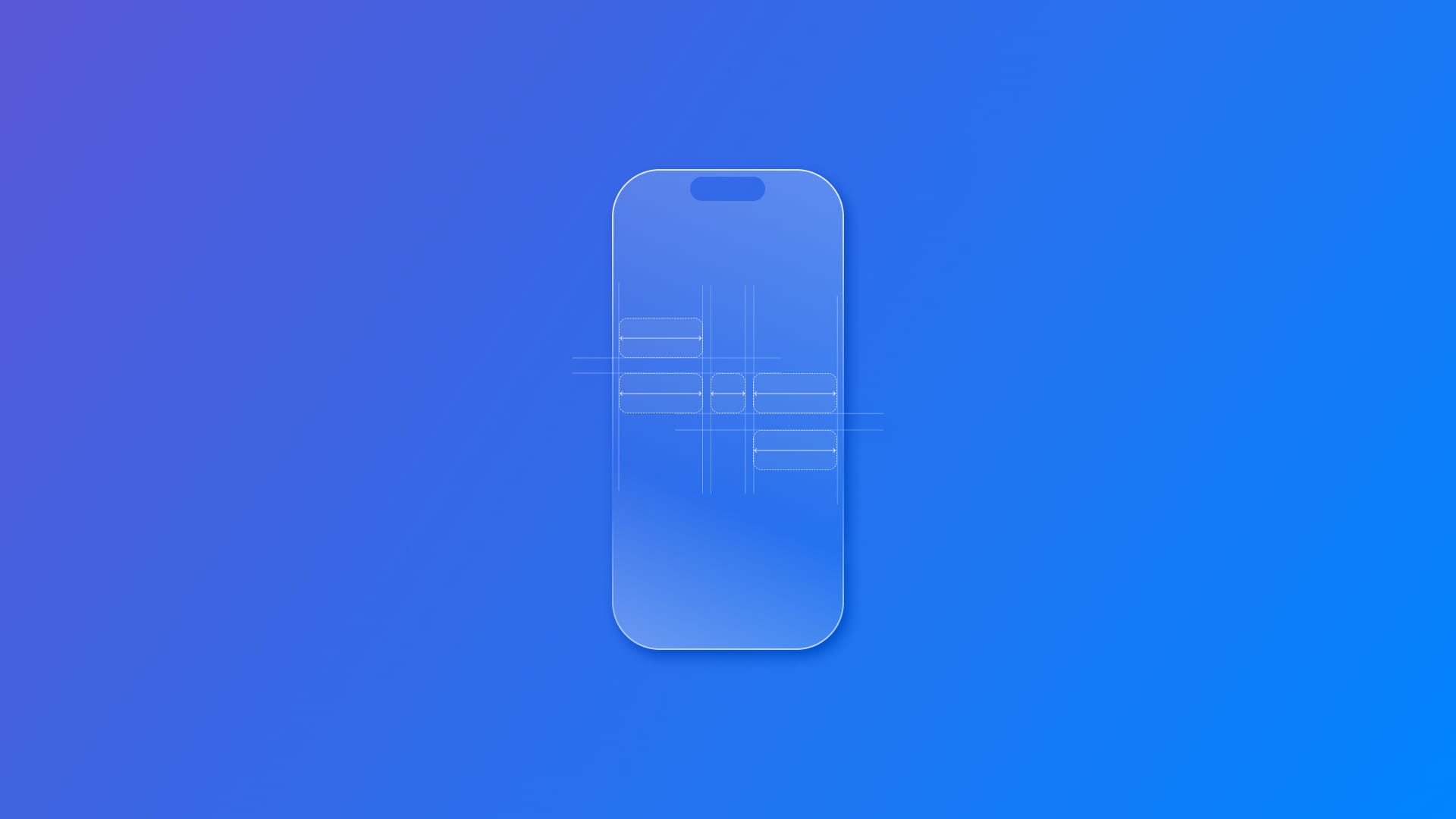
Custom layouts in SwiftUI are types that define the geometry of a collection of views. Instead of relying on the predefined behavior of built-in layouts, you can create your own layout logic that positions views exactly where you want them.
Think of custom layouts as your own personal layout containers: just like HStack arranges views horizontally, your custom layout can arrange views in any pattern you can imagine: circles, flowing text, grids with varying sizes, or any other creative arrangement.
They can give you precise control over every view's position, better performance than GeometryReader, reusable layout logic you can use anywhere and automatic animation support when layouts change.
SwiftUI's layout process happens in two phases:
- Size negotiation: Parent views propose sizes to child views
- Positioning: Once sizes are agreed upon, views are positioned
This two-phase approach ensures efficient and predictable layouts throughout your app.
Layout Protocol Fundamentals
The Layout protocol gives you direct access to SwiftUI's layout engine, making custom layouts both performant and elegant. You need to implement two essential methods:
protocol Layout {
    // Required: calculate total size needed
    func sizeThatFits(
        proposal: ProposedViewSize,
        subviews: Subviews,
        cache: inout Cache
    ) -> CGSize

    // Required: position each subview
    func placeSubviews(
        in bounds: CGRect,
        proposal: ProposedViewSize,
        subviews: Subviews,
        cache: inout Cache
    )
}
sizeThatFits(_:) is used to compute the size of the entire layout, and placeSubviews(in:proposal:subviews:cache:) lets you set the position of the individual subviews.
Let's break these functions down.
ProposedViewSize is SwiftUI’s way of suggesting how much space your layout might have. It comes in three forms:
- Specific size:
ProposedViewSize(width: 300, height: 200) - Unspecified dimension:
ProposedViewSize(width: 300, height: nil) - Completely unspecified:
ProposedViewSize.unspecified
Subviews gives you access to all child views. For each subview, you can:
- Ask for its size using
subview.sizeThatFits(_:) - Place it with
subview.place(at:anchor:proposal:) - Access spacing preferences with
subview.spacing(must be applied manually)
Cache is an optional performance optimization. SwiftUI updates the cache only when views change. For beginners, you can ignore caching initially by using Void as your cache type.
Understanding the Coordinate System
The coordinate system is crucial for proper positioning:
- bounds.minX: Left edge of your layout's space
- bounds.minY: Top edge of your layout's space
- bounds.midX: Horizontal center of your layout's space
- bounds.midY: Vertical center of your layout's space
Anchor parameter determines which part of the subview aligns to the given point:
.leading: Left edge of subview aligns to the point.center: Center of subview aligns to the point.trailing: Right edge of subview aligns to the point
Building a Custom Layout
Let's build a simple layout called FixedSpacer, that places views with fixed spacing between them, regardless of their sizes.
Our FixedSpacer will:
- Arrange views horizontally with exactly 20 points between each view
- Size itself to fit all views plus the spacing
- Center views vertically if they have different heights
Basic structure
import SwiftUI

struct FixedSpacer: Layout {
    let spacing: CGFloat = 30

    // Calculate the total size needed for our layout
    func sizeThatFits(
        proposal: ProposedViewSize,
        subviews: Subviews,
        cache: inout ()
    ) -> CGSize {
         // Implementation coming next...
    }

    // Position each subview within our bounds
    func placeSubviews(
        in bounds: CGRect,
        proposal: ProposedViewSize,
        subviews: Subviews,
        cache: inout ()
    ) {
         // Implementation coming next...
    }
}
Now, let's explore first the implementation of sizeThatFits:
func sizeThatFits(
    proposal: ProposedViewSize,
    subviews: Subviews,
    cache: inout ()
) -> CGSize {
    // 1. Ask each subview for its preferred size
    let subviewSizes = subviews.map { subview in
        subview.sizeThatFits(.unspecified)
    }

    // 2. Calculate total width needed: all widths + spacing between views
    let totalWidth = subviewSizes.map(\.width).reduce(0, +) +
                    spacing * CGFloat(subviews.count - 1)

    // 3. Find the tallest view for our height
    let maxHeight = subviewSizes.map(\.height).max() ?? 0

    return CGSize(width: totalWidth, height: maxHeight)
}
This method:
- Asks each subview for its ideal size using
.unspecified - Sums all widths and adds spacing between views
- Uses the tallest subview to determine our total height
And now, let's explore in detail the implementation of placeSubViews:
func placeSubviews(
    in bounds: CGRect,
    proposal: ProposedViewSize,
    subviews: Subviews,
    cache: inout ()
) {
    // Start positioning from the left edge
    var currentX = bounds.minX

    // Place each subview
    for subview in subviews {
        // Find out how big this subview wants to be
        let subviewSize = subview.sizeThatFits(.unspecified)

        // Position the subview
        subview.place(
            at: CGPoint(x: currentX, y: bounds.midY),
            anchor: .leading,  // Anchor to the leading edge
            proposal: .unspecified
        )

        // Move to the next position (width + spacing)
        currentX += subviewSize.width + spacing
    }
}
This method:
- Iterates through each subview from left to right
- Positions each view at the calculated X position
- Centers views vertically using
bounds.midY - Uses
.leadinganchor so views align to the left edge of their position - Advances the X position by the view's width plus spacing
Using the new Custom Layout
Here's how to use your new FixedSpacer layout:
struct ContentView: View {
    var body: some View {
        FixedSpacer {
            Text("Short")
                .padding()
                .background(.blue)

            Text("Much Longer Text")
                .padding()
                .background(.green)

            Text("Medium")
                .padding()
                .background(.orange)
        }
        .padding()
    }
}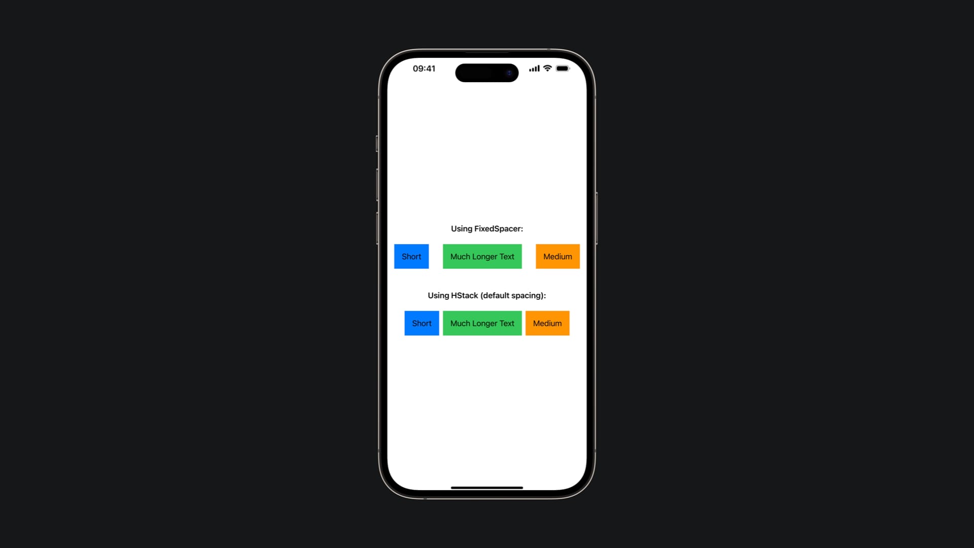
And that's it! What we just built is a fully functional custom layout that you can use anywhere in your SwiftUI app. Your FixedSpacer layout demonstrates all the core concepts you need to build more complex custom layouts.
You can now create layouts that arrange views in circles, flowing patterns, custom grids, or any other arrangement you can imagine. Custom layouts unlock the full power of SwiftUI's layout system, giving you precise control while maintaining the declarative nature that makes SwiftUI so powerful.