
Creating Ornaments in visionOS
Understand the usage of Ornaments in visionOS applications.

An Ornament is a two-dimensional interface component that sticks on a plane parallel to its associated window, slightly in front of it, always keeping the same relative position. It ensures that while your user is navigating your app, crucial information, like status updates, or critical actions are always accessible where the user expects them to be, without getting in the way of your app's content.
System-provided ornaments
On visionOS, by default, tab bars and toolbars natively appear as ornaments. Before creating a custom ornament, investigate if one of the two fits your needs.
When you create a TabView in your visionOS app, the tab bar will automatically appear as an ornament, displayed vertically on the leading side of the window. When the user is looking at the tabs they will expand, so you should provide each tab with a symbol and a short text label.
https://developer.apple.com/design/human-interface-guidelines/tab-bars#visionOS
With the tab bar being an ornament we are always sure that the root navigation is always one snap away. If you app needs a secondary navigation within the content of one of the tabs, consider nesting a sidebar within it.
If you need to provide the user with contextual information or actions, you may consider to use a toolbar with a bottomOrnament placement. For example, if you need to implement controls for an audio player, you could do as below.
.toolbar {
    ToolbarItemGroup(placement: .bottomOrnament) {
        Button("Backward", systemImage: "backward") {
            ...
        }
        Button("Play", systemImage: "play.fill") {
            ...
        }
        Button("Forward", systemImage: "forward.fill") {
            ...
        }
    }
}
Consider using borderless buttons to be consistent with the system design: by default a button will highlight when the user is looking at it, leveraging system the behavior and materials.
Custom ornaments
If none of these two components fits your needs, SwiftUI provides you with a modifier to create your own custom ornament, the ornament(visibility:attachmentAnchor:contentAlignment:ornament:).
nonisolated
func ornament<Content>(
    visibility: Visibility = .automatic,
    attachmentAnchor: OrnamentAttachmentAnchor,
    contentAlignment: Alignment = .center,
    @ViewBuilder ornament: () -> Content
) -> some View where Content : View
Declaration of the ornament modifier.
Visibility
The visibility parameter controls when the ornament is displayed; its default value is automatic, meaning it will always be visible when the window associated to the ornament is visible.
But if you want the ornament to be displayed as a consequence of a user interaction, you can control it by programmatically switching its visibility between hidden and visible. For example, displaying an ornament with photo editing tools only after the user has tapped on an Edit button in the context of a specific image.
Attachment anchor
The attachmentAnchor parameter is used to decide the anchor point of the window to which the ornament will be attached. When you are attaching an ornament to a window, you can use the type UnitPoint.
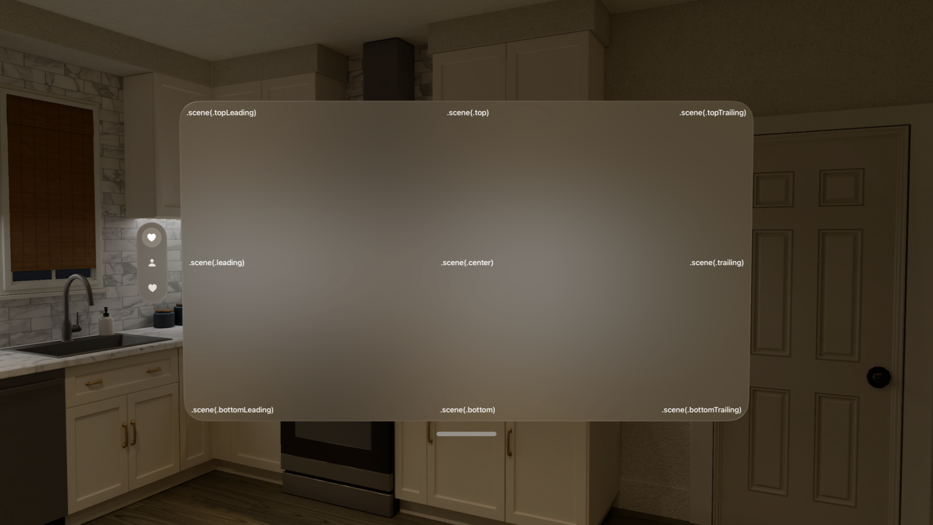
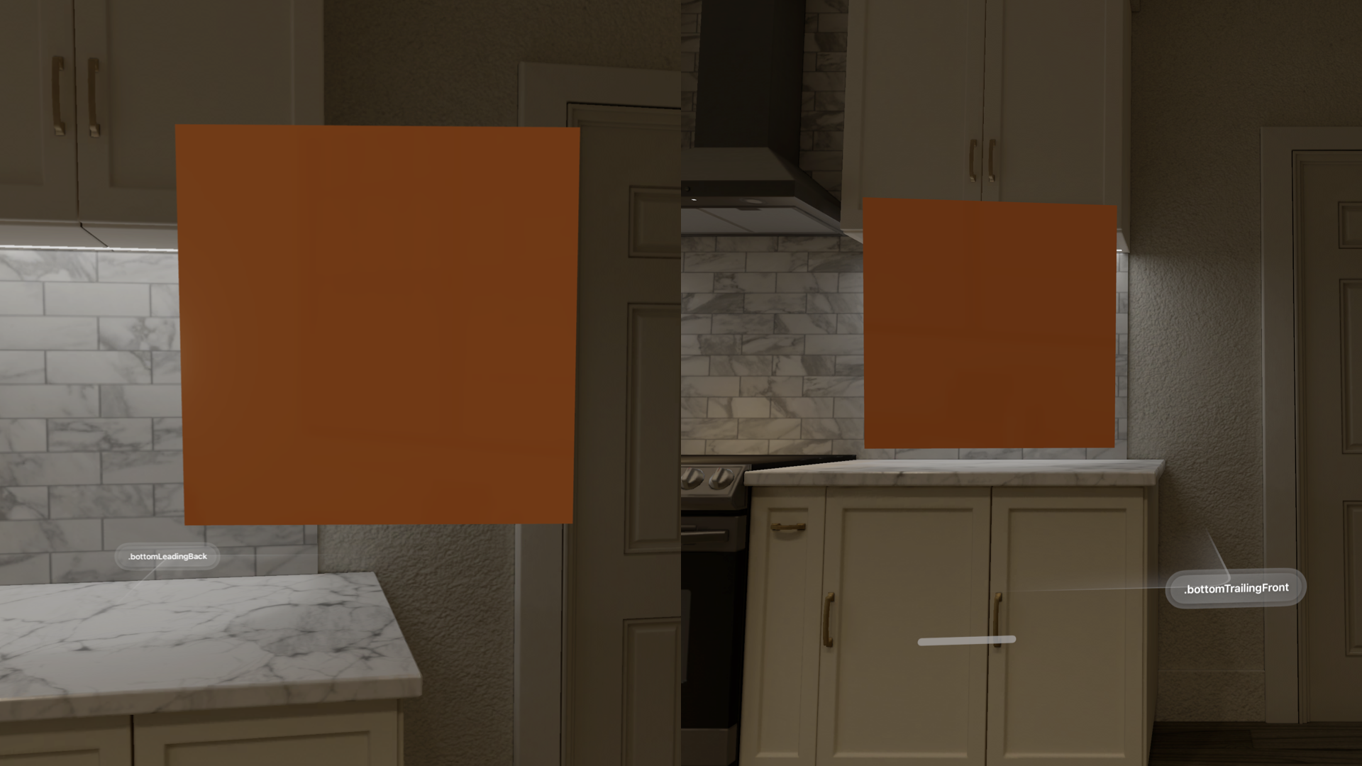
When working with a volume, you can use the type UnitPoint3D which allows the definition of the attachment anchor, taking into consideration three axes.
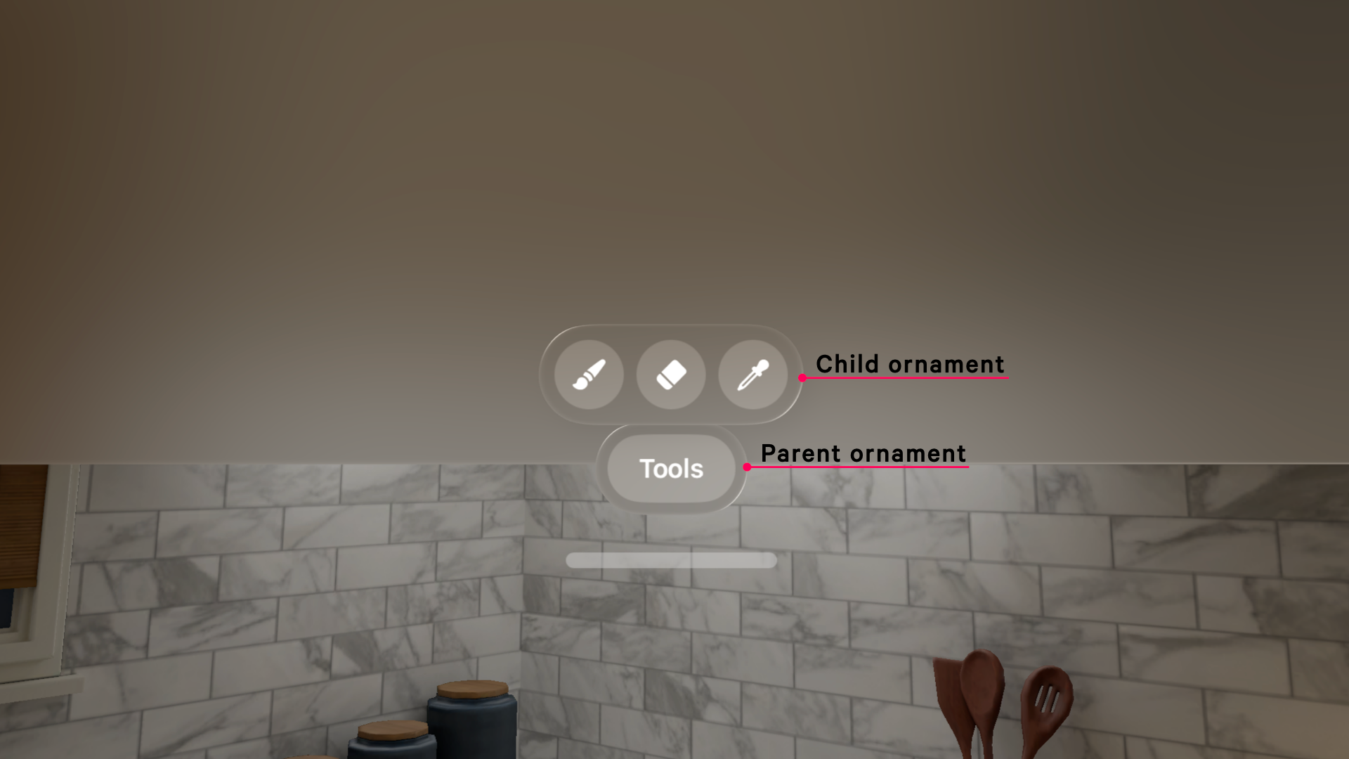
The attachmentAnchor can be related to the window or volume with the scene(_:) method, and starting from visionOS 26, in case you are nesting an ornament, you can attach it to its parent ornament with the parent(_:) method.
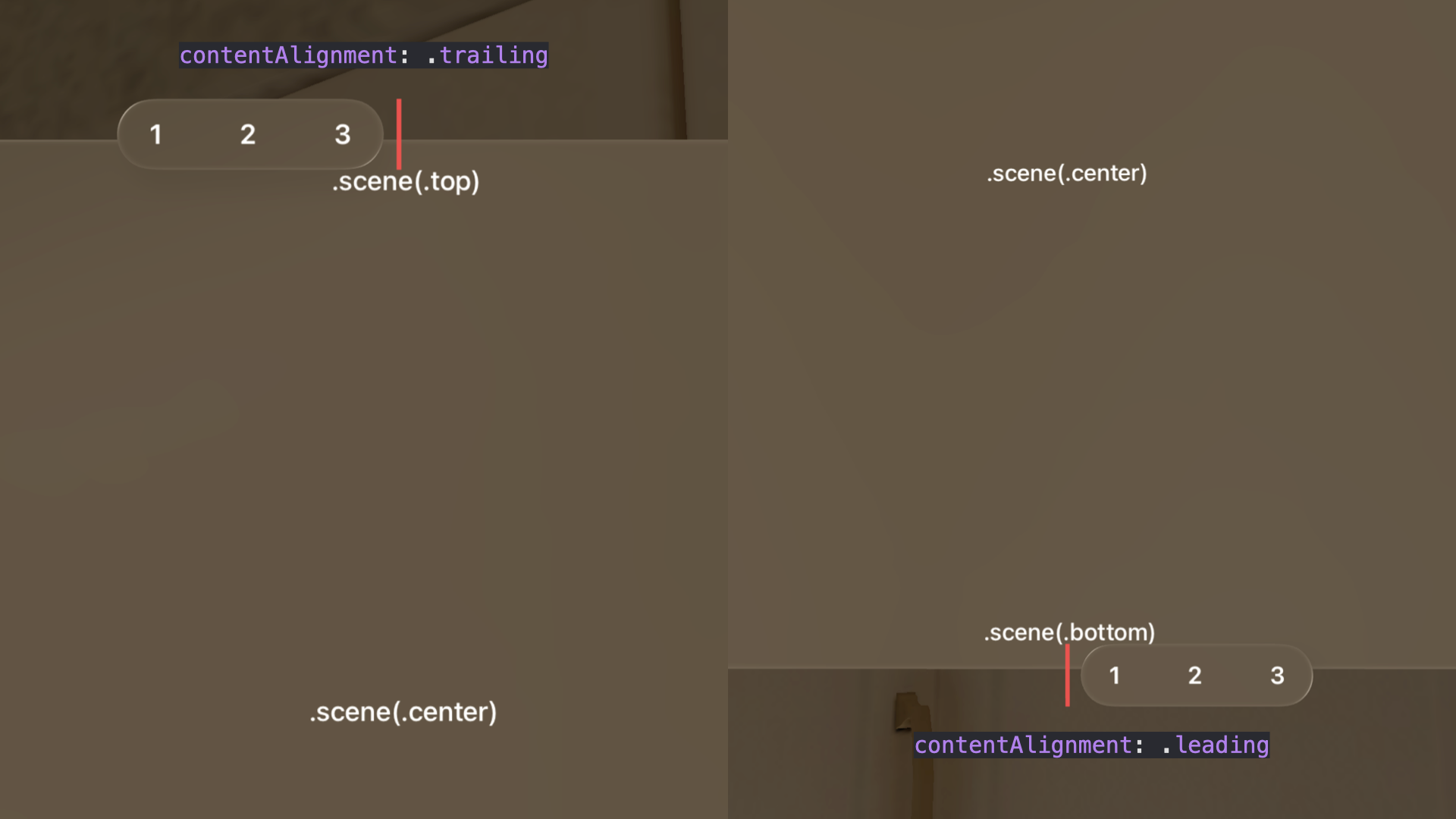
Content alignment
With the contentAlignment parameter, you can align the ornament to the selected attachmentAnchor. Little disclaimer: you are not aligning the content inside a container, actually, you are selecting the anchor point of the ornament that will overlap the attachmentAnchor.
Ornament's content
In the ornament closure, you define the content of the ornament itself.
Before creating a custom ornament, consider using the native tab bar for navigation or a native toolbar for controls.
To determine if an ornament is the best choice, always ask yourself if it provides the user with important information or actions that are needed in a specific context, without disappearing while the user navigates your app's content.
Always keep an ornament visible when needed and avoid making it larger than the size of the window it is attached to. Prioritize visual balance without overwhelming the user with too many decorative elements.
Always be mindful of the materials you use; keep in mind that the background of an ornament is usually glass and, considering that we are on the visionOS platform, you can use borderless buttons since the system automatically applies a hover effect to a button when the user looks at it.
To know more about best practices on when and how to use ornaments in the context of a visionOS application, read Apple's Human Interface Guidelines.