Define how scrolling behaves with Scroll Target Behavior in SwiftUI
Learn how to customize the way the scroll behavior ends and the content aligns when scrolling in SwiftUI

When scrolling a view in SwiftUI, you can customize how the scroll finishes and how the content aligns by using ScrollTargetBehavior, a protocol that helps to define the scroll behavior of a scrollable view, and scrollTargetBehavior(_:), the related ScrollView method that allows applying that behavior in the view.
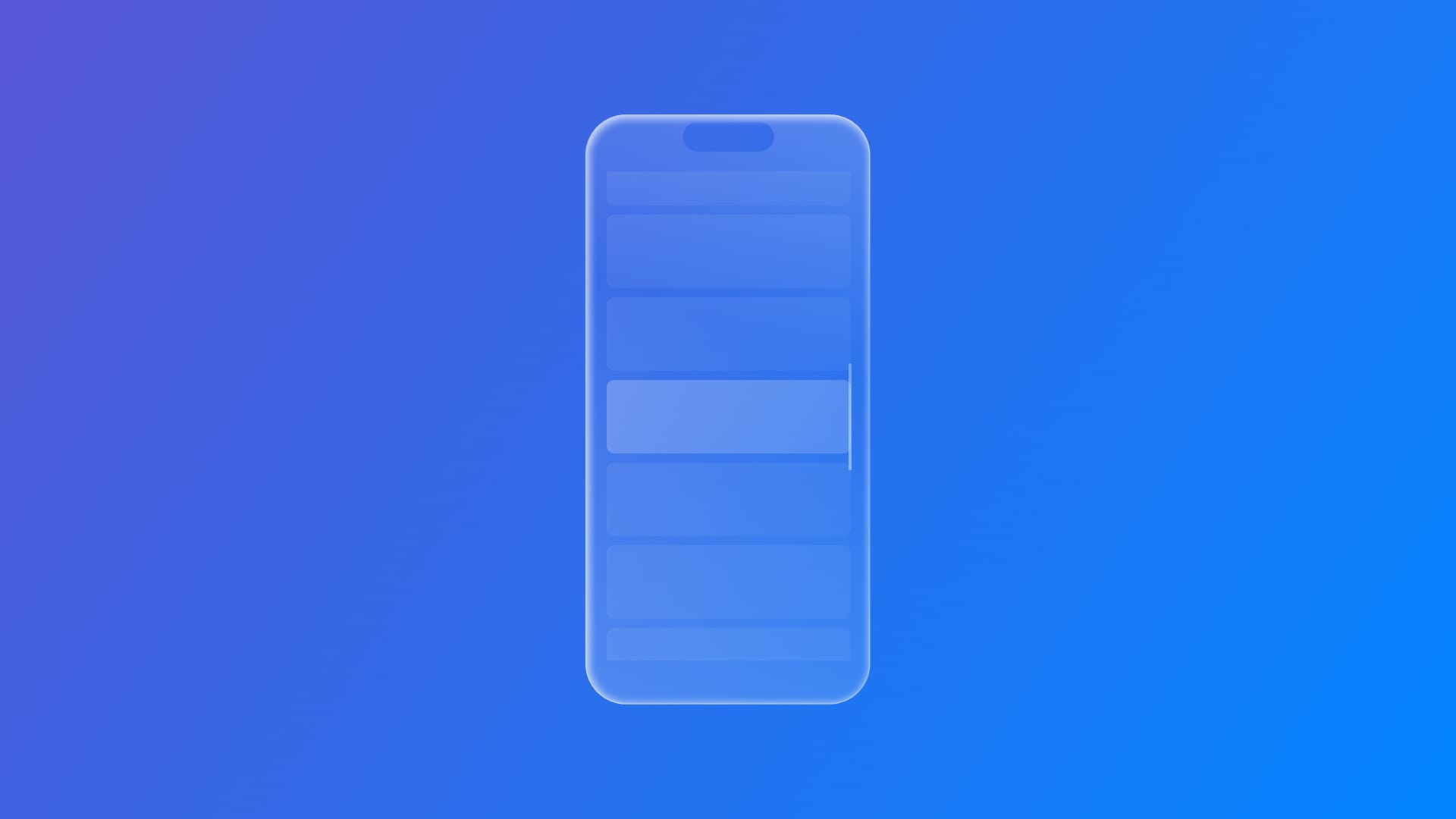
ScrollView with a ScrollTargetBehavior implemented and without.
Here is how you can implement a scrolling behavior:
// 1.
ScrollView(.horizontal) {
    // 2.
    LazyHStack {
        ForEach(0..<50) { x in
            ZStack {
                Rectangle()
                    .fill(colors.randomElement()?.opacity(0.7) ?? .gray)
                    .frame(width: 250, height: 180)

                Text("\(x+1)")
                    .foregroundStyle(.white)
                    .fontWeight(.heavy)
            }
            .padding()
        }
    }
}
// 3.
.scrollTargetBehavior(.paging)
- Create an instance of
ScrollView. - Add the view content.
- Call the
scrollTargetBehavior(_:)modifier on theScrollViewand pass the expectedScrollTargetBehavior(in the code snipper we usepaging).
SwiftUI offers two built-in scroll behaviors:
paging- AScrollTargetBehaviorthat conforms toPagingScrollTargetBehaviorthat results in aligning scroll targets to container-based geometry.viewAligned- AScrollTargetBehaviorthat conforms toViewAlignedScrollTargetBehaviorthat results in aligning its scroll targets to a rectangle that’s aligned to the geometry of a view.
While paging can be easily implemented as demonstrated before, viewAligned needs some code integration.
ScrollView(.horizontal) {
    LazyHStack {
        ForEach(0..<50) { x in
            ZStack {
                Rectangle()
                    .fill(colors.randomElement()?.opacity(0.7) ?? .gray)
                    .frame(width: 250, height: 180)

                Text("\(x+1)")
                    .foregroundStyle(.white)
                    .fontWeight(.heavy)
            }
            .padding()
        }
    }
    // 1.
    .scrollTargetLayout()
}
// 2.
.scrollTargetBehavior(.viewAligned)- Use the
scrollTargetLayout(isEnabled:)modifier on the container whose content needs to align asScrollViewgets scrolled. - Call the
scrollTargetBehavior(_:)and pass theviewAlignedvalue.
ViewAlignedScrollTargetBehavior conforming behavior such as viewAligned works along scrollTargetLayout(isEnabled:) method, which applies scroll targeting only to the content inside the layout it's called on, while making sure that any nested target layouts don’t also act as scroll target areas.
paging - viewAligned
The number of views that can be scrolled at a time can be defined by using a LimitBehavior, which comes with the following built-in values:
automatic: the default behavior that limits scrolling only in compact horizontal environments.always: always limits scrolling regardless of the environment.alwaysByFew: limits to a few items per gesture (chosen automatically).alwaysByOne: limits a one-item scroll per interaction.never: never limits the amount of views that can be scrolled.
Here is how to apply a limit behavior:
ScrollView(.horizontal) {
    ...
}
// 1.
.scrollTargetBehavior(.viewAligned(limitBehavior: .alwaysByOne))
Specify the LimitBehavior when you create a view aligned scroll behavior using ViewAlignedScrollTargetBehavior(limitBehavior:) by passing one of those values as a parameter accordingly to the scrolling behavior designed.
With 26.0 OS, two new ViewAlignedScrollTargetBehavior constructors are available:
init(anchor:): allowing the specification of the anchor point for a view-aligned scroll behavior.init(limitBehavior:anchor:): allowing to specify both limit behavior and anchor for a view-aligned scroll behavior.
The scroll behavior customization can go further with ScrollTargetBehavior protocol, that allows shaping the behavior leveraging the updateTarget(_:context:) method, responsible to update the proposed target that a scrollable view should scroll to.
// 1.
struct OneCenteredItemScrollTargetBehavior: ScrollTargetBehavior {
    // 2.
    func updateTarget(_ target: inout ScrollTarget, context: ScrollTargetBehaviorContext) {
        // 3.

        // 3a. Define layout constants
        let itemWidth: CGFloat = 250
        let padding: CGFloat = 16
        let totalItemWidth = itemWidth + padding * 2
        let containerWidth = context.containerSize.width

        // 3b. Calculate scroll offset and delta
        let originalOffset = context.originalTarget.rect.origin.x
        let proposedOffset = target.rect.origin.x
        let scrollDelta = proposedOffset - originalOffset

        // 3c. Calculate the index of the item currently centered
        let currentIndex = Int(round((originalOffset + containerWidth / 2) / totalItemWidth))

        // 3d. Determine scroll direction and update index
        var targetIndex = currentIndex
        if scrollDelta > totalItemWidth * 0.2 {
            targetIndex += 1 // Scroll right
        } else if scrollDelta < -totalItemWidth * 0.2 {
            targetIndex -= 1 // Scroll left
        }

        // 3e. Clamp the index within bounds
        targetIndex = max(0, min(49, targetIndex))

        // 3f. Compute offset to center the item
        let centeredOffset = CGFloat(targetIndex) * totalItemWidth + totalItemWidth / 2 - containerWidth / 2

        // 3g. Apply the updated rect
        target.rect = CGRect(x: centeredOffset, y: 0, width: totalItemWidth, height: 1)
    }
}
It works as follows:
- Create a custom struct that conforms to
ScrollTargetBehavior. - Declare the
updateTarget(_:context:)stub. - Add the logic of the scrolling behavior.
In this example, the scroll behavior should consist of scrolling one item at a time, which should always stay at the center of the screen:
- Set layout constants
- Capture the offset before and after the scroll
- Calculate the index of the item currently centered
- Determine scroll direction and update index
- Clamp the index within bounds
- Compute offset to center the item
- Update the
ScrollTarget.
ScrollView(.horizontal) {
    ...
}
// 1.
.scrollTargetBehavior(OneCenteredItemScrollTargetBehavior())- Pass an instance of the custom behavior to the
scrollTargetBehavior(_:)method.
SwiftUI invokes updateTarget(_:context:) in two main scenarios:
- At the end of a scroll gesture, the system uses system momentum to determine the natural stopping point.
- When the size of the scroll view changes, the system requires a new scroll position calculation.
By customizing this behavior, you can override the default destination, creating smooth, deliberate snapping effects tailored to your content.