Enhancing the tab bar with a bottom accessory
Learn how to add a custom bottom accessory above the tab bar using the bottom accessory modifier.

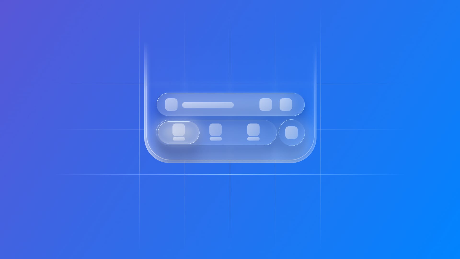
In apps such as Apple Podcasts and Apple Music, there’s a floating button sitting right above the tab bar. It controls the media player, and when tapped, it brings up a modal with full controls. What’s nice is that this button is always there, no matter which tab you’re on.
With iOS 26 and the new Liquid Glass design system, Apple introduced this style of control, now known as a bottom accessory. You can add one to your app by calling tabViewBottomAccessory(_:) on a TabView.
When the tab bar collapses during the scroll, the accessory blends right in. This default behavior conforms to the heart principle of Liquid Glass: prioritizing clarity and making controls and navigation layouts harmoniously integrated with the background, ready to emerge from the context only when needed.
Let’s see how to implement it.
struct TabBarView: View {
    var body: some View {

        // 1.
        TabView {
            Tab("Home", systemImage: "house") {
                ContentView()
            }
            Tab("Alerts", systemImage: "bell") {
                ContentView()
            }
            Tab("Favorites", systemImage: "heart.fill") {
              ContentView()
            }
            Tab(role: .search) {
                ContentView()
            } label: {
                Image(systemName: "magnifyingglass")
            }
        }

        // 2.
        .tabViewBottomAccessory {
            // 3.
            Image(systemName: "star.fill")
        }

    }
}
- Create an instance of a
TabView. - Call the
tabViewBottomAccessory(_:)modifier. - Add the view to be built as an accessory.
If each tab content contains scrollable content, the accessory will be automatically integrated into the tab bar when collapsing.
To enable this behavior:
struct TabBarView: View {
    var body: some View {
        TabView {
            ScrollView {
                ...
            }
        }.tabViewBottomAccessory {
           Image(systemName: "star.fill")
        }
        // 1.
        .tabBarMinimizeBehavior(.onScrollDown)
    }
}
- Call the
tabBarMinimizeBehavior(_:)modifier on the TabView
To learn more about how to minimize the tab bar, check this article:
 Antonella Giugliano
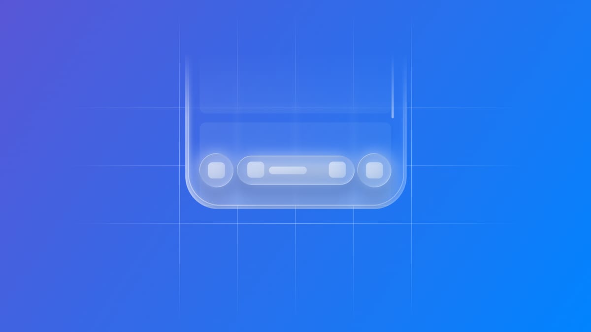
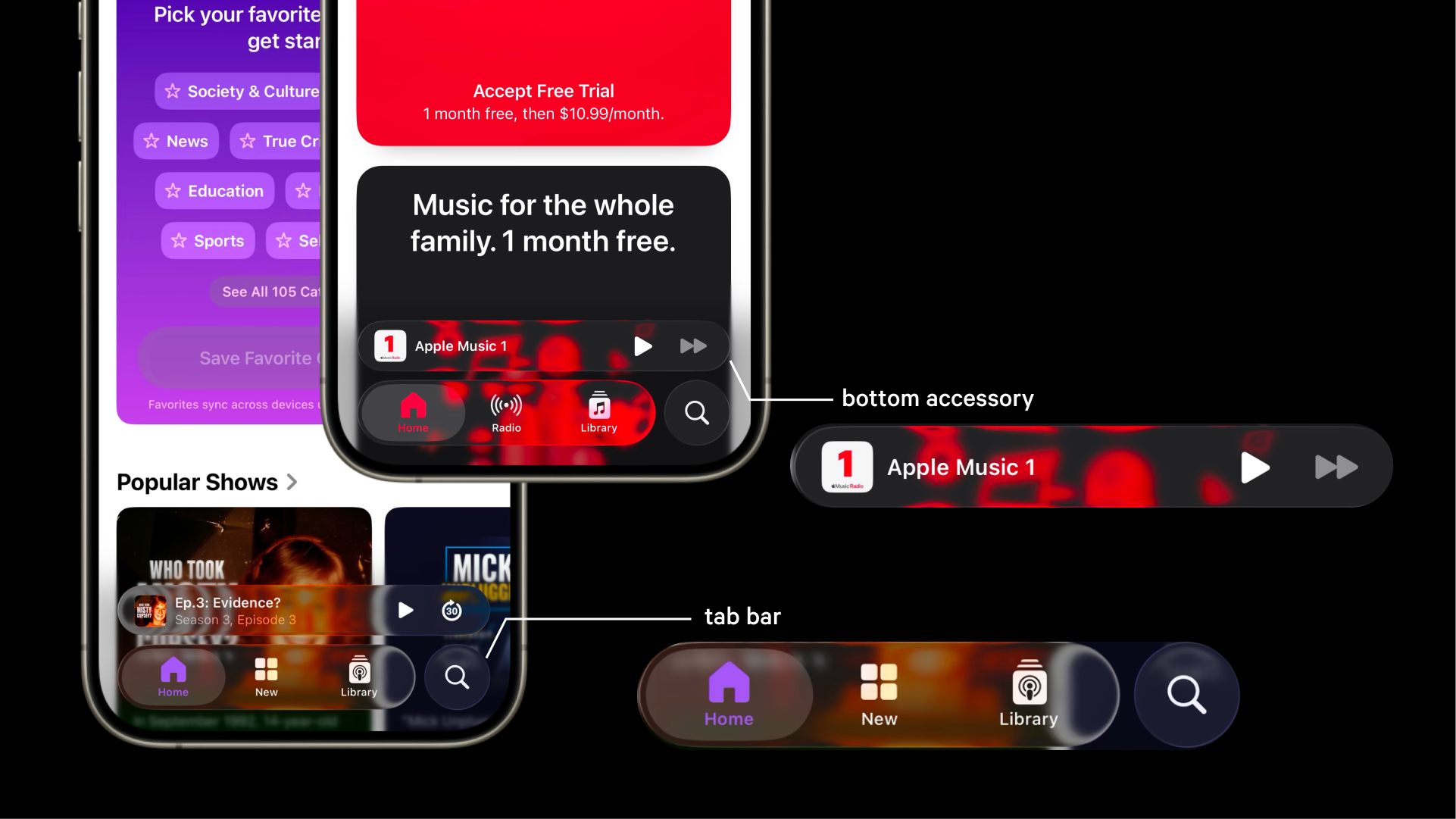
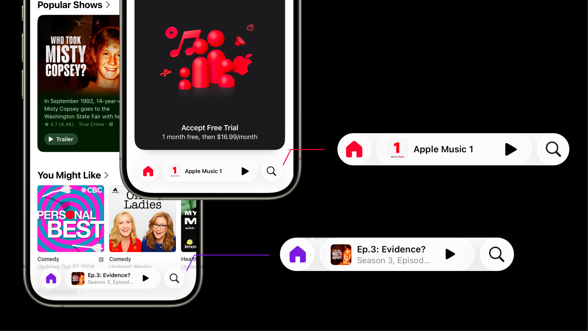
While scrolling, the bottom accessory moves from an expanded TabViewBottomAccessoryPlacement - meaning the bar is placed on top of the bottom tab bar, if there is a bottom tab bar, or at the bottom of the tab’s content view - to an inline one, where the accessory is integrated in line with the bottom tab bar.
The new bottom accessory in iOS 26 is a small addition that has a significant UX impact. It keeps important actions (like media controls) always available, while still respecting the “content first” principle of Liquid Glass. If you’re building with SwiftUI, this is one of those features that’s easy to add and instantly makes your app feel at home on iOS.