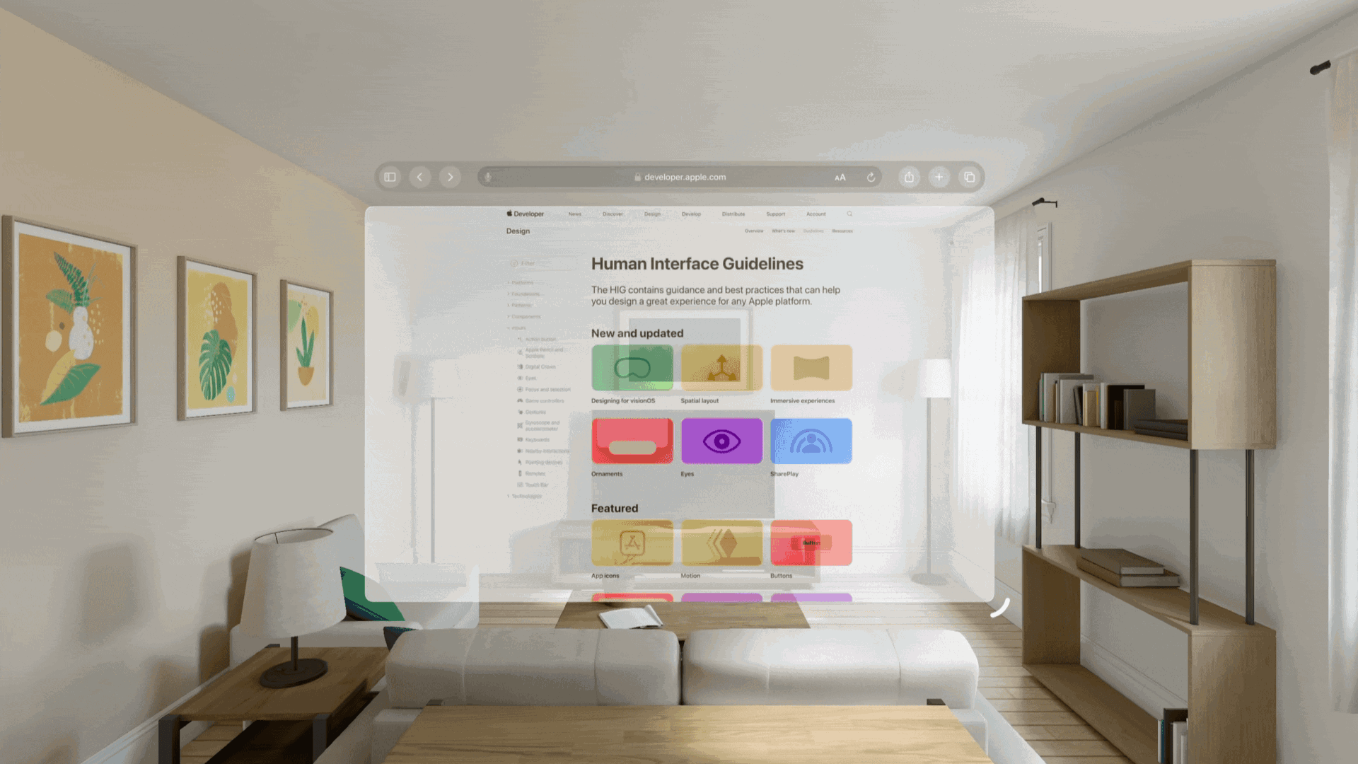
Ensuring interface legibility and contrast in visionOS
Use materials to craft spatial user interfaces, ensuring legibility and contrast.


Legibility and contrast within Apple's innovative spatial operating system bring new challenges in designing optimal user interfaces.
Let's combine design theory with practical SwiftUI demonstrations to explore key concepts such as the use of glass material for depth, the role of translucency in creating dimension, the strategic application of colors for clarity, and the impact of vibrancy on visual hierarchy.
The goal is to equip designers and developers with the tools needed for crafting interfaces that are both visually appealing and functionally intuitive.
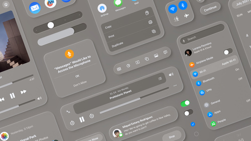
Glass material
Materials on Apple platforms impart translucency by altering the color values and blurring the visual content beneath them. Windowed apps on visionOS use a system-defined glass material that dynamically adapts to different light conditions and backgrounds, allowing for seamless integration of digital and physical spaces.
Glass is an adaptive material designed to modulate background colors for optimal contrast, thus ensuring that window content is easily readable. It also automatically adapts brightness based on the physical environment for a comfortable viewing experience.
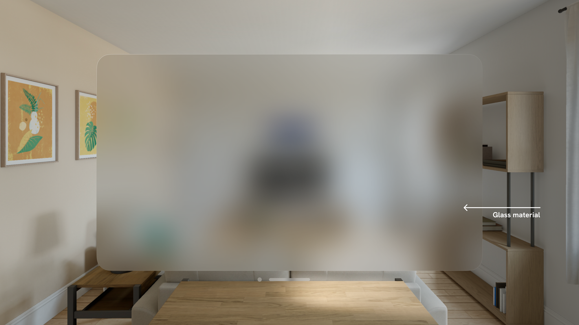
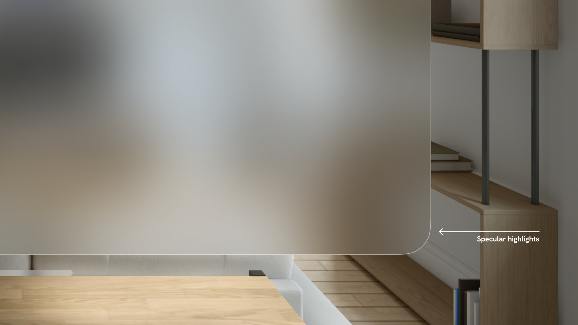
Its translucency introduces a tangible sense of depth and positioning, making digital content feel anchored within the user's physical space through specular highlights and shadows.
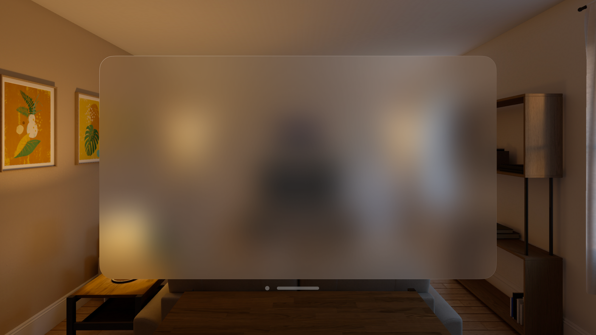
visionOS also offers a range of features, such as increased transparency during window repositioning, which provides spatial awareness and helps users navigate the digital space.
In other words, the users should feel they are aligning windows in real space, not just scattering them in a virtual world. For the same reason, there is no Dark Mode like on iOS.
The glass material of the interface adapts to changing lighting conditions. It ensures that the interface is always legible and visually pleasing.
Translucency
Materials impart translucency by blurring and modifying the color values of the visual content lying beneath. When designing spatial user interfaces, selecting the appropriate glass materials or vibrancy style to enhance legibility and contrast is paramount.
Using darker materials can help differentiate app sections like sidebars and make buttons more visible, while lighter materials highlight interactive components.
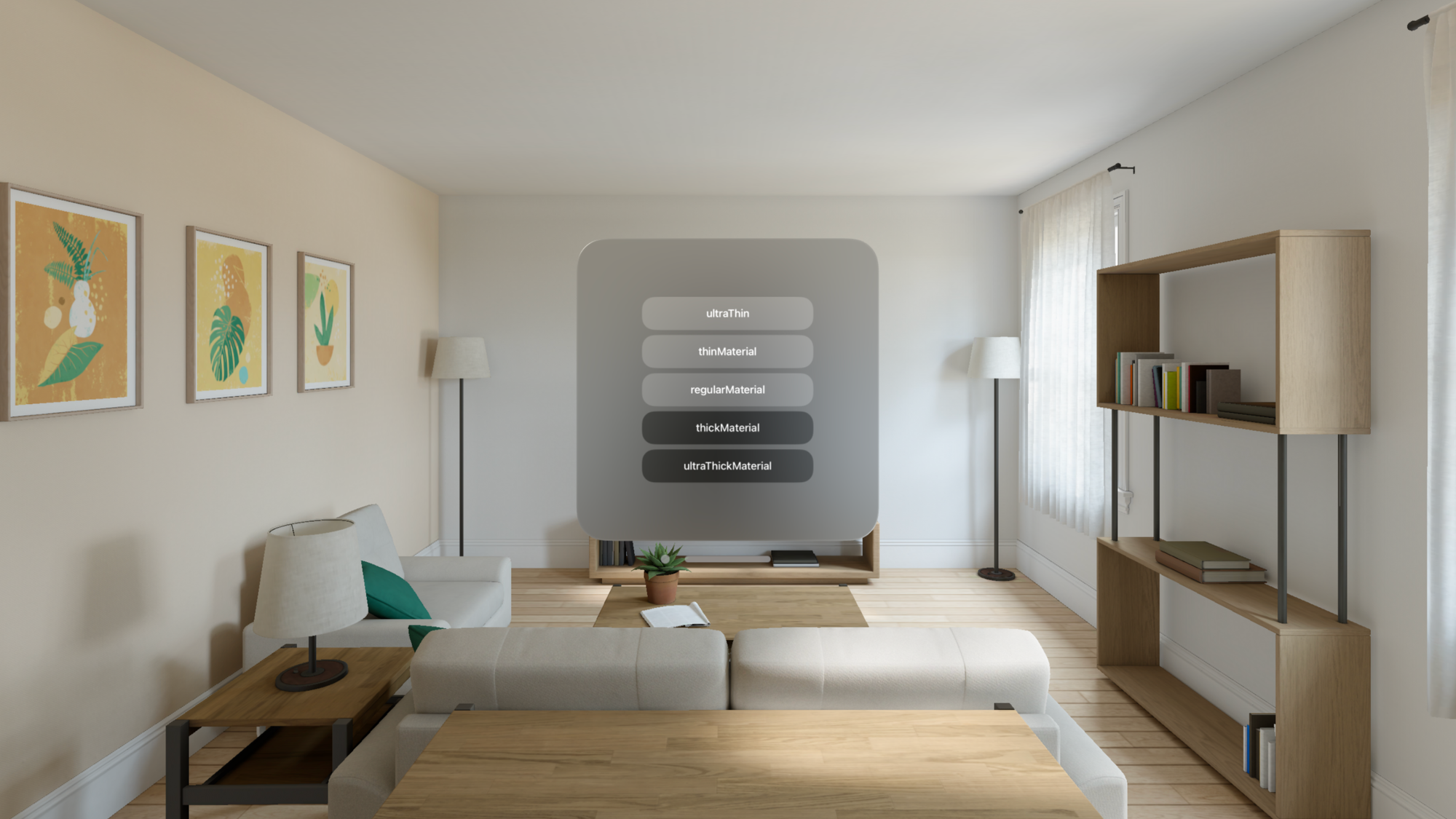
- The
.thinmaterial highlights interactive elements like buttons and selected items. - The
.regularmaterial helps to visually separate sections of an app, such as a sidebar or a grouped table view. - The
.thickmaterial can make a component, such as a text field, appear recessed, indicating that it is an area where text entry is accepted.
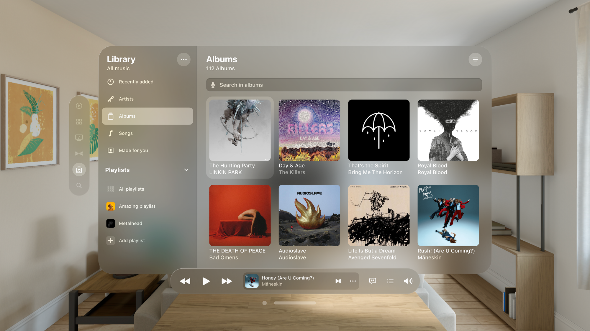
For instance, in the Music app:
- The sidebar features a darker material to increase contrast against the lighter window
- The interactive elements, such as buttons, are emphasized using lighter materials over the sidebar
- Input fields feature even darker materials providing a sense of depth
We've just delved into the basics of materials and their categorizations. Let's see how to apply these principles in SwiftUI.
struct ContentView: View {
    var body: some View {
        VStack {
            Text("ultraThin")
                .frame(width: 240)
                .padding()
                // A mostly translucent material.
                .background(.ultraThinMaterial)
                .mask(RoundedRectangle(cornerRadius: 20))

            Text("thinMaterial")
                .frame(width: 240)
                .padding()
                // A material that's more translucent than opaque.
                .background(.thinMaterial)
                .mask(RoundedRectangle(cornerRadius: 20))

            Text("regularMaterial")
                .frame(width: 240)
                .padding()
                // A material that's somewhat translucent.
                .background(.ultraThinMaterial)
                .mask(RoundedRectangle(cornerRadius: 20))

            Text("thickMaterial")
                .frame(width: 240)
                .padding()
                // A material that's more opaque than translucent.
                .background(.thickMaterial)
                .mask(RoundedRectangle(cornerRadius: 20))

            Text("ultraThickMaterial")
                .frame(width: 240)
                .padding()
                // A mostly opaque material.
                .background(.ultraThickMaterial)
                .mask(RoundedRectangle(cornerRadius: 20))
        }
    }
}
Material types - Code example.
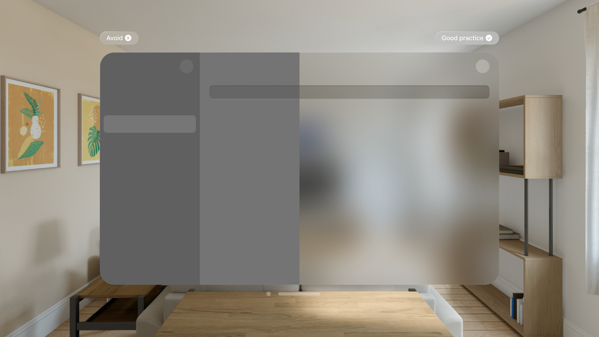
Avoid creating opaque windows that can obstruct visibility and reduce spatial awareness. Doing so can make it difficult for users to perceive virtual and physical objects around them.
Colors
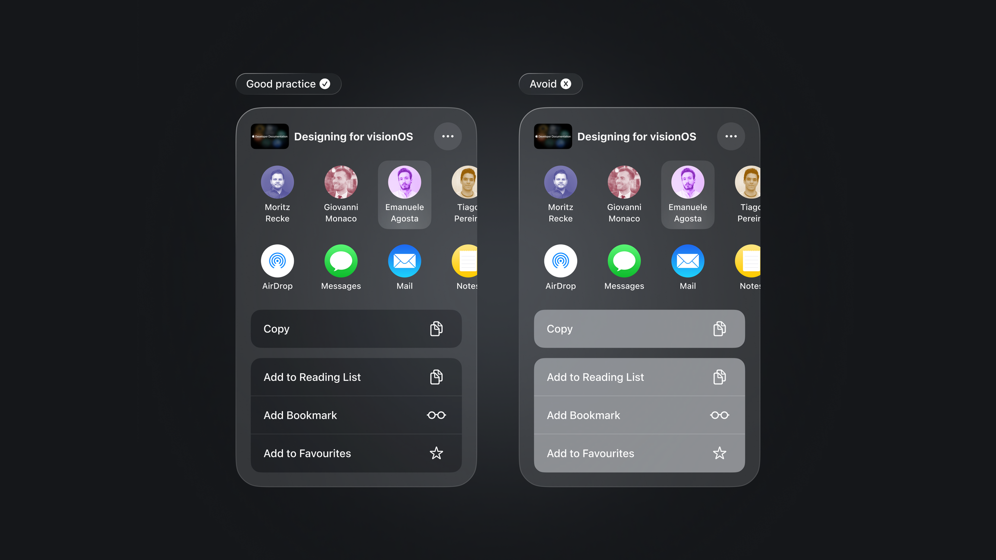
Text and symbols should maintain clear visibility when placed on top of materials. By adhering to best practices you can ensure that content stands out with sufficient contrast.
- Use white text and place lighter buttons.
- Use system colors in backgrounds or buttons judiciously to ensure elements are easily discernible.
- While you can use colors in buttons or background layers, avoid using colored text.
- Consider adding a darker background behind text or interactive elements to improve contrast.
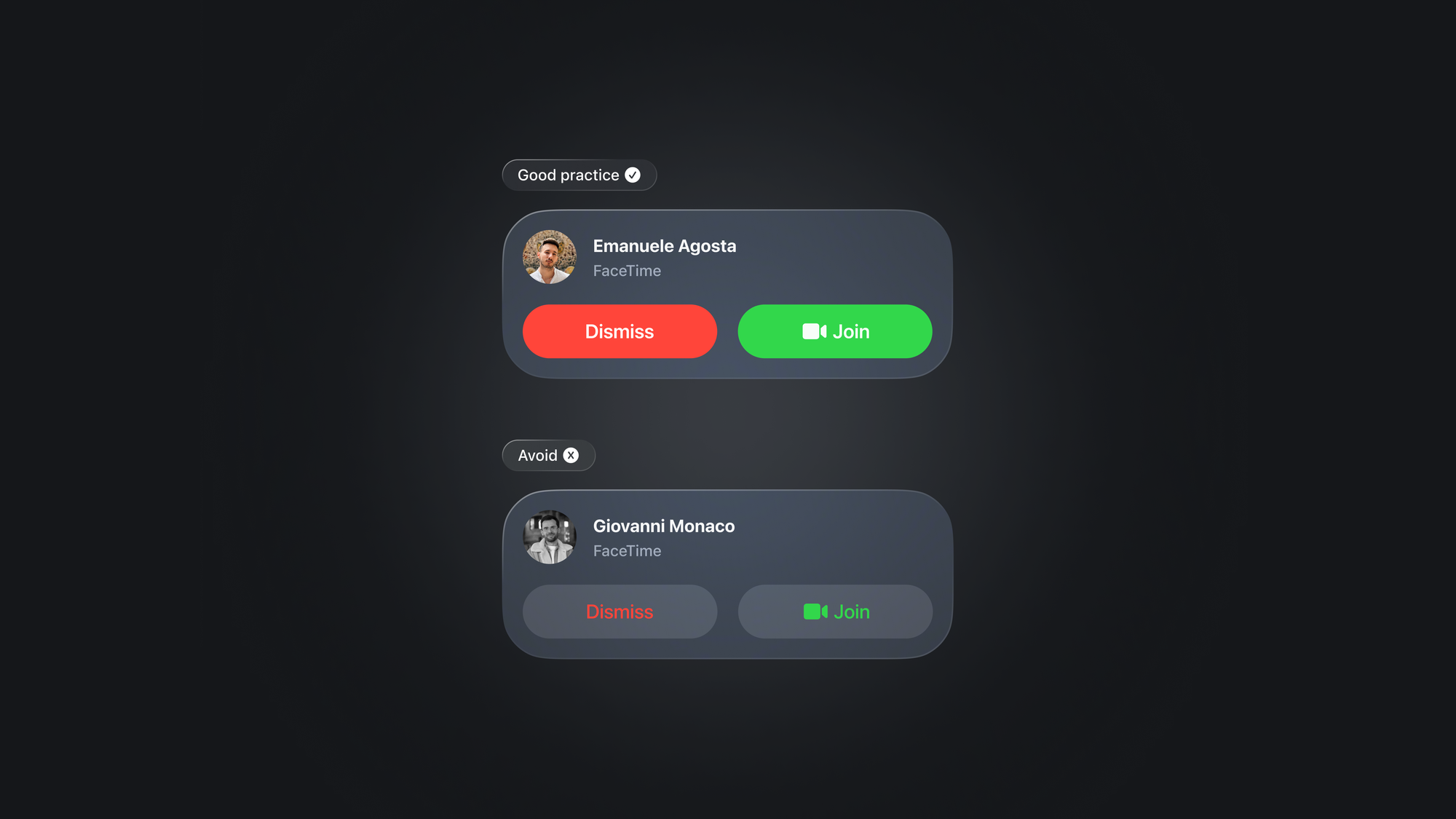
We've got a handle on the basic principles of color and contrast in spatial user interface design. Let's put that knowledge into action with an example.
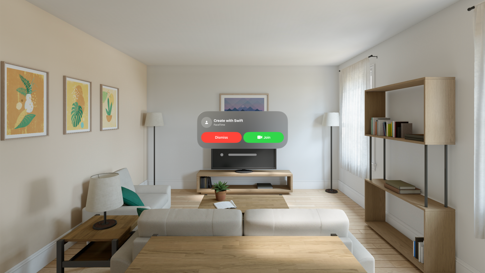
struct FaceTimeIncomingCallView: View {
    var body: some View {
        VStack(spacing: 20.0) {

            HStack {
                ZStack {
                    Circle()
                        .foregroundStyle(.thinMaterial)
                        .frame(width: 52, height: 52)
                    Image(systemName: "person.fill")
                }

                VStack(alignment: .leading) {
                    Text("Create with Swift")
                        .bold()
                          // A shape style that maps to the first level of the current content style.
                        .foregroundStyle(.primary)
                    Text("FaceTime")
                        .font(.caption)
                        // A shape style that maps to the second level of the current content style.
                        .foregroundStyle(.secondary)
                }
                .frame(maxWidth: .infinity, alignment: .leading)
            }

            HStack {
                Button(action: {
                    //
                }, label: {
                    Text("Dismiss")
                        .frame(maxWidth: .infinity, minHeight: 52, maxHeight: 52, alignment:.center)
                })
                .buttonStyle(.plain)
                .background(.red)
                .clipShape(RoundedRectangle(cornerRadius: 100))

                Button(action: {
                    //
                }, label: {
                    Label(
                        title: { Text("Join") },
                        icon: { Image(systemName: "video.fill") }
                    )
                        .frame(maxWidth: .infinity, minHeight: 52, maxHeight: 52, alignment:.center)
                })
                .buttonStyle(.plain)
                .background(.green)
                .clipShape(RoundedRectangle(cornerRadius: 100))
            }

        }
        .padding(20)
    }
}

#Preview {
    FaceTimeIncomingCallView()
        .frame(width: 436, height: 164)
}
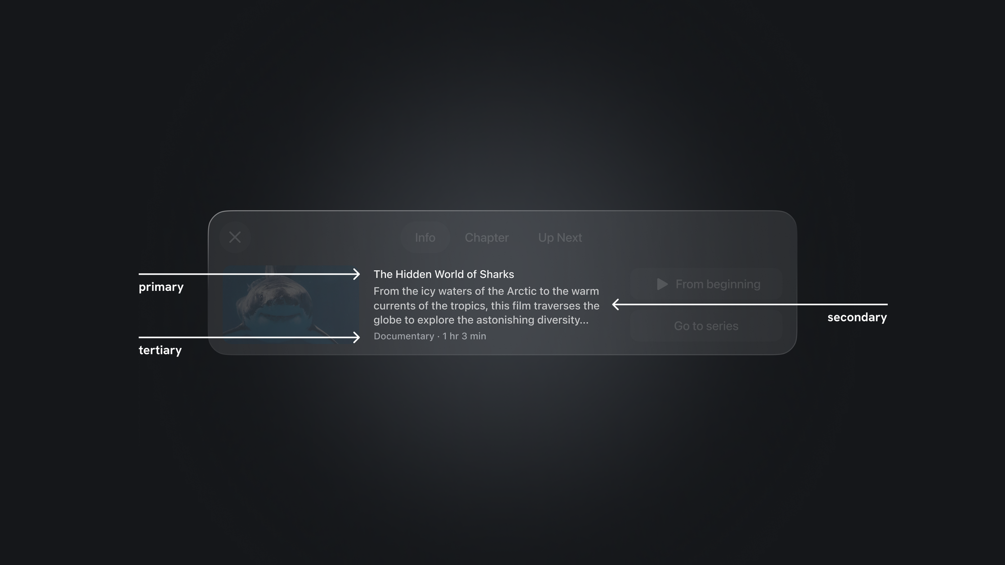
FaceTime incoming call replica - Code example.
Consider the example below, since the texts are white and the buttons are lighter, using a darker cell for each region increases contrast. Therefore, avoid stacking lighter materials on top of each other, as this can make the text harder to read.
Vibrancy
Vibrancy effects further augment contrast and legibility by pulling light and color forward from both virtual and physical surroundings, enhancing depth perception.
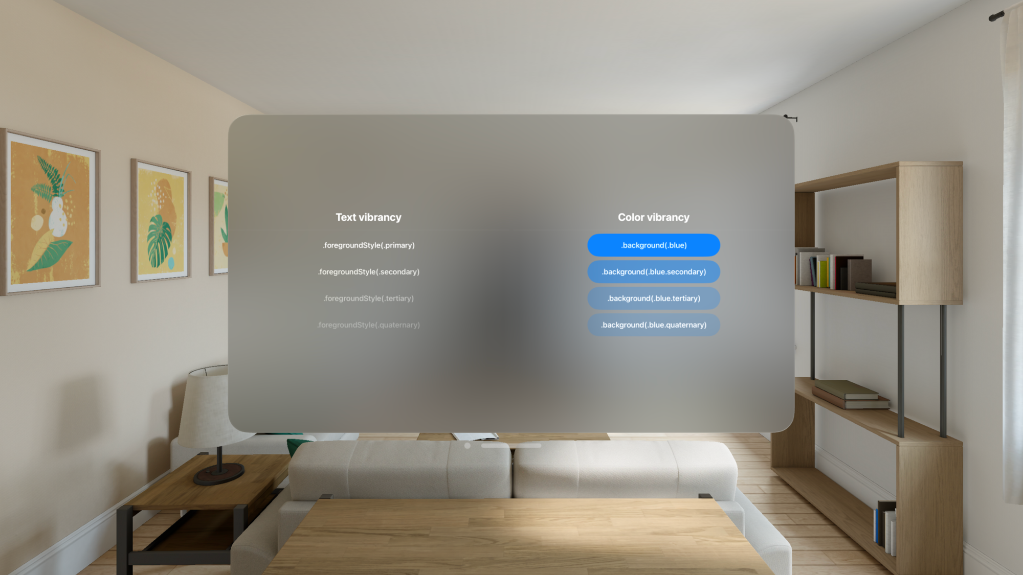
visionOS categorizes vibrancy into primary, secondary, and tertiary modes, each tailored to optimize the visibility and hierarchy of text, symbols, and fills. Regarding text:
- Use
.primaryfor standard text. - Use
.secondaryfor descriptive text like footnotes and subtitles. - Use
.tertiaryfor inactive elements, and only when the text doesn’t need high legibility.
Vibrancy impacts not only text but also symbols and fills. Let's delve further into the application of transparency, color, and contrast dynamics.
struct ContentView: View {
    var body: some View {
        HStack {

            VStack {
                Text("Text vibrancy")
                    .font(.title)
                Divider()
                Text(".foregroundStyle(.primary)")
                    .padding()
                    .foregroundStyle(.primary)
                    .frame(width: 300, height: 52, alignment:.center)
                Text(".foregroundStyle(.secondary)")
                    .padding()
                    .foregroundStyle(.secondary)
                    .frame(width: 300, height: 52, alignment:.center)
                Text(".foregroundStyle(.tertiary)")
                    .padding()
                    .foregroundStyle(.tertiary)
                    .frame(width: 300, height: 52, alignment:.center)
                Text(".foregroundStyle(.quaternary)")
                    .padding()
                    .foregroundStyle(.quaternary)
                    .frame(width: 300, height: 52, alignment:.center)
            }

            VStack {
                Text("Color vibrancy")
                    .font(.title)
                Divider()
                Text(".background(.blue)")
                    .padding()
                    .frame(width: 300, height: 52, alignment:.center)
                    .background(.blue)
                    .clipShape(RoundedRectangle(cornerRadius: 100))
                Text(".background(.blue.secondary)")
                    .padding()
                    .frame(width: 300, height: 52, alignment:.center)
                    .background(.blue.secondary)
                    .clipShape(RoundedRectangle(cornerRadius: 100))
                Text(".background(.blue.tertiary)")
                    .padding()
                    .frame(width: 300, height: 52, alignment:.center)
                    .background(.blue.tertiary)
                    .clipShape(RoundedRectangle(cornerRadius: 100))
                Text(".background(.blue.quaternary)")
                    .padding()
                    .frame(width: 300, height: 52, alignment:.center)
                    .background(.blue.quaternary)
                    .clipShape(RoundedRectangle(cornerRadius: 100))
            }

        }
    }
}
Text and Color vibrancy - Code example.
Vibrancy can affect all apps, even the ones without vibrant views, because some components are vibrant by default, such as menus in macOS, windows in visionOS, and labels in iOS.
Wrapping up, we explored how to design eye-comfortable interfaces for visionOS. This is meant to be a starting point, encouraging a balance between beauty and functionality in digital spaces.
To learn more about designing spatial user interfaces, take a look at this WWDC session.