Exploring a new visual language: Liquid Glass
Understand Apple’s new design language and learn how to use it.


During WWDC25, Apple introduced Liquid Glass, its most significant design evolution since iOS 7 in 2013. This dynamic, cross-platform design visual refresh is a fundamental reimagining of how users interact within the entire Apple ecosystem.
Liquid Glass transforms user interfaces into emotionally engaging experiences through the seamless integration of motion, translucency, and spatial depth. By simulating natural physics in micro-interactions, it creates a user experience that feels human rather than mechanical. This revolutionary approach brings organic motion, sophisticated light play, and immersive fluidity to every Apple platform, setting the foundation for the future of spatial computing.
WWDC25 - Meet Liquid Glass.
Liquid Glass: the evolution of Apple’s UI materials
Liquid Glass builds on decades of visual design innovation at Apple. Apple has learned from its hardware and software over time, creating something new: Liquid glass, which combines the Aqua user interface of Mac OS X, the real-time blurs of iOS 7, the fluidity of the iPhone X’s gesture system, the flexibility of Dynamic Island, and ultimately, the immersive glass interface of visionOS.
The combination of these influences brings three-dimensional thinking to two-dimensional screens, preparing Apple’s entire ecosystem for future spatial computing experiences.
Apple’s design innovation over the years. In order: Aqua (macOS X), Live blurs (iOS7), Gesture system (iPhone X), immersive layers (visionOS) - Meet Liquid Glass
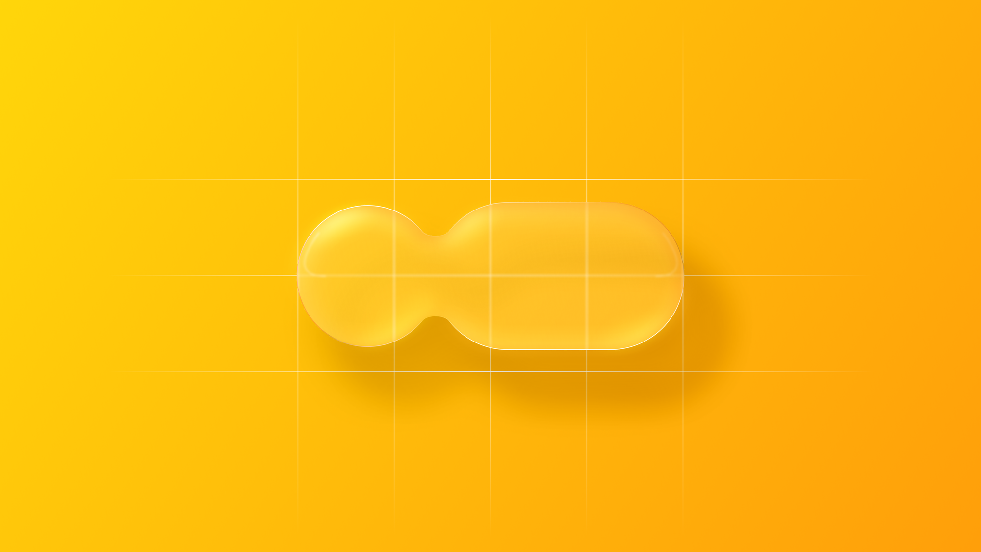
Liquid Glass functions as a meta-material that simulates the optical qualities of physical glass while transcending its limitations. This digital material exhibits responsive fluidity, environmental refraction, and dynamic light reflection, resulting in a "liquid" substance that morphs in response to its surroundings.
Unlike traditional skeuomorphic materials that simply mimic physical objects, Liquid Glass behaves as a light-bending, shape-shifting digital material that reacts dynamically to both touch and context. It feels alive, organic, and responsive, continuously adapting to different needs and opening up entirely new interaction scenarios.
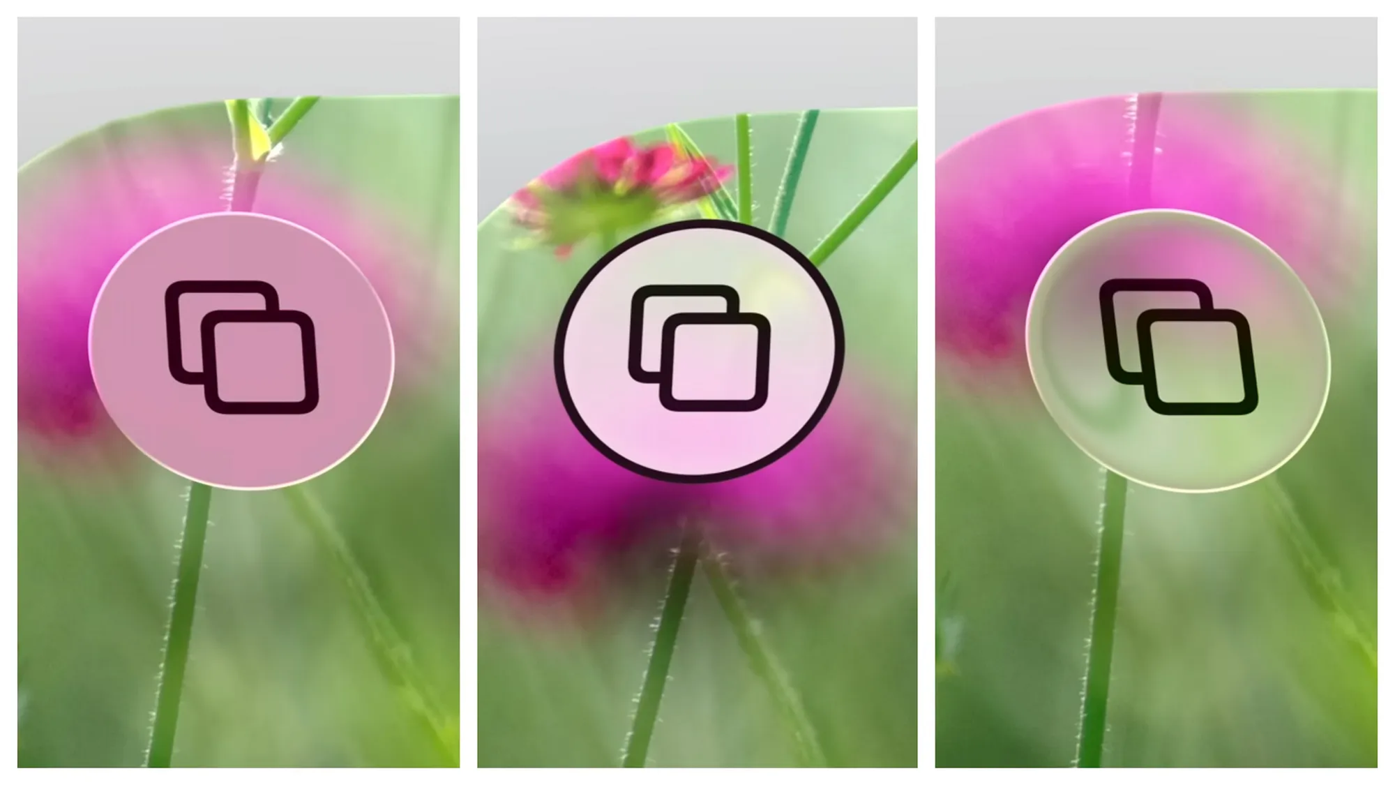
The material features a responsive lensing effect along edges, where light bends to create depth and separation between layers. This produces a clear visual hierarchy and definition without blocking content, generating a transparent, dynamic glow that draws from our natural understanding of light behavior.
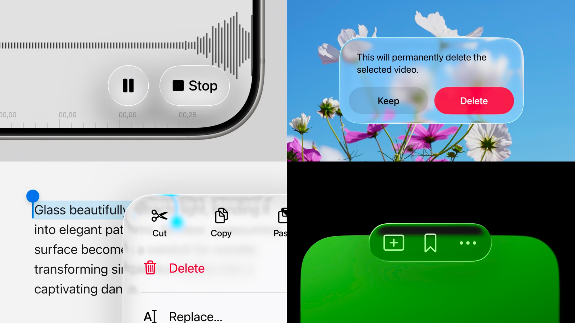
Apple has released the iOS 26 Library for Sketch. While the official Figma version is still in development, our team has recreated the Liquid Glass controls, available at the link below.

Material variants: regular and clear
Liquid Glass features two material variants and understanding in which context to use is crucial for effective implementation.
Regular represents the standard implementation:
- Recommended for most use cases, particularly navigation and control elements
- Fully adaptive to any context
- Works effectively in any size and environmental condition
- Maintains legibility automatically through intelligent opacity adjustment
Clear offers a more transparent alternative:
- Ideal only in specific scenarios:
- When positioned over media-rich content
- When content won't be negatively affected by a dimming layer
- When foreground content is bold and bright enough to maintain contrast
- Permanently more transparent than Regular
- Lacks adaptive behaviors found in the Regular variant
The choice between variants should always prioritize content legibility and user task completion over aesthetic preferences.
Design principles
Liquid Glass is built on three core principles that guide its behavior and aesthetic across the Apple ecosystem.
Hierarchy - Content-first interfaces
It enhances content rather than competing with it. The design prioritizes clarity, making controls and navigation layouts harmoniously integrated with the background and ready to emerge from the context only when needed. This content-first approach keeps the focus where it belongs.
This hierarchy manifests through adaptive opacity and intelligent layering. Interface elements recede when users focus on content and expand back when interaction is required, creating a breathing interface that respects user attention.
Dynamism - Responsive interaction design
Every element feels responsive and alive. These are not just animations; they’re behavioral cues embedded into the material. Controls adapt fluidly: colors shift dynamically depending on the surroundings and the appearance integrates with the background when the focus is on the content, expanding back only when the user needs them again.
Motion is inherently fluid. Unlike static blurs or gradients, Liquid Glass is fully interactive, with elements that stretch, bounce, and morph in response to touch interactions. Even simple transitions, like opening a menu, feel grounded and tactile, as if the interface is physically responding with a subtle glow.
Controls adapt fluidly: colors shift dynamically based on the surroundings, and interface elements integrate with the background during content focus, expanding only when needed.
Consistency - A universal design language
Liquid Glass unifies the user interface across platforms. macOS UI aligns with iOS and iPadOS, while iPadOS UX conforms to macOS. The result is a coherent experience where interface logic and visual language behave consistently, regardless of device.
Shapes follow concentric principles. To ensure visual balance and nesting harmony between elements, shapes become rounded and floating, with corners that follow hardware design nature and controls that reflect finger geometry.
Environmental intelligence: adaptive behavior across contexts
Multi-layer architecture
Liquid Glass is composed of multiple adaptive layers that automatically adjust based on what’s behind them. They are all essential to give the user back the feeling of the new meta-material.
On top, we can find highlights, which behave like the world around us. They follow and define the geometry on the shapes and adapt and respond occasionally to device motion. These create the primary sense of dimensionality.
Shadows also play an important role in the behavior of liquid glass, increasing its opacity when elements such as texts appear in the background or lowering it when the background is plain white. This ensures optimal readability across diverse content types.
Illumination and visual response make the material feel genuinely alive. Interacting with Liquid Glass causes the material to illuminate from underneath as feedback—the glow radiates across elements and extends into nearby Liquid Glass surfaces, blending with the material's flexible nature to create organic interactions.
Contextual adaptation
This intelligent layering system allows the UI to:
- Maintain contrast over all content types
- Shift automatically between light and dark modes
- Subtly change in depth and character based on context
Cross-platform scaling
Whether it’s a toolbar on iPhone or a floating sidebar on Mac, Liquid Glass scales fluidly:
- Larger elements cast deeper shadows and show richer lensing
- Sidebars adapt their appearance based on ambient app content
- Glass conforms seamlessly to rounded corners, aligning with hardware geometry
This cohesive behavior helps establish a unified visual language across iPhone, iPad, Mac, and visionOS.
Designing with Liquid Glass
Usage contexts
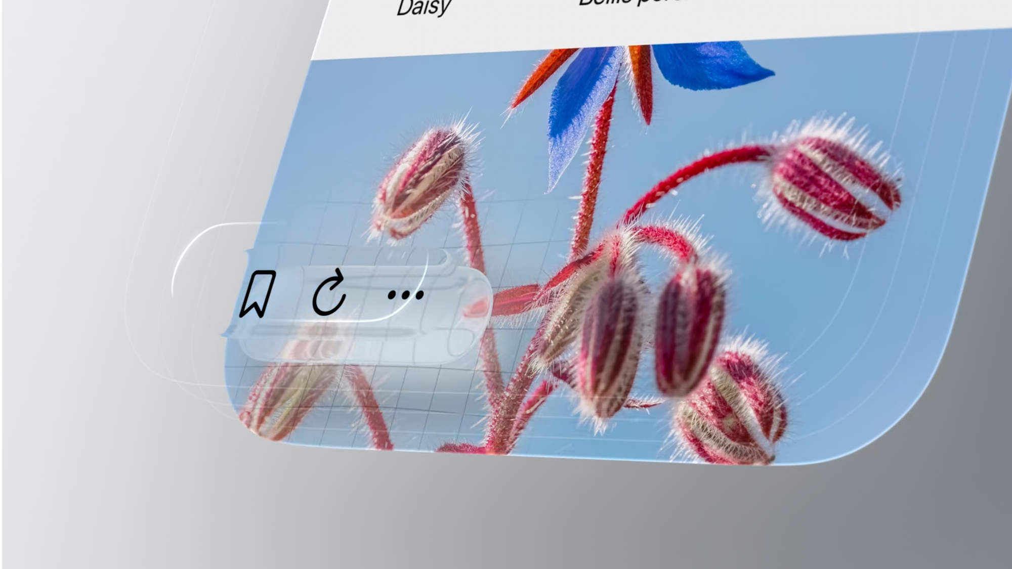
Liquid Glass is specifically designed for UI elements that float above content, such as:
- Navigation bars
- Tab bars and toolbars
- Sidebars
- Menus
Avoid using Liquid Glass in scrollable content areas (such as tables or list items), as this can muddy visual hierarchy and create confusion about interface structure.
Layer management
Avoid Glass-on-Glass stacking. Multiple Liquid Glass layers can overwhelm users visually and break the material's illusion. Instead:
- Use transparency or vibrancy on top elements
- Ensure clear visual separation between glass and non-glass elements
Strategic tinting
Tinting brings functional clarity and vibrancy to elements but should be applied selectively to:
- Primary actions and call-to-action buttons
- Important interface elements (such "Buy Now")
- Items with specific functional significance
Avoid tinting everything, overuse reduce contrast and visual hierarchy, reducing the effectiveness of truly important actions.
Tinted glass can be used in different contexts and variants - always highlighting the main actions.
Accessibility integration
Liquid Glass fully supports accessibility settings:
- Reduced Transparency increases frosting for more clarity
- Increased Contrast uses stark color shifts and borders
- Reduced Motion tones down animations and elastic effects
These modifiers apply system-wide with no additional work from developers - Liquid Glass will automatically adjust.
A core designing for accessibility concept, pushed with the release of the new design language, is the idea of crafting a multiple senses experience by making apps adapt to people rather than expecting people to adapt to apps are the main principles driving accessibility.
This concept translates into accessibility features being able to fill the gap that exists between what a body can do and what society expects it to be able to do, meaning that accessibility should support all the different degrees of each specific sense - Vision, Motor, Hearing, Cognitive and Speech - disability spectrum.
Implementing Liquid Glass
Technical requirements
Transitioning existing apps to Liquid Glass is remarkably straightforward. Regardless of whether your app uses SwiftUI, UIKit, or AppKit, no code changes are required, simply recompile with the related iOS 26, macOS 26, or other OS 26 releases.
For developers seeking to optimize their Liquid Glass integration, specific APIs have been updated, primarily concerning controls and navigation layouts, since Liquid Glass is intended for UI elements that float above content.
Navigation components
Navigation elements now float over content, fundamentally changing the concept of safe areas. Content extends beyond traditional boundaries, with previously clipped elements now fully visible on screen.
Tab bars float above content with the ability to integrate additional bottom controls. They intelligently collapse during scrolling based on the content-first principle, ensuring users can focus on their primary tasks.
Sheets transition to full height with glass effect backgrounds that gradually emerge, becoming opaque and anchoring to screen edges. They can morph directly out of the buttons that present them using navigation zoom transitions.
Sheet transitioning from small detent to large one in Maps
Interface elements
Toolbars float above content while adapting to environmental conditions. Items are automatically grouped, and spacer APIs allow developers to collect related actions for improved visual clarity.
Search bars are now positioned at the bottom of screens for easy accessibility and integrate naturally in multi-tab applications. Based on factors like screen size, toolbar density, and available space, the system may adaptively minimize search fields into toolbar icons.
Controls such as buttons adopt capsule shapes by default, with updated heights for better clarity and expanded tap areas. Smaller sizes on macOS retain compact forms, while extra-large buttons are available for key actions. New glass styles bring depth and vibrancy to control elements.
Sliders now support tick marks and can display fill starting from a neutral center point, making them ideal for values that shift in both directions (such as audio balance or color temperature adjustments).
Menus feature a cleaner, unified appearance across platforms, with consistent icon placement and logical structure. Glass effects can be applied to grouped controls, allowing them to react to touch simultaneously with subtle motion while maintaining consistency and depth across the interface.
Brightness Slider in Setting
Conclusion
Liquid Glass represents more than a visual update, it's a fundamental shift toward interfaces that feel alive, responsive, and deeply integrated with user intent. By combining decades of design innovation with cutting-edge material science principles, Apple has created a design language that bridges the gap between current device interactions and future spatial computing experiences.
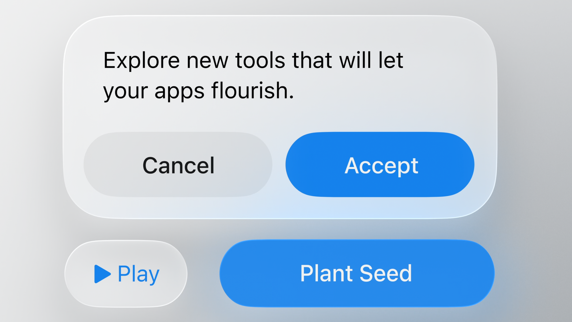
This design language doesn't stop at UI elements and interactions. It extends all the way to how applications visually represent themselves through their icons. To unify the visual language across the ecosystem, Apple has introduced a new tool for crafting app icons using Liquid Glass principles: the Icon Composer.
Flora has explored how this new tool reshapes iconography and contributes to a cohesive, immersive user experience in the article below:
 Flora Damiano
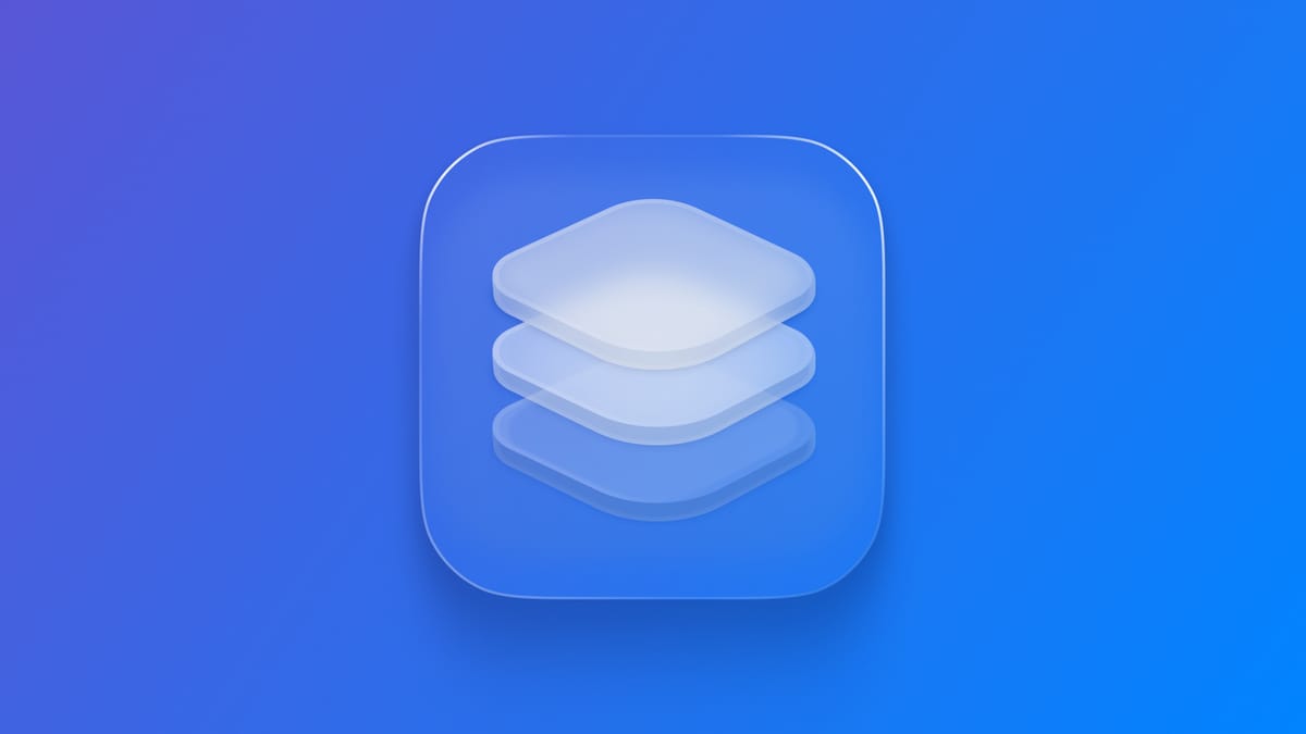
Aiming to make technology feel more human through intelligent adaptation, environmental awareness, and principled consistency, Liquid Glass helps to create interfaces that respond to users rather than demanding adaptation from them.
This evolution positions Apple's design language at the forefront of the spatial computing revolution, ensuring that users will experience seamless transitions as they move from today's devices to tomorrow's immersive computing environments. Liquid Glass doesn't just change how interfaces look, it transforms how they feel, behave, and connect with human users on a fundamentally deeper level.