Exploring Concentricity in SwiftUI
Learn about the concept of concentricity applied to UI elements in a SwiftUI app.

Concentricity is one of the key design principles Apple highlighted at the last WWDC. It’s a concept already present in many parts of their operating systems. A clear example is the Dynamic Island, where its corner radius perfectly mirrors the rounded corners of the device’s bezel.
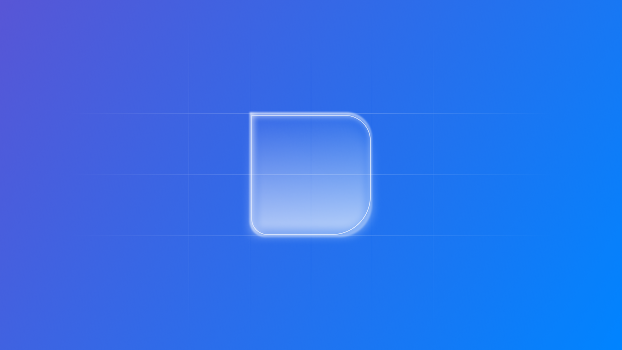
In UI design, concentricity means aligning the rounded corners of nested shapes so that their curves share a common center. This creates a natural sense of nesting and visual harmony, making interfaces feel more consistent, refined, and cohesive.
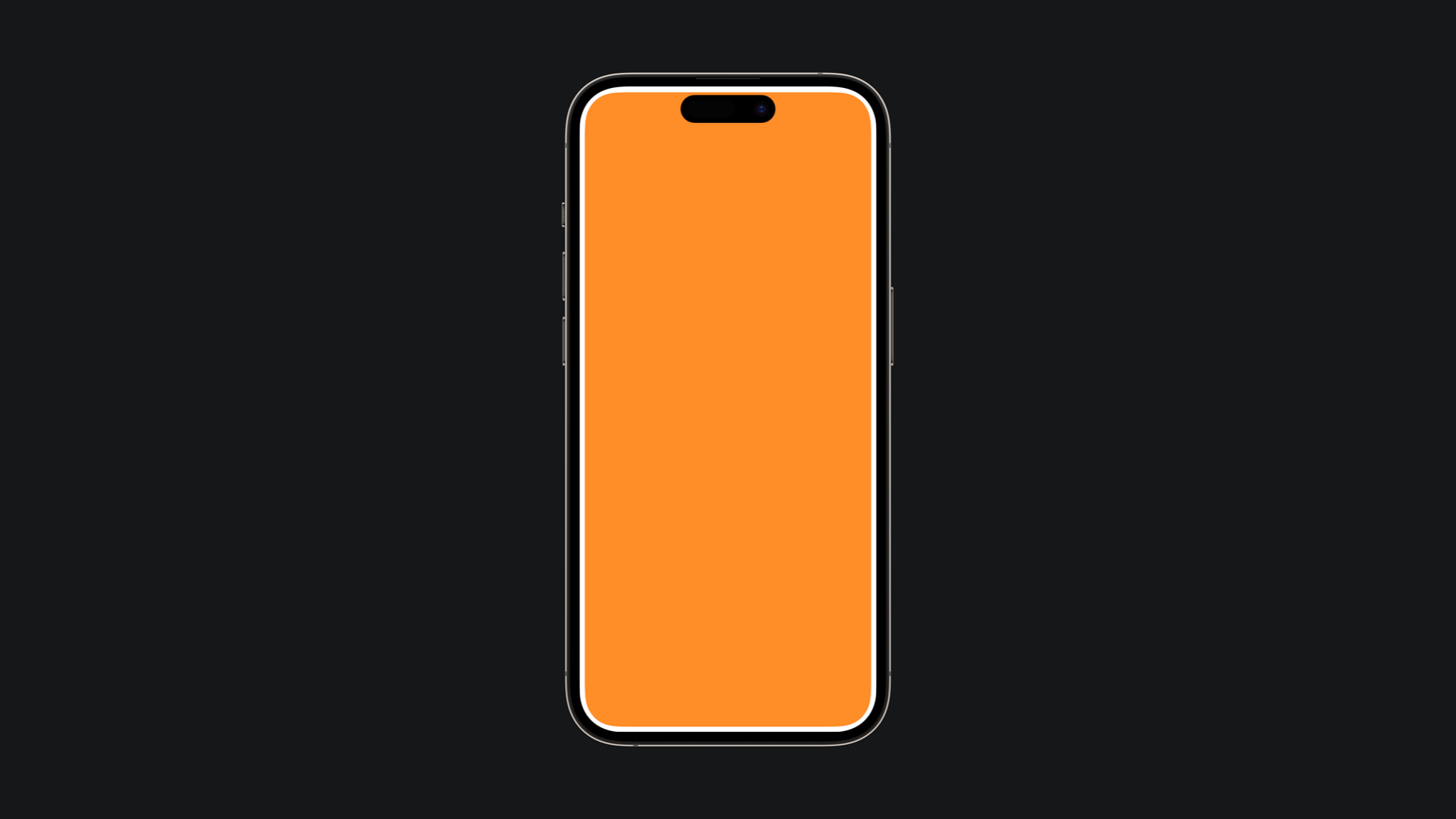
In SwiftUI, starting from iOS 26, concentric shapes can be defined using the new ConcentricRectangle structure that will automatically match the corner radius of the shape with the corner radius of the container
import SwiftUI

struct ContentView: View {
    var body: some View {
        ZStack {
            ConcentricRectangle()
                .fill(Color.orange)
                .padding(8)
                .ignoresSafeArea()
        }
    }
}
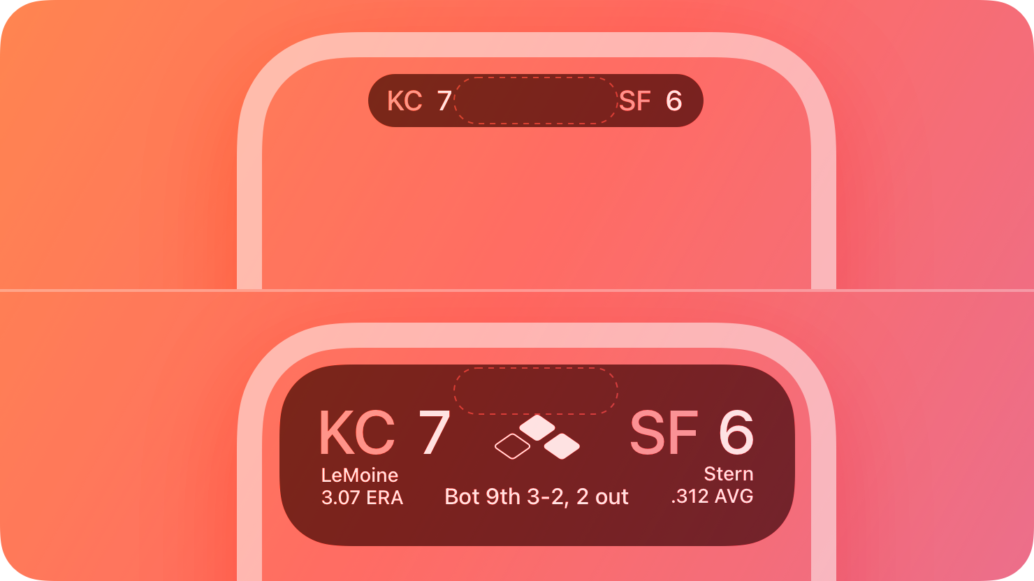
Additionally we can also specify which corner of the shape needs to follow the outer corner radius of the container:
ConcentricRectangle(
topLeadingCorner: .concentric(minimum: 25),
topTrailingCorner: .concentric(minimum: 25),
bottomLeadingCorner: 0,
bottomTrailingCorner: 0,
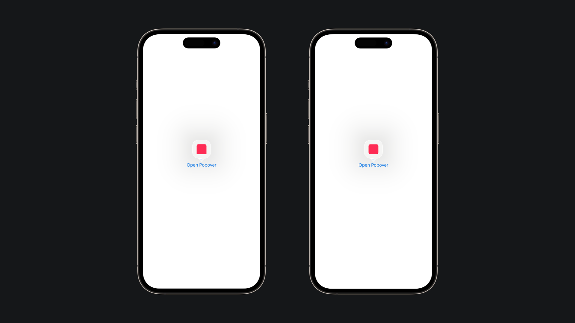
)Depending on where you place it in your app’s hierarchy, the concentric shape will inherit its corner radius from its container. For instance, inside a sheet or popover, you can use parameters like isUniform to ensure visual balance, especially near elements like popover arrows
import SwiftUI

struct ContentView: View {
    @State var isPopoverOpened: Bool = false
    var body: some View {
        Button("Open Button"){
            isPopoverOpened.toggle()
        }
        .popover(isPresented: $isPopoverOpened) {
            ConcentricRectangle(
                corners: .concentric, isUniform: false
            )
            .fill(.pink)
            .presentationCompactAdaptation(.popover)
            .padding()
        }
        .statusBarHidden()
    }
}
Concentricity helps unify your app’s design, making nested elements feel intentional and harmonious. By leveraging the new SwiftUI APIs, you can create interfaces that adapt gracefully to different layouts, containers, and device shapes, all while maintaining a polished and modern look.