Exploring Widgets: Crafting glanceable experiences
Understand the principles for creating meaningful widgets that extend your app's features beyond the app itself.

Widgets are compact, glanceable interfaces that bring critical information to the user’s screen without requiring them to open an app. Their primary purpose is to reduce cognitive load, helping people access what they need in a moment.
A great widget reduces the friction between the user and the need to open an app just to check for information. It surfaces relevant content from your app or game at a glance, allowing users to have access to it in multiple contexts. Widgets display information and provide functionality without requiring user action, and also let users quickly organize and personalize their devices by accessing features and information they care about.
Unlike notifications, which are interruptive alerts, or Live Activities, which provide real-time updates for ongoing events, widgets are persistent, snapshot-based, and context-driven. They live on the Home Screen, Lock Screen, Smart Stacks, or visionOS spaces, offering glanceable information at the user’s own pace. Widgets are not about interruption or urgency; they're about presence wherever they are most useful to the user.
Cognitive Load
To design effective widgets, it's essential to consider cognitive load (mental effort to process information). Since widgets are meant to simplify the process of understanding and gathering information from your product, they should make it clear what is most important. Overwhelming them with details confuses the user, while under-informing makes them pointless.
It's also important to keep in mind principles that support the design process, such as Miller's Law:
"The average person can only keep 7 (plus or minus 2) items in their working memory."
The Golden rule: Clarity > Quantity
Widgets should communicate the most important information in the simplest way possible. Effective widgets balance three qualities:
- Personal: meaningful to the user
- Informational: glanceable and clear data
- Contextual: adapting to time, place, or behavior.
By prioritizing what truly matters, widgets enhance the user experience, creating delightful micro-experiences.
Design Principles for Widget
Whenever we need to design a component that will interface with the user, it is fundamental to consider general design principles and apply the widget's context. These principles form the foundation of effective widget design.
Choose a single task
Focus the widget on one key purpose that the user would benefit from having always on the main page at a glance. The widget should serve one clear user need. The design process should start by identifying the primary user goal your widget serves, without combining multiple unrelated functions, and by considering only what users check most frequently in your main app.
Hierarchy
Establish a clear visual hierarchy. Surface the most important information first. To enforce the hierarchy of the information, it is important to play with size, scale, color, contrast, typography weight, positioning, and white space.
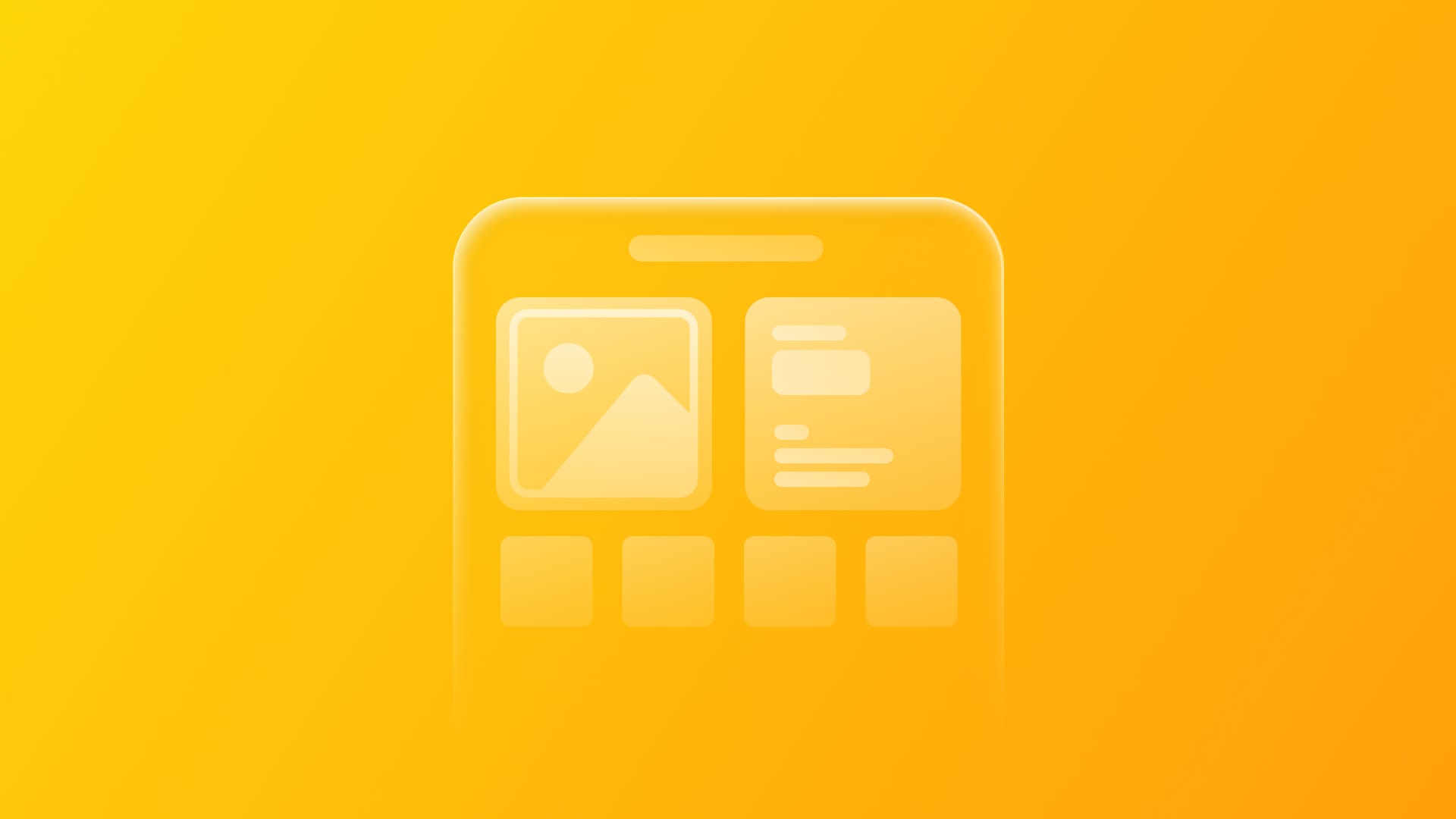
Layout patterns
Use proven structures that fit your product needs, changing the layout based on the default components already existing, depending on the platform. To learn more about all the possible structures, check the official Apple documentation.
Brand consistency
Carry your app's identity (colors, typography, style) while blending with the system aesthetic. Your widget should feel like a natural extension of your brand without appearing out of context.
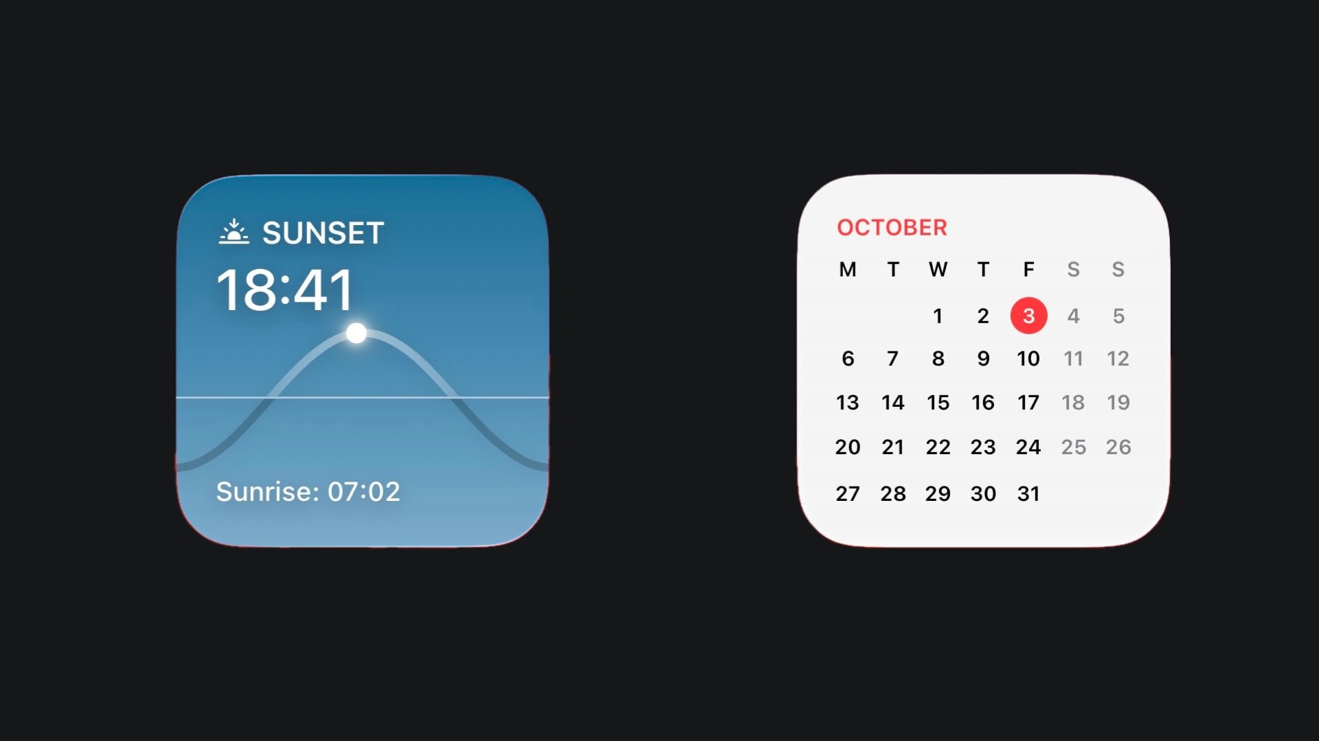
Personalization and dynamism
Enable configuration so users feel the widget is tailored and not generic, from its size to the things displayed. Widgets are not static screenshots; they should be dynamic and responsive to provide ongoing value. The content should feel alive and current, encouraging users to glance at it regularly.
Duolingo
Widgets for visionOS
On visionOS, widgets evolve beyond flat UI elements into spatial, persistent objects that live in the user's environment. Due to this, it’s important to consider new factors:
Persistence
Once placed in space, widgets remain there, anchored just as a real object would be. Depending on the use case, a widget can rest on a flat surface and tilt for usability, integrate into a wall to create the illusion of a window, or hang like a painting.
Fixed size, legibility, and typography
Text and hierarchy must be readable from near and far, respecting real-world proportions and ensuring accessibility across viewing distances.
Materials and colors
Choose between Paper (flat, ambient) and Glass (layered, immersive) styles to fit different environments, and consider how your widget would appear in the real world if it were a physical object.
Proximity awareness
Widgets adapt based on distance: simplified views from afar, richer details up close. This ties directly back to cognitive load and what's appropriate in context.
Widgets succeed when they balance utility, clarity, and context. Unlike notifications and Live Activities, they are about persistence: providing the right information whenever the user needs it.
Start small, focus on essential information, and let the user decide how it works best for their needs. On every platform, widgets can flow into powerful micro-experiences that extend your app's value in users' daily lives.
To continue exploring the design principles behind creating great widget experiences across Apple platforms, check their official resources and documentation. WWDC videos provide rich explanations on how to make those experiences and visual examples of good practices to follow.