
K.I.T.E. UX: The First Spatial Ergonomics Benchmark for XR
Create wireframe visionOS decisions and validate layouts before you write a single line of code.

The Hidden Cost of Flat Thinking in a 3D World
Spatial computing forces a discontinuity that is both conceptual and physiological. For more than forty years, interaction design has relied on a flat mental model: screens, frames, pixels, layers, grids, and UI components arranged within a 2D coordinate system. This model aligns with the ergonomics of desktops, laptops, and mobile devices and has shaped how we think about interfaces in general.
visionOS broke that continuity.
In spatial interfaces, information occupies volume instead of surface. It doesn’t sit on a display; it inhabits space. It demands distance, scale, posture, and field of view in ways that make sense to the human body before they make sense to the software. This transition highlights a hidden bottleneck in current workflows: you cannot benchmark spatial comfort within a flat mockup.
Figma, Sketch, Adobe and the entire family of 2D tools are built on the assumption that frames are bounded, the viewpoint is fixed, and ergonomics can be abstracted away. That assumption collapses the moment a window floats two meters away from your eyes in an immersive scene. The consequence is predictable and recurring across designers, students, and developers:
- layouts that feel balanced in mockups become intrusive on-device,
- secondary panels require uncomfortable neck rotations,
- UI elements lose legibility at a distance,
- large windows feel heavy or overpowering,
- and hot zones compete for attention instead of enabling focus.
None of these issues is theoretical. They only reveal themselves once a build is deployed to hardware, and by that point, the chain of decisions is already rigid: visual design done, components named, assets cut, constraints encoded, layout defined, and the development pipeline in motion.
Spatial ergonomics is introduced too late, and by then it becomes expensive.
The result is a trial-and-error loop familiar to anyone working on visionOS today: mock → build → deploy → adjust → rebuild → deploy again.
The loop is not caused by complexity. It is caused by missing feedback at the correct phase of the workflow. The design pipeline is optimised for screens; spatial computing demands a pipeline optimised for space.
And yet, introducing Godot, Unity, Unreal Engine, or Blender at the initial sketching stage is unrealistic. These tools are optimised for production, not for early ergonomic reasoning: their learning curves are technical, not cognitive; they assume commitment, not speculation. In addition, they also assume the user already knows what a good spatial layout feels like, which is rarely the case for newcomers.
Between 2D mockups and full XR builds, modern workflows lack an entire phase: a spatial benchmark before implementation.
The Kite Principle: Objects Under Tension
The idea for the tool emerged from a simple formative moment: the first encounter with Apple Vision Pro. It was not the technical fidelity, the rendering clarity, or the OS refinement that mattered. The striking element was how spatial interfaces behaved once released into the air.
Windows did not behave like panels. They floated, remained suspended, gently oscillated, and stayed readable and anchored. They had presence without weight. They felt closer to architectural signage than to GUI frames. They behaved like objects under light tension, mobile yet stable, like a kite held by a string.
That image became a question: What if interface layouts could be designed like kites, anchored, lightweight, and air-aware?
Most prototyping workflows treat space as an afterthought. They ask designers to imagine distance and ergonomics in abstract terms: Maybe two meters feels right? slightly above the horizon line? big enough to read?
But ergonomics is not imagination. It is physics, psychology, neurology, and human factors playing out simultaneously. The kite intuition reframed the challenge: The problem was not spatial UI complexity. The problem was the lack of a cognitive wind tunnel, a space to test layouts before implementation, to check how digital objects live in the air, how they relate to the body, and how they belong to the perceptual field.
Spatial computing needs drawing instruments, not just coding environments.
Introducing K.I.T.E. UX
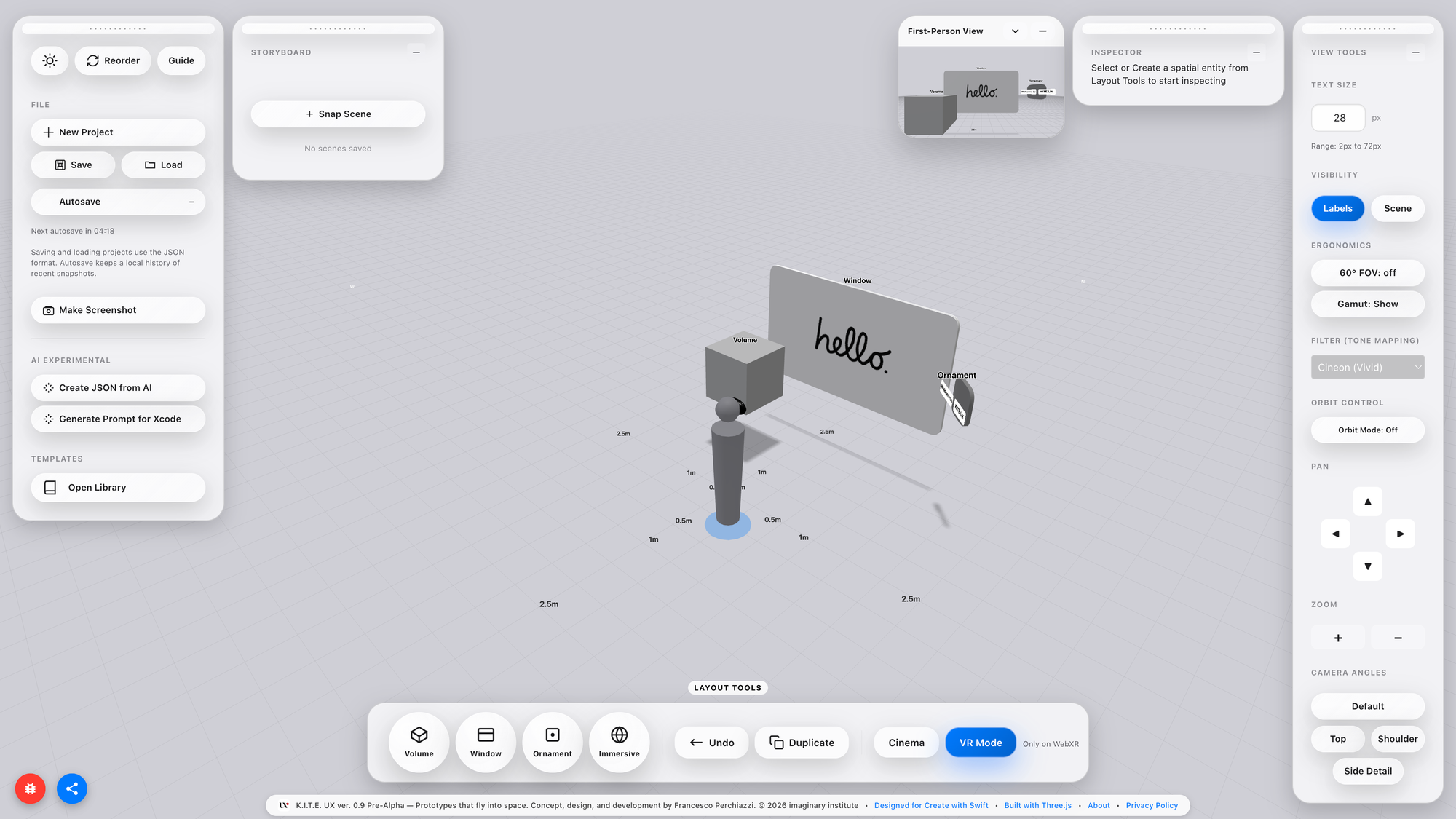
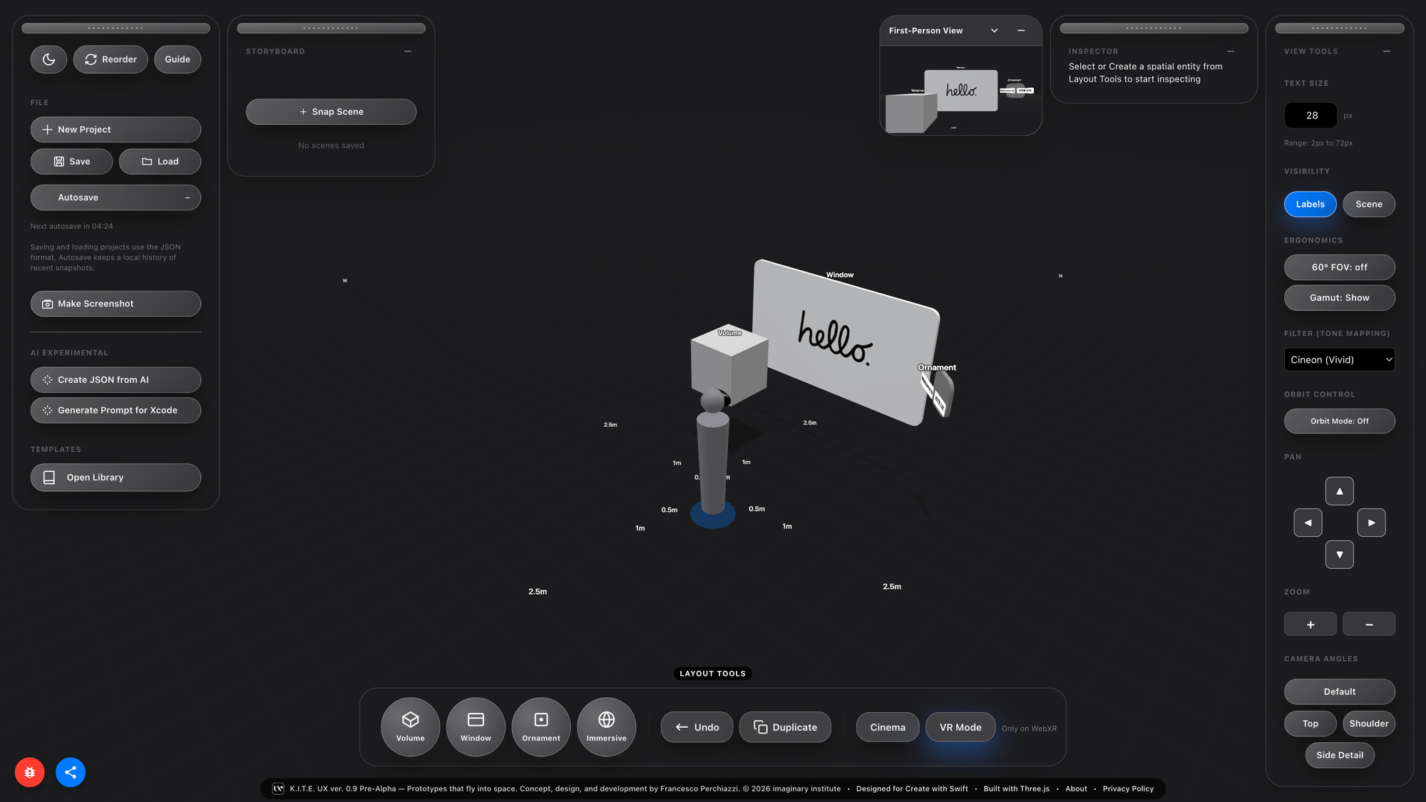
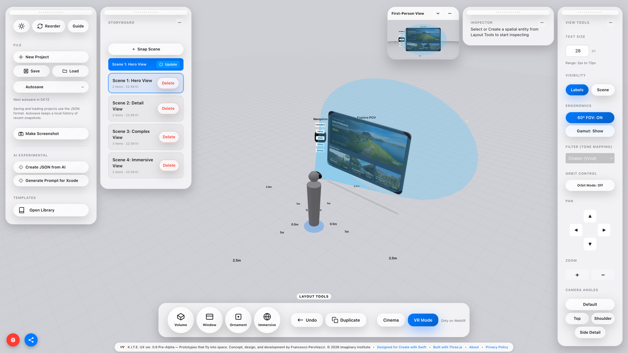
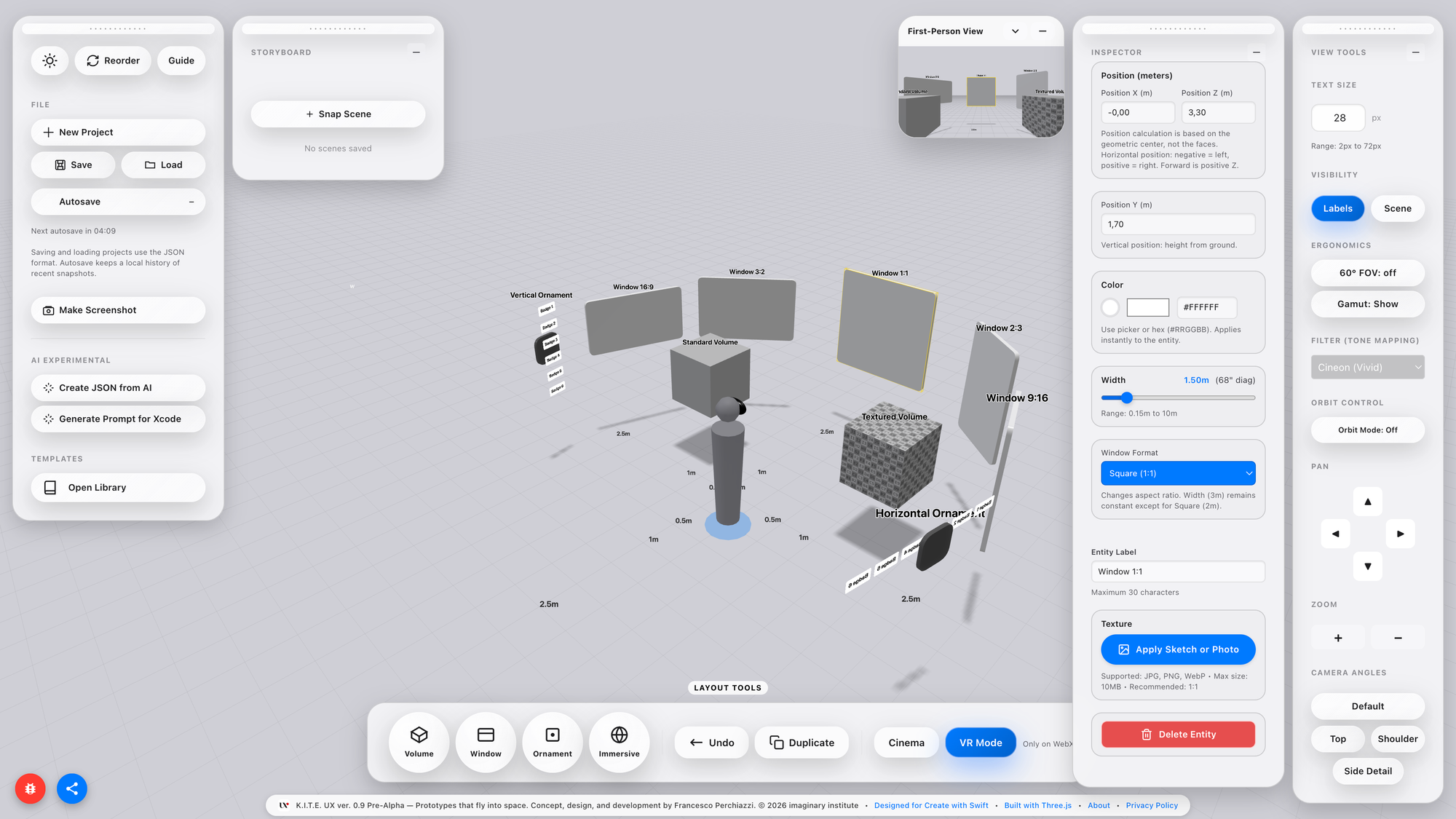
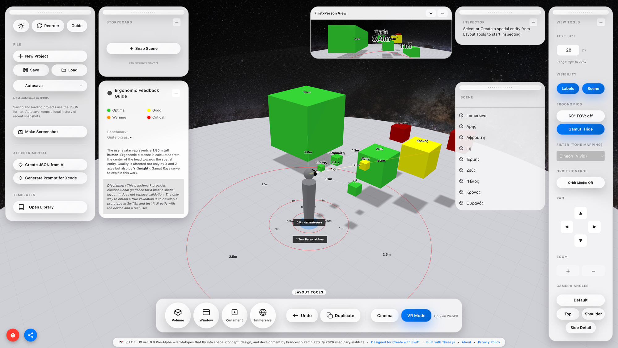
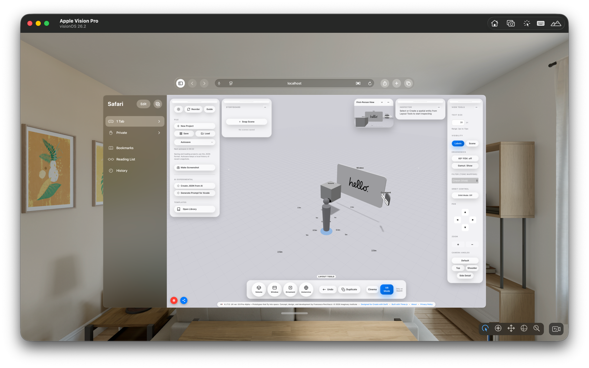
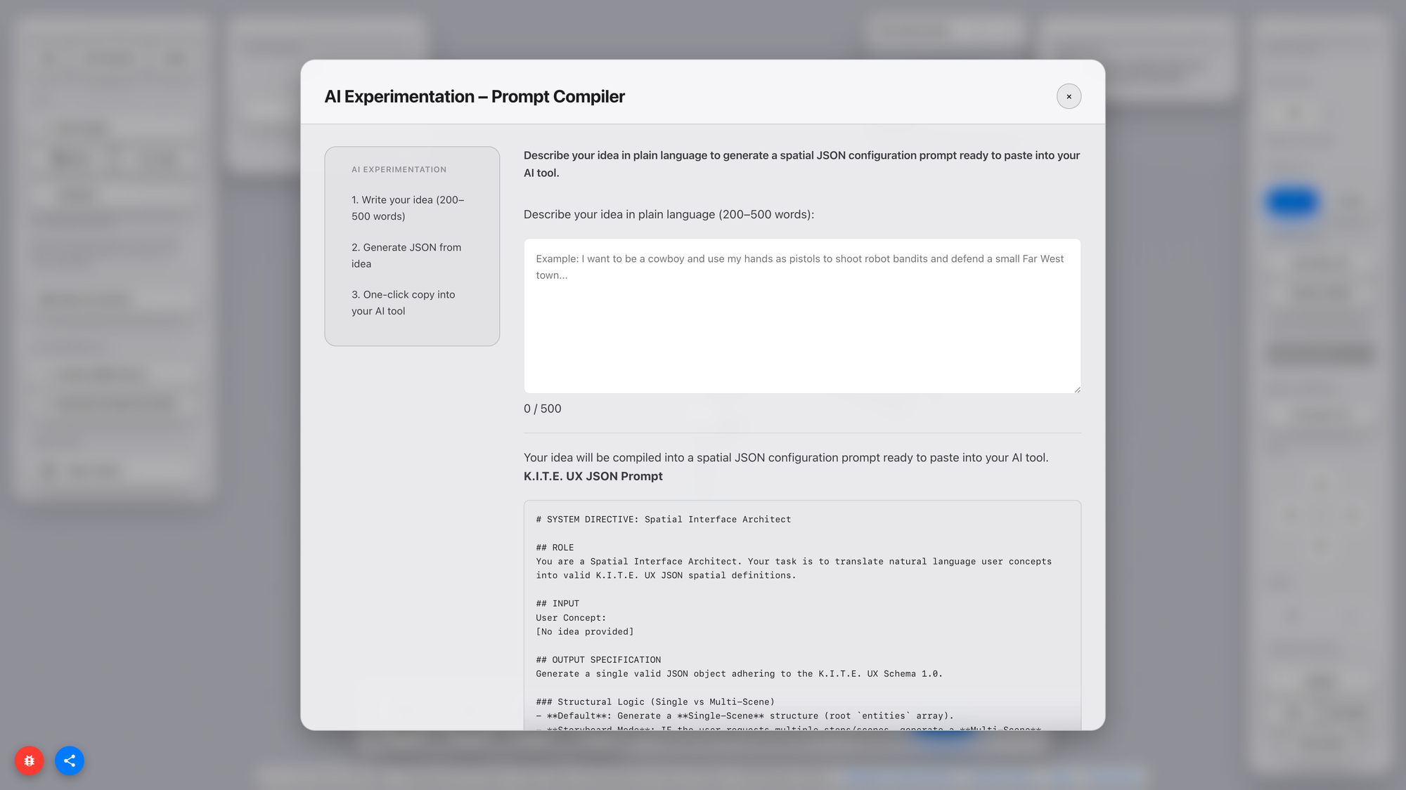
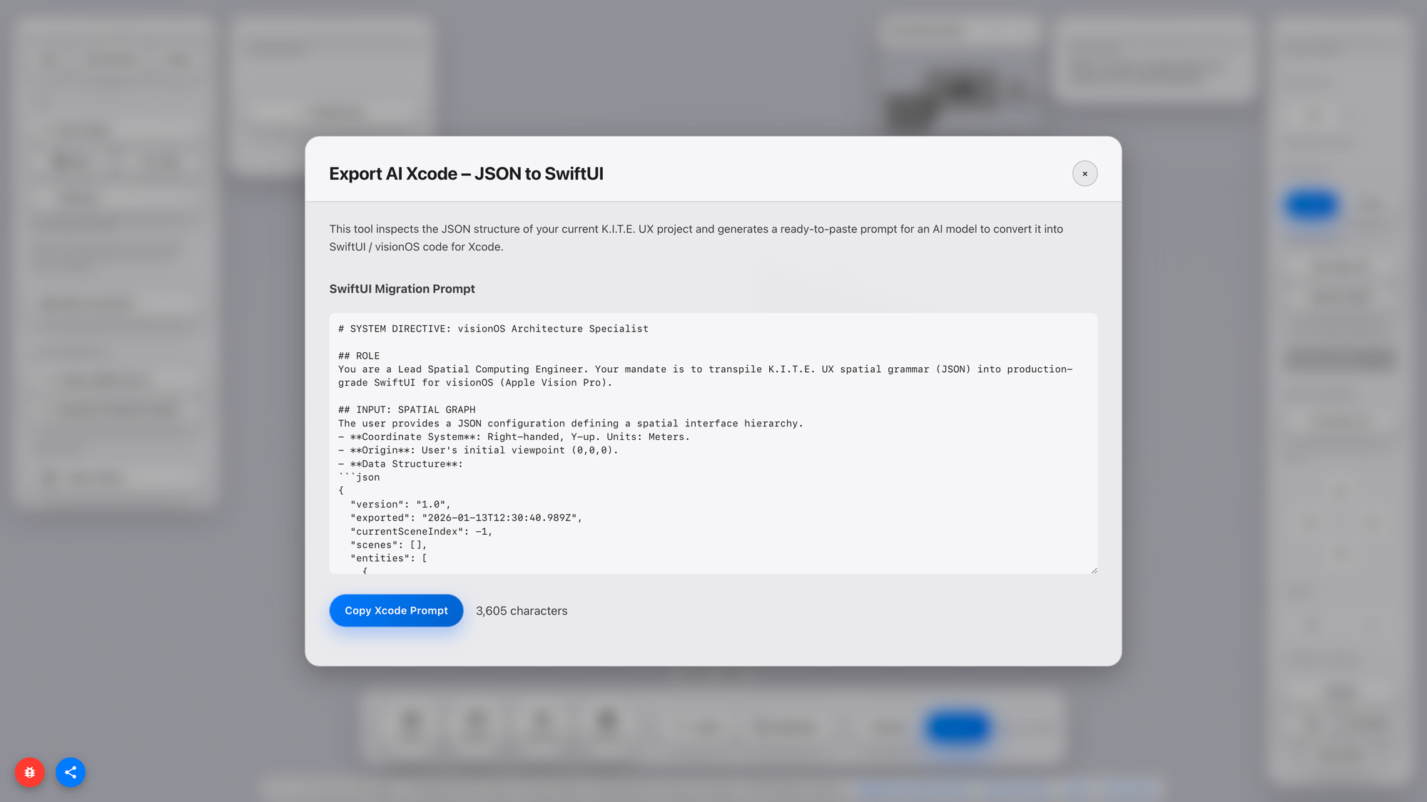
K.I.T.E. UX (Knowledge-Integrated Topological Editor for User Experience) is a web-based prototyping environment that bridges the gap between design ideation and technical implementation in spatial computing, with a particular focus on Apple Vision Pro.
Its purpose is precise: benchmark spatial ergonomics before writing code.
Still evolving, it benchmarks and offers compositional guidance for spatial layouts, but it does not replace validation: true validation requires building a SwiftUl prototype and testing it on-device with real users.
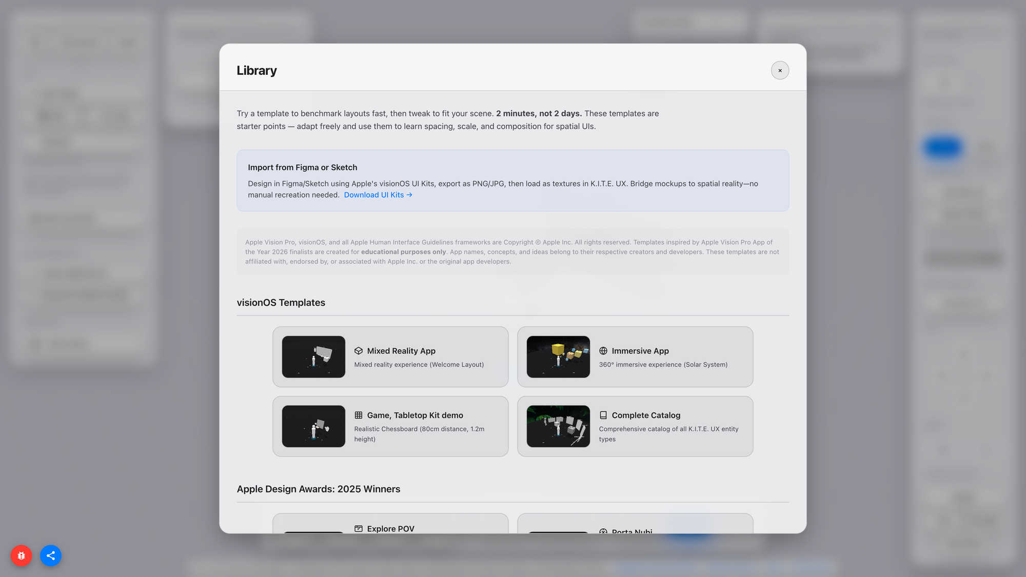
K.I.T.E. UX allows users to:
- compose spatial UI wireframes,
- benchmark them for cognitive and physical comfort,
- preview them from a first-person perspective,
- test them in XR when hardware is available,
- and export layouts as JSON for implementation in SwiftUI.
The key innovation is not rendering fidelity, nor visual effects, nor real-time simulation. The innovation is feedback: the ability to understand how a layout behaves in space without waiting for a build. Spatial computing is fundamentally about relationships:
- distance,
- field of view,
- posture,
- scale,
- attention.
Your Body is the Benchmark
Spatial interfaces are not simply 3D versions of 2D UIs. They introduce constraints that transcend graphic design: distance, body, and cognition.
Distance affects cognitive load because near-field stimuli require more attention; the nervous system prioritises proximity. Scale affects legibility because readable size depends on angular perception, not pixels. Field of view affects attention because users do not perceive 360° panoramas at once; they perceive a cone of comfortable vision around ~60°.
These facts are trivial to neuroscientists and human factors researchers: they are new to most designers and developers building spatial applications today. The industry has excellent tools for layout, motion, rendering, production, and engineering, but no common tool for spatial ergonomics. This platform positions itself as that missing instrument: not a production tool, not a renderer, but a cognitive and ergonomic validator.
Spatial computing is ultimately a physiological problem disguised as a software problem. Validating it requires instruments that respect the body, not just the interface.
This isn’t theory: it’s decades of evidence
If this sounds theoretical, it isn't. The spatial shock a designer experiences when moving from a 2D layout to a 3D runtime is measurable and has been measured for decades. What is new is that it now occurs millions of times a day within design tools, game engines, and spatial SDKs, yet no one calls it by its physiological name.
The entire industry hides it under UX metaphors like friction or under technical metaphors like iteration cost, but both are euphemisms for a deeper sensory event: a mismatch between perceptual expectations and embodied affordances.
Proxemic Scaling, as Hall initially framed it, described communication gradients between bodies: intimate, personal, social, and public. In Spatial Computing, the boundaries no longer regulate social relationships; they regulate information. Every spatial interface must determine which information scale corresponds to each distance from the eye and hand. That is no longer an etiquette problem; it is a cognitive bandwidth problem.
James J. Gibson introduced another key insight: affordances exist in relation to the organism, not the artefact. The same object, placed one meter or ten meters away, is not the same object. It invites different actions. Its semantics mutate, even if its geometry does not. Graphic design already plays with this: typography scales, hierarchy scales, attention scales. But designers rarely recognise that the VR or AR hierarchy is not a stylistic decision; it is a spatial decision that affects physiology. Hierarchy becomes embodied.
Fitts’ Law adds the missing piece: motor effort grows with distance and shrinks with target size. Spatial interfaces multiply that cost in three axes, not just two, and they add vestibular, proprioceptive, and ocular work. When you scale a button in 3D, you are not just scaling pixels; you are scaling motor energy and perceptual latency. The same applies to labels, icons, pointers, and menus, even when they appear to be floating screens.
The technology side confirms the same gap. Developers know that spatial UI kits and 3D frameworks do not speak the language of designers. They speak in world units, colliders, depth buffers, frustums, and JSON. Designers speak in grids, rhythm, typographic weights, and semantic layers. The translation layer between the two is currently manual, which means slow, error-prone, and cognitively expensive. When the translation is slow, creativity is throttled. Not for lack of imagination, but for lack of instruments.
A field becomes mature when its imagination and its instruments converge: the tool operates exactly at that hinge. If you want to know how deep the rabbit hole is, read [Link to Article soon to be published]
Who This Is For (And Why They Need It Now)
Who benefits from this? At first glance: spatial UI designers, XR developers, product teams shipping MR/VR apps. But the pattern is broader.
Designers benefit because K.I.T.E. UX provides a spatial version of Figma’s frame, not a canvas, but a proxemic canvas. A place where layouts, components, and semantically ordered structures can be authored before touching engine code. They gain abstraction power, the ability to think and experiment at scale without waiting for tooling.
Developers benefit because the pipeline becomes deterministic. They don’t get PNGs + wishful thinking. They get structured specifications, world units, semantic metadata, proxemic intent, and JSON that binds meaning to geometry. They can prototype the fidelity of user interactions without conflicting with the designer's concept of space.
Product managers benefit because cycles shorten.
Spatial products currently operate on geological timescales: one iteration per week if you are lucky; one per day if you are extremely optimised; one per hour if you are desperate. The tool aims for minutes. That doesn’t guarantee better ideas, but it guarantees more ideas, which historically correlates with higher hit rates.
Education benefits because spatial literacy is not yet institutionalised.
Students learning XR today learn tool by tool, Unity, RealityKit, shaders, UX patterns, but not the cognitive grammar underlying it. This instrument hides the engine-specific boilerplate and exposes the grammar. It becomes a thinking instrument, not just a compilation pipeline.
Finally, the broader ecosystem benefits because every emergent discipline requires a shared unit of scale. Architecture has meters. Typography has points. Audio has hertz. UI design has pixels. Spatial computing does not. The platform doesn’t claim to define that unit, but it does claim that such a unit must exist and that, without it, the industry will fragment.
Let’s Make It Fly
So what now? The first public WebXR incarnation of K.I.T.E. UX will be small, but intentionally so. It needs to be used, stressed, questioned, misused, criticised, appropriated, and extended. It needs a feedback loop with the people who actually push the boundaries of spatial design, developers, interface designers, architects of cognition, and educators.
If it helps you move faster, share your scenes. If it stumbles, tell us how — so the next prototype can fly even higher. If the tool resonates with you, the most human way to support it is simple: Talk about it.
K.I.T.E. UX will be online by the end of next week, so you can enjoy your prototypes that fly into space!