Liquid Glass: Redefining design through Hierarchy, Harmony and Consistency
Understand the principles behind Liquid Glass, Apple's new design system.

When you look at Apple’s design evolution over the years through hardware and software, one thing becomes clear: it’s all about experience. With the upcoming updates in iOS 26, Apple’s approach has evolved into three key principles highlighted in the new HIG:
- Hierarchy
- Harmony
- Consistency
These changes are not just about how things look—they represent a deeper evolution of the Apple ecosystem’s core values, making the interface more responsive, adaptive, and aware of both context and content.
To fully appreciate this shift, it’s helpful to look back at the foundation on which this evolution was built.
In earlier versions of iOS, Apple emphasized design themes that shaped a minimal, content-first UI approach. The focus was on keeping interfaces clear and functional, allowing content to take the spotlight, minimizing visual noise, and utilizing motion or layering to provide structure and context. UI elements were expected to be legible and predictable—contributing to a polished and intuitive experience.
The older guidelines were built around concepts such as deference, where the UI shouldn’t compete with content; clarity, ensuring every element is readable and purposeful; and depth, where layering and movement guide attention and understanding. Foundational principles also included consistency, feedback, and user control.
To understand this evolution in practice, let's examine the updated Apple Music app and how these new principles enhance the user experience today.
Hierarchy
“Establish a clear visual hierarchy where controls and interface elements elevate and distinguish the content beneath them.”
— Apple Human Interface Guidelines (iOS 26)
While content has always played an essential role in Apple’s design, the emphasis in iOS 26 brings this to the forefront like never before. The interface now adapts to content and user context more intelligently, resulting in a more refined and responsive experience. Hierarchy is now more evident in how navigation and content layout dynamically adjust to support the user’s focus. Instead of fixed UI patterns, components adapt in real time to enhance readability, reduce distractions, and support intentional flow.
The overall user experience has been improved by putting content at the center of the experience in every possible way.
Now that the UI is fully content-aware, we can see this in the main components, such as the tab bar. One of the most noticeable shifts in iOS 26 is how the interface responds to content. In earlier versions of iOS, components such as the tab bar were static: always visible, regardless of context or user behavior.
In iOS 26, hierarchy is no longer fixed; it’s dynamic. The interface can now prioritize, hide, or simplify its components based on user actions and contents.
Why does this matter? A more responsive UI leads to a clearer, more guided experience, allowing users to focus on the content.
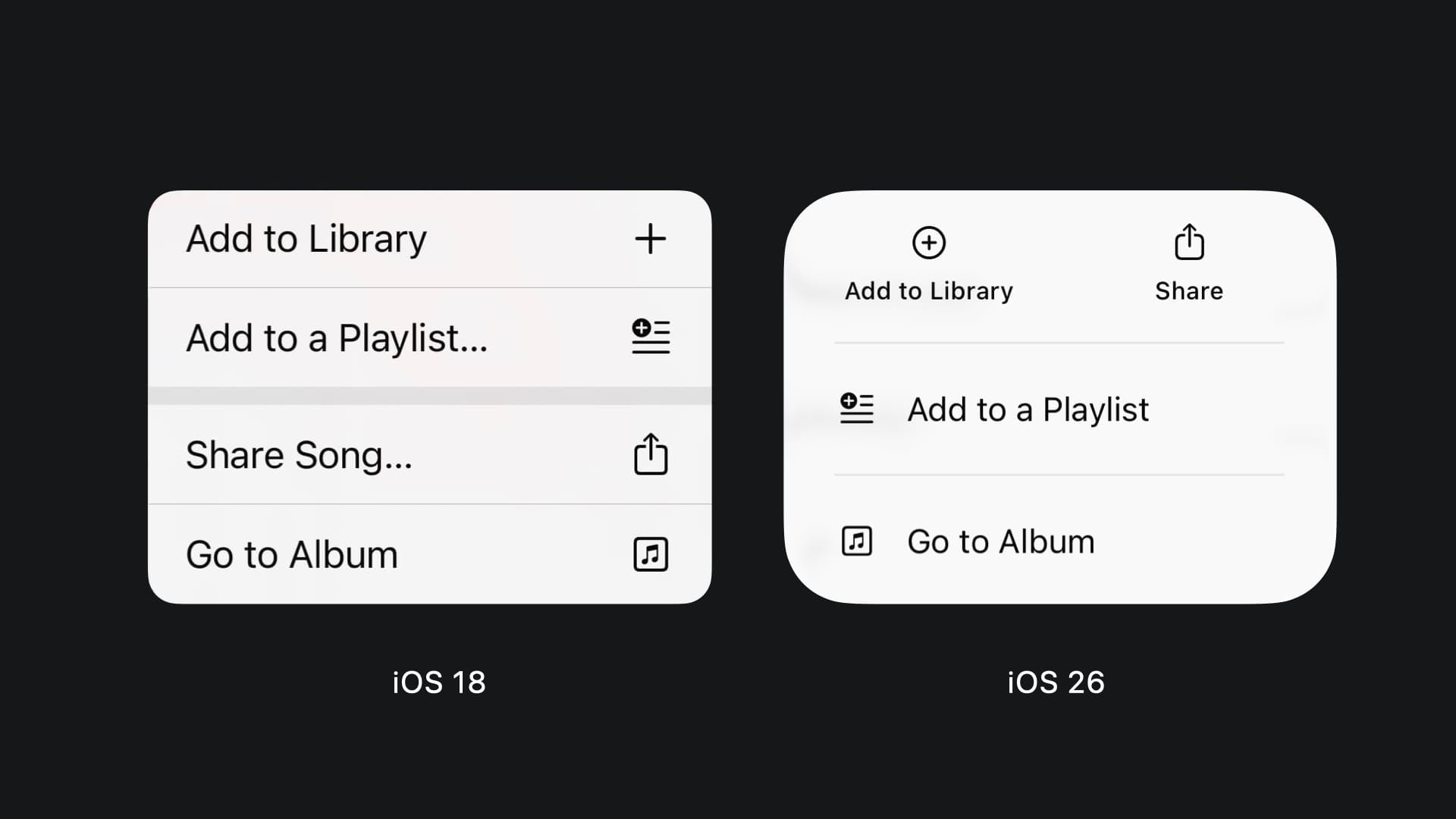
Another significant change that further reinforces the focus on making hierarchy a core part of the new UI is the way actions and information are displayed. As you can see in the screens below, now the action layout is smarter. Related actions are now grouped and this includes the conscious usage of icons, improved structure, and, in components like the toolbar or tab bar, the merging of similar or related actions makes the experience more guided and clear.
Harmony
“Align with the concentric design of the hardware and software to create harmony between interface elements, system experiences, and devices.”
— Apple Human Interface Guidelines (iOS 26)
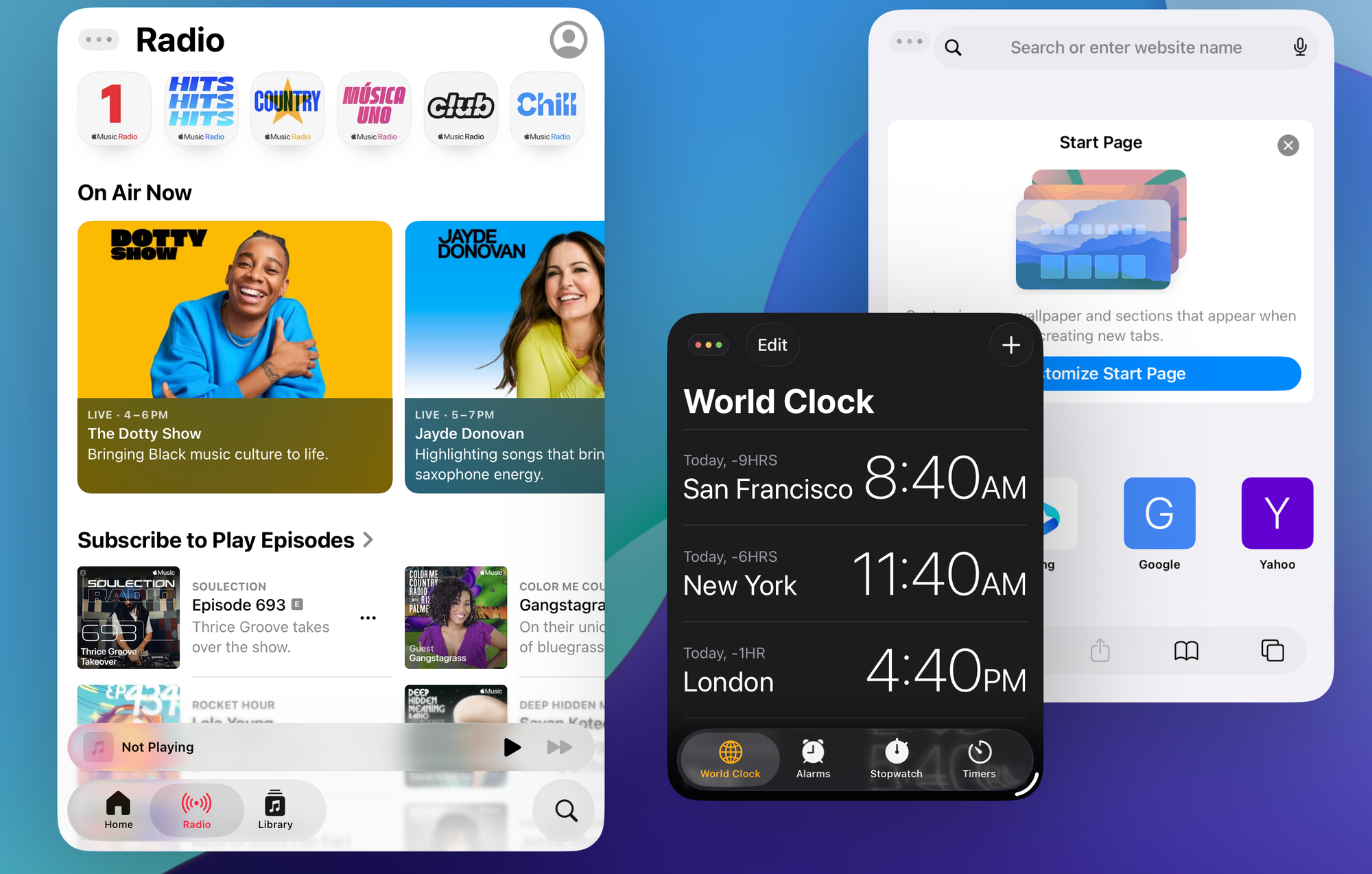
In iOS 26 HIG, harmony is about aligning software with the physical and contextual realities of each device. It’s not just about visuals but it’s about making the entire experience feel natural and seamless. From this perspective, there is a refined use of shapes and materials, everything blends together perfectly, putting the glass effect pushed to their highest potential, blending the interface into the app and the device itself.
Shapes follow the hardware, touch and content are never disturbed or disturbed by the UI. The glass effect makes it blend perfectly. This harmony isn’t limited to a single app not but it extends to the overall UX, in the multitasking the various apps, using the new materials, reshape themselves to adapt to the user’s needs.
Consistency:
“Adopt platform conventions to maintain a consistent design that continuously adapts across window sizes and displays.”
— Apple Human Interface Guidelines (iOS 26)
Consistency helps people understand how the app works and reduces the cognitive load required to use it. It’s also a key point where harmony and hierarchy converge. This principle has always been the cornerstone of Apple’s HIG, going back to early iOS versions where repeated patterns and predictable layouts shaped user expectations.
What’s different now is how consistency stretches across contexts without forcing uniformity. Apple has designed a system where the design is as consistent and harmonious as possible. As highlighted in the new Human Interface Guidelines, allowing elements to adapt fluidly across different devices and contexts.
We can see this in the latest version of iPadOS, which now more closely resembles macOS while remaining highly customizable. As mentioned earlier, interaction is the key: in some native apps, the user can decide where actions and navigation should happen.
As shown in the example of Apple Music on iPadOS below, using the menu bar provides more vertical space to the content underneath, while the sidebar offers a more structured overview when browsing the library. This kind of flexibility makes the experience more adaptive without losing consistency.
Elevate the design of your iPad app WWDC25sf
“Design should speak the users’ language […] Follow real-world conventions, making information appear in a natural and logical order.”
- Jakob Nielsen, Usability Heuristics for User Interface Design (1995)
"Interaction-driven" and "content-driven" are the principles guiding this design evolution, resulting in a more structured and efficient interface. Now designers can focus on choosing the glass material that best highlights their product's content rather than obscuring it, creating a more immersive and purposeful user experience.
What does this mean for designers and developers?
With iOS 26 and the Liquid Glass Design System, Apple’s design direction is more than a visual refresh; it’s a structural shift in how interfaces behave and how we should build them. For designers and developers, this means rethinking the relationship between interface, content, and context.
How can you start adapting your applications?
- Prioritize clarity through hierarchy: Make sure the most important content is visually and functionally prioritized. Use spacing, size, and component behavior to guide the user, rather than relying solely on colors or effects.
- Think in systems, not screens: With concentric design and adaptive geometry, elements need to work consistently across iPhone, iPad, and Mac. Test your designs in different environments and make sure the experience remains coherent.
- Use materials and motion meaningfully: Glass effects and transitions shouldn’t be decorative; they’re tools to signal depth, feedback, or changes in context. Use them purposefully.
- Rethink native components: These elements are no longer fixed containers; they are part of the flow. Consider how they behave and adapt based on UX and screen size.