
Preparing your App for VoiceOver: Hiding Elements from the Accessible Interface
Ensure your app’s interface elements communicate their function properly to assistive technologies.


Preparing an app for VoiceOver is not limited to ensuring that every component of the interface is readable by the assistive API. What developers need to focus on is not just achieving a simple one-to-one translation of the interface into accessible elements but also optimizing the Accessible User Interface (AUI) by removing unnecessary elements. This optimization allows users to navigate efficiently, avoiding the need to listen to VoiceOver reading unhelpful descriptions, creating a robust Accessibility User Interface.
Hide elements from the AUI helps developer to join the following guidelines from the WACG:
Guideline 1.1.1: Decoration, Formatting, Invisible If non-text content is pure decoration, is used only for visual formatting, or is not presented to users, then it is implemented in a way that it can be ignored by assistive technology.
Guideline 1.4 Distinguishable "Make it easier for users to see and hear content including separating foreground from background."
Guideline 2.4 Navigable Provide ways to help users navigate, find content, and determine where they are.
How to hide elements from the AUI
Hide an element from the VoiceOver is incredibly easy to do regardless of the framework that you are using.
Hiding Elements from the AUI with SwiftUI
In SwiftUI all you need is to apply the .accessibilityHidden(true) modifier to your view and this will be ignored by the VoiceOver.
struct SwiftUIView: View {
    var body: some View {
        ZStack {
            Image(systemName: "swift")
                .accessibilityHidden(true)
        }
    }
}
Hiding elements from the AUI in SwiftUI using the .accessibilityHidden modifier.
If you want to hide images from the AUI consider using the decorative initializer for Image Views. The initializer automatically ensures that the Image View is ignored by Assistive Technologies.
struct SwiftUIView: View {
    var body: some View {
        ZStack {
            Image(decorative: "imageName")
        }
    }
}
Hiding an image from the AUI in SwiftUI the decorative initializer for Image Views.
Hiding Elements from the AUI with UIKit
You can easily hide an interface element in UIKit from the AUI by setting the properties:
- isAccessibilityElement: boolean to specify whether an element is visible or not to the Accessibility API (any assistive technology).
- accessibilityElementsHidden: boolean to indicate whether the children elements of the target element are visible or not to the Accessibility API.
- accessibilityViewIsModal: boolean that can make visible or not the sibling elements of the target element to the Accessibility API.
import UIKit

class ViewController: UIViewController {
    @IBOutlet weak var bluParentView: UIView!
    @IBOutlet weak var imageChildView: UIImageView!
    @IBOutlet weak var labelChildView: UILabel!

    override func viewDidLoad() {
        super.viewDidLoad()

        self.view.addSubview(bluParentView)

        /// If isAccessibilityElement is 'true', the target element will be the only accessible element.
        /// If accessibilityElementsHidden is 'false' and isAccessibilityElement is 'false', only the children elements will be accessible.

        bluParentView.isAccessibilityElement = false
        bluParentView.accessibilityElementsHidden = false

        bluParentView.accessibilityLabel = "Create with Swift"

        ///Swift Logo
        bluParentView.addSubview(imageChildView)
        imageChildView.isAccessibilityElement = true
        imageChildView.accessibilityLabel = "Swift Logo"

        bluParentView.addSubview(imageChildView)
        bluParentView.addSubview(labelChildView)
    }
}
When you set isAccessibilityElement to true for an element, you are designating it as an accessible element. This means that this specific element will be the primary focus of accessibility interactions. On the other hand, when you set accessibilityElementsHidden to false and isAccessibilityElement is set to false for an element, the focus shifts to the child elements within the hierarchy.
This configuration is valuable when you have complex UI components that consist of multiple sub-elements. By setting for the parent element and not designating it as an accessible element, you ensure that users can access the child elements individually.
To mark your view as a custom modal set the accessibilityViewIsModal property to true to indicate this view and its contents are the only things on screen VoiceOver should currently care about. When the custom view is presented you should also use the Accessibility Notification API to post a notification to VoiceOver that the screen has changed so that it knows to update its focus to the new content now displayed on top of the older content.
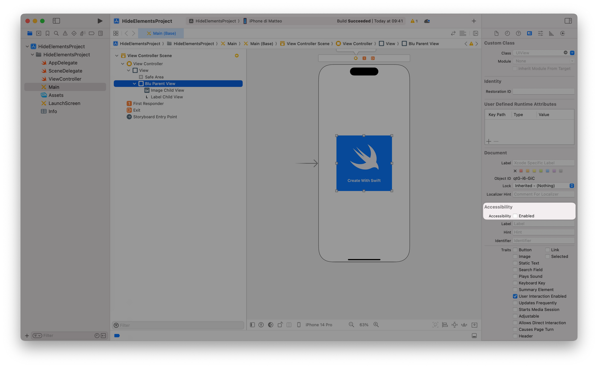
The isAccessibilityElement attribute is also available via the Accessibility section of the Identity Inspector in the Xcode's Inspectors panel.
When to hide elements from the AUI?
In your app's user interface, there are often elements that serve purely aesthetic purposes and don't provide any meaningful information to users. In such cases, the developer should omit these elements from the Accessibility User Interface (AUI). This omission ensures that these purely visual components are ignored by assistive technologies, enhancing the overall user experience by reducing unnecessary action.
Let’s look at Shazam for example: The label “Tap to Shazam” is hidden from the assistive API because it is included in the accessibilityLabel of the button. This way the person using VoiceOver doesn't have to swipe two times when navigating the user interface of the application.

Another scenario where hiding elements of the user interface becomes essential is when implementing a custom modal interface. When you overlay a custom modal view on top of other elements, the views beneath it remain visible. However, VoiceOver doesn't inherently recognize that these underlying views should no longer be accessible, creating a confusing experience.