Programmatic navigation with Tab View in SwiftUI
Learn how to handle trigger navigation in Tab Views through code in a SwiftUI app.

When we want direct control over navigation in a SwiftUI app, like presenting a specific view, we use programmatic navigation. This pattern lets us trigger navigation based on a value, instead of waiting for user interaction.
An example is the Fitness app on iOS, after finishing the Trainer Tips video content in the summary tab, the user will automatically be redirected to the Fitness+ tab.
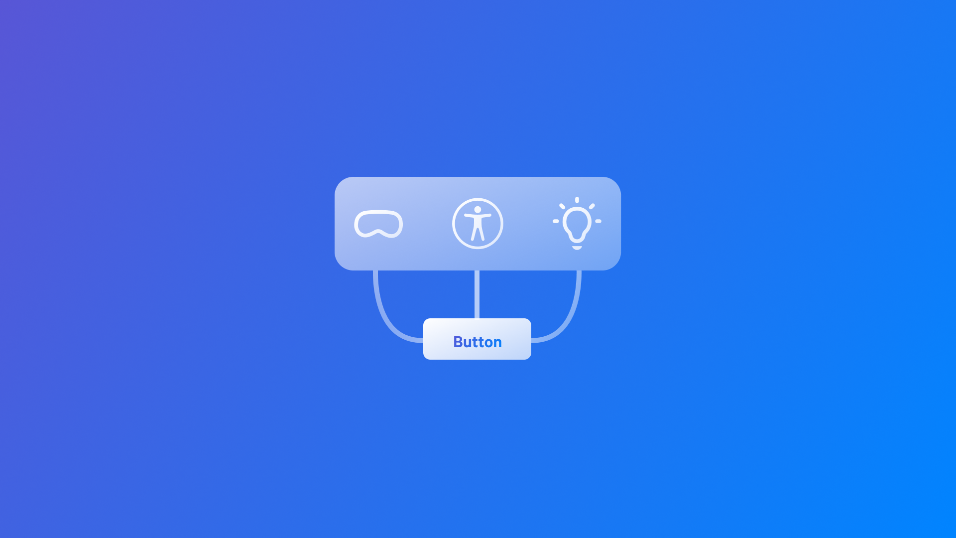
To implement this type of navigation we first need to define a type that represents each tab.
enum NavigationTabs {
    case make-it-accessible
    case make-it-spatial
    case make-it-intelligent
}
In the example above, we have defined the enumeration with three different possible values.
Now, within a view, declare a state property to track which is the currently selected tab, initialized with the value of the default selection.
import SwiftUI

struct ContentView: View {

    @State var selectedTab : NavigationTabs = .make_it_accessible

    var body: some View {
        // TODO
    }
}
With all set, just implement the TabView container binding the state property to the selection parameter in its initializer.
import SwiftUI

struct ContentView: View {

    @State var selectedTab : NavigationTabs = .make_it_accessible

    var body: some View {
        TabView(selection: $selectedTab) {
            // TODO: Add tabs
        }
    }
}
For assigning a selection value to each tab use the init(_:systemImage:value:content:) initializer. Every time that a tab is presented the selectedTab property will update its value according to the displayed tab.
import SwiftUI

struct ContentView: View {

    @State var selectedTab : NavigationTabs = .make_it_accessible

    var body: some View {
        TabView(selection: $selectedTab) {
            Tab("Accessibility", systemImage: "accessibility", value: .make_it_accessible) {
                Text("Make it accessible")
            }

            Tab("Spatial computing", systemImage: "visionpro", value: .make_it_accessible) {
                Text("Make it Spatial")
            }

            Tab("Machine learning", systemImage: "lightbulb.min.fill", value: .make_it_accessible) {
                Text("Make it Intelligent")
            }
        }
    }

}
To directly navigate to a specific tab, you can implement a button that modifies the selectedTab property. When triggered, the button updates the selectedTab value, dynamically rendering the corresponding tab.
This approach enables developers to design custom tab bars, also by leveraging the new init(value:content:) initializer, which sets the label of the tab as an empty label.
struct ContentView: View {

    @State var selectedTab : NavigationTabs = .make_it_accessible

    var body: some View {
        ZStack {
            TabView(selection: $selectedTab)  {
                Tab(value: .make_it_accessible) {
                    ContentUnavailableView("Make it Accessible", systemImage: "accessibility")
                        .toolbarVisibility(.hidden, for: .tabBar)
                }

                Tab(value: .make_it_spatial) {
                    ContentUnavailableView("Make it Spatial", systemImage: "visionpro")
                        .toolbarVisibility(.hidden, for: .tabBar)
                }

                Tab(value: .make_it_accessible) {
                    ContentUnavailableView("Make it Intelligent", systemImage: "lightbulb.min.fill")
                        .toolbarVisibility(.hidden, for: .tabBar)
                }
            }

            CustomTabBarView(selectedTab: $selectedTab)
        }
    }

}
In the example above we have also applied to each view the toolbarVisibility(_:for:) modifier so that the tab bar will be completely disabled.
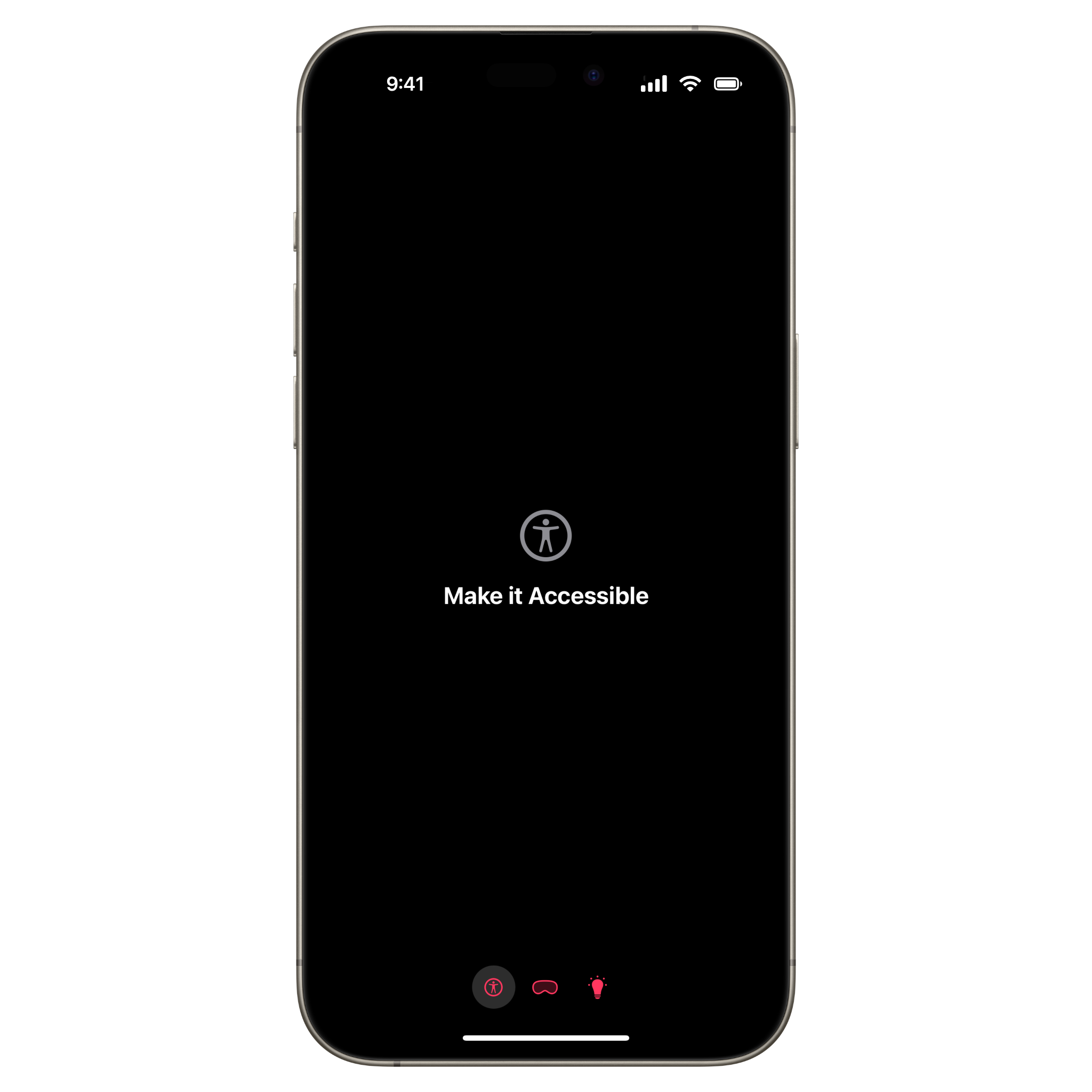
In this way developers can maintain the functionality of the Tab component while applying their own custom designs and interactions, preserving the structural benefits of the tab navigation system.