Solid Interfaces for visionOS: Widgets and Cognitive Space in Spatial Computing
A new grammar for designing Cognitive Spatial Experiences in visionOS and WebXR.

Picture entering your living room, where the walls are adorned not just with art and decor, but with virtual interfaces smoothly integrated into your physical world. A calendar hangs persistently on your wall, a virtual assistant hovers by your desk, and news widgets comfortably nestle into the corners of the room. Instead of appearing as temporary windows that vanish once a task is complete, spatial interfaces persist in the user’s environment, becoming part of the cognitive landscape. This shift moves interaction from episodic attention (summon, interact, dismiss) to constant presence, a different mode of thinking entirely.
Spatial widgets are not simply things you look at; they are things you live with.
The result is an extensive reconfiguration of what an interface is and what it is for. Traditional screen-based UI evolved under a simple operating assumption: software lives in a rectangle. The rectangle provides stable constraints on edges, stacking order, foreground vs. background, absolute visual scale, constant reading distance, and predictable ergonomics. Spatial computing removes all of these constraints simultaneously: the user becomes the reference frame, and cognition replaces layout as the medium of coordination.
This transition forces a conceptual upgrade: from patterns to grammars, from describing repeatable configurations to describing the rules that make configurations valid. An apt metaphor for this shift is the difference between building a model with a LEGO set and the broader LEGO brick system. The set provides a specific pattern to follow, a predetermined model, but the system of bricks represents the grammar, offering infinite possibilities by understanding the fundamental rules of combination. In spatial systems, grammars are essential because objects in space interact through distance, proprioception, memory, and attention variables that continuously update and do not converge on a single canonical layout.
When Apple introduced spatial widgets for visionOS 26 at WWDC25, something fundamental changed in how we understand digital user interfaces. For decades, applications followed a regular cadence: they appeared when summoned, enabled specific actions, then disappeared when dismissed. This episodic existence defined our relationship with software tools, materialised momentarily, then dissolved back into the computational void.
“All widgets — including Calendar, shown here — are customizable, with a variety of options for frame width, color, and depth.” From Newsroom. Copyright © 2026 Apple Inc. All rights reserved.
Spatial widgets introduced persistence, the capability to remain present across sessions, occupying space continuously rather than episodically (Cronin & Scoble, 2025). Consider the everyday frustration of constantly searching for your calendar on a messy desk or in a sea of tabs on a screen. Now, picture a calendar that remains steadfastly on your kitchen wall. Instead of frantically opening apps or shuffling through papers, a quick glance ensures you’re up to speed.
After repeated exposure, your brain’s hippocampus can encode these digital objects as environmental landmarks, just as you remember where furniture sits, or light switches are located (O’Keefe & Nadel, 1978; Felten et al., 2022). Thinking “I need to check my calendar” triggers automatic physical alignment toward its location, with no conscious search required. The widget becomes part of your cognitive geography, enabling what neuroscientists call allocentric memory, mapping spatial positions defined relative to stable environmental structure rather than to your body. This represents a conceptual departure for designers of cognitive environments from the trajectory of mobile computing. The iPhone revolution prioritised dematerialisation, removing physical complexity from symbolic interfaces. Contact lists replaced address books, maps replaced atlases, and shopping apps replaced stores. Dematerialisation served brilliantly for pocket computing, but established cognitive patterns that now constrain spatial thinking.
Extended Reality XR technologies represent re-materialisation, bringing digital experiences back into space, back into presence, not through skeuomorphic imitation of physical objects, but by engaging perceptual and cognitive systems that evolved for three-dimensional environments (Gibson, 1979). When a calendar occupies space near your workspace, it doesn’t merely display information symbolically; it inhabits your surroundings, determining how you think and orient (Clark, 2016). The neuroscientific foundation for this shift lies in predictive processing, one of the most influential models in contemporary cognitive science. Your nervous system doesn’t passively record reality; it predicts it. Every moment, your brain generates hypotheses about incoming sensory data based on accumulated experience, then checks those predictions versus actual input (Clark, 2016; Friston, 2010). When predictions correspond with reality, perception flows effortlessly.
Zero prediction error creates the sensation of naturalness.
When mismatches occur, your brain expends energy to reconcile the discrepancy, generating cognitive friction that manifests as confusion, discomfort, or, in extreme cases, simulator sickness. Spatial computing design transforms from aesthetic choice to cognitive necessity: interfaces must confirm predictions that the nervous system has spent 200,000 years learning to make.
From Predictive Screens to Predictive Space
Spatial computing and XR technologies do not simply add depth. They add predictive structure: the brain does not passively receive visual input; it actively predicts the scene before perception arrives. As Andy Clark argues, perception behaves like controlled hallucination powered by internal generative models (Clark, 2016): spatial interfaces succeed when they conform to those predictions and fail when they violate them.
This is why highly polished rendering can still feel wrong; photorealism alone does not guarantee cognitive credibility. The brain expects certain invariants: objects should remain stable when you move your head; nearby items should be easier to manipulate than distant ones; tools should remain proximal to the task they modify. When spatial widgets violate these expectations by floating, drifting, rescaling arbitrarily, or requiring body gymnastics, they generate cognitive friction. To experience this perceptual friction firsthand, try a simple experiment at home: hold your phone with the UI open at a distance of 3 meters for a few moments. Notice the disquiet as the screen’s clarity diminishes and manipulation becomes practically impossible. This exercise provides an immediate, tangible sense of how spatial dissonance may interrupt interaction, converting abstract discomfort into memorable insight.
Therefore, the new paradigm introduces a new design constraint: neuroergonomic correctness. It is no longer enough for a widget to be visually attractive or semantically transparent; it must also be physiologically plausible. Another shift is toward allocentric cognition, representing objects relative to the environment rather than the body. In screen-based computing, everything is egocentric: you look at the screen, you scroll, you click. In spatial computing, many objects become world-anchored: attached to walls, corners, furniture, or stable surfaces. Once placed, they become landmarks.
Persistent widgets introduce a new form of composability: world-structured workflows. Instead of opening and closing windows, the user arranges tools in the environment and returns to them throughout tasks or sessions. It becomes less like managing files and more like furnishing a room.
The Missing Framework
Despite the revolutionary potential, the medium lacks a strong grammar for arrangement. Developers can build windows and volumetric objects; visionOS provides anchors, surfaces, dynamic scaling, passthrough, motion parallax, and presence. Human Interface Guidelines are a masterpiece and an exceptional legacy in interface design, offering guidance and best practices to help you design a great experience across any Apple platform. However, what we need here is not a guide but a grammar for spatial developers. The HIG excels at prescribing what to do, component specifications, interaction patterns, and visual hierarchies. It answers questions like “How should a button look?” or “Where should controls be placed?” These are essential questions, and Apple’s answers have been refined over decades of iteration.
But spatial computing introduces a different order of problem. We’re no longer arranging elements within a predetermined canvas; we’re defining the canvas itself through the user’s proprioceptive space.
The questions shift from what to why:
- Why does this distance feel correct?
- Why does this scale preserve meaning?
- Why does this persistence support memory rather than creating clutter?
Let’s be honest, there are currently no epistemological indications for where content should go, how large it should be, what ideal distances are, when a widget should persist, or how multiple widgets maintain system-wide consistency. This is the core problem: it currently offers features lacking composition rules. Without such a compass, spatial layouts easily collapse into 3D desktop metaphors, floating HUD clusters, or VR tool palettes, all functional, none taking advantage of allocentric cognition. Conversely, overly abstract spatial studies frequently yield aesthetic novelty at the expense of ergonomic correctness.
A developer-friendly grammar must answer questions such as:
- How close should objects be for manipulation vs. reading vs. reference?
- How should scale change with distance?
- Which widgets should remain throughout sessions?
Pattern libraries cannot answer these questions. Only grammars can.
From Theory to Practice: K.I.T.E. UX
Recognising this gap, we set out to build not just a theoretical framework, but an operational instrument, a tool that could translate ergonomic principles into immediate design feedback. The challenge was epistemological: how do you teach spatial grammar without forcing designers to master neuroscience, proprioceptive psychology, and biomechanics first? The solution required creating a system that could externalise cognitive evaluation, making invisible ergonomic violations visible, transforming abstract principles into concrete, actionable signals. If a designer places a control panel at an uncomfortable distance, they shouldn’t need to calculate angular subtense manually or consult Fitts’s Law tables. The tool itself should perform these calculations in real-time and communicate the results through intuitive visual language.
This is where K.I.T.E. UX (Knowledge-Integrated Topological Editor for User Experience) originates: not as documentation of existing practice, but as a pedagogical instrument.
K.I.T.E. UX is a web-based demonstrator conceived and built by Francesco Perchiazzi to operationalise his research framework. Initially developed for personal study and experimentation, it implements spatial ergonomics and cognitive grammars in real time for WebXR evaluation and prototyping, with design intent for visionOS. What began as a research tool evolved naturally into a universal instrument accessible to all. Beyond individual research, K.I.T.E. UX now serves as both a pedagogical and community tool within the imaginary institute’s ongoing work on cognitive tooling for spatial computing, demonstrating how rigorous personal research can transform into a collective contribution. It emerged from a simple hypothesis: if we could encode neurophysiological constraints into a design environment, designers could learn spatial grammar through direct manipulation rather than theoretical study, discovering optimal arrangements through experimentation rather than memorisation.
Share your feedback to help us improve it.
This open-source web-based spatial interface editor implements a real-time benchmarking system for XR layouts. By using the Gamut Warning system, developers and designers could quickly adjust the layout, reducing cognitive strain and enabling fluid interaction. This anecdotal evidence underscores the practical value of the framework, turning architectural descriptions into persuasive proof of its usefulness. Use its real-time benchmark features to test spatial layouts early in the design process, ensuring ergonomic standards are met before finalising layouts. Incorporating the benchmark early in the design process enables iterative testing, enabling rapid identification and correction of spatial misalignments. Transitioning from theoretical concepts to practical applications becomes seamless, equipping designers with the tools needed for effective spatial computing design.
Step 1: Prototype spatial layouts using the editor to explore various configurations and understand the framework’s capabilities.
Step 2: Utilise its real-time benchmark features to conduct thorough tests on the prototypes, identifying ergonomic and interaction design flaws early in the process. This ensures compliance with the principles before producing the final design.
Step 3: Benchmark the refined spatial interface designs by exporting them from the platform for implementation in visionOS, ensuring that all ergonomics and integration requirements are adhered to.
Built with Three.js and WebXR, it provides designers and developers with immediate feedback about proxemic correctness as they arrange spatial widgets. When you position a window entity at 2.5 meters, the Gamut Warning system calculates angular subtense, evaluates Fitts’s Law targeting difficulty, and applies colour-coded overlays, red for violations, yellow for marginal cases, green for ideal positioning.
The tool serves two purposes: it’s a practical editor for spatial interface design and a reference implementation (Dynamic Proxemic Model for Human–Robot Interactions Using the Golden Ratio, 2025) that demonstrates how framework concepts translate into working code. Throughout this article, we’ll reference the tool’s architecture to show how the degree-of-abstraction principles become concrete benchmark logic. But what exactly does it measure when it assigns those red, yellow, and green overlays? What makes 2.5 meters marginal for one interaction but optimal for another?
To understand its evaluation logic, we must first establish the foundational grammar it implements; the systematic rules that define spatial usability itself.
What follows is the complete theoretical substrate that powers the real-time evaluation system: the Proxemic Scaling Framework (PSF). This framework defines why distances matter, how the body structures space, and what cognitive expectations spatial interfaces must satisfy. Think of this section as the tool’s constitutional document, the source code for its decision-making logic, expressed in human-readable form.
The Foundation: Understanding Spatial Cognition
To work in this medium, we must start not from software primitives but from the human body. Anthropometry provides measurements; ergonomics imposes limitations; proprioception provides the spatial substrate. Edward T. Hall’s proxemic theory (1966) remains an essential precursor: humans divide space into meaningful regions (intimate, personal, social, public) not arbitrarily, but biologically.
Translating these zones into spatial computing yields we have a seven-zone proprioceptive architecture:
- Zones Z1–Z3: manipulation and working zones (0–120cm)
- Zones Z4–Z6: contextual and glanceable zones (120–350cm)
- Zone Z7: out-of-bounds beyond usability (~7m+)
Table 1: ZONES
| Zone | Distance Range | Human Accuracy (±) | Fatigue Load | Design Constraints / Functional Domain |
|---|---|---|---|---|
| Z1 - Intimate Manipulation | 0-50 cm | ±1-2 cm | Minimal | Micro-interactions, precision tasks, detailed inspection, fine motor control |
| Z2 - Personal Workspace | 50-80 cm | ±3-5 cm | Low | Primary work surface, tool usage, continuous interaction, dominant hand reach |
| Z3 - Arm's Reach Boundary | 80-120 cm | ±5-8 cm | Moderate | Extended workspace, secondary controls, occasional access, intermittent |
| Z4 - Social Distance | 120-220 cm | ±10-15 cm | Moderate-High | Glanceable displays, contextual information, shared reading, collaborative cues |
| Z5 - Indoor Landmarks | 220-350 cm | ±20-30 cm | High | Environmental anchors, ambient awareness, spatial orientation, peripheral cognition |
| Z6 - Environmental Landmarks | 350-700 cm | ±40-50 cm | Very High | Architectural signage, large-scale indicators, public information, wayfinding |
| Z7 - Out-of-Range | >700 cm | n/a | n/a | Beyond proxemic interaction; perceptual domain only: interface failure zone |
Zone: Z1 - Intimate Manipulation
Distance Range: 0-50 cm
Human Accuracy (±): ±1-2 cm
Fatigue Load: Minimal
Design Constraints / Functional Domain: Micro-interactions, precision tasks, detailed inspection, fine motor control
Zone: Z2 - Personal Workspace
Distance Range: 50-80 cm
Human Accuracy (±): ±3-5 cm
Fatigue Load: Low
Design Constraints / Functional Domain: Primary work surface, tool usage, continuous interaction, dominant hand reach
Zone: Z3 - Arm's Reach Boundary
Distance Range: 80-120 cm
Human Accuracy (±): ±5-8 cm
Fatigue Load: Moderate
Design Constraints / Functional Domain: Extended workspace, secondary controls, occasional access, intermittent
Zone: Z4 - Social Distance
Distance Range: 120-220 cm
Human Accuracy (±): ±10-15 cm
Fatigue Load: Moderate-High
Design Constraints / Functional Domain: Glanceable displays, contextual information, shared reading, collaborative cues
Zone: Z5 - Indoor Landmarks
Distance Range: 220-350 cm
Human Accuracy (±): ±20-30 cm
Fatigue Load: High
Design Constraints / Functional Domain: Environmental anchors, ambient awareness, spatial orientation, peripheral cognition
Zone: Z6 - Environmental Landmarks
Distance Range: 350-700 cm
Human Accuracy (±): ±40-50 cm
Fatigue Load: Very High
Design Constraints / Functional Domain: Architectural signage, large-scale indicators, public information, wayfinding
Zone: Z7 - Out-of-Range
Distance Range: >700 cm
Human Accuracy (±): n/a
Fatigue Load: n/a
Design Constraints / Functional Domain: Beyond proxemic interaction; perceptual domain only: interface failure zone
Each zone has distinct accuracy, fatigue, and semantic expectations: designers routinely violate these by placing actionable controls at conversational distance or text at environmental scale. The screen-era collapse of area as a flat plane made such violations invisible; spatial computing makes them consequential. The seven-meter boundary is a hard cognitive edge. Beyond this limit, text-dependent interaction collapses; objects become environmental signals. The body cannot sustain fine-grained visual parsing at architectural distance (Distance perception within near visual space, 2001, pp. 21-31).
To formalise the medium, we differentiate two fundamental spatial interface categories:
- Windows: planar, reading-first, controlled through gaze and pointing
- Volumes: object-like, manipulation-first, controlled through hand and proprioception
Ornaments are treated as attached elements rather than standalone entities: they inherit their spatial properties from the Windows or Volumes they accompany.
Each category admits archetypes (six per category), ranging from 2D informational planes to 3D tool clusters. This ontology resolves the ambiguity in the design space between CAD objects, HUD panels, dashboards, and widgets. Within each category (Volumes and Windows), the framework defines six archetypal scales representing culturally recognisable object categories with established perceptual expectations:
A) Volume Archetypes (measured in linear scale - cube side length):
- V1: Junghans Max Bill Watch (0-20cm) - Wearable, intimate objects
- V2: Brionvega Radio (20-60cm) - Tabletop objects, personal tools
- V3: Wassily Chair (60cm-1.2m) - Body-scale furniture
- V4: Arco Lamp (1.2-2.4m) - Environmental objects, room features
- V5: Fiat 500 (2.4-5.0m) - Vehicles, urban mobility scale
- V6: Apollo 13 (5.0-15.0m) - Aerospace, infrastructural scale
B) Window Archetypes (measured in diagonal):
- W1: Pocket Book (0-30cm) - Dense text, intimate reading
- W2: Newspaper (30cm-1.2m) - Mixed information, standard reading
- W3: Poster (1.2-2.2m) - Visual + text, wall-mounted displays
- W4: Billboard (2.2-3.5m) - Commercial displays, public information
- W5: Train Timetable (3.5-5.0m) - Informational boards, transit signage
- W6: Highway Signals (5.0-10.0m) - Long-distance signalling, wayfinding
The framework presented in this work, the Proxemic Scaling Framework (PSF), defines spatial computing as a grammar of:
- distances
- scales
- persistence
- roles
- relationships
The goal is not to dictate design quality but to ensure cognitive and ergonomic coherence. Spatial interfaces become stronger when they correspond with how memory, attention, and motor control already work.
The Grammar: Proxemic Scaling Framework (PSF)
The Proxemic Scaling Framework (PSF) provides a grammar for spatial interface arrangement grounded in biological constraints. The idea is simple: the user’s body defines the coordinate system, not a 3D engine. Camera rays, skeletal tracking, anchors, and scene graphs are abstractions for computation; proprioception, attention, and memory are the abstractions for cognition.
PSF formalises four variables that co-determine spatial usability:
1. Distance (how far)
2. Scale (how large)
3. Persistence (how long)
4. Role (what for)
A spatial widget is only meaningful when these four align.
A 20cm-wide control panel placed at 250cm becomes unreadable due to noise.
A tiny calendar placed at 40cm becomes a visual irritant.
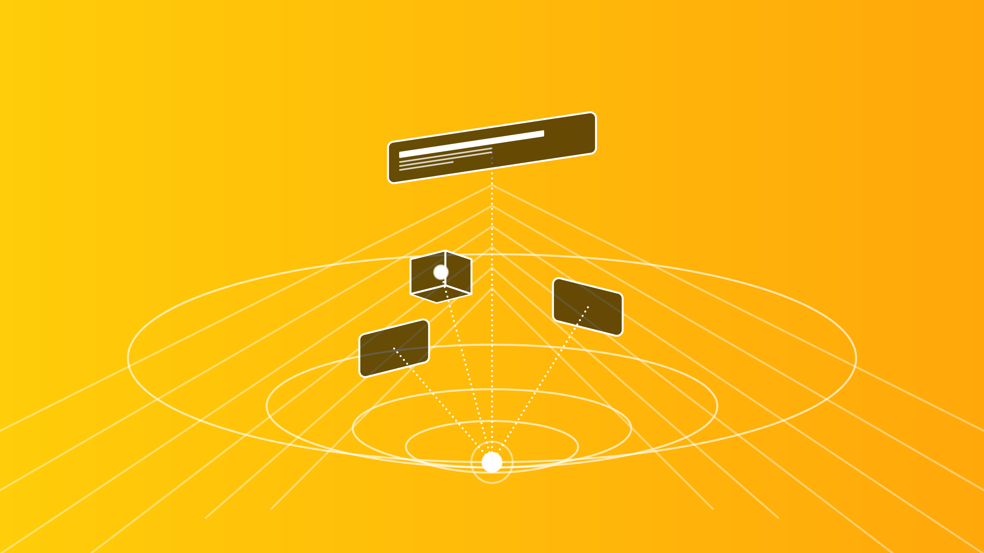
A persistent landmark placed within arm’s reach becomes clutter; the same widget placed at environmental distance becomes orientation. Spatial interfaces must be benchmarked, and PSF defines five evaluation states that describe how well a widget conforms to proxemic expectations.
These states are named for clarity as:
- Optimal
- Good
- Critical
- Warning
- Out of Bounds
These are not merely aesthetic judgments but classify ergonomic viability based on factors such as angular subtense, which determines the minimum font size needed for readability, and aiming accuracy, which considers Fitts-like motor envelope dynamics. Other factors include fatigue budget accounting for arm reach and posture, mnemonic persistence related to allocentric anchoring, temporal transitions that avoid arbitrary transforms, and proprioceptive plausibility, which assesses whether the required body motion is realistic.
visionOS implements dynamic scaling, but scaling alone does not guarantee conformance to proxemic expectations. PSF clarifies when scaling is appropriate and where content should be placed to provide an optimal ergonomic experience. The evaluation runs every frame during interaction, offering immediate responses as designers manipulate entities. When you drag a control panel from 60cm (optimal) to 2.8m (warning), the overlay colour shifts gradually, visualising the degradation of ergonomic fitness. This immediate visual feedback converts abstract ergonomic principles into design constraints you can see and feel. The colour isn’t decorative, it’s a neuroergonomic signal encoded in the rendering pipeline.
Proxemic Scaling Framework (PSF) in action. Living-room reconstruction showing how spatial interfaces, physical objects, and proxemic regions form a Cognitive Tensegrity: a relational structure that enables persistent, ergonomic, and mnemonic interaction in domestic environments.
Cognitive Tensegrity: The Structural Model
Traditional interface design operates through compositional authority. The designer creates a fixed arrangement, a single, optimal layout, and delivers it uniformly to every user. The screen functions as an immutable frame, and the interface exists as a singular, non-negotiable viewpoint. This paradigm assumes that spatial organisation is something imposed by the designer and received by the user.
Spatial computing dissolves this assumption entirely.
In visionOS, an interface no longer exists as a singular, authoritative arrangement but as a plastic layout, a cognitive-spatial structure that continuously adapts to the user’s body, posture, proxemic preferences, and physical surroundings. The user transitions from passive recipient to active author of the interface composition. However, giving users total freedom to scatter interface elements creates chaos. Without structure, layouts degrade into spatial confetti, disconnected widgets that impose an immense cognitive load as the user struggles to remember where everything is. We need a way to maintain coherence without enforcing rigidity.
The solution lies in Cognitive Tensegrity.
Tensegrity, from the term tensional integrity, was first formalised by the architect Buckminster Fuller in the 1960s, building on the pioneering structural experiments of sculptor Kenneth Snelson (Fuller, 1975; Snelson, 1965). Fuller defined tensegrity as “islands of compression in an ocean of tension”, structures where rigid elements float within a network of continuous tension. The structure maintains form not through rigid connections but through the balanced distribution of forces (Klee, 1992).
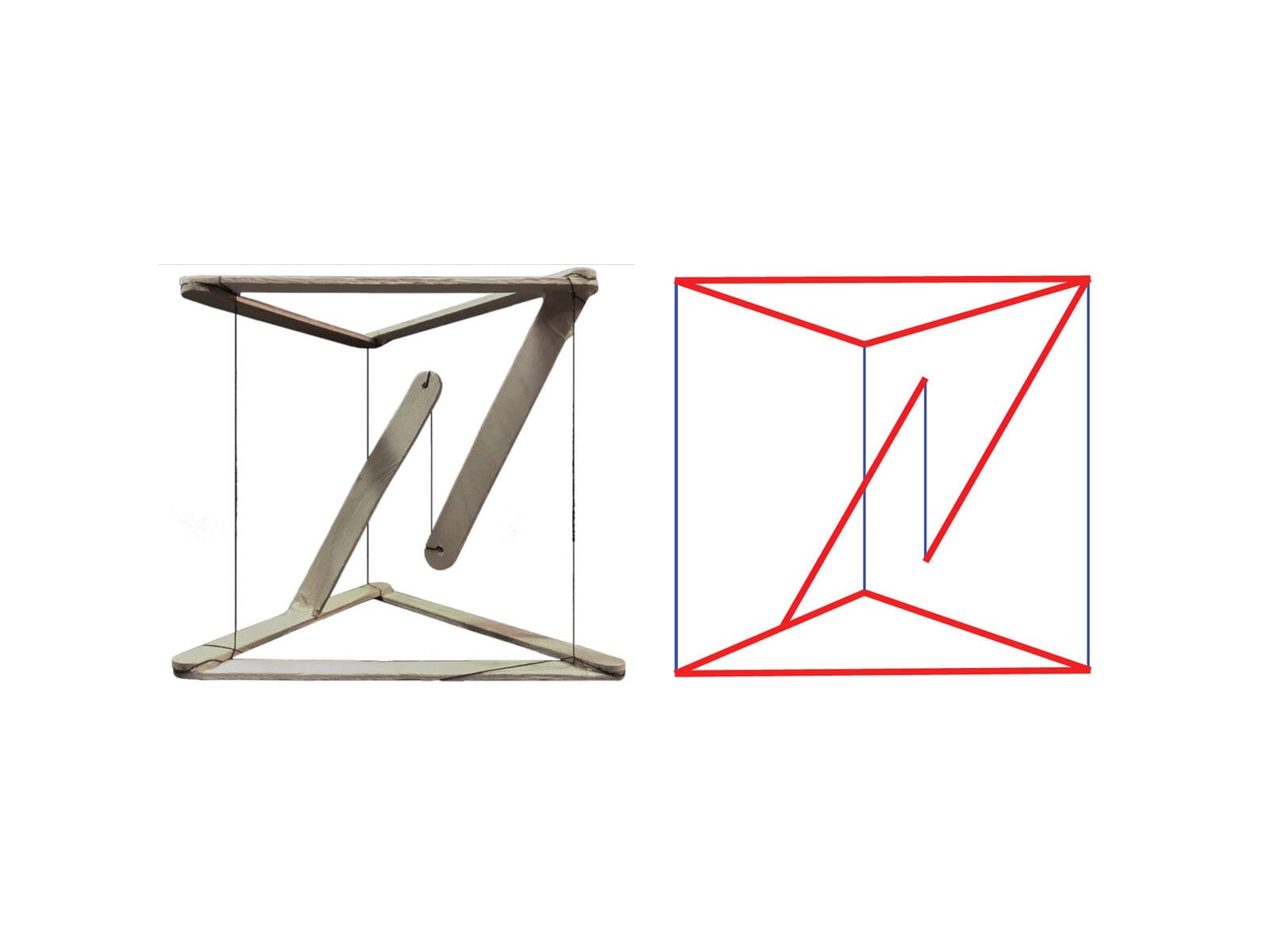
We adopt tensegrity as a cognitive-structural metaphor for spatial computing interfaces, not as a literal mechanical implementation, but as a pedagogical model for understanding how spatial layouts maintain coherence through relational forces rather than positional coordinates. In this model, elements are interface components, tension represents cognitive relationships, and stability means system coherence. The interface remains understandable, navigable, and predictable even as users reshape it.
Three Types of Cognitive Tension
How do we define these invisible forces? The framework identifies three distinct types of cognitive glue, each corresponding to a different level of functional dependency and memory encoding.
1. Strong Tension: The Functional Bond (≤15cm)
This represents a hard functional dependency where elements are cognitively inseparable. A data visualisation and its legend exemplify this. The legend explains the colour coding and symbols in the chart; understanding one requires immediate access to the other.
- The Constraint: These elements must maintain a separation of 15 centimetres or less.
- The Cognitive Basis: This threshold is dictated by working memory limitations (Miller, 1956; Baddeley, 2000). When two items are within the same attentional envelope (approx. 15cm at arm’s length), the brain processes them as a single functional unit or chunk. If they are separated further, the eye must saccade between them, forcing the brain to hold one in working memory while acquiring the other. This split-attention effect creates micro-interruptions that degrade cognitive performance.
- The Behaviour: If the user moves the primary object (the chart), the strongly bound element (the legend) must follow immediately. The relationship is rigid; they move as a compound body.
- Clear example: Ornaments.
“In visionOS, a tab bar is always vertical, floating in a position that’s fixed relative to the window’s leading side. When people look at a tab bar, it automatically expands; to open a specific tab, people look at the tab and tap.” From Human Interface Guidelines, Tab Bars
2. Medium Tension: The Contextual Orbit (30–60° Sector)
This represents contextual relations where elements support the primary task but do not require constant, millisecond-level interaction. A calendar widget near a project workspace provides temporal context; reference documentation floating near a code editor supports lookup.
- The Constraint: These elements do not need fixed coordinates. Instead, they must inhabit a specific angular sector (e.g., to the right, between 30 and 60 degrees) relative to the primary focus.
- The Cognitive Basis: This leverages allocentric memory’s sector-based encoding (Bicanski & Burgess, 2020). Users rarely remember exact xyz coordinates of secondary objects; they remember the calendar is over there, to the right. As long as the object remains in that sector, the spatial memory holds.
- The Behaviour: The connection is elastic. If the user rotates their body or the primary workspace, the contextual elements rotate with them to maintain the relative sector, but they can drift or breathe to avoid occluding the environment.
- Clear Example: FaceTime Spatial Personas.
With SharePlay in the Photos app, Apple Vision Pro users will be able to enjoy their favorite photos and videos with others using spatial Persona. From Newsroom visionOS 2 brings new spatial computing experiences to Apple Vision Pro
3. Weak Tension: The Ambient Field (Peripheral)
This represents environmental anchors, background music, visualisations, environmental sensors, and notification badges. These elements require only presence within the perceptual field, typically in the peripheral vision zones beyond 60 degrees from the centre.
- The Constraint: These elements must remain outside the foveal cone (the central 30 degrees) to prevent distraction.
- The Cognitive Basis: The magnocellular visual pathway rapidly processes peripheral motion and presence, but with low spatial resolution. It is excellent for alerting, noticing that something has changed, but poor for detail. Weak tension elements leverage this by providing ambient awareness without demanding attentional resources.
- The Behaviour: These elements are loosely coupled. They might not follow the user at all, or they might drift slowly to stay within the periphery. They function as spatial wallpaper, grounding the user in the environment without demanding interaction.
- Clear Example: Widgets in visionOS on a wall.
With visionOS 26, users can decorate their spaces with widgets, including stunning panoramas and spatial photos of their favorite memories. From visionOS 26 introduces powerful new spatial experiences for Apple Vision Pro
Table 2: Cognitive Tension Types
| Tension Type | Separation | Relationship | Follows Primary? | Memory Encoding | Example |
|---|---|---|---|---|---|
| Strong | ≤15cm | Functional dependency | Yes (elastic lag) | Working memory binding | Chart + legend |
| Medium | 30-60° sector | Contextual support | Sectoral only | Allocentric sectors | Workspace + calendar |
| Weak | Peripheral (>60°) | Ambient awareness | No | Environmental presence | Notifications |
Tension Type: Strong
Separation: ≤15cm
Relationship: Functional dependency
Follows Primary?: Yes (elastic lag)
Memory Encoding: Working memory binding
Example: Chart + legend
Tension Type: Medium
Separation: 30-60° sector
Relationship: Contextual support
Follows Primary?: Sectoral only
Memory Encoding: Allocentric sectors
Example: Workspace + calendar
Tension Type: Weak
Separation: Peripheral (>60°)
Relationship: Ambient awareness
Follows Primary?: No
Memory Encoding: Environmental presence
Example: Notifications
The tensegrity model describes relational structures, but what creates these tensions in the user’s mind? This force is cognitive glue, a three-dimensional mind model, the set of relational expectations that enable the nervous system to bind spatially distributed interface elements into coherent wholes. Cognitive glue operates through the brain’s predictive machinery (Clark, 2016; Friston, 2010). The nervous system continuously generates hypotheses about where functionally related information should be located. When users move an object, they expect the associated controls to move with it. When this prediction is confirmed, the interface feels solid and coherent. When it is violated, when a tool is left behind, or a legend drifts away from its chart, prediction error manifests as confusion (Where did it go?) and cognitive friction. The cognitive cost of violating these tensions is measurable. In educational VR research, De Witte et al. (2024) found that when functionally related elements failed to maintain expected relationships, cognitive load increased significantly. This elevation in extraneous load correlated with reduced self-efficacy.
This confirms that cognitive glue isn’t just a metaphor; it represents real neural work. When we design solid tensegrity structures, we are literally saving the user’s metabolic energy.
Plastic Layouts: From Canonical Composition to Spatial Co-Authorship
Once we understand interface structure as a set of tensions rather than fixed positions, we unlock a new paradigm: the Plastic Layout. In traditional UI, the layout is brittle. If you change the screen size, the layout breaks or must be completely re-flowed by the system. In spatial computing, layouts are fluid. Because the constraints are relational (tensions), the interface can deform, stretch, and adapt to the user’s environment without losing its meaning. This acknowledges a fundamental truth of spatial computing: users don’t simply consume interfaces; they inhabit them. And inhabitants inevitably reshape their environments. A user might pull a video player closer (Z1) to watch a detail, then push it to the wall (Z5) to watch passively while cooking.
A plastic layout handles this transition gracefully:
- When close (Z1), the controls are strongly bound (visible, reachable).
- When far (Z5), the controls might fade or detach to a remote, but the relationship remains (the remote controls that specific screen).
This is layout-as-negotiation. The designer proposes a default arrangement (a hypothesis), but the user optimises it for their body and room. The system’s job is to ensure that no matter how the user stretches the elastic, the cognitive tensions don’t snap.
A spatial grammar is a hypothesis: “If I arrange things this way, the user will understand.” Like any hypothesis, it must be tested. But how do we validate a grammar that changes shape?
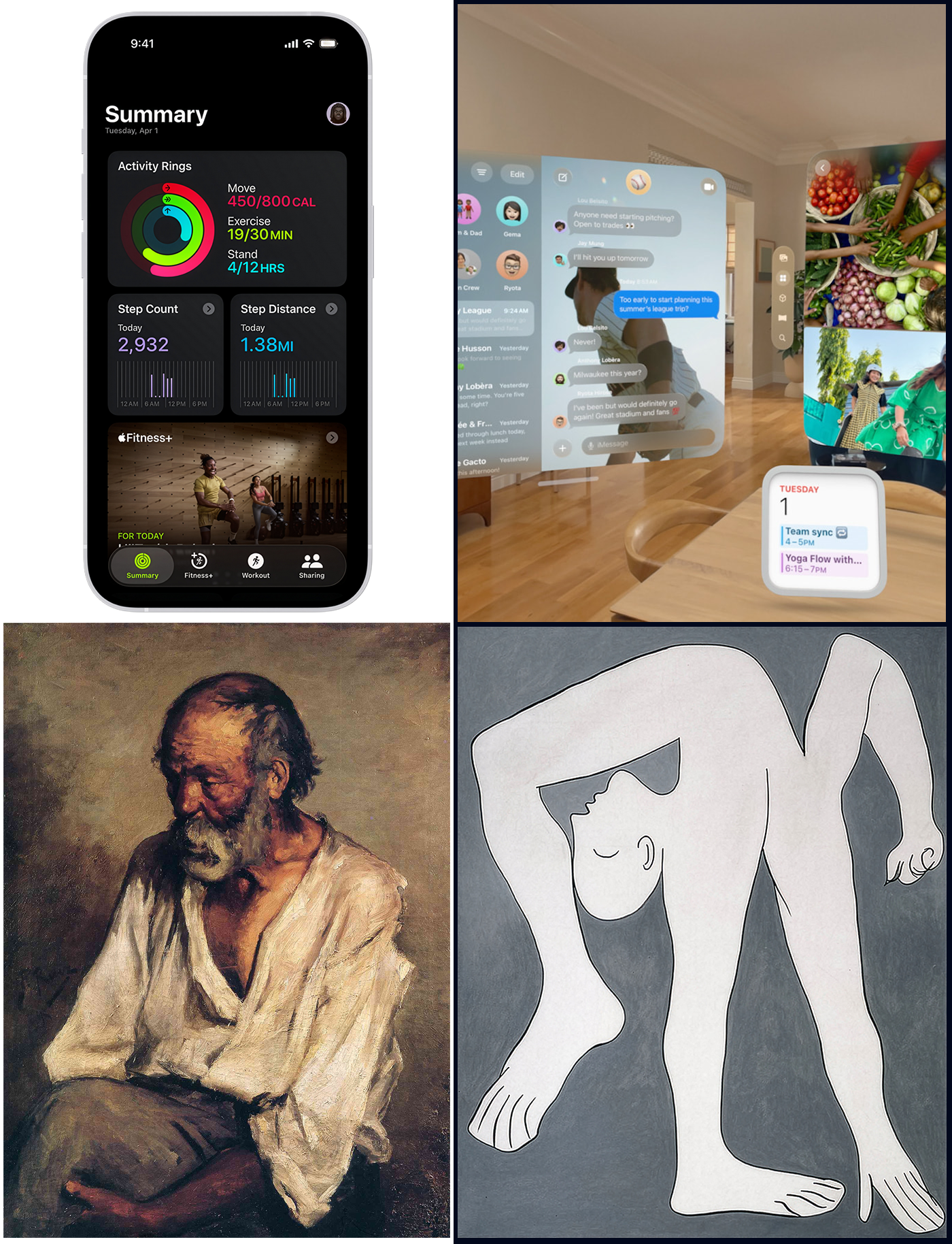
In the following picture, on the left, Pablo Picasso, The Old Fisherman (1895). On the right, still Pablo Picasso, The Acrobat (1930). Picasso’s anatomies embody plasticity: parts can shift, stretch, and relocate without losing identity. Structure is preserved even as form adapts. Traditional iOS layouts resemble a rigid anatomy: fixed, closed to authorship, optimised for repetition, and largely indifferent to body, posture, and context. Their correctness can be verified by coordinates and pixels, because nothing truly moves.
In visionOS, there is no stable pixel to validate. Distance changes, scale adapts, posture interferes, and context reshapes perception. The interface behaves less like a mechanical body and more like a living one.
Not pixels.
Not layouts.
But relationships, coherence, and elastic cognition.
That is the shift from rigid anatomy to plastic anatomy and from layout validation to spatial grammar evaluation.
Designing for Neurodiversity and Cultural Diversity
The standard user does not exist. Human cognition is a spectrum, and spatial computing amplifies differences in how brains process sensory input. A screen is a small window; a spatial interface is a whole world. If that world is hostile to a user’s neurology, it is not just hard to use; it is uninhabitable.
Approximately 15-20% of the population is neurodivergent (including Autism, ADHD, Dyslexia, Dyspraxia - Nancy Doyle, 2020, British Medical Bulletin). Spatial interfaces interact directly with sensory processing, attention, and motor planning systems that function differently in these groups.
- Autism & Sensory Processing: Many Autistic users have heightened sensitivity to sensory input. A noisy spatial environment with floating particles, transparent layers, and constant motion can trigger sensory overload.
The Design Response: Structured Mode. A system setting that simplifies the grammar. It replaces organic/floating layouts with a rigid grid. It reduces visual transparency (opacity = 100%) to remove ambiguity. It disables decorative motion. It provides a “Quiet Space” where the user can retreat. - ADHD & Attention Regulation: ADHD often involves difficulty filtering out irrelevant stimuli (distractibility) or, conversely, an intense ability to focus on high-interest stimuli (hyperfocus).
The Design Response: Focus vs. Scanning Modes.- Hyperfocus Mode: The system actively dims or hides all Weak Tension and Medium Tension elements. Only the Primary Workspace remains visible. The world shrinks to the task at hand.
- Scanning Mode: The system leverages the ADHD strength in parallel monitoring. It lays out information spatially (allocentrically) rather than hierarchically, allowing the user to graze information across the room without navigating deep menus.
- Dyspraxia & Motor Control: Dyspraxia affects fine motor coordination and spatial planning. Gestures that require high precision (e.g., pinching a 2mm target) or complex timing are exclusionary.
The Design Response: Motor Tolerance. The interface must separate visual size from interaction size. A button may look 2cm wide, but its hit target should be 5cm. We implement magnetic cursors that snap to targets and dwell interactions (look-to-select) as alternatives to gesture-based selection.
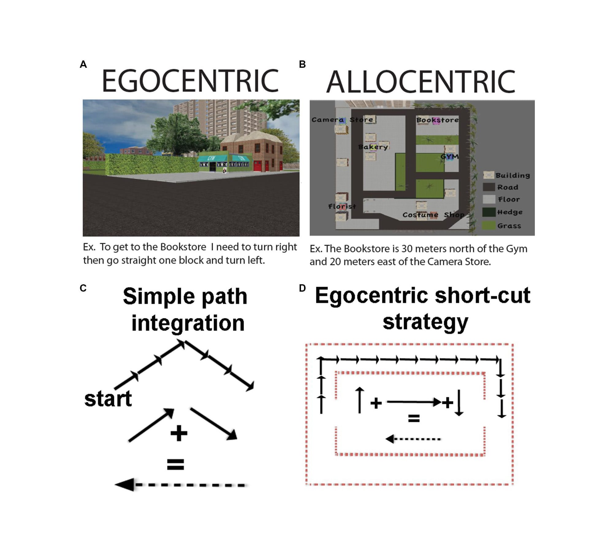
Cultural Diversity: the Reference Frame, Space is not universal; it is cultural.
- Egocentric vs. Allocentric Cultures: In Western cultures (and most UI), space is Egocentric (Relative to Me: Left, Right, Front). In some indigenous and non-Western cultures (e.g., Guugu Yimithirr in Australia, Tzeltal in Mexico), space is Allocentric (Absolute: North, South, Uphill). A user from an absolute-frame culture might find body-locked interfaces confusing because the interface moves when they move, violating their grounding in the fixed world (Levinson, 2003).
The Design Response: Allow users to pin interfaces to the world (Walls/Floor) rather than the body (HUD). - Proxemics: The Personal Zone (Z2) is not a biological constant; it is a cultural variable. Hall (1966) showed that comfortable conversational distance varies dramatically from close-contact cultures (Latin America, Southern Europe) to non-contact cultures (Northern Europe, Japan).
The Design Response: Configurable Proxemics. The grammar should not hard-code 60cm. It should include a Proxemic Scalar that allows the user to expand or contract the Z-zones to match their cultural comfort level.
Design is One: the new discipline of Cognitive Spatial Design
We stand at a threshold. Spatial computing is not just a new screen; it is the re-materialisation of digital life. We are bringing software back from the abstraction of the command line and the desktop metaphor into the physical world of distance, depth, and body.
This transition asks more of us than any previous paradigm shift. When we design for a screen, we compete for attention. When we design for space, we inhabit the user’s reality. We place objects in their homes; we intercept the photons reaching their retinas; we ask their motor cortex to predict physics that we wrote in code.
The frameworks presented here, The Seven-Zone Architecture, The Proxemic Scaling Framework, and Cognitive Tensegrity, are not rules for making things look cool. They are safety rails for this new reality. They are built on the recognition that the human brain has limits on working memory, proprioception, and prediction. If we ignore these limits, if we prioritise visual spectacle over cognitive coherence, if we scatter widgets like confetti without tensegrity, if we force bodies into unnatural postures, we will build a Spatial Web that is exhausting, confusing, and alienating. We will create the cognitive friction we warned against: a world where nothing feels real, and everything feels like work.
But if we respect these limits, if we build Grammars instead of patterns, if we design for Solidity, if we honour the Neurodiversity of the human mind, we can create something extraordinary. We can create environments that extend our cognition rather than taxing it. We can build workspaces that feel like workshops, libraries that feel like cathedrals, and tools that feel like extensions of our own hands. Spatial computing invites design to return to its original, pre-disciplinary unity. For decades, we have fragmented the field into graphic, interface, product, architectural, interaction, and HCI domains, each defending its vocabulary, methods, and territory. But space dissolves these borders.
- A widget becomes architecture;
- Typography becomes signage;
- Workflow becomes choreography;
- Ergonomics becomes cognition;
- Layout becomes memory.
The medium resists our taxonomies and reveals the discipline’s underlying continuity. Massimo Vignelli famously asserted that “Design is One,” not to erase difference but to remind us that the true substrate of design is relational thinking. Media change; methods diversify; technologies drift. But proportion, structure, hierarchy, geometry, and human factors remain constant because cognition is constant.
Spatial interfaces will succeed only when they are designed not as software artefacts but as cognitive environments, places that users inhabit, remember, and adapt. In this sense, Vignelli’s maxim is not a slogan from the past but a preview of the future: Design is One because cognition is one.
The technology will change. The divies you wear today will be a museum piece in five years. But the Cognitive Space is the way your hippocampus maps a room, the way your hand reaches for a tool, the way your brain seeks patterns in chaos that will remain. That is the true platform.
We are designing environments to be inhabited, not screens to be observed.
Share your feedback to help us improve it.
References
- Baddeley, A. D. (2000). The episodic buffer: A new component of working memory? Trends in Cognitive Sciences, 4(11), 417-423. https://pubmed.ncbi.nlm.nih.gov/11058819/
- Bicanski, A., & Burgess, N. (2020). Neuronal vector coding in spatial cognition. Nature Reviews Neuroscience, 21(8), 453-470. https://www.nature.com/articles/s41583-020-0336-9
- Clark, A. (2016). Surfing uncertainty: Prediction, action, and the embodied mind. Oxford University Press. https://academic.oup.com/book/7843
- Cronin, I., & Scoble, R. (2025). The Infinite Retina: Navigate Spatial Computing, Augmented and Mixed Reality, and the next tech revolution (2nd ed.). Packt Publishing. https://www.amazon.com/Infinite-Retina-Computing-Augmented-revolution/dp/1836204833
- De Witte, N. A. J., et al. (2024). Cognitive load and cybersickness in VR: An empirical study on procedural learning.
https://www.researchgate.net/publication/397672471_Immersive_Virtual_Reality_Learning_and_Cognitive_Load_A_multiple-Day_Field_Study - Felten, D. L., O'Banion, M. K., & Maida, M. S. (2022). Netter's Atlas of Neuroscience (4th ed.). Elsevier Health Sciences. https://www.us.elsevierhealth.com/netters-atlas-of-neuroscience-9780323756549.html
- Friston, K. (2010). The free-energy principle: A unified brain theory? Nature Reviews Neuroscience, 11(2), 127-138. https://www.nature.com/articles/nrn2787
- Fuller, R. B. (1975). Synergetics: Explorations in the geometry of thinking. Macmillan. https://archive.org/details/buckminster-fuller-synergetics-explorations-in-the-geometry-of-thinking
- Gibson, J. J. (1979). The ecological approach to visual perception. Houghton Mifflin. https://www.taylorfrancis.com/books/mono/10.4324/9781315740218/ecological-approach-visual-perception-james-gibson
- Hall, E. T. (1966). The hidden dimension. Doubleday. https://archive.org/details/hiddendimensionhall00hall
- Klee, P. (1992). Teoria della forma e della figurazione [Theory of form and figuration] (J. Spiller, Ed.). Feltrinelli. (Original work published 1956). https://epdf.pub/teoria-della-forma-e-della-figurazione.html
- Levinson, S. C. (2003). Space in language and cognition: Explorations in cognitive diversity. Cambridge University Press. https://www.cambridge.org/core/books/space-in-language-and-cognition/D07AD2885A025E00B1C94ED722071D80
- Miller, G. A. (1956). The magical number seven, plus or minus two: Some limits on our capacity for processing information. Psychological Review, 63(2), 81-97. https://pubmed.ncbi.nlm.nih.gov/13310704/
- O'Keefe, J., & Nadel, L. (1978). The hippocampus as a cognitive map. Oxford University Press. https://repository.arizona.edu/handle/10150/620894
- Snelson, K. (1965). Continuous tension, discontinuous compression structures. U.S. Patent 3,169,611. https://patents.google.com/patent/US3169611A/en