Text Effects using TextRenderer in SwiftUI
Explore the TextRenderer protocol and learn how to make text effects in a SwiftUI app.

When you find yourself limited by the built-in SwiftUI Text modifiers and want to create more dynamic, animated, or custom-rendered text, you’ll be happy to know that Apple introduced a powerful new API in iOS 18 and aligned releases: TextRenderer.
With TextRenderer, we can take complete control over how text is drawn, enabling effects ranging from subtle highlights to full character animations.
At its core, TextRenderer is a protocol with a single required method:
protocol TextRenderer {
    func draw(layout: Text.Layout, in context: inout GraphicsContext)
}
The method gives you two powerful objects: Text.Layout and GraphicsContext.
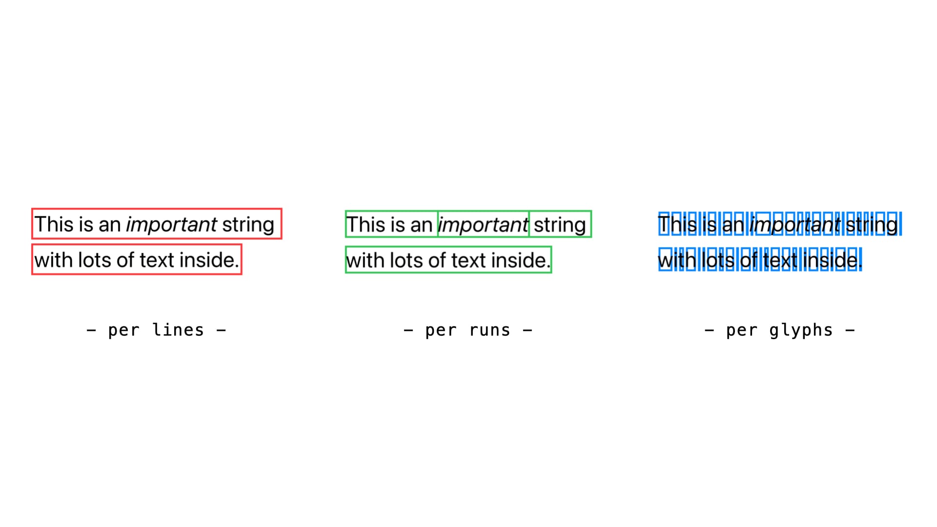
Text.Layout is a structured representation of text, organized as:
Text.Layoutis a collection of lines;Lineis a collection of runs (stylistic groups, e.g. bold or italic);Runis a collection of runSlices (the smallest unit, typically individual glyphs).
GraphicsContext instead, is the same drawing context you’d use in a Canvas, where you can apply transforms, filters, and effects.
This means you can step into rendering and modify text at any level of detail: per line, per run, or per glyph.
Basics of TextRenderer
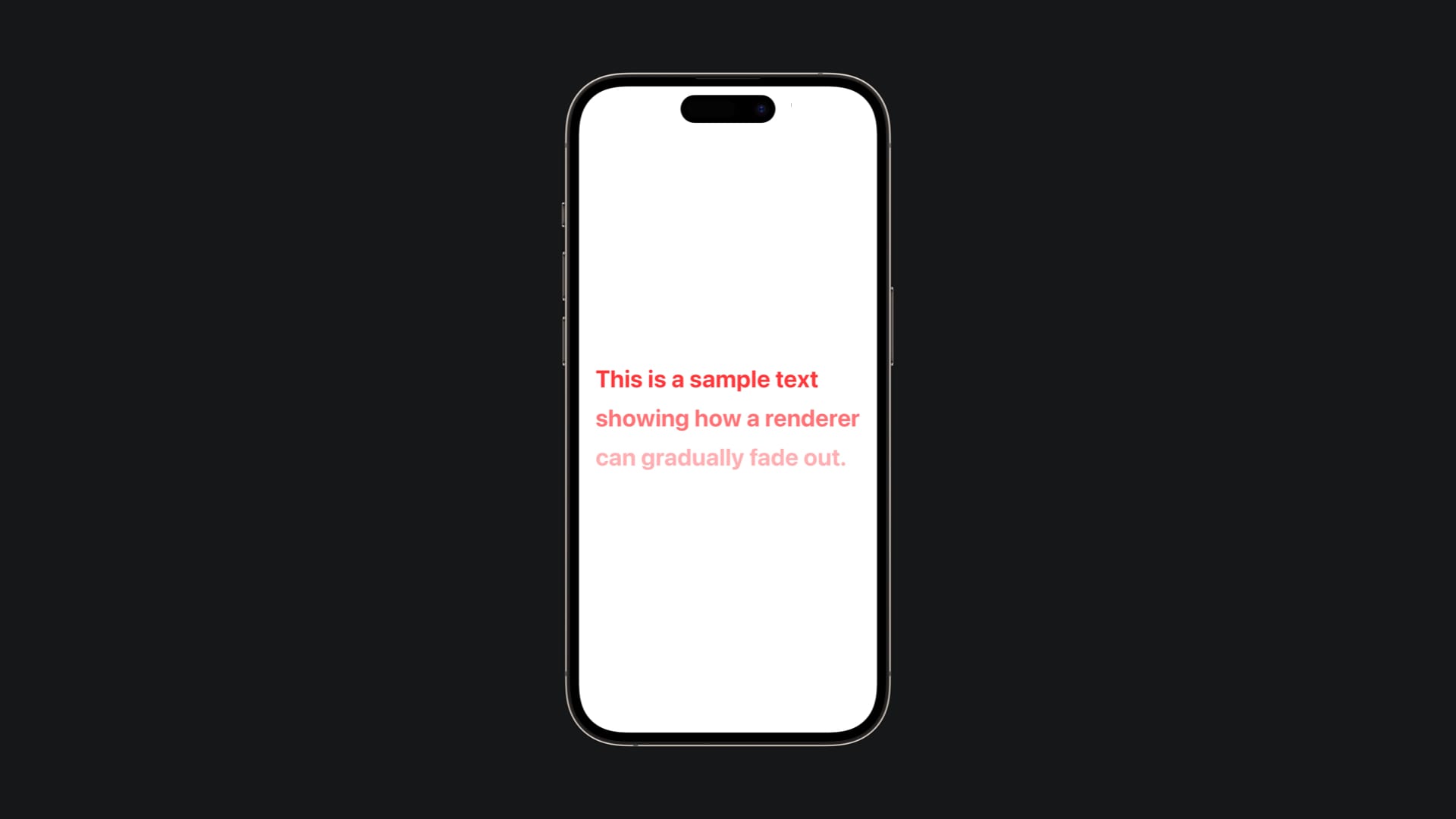
Let’s start small. Here’s a minimal renderer that makes a text gradually fading out as you go down through its lines.
Let's go through it.
import SwiftUI

struct FadingRenderer: TextRenderer {
    func draw(layout: Text.Layout, in context: inout GraphicsContext) {
        // Enumerate gives us both the line and its position (0, 1, 2...)
        for (index, line) in layout.enumerated() {
            // Decrease opacity as lines go down: first line = 1.0, second = 0.7, third = 0.4, minimum = 0.3
            let alpha = max(1.0 - Double(index) * 0.3, 0.3)

            // Apply the opacity to the drawing context
            context.opacity = alpha

            // Draw this line with the current opacity setting
            context.draw(line)
        }
    }
}

struct FadingView: View {
    var body: some View {
        Text("This is a sample text\nshowing how a renderer\ncan gradually fade out.")
            .font(.largeTitle)
            .fontWeight(.bold)
            .foregroundStyle(.red)
            .lineSpacing(15)
            .textRenderer(FadingRenderer()) // Apply our custom renderer
            .padding()
    }
}
This example shows the essence of TextRenderer: loop through the layout, tweak the context, and draw.
The key insight here is that context acts like a graphics state machine. When we set context.opacity = alpha, that opacity persists for all subsequent drawing operations until we change it again. This is why each line gets progressively more transparent as we move down, we're literally reducing the drawing context's opacity with each iteration.
Notice the use of max() to ensure the opacity never goes below 0.3, keeping even the bottom lines readable. The formula 1.0 - Double(index) * 0.3 creates a linear fade: the first line (index 0) stays at full opacity, the second drops to 0.7, and so on.
The beauty of this approach is its simplicity: we're not modifying the text data itself, just how it's rendered. Each line maintains its original styling (font, color, weight) while gaining this fade effect on top.
Animating with TextRenderer
The real fun starts when you add animation. To do this, your renderer must conform to Animatable and provide an animatableData.
Per-line animations
Here’s a pulse effect, where each line pulse and scale through animation renderer.
Let's give a look to the implementation:
import SwiftUI

struct PulseRenderer: TextRenderer, Animatable {
    var scale: Double

    // This is the bridge between SwiftUI animations and our renderer
    var animatableData: Double {
        get { scale }
        set { scale = newValue }
    }

    func draw(layout: Text.Layout, in context: inout GraphicsContext) {
        for line in layout {
            // Create a copy to avoid affecting other lines
            var copy = context

            // Calculate the center point for proper scaling
            let bounds = line.typographicBounds
            let centerX = bounds.width / 2
            // Negative because SwiftUI's coordinate system has Y increasing downward
            let centerY = -(bounds.ascent - bounds.descent) / 2

           // Transform sequence: translate to origin, scale, translate back
            copy.translateBy(x: centerX, y: centerY)    // Move to center
            copy.scaleBy(x: scale, y: scale)            // Apply scaling
            copy.translateBy(x: -centerX, y: -centerY)  // Move back

            copy.draw(line)
        }
    }
}

struct PulseView: View {
    @State private var scale = 1.0

    var body: some View {
        Text("Pulsing animation!")
            .font(.largeTitle)
            .multilineTextAlignment(.center)
            .textRenderer(PulseRenderer(scale: scale))
            .onAppear {
                withAnimation(.easeInOut(duration: 1).repeatForever(autoreverses: true)) {
                    scale = 1.3  // SwiftUI will interpolate from 1.0 to 1.3
                }
            }
            .padding()
    }
}
The magic here lies in the Animatable protocol and animatableData. When SwiftUI animates a value, it doesn't just jump from start to finish, it creates dozens of intermediate frames. Without Animatable, SwiftUI would only call our renderer at the beginning and end of the animation, creating a jump effect.
By conforming to Animatable and exposing our scale property through animatableData, we're telling SwiftUI: "This renderer can be animated, and here's the property you should interpolate." SwiftUI then creates multiple instances of our renderer with incrementally different scale values (1.0, 1.05, 1.1, 1.15... up to 1.3), calling draw for each frame.
The transformation sequence in the drawing code is crucial for proper scaling. Graphics contexts scale around the origin (0,0), so we first translate each line to center it at the origin, apply the scale, then translate back. Without this centering, text would scale from its top-left corner, creating an awkward effect.
Notice how we create a copy of the context for each line, this ensures that transformations applied to one line don't affect subsequent lines. Each line scales independently while maintaining its original position in the layout.
Per-line animation like this works best when you want uniform, coordinated effects across your text. All lines pulse together, creating a cohesive visual rhythm that's easy to follow and doesn't overwhelm the reader.
If you would like the animation of your text to have a more chaotic effect, you may choose to animate your text per-glyph, and not per-line.
Per-glyph animations
Let's implement a bounce effect, where each glyph bounces independently from others.
import SwiftUI

// Custom attribute to mark which text should bounce
struct BounceAttribute: TextAttribute { }

struct BounceRenderer: TextRenderer {
    var offsetAmount: Double

    // Make the offset animatable so SwiftUI can interpolate between values
    var animatableData: Double {
        get { offsetAmount }
        set { offsetAmount = newValue }
    }

    func draw(layout: Text.Layout, in context: inout GraphicsContext) {
        for line in layout {
            for run in line {
                // Check each glyph individually for maximum control
                for (i, glyph) in run.enumerated() {
                    // Only apply bounce effect to glyphs marked with BounceAttribute
                    if run[BounceAttribute.self] != nil {
                       // Create alternating up/down pattern: even indices go up, odd go down
                        let direction = i.isMultiple(of: 2) ? 1.0 : -1.0
                        let yOffset = direction * offsetAmount

                        // Create isolated context for this glyph
                        var copy = context
                        copy.translateBy(x: 0, y: yOffset)

                        copy.draw(glyph)
                    } else {
                        // Draw unmarked glyphs normally without any transformation
                        context.draw(glyph)
                    }
                }
            }
        }
    }
}

struct BounceView: View {
    @State private var offset = 0.0

    var body: some View {
        VStack {
            Text("This text is ***bouncing***!")
                .customAttribute(BounceAttribute()) // Mark the entire text for bouncing
                .font(.system(size: 60))
                .textRenderer(BounceRenderer(offsetAmount: offset))
                .multilineTextAlignment(.center)
        }
        .padding()
        .onAppear {
            withAnimation(.easeInOut(duration: 0.8).repeatForever(autoreverses: true)) {
                offset = 10 // Animate from 0 to 10 pixels of offset
            }
        }
    }
}
This example introduces TextAttribute, a powerful system for selectively applying effects to specific parts of your text. Think of BounceAttribute as an invisible tag that we attach to text ranges. The renderer then checks each run (stylistic group) for this attribute using run[BounceAttribute.self], if found, the bounce effect applies; if not, the text renders normally.
The glyph-level iteration for (i, glyph) in run.enumerated() gives us individual character control. The alternating pattern i.isMultiple(of: 2) ? 1.0 : -1.0 creates an effect where even-positioned glyphs (0, 2, 4...) bounce upward while odd-positioned ones (1, 3, 5...) bounce downward. When animated, this creates a mesmerizing ripple effect across the text.
Notice how we create a fresh context copy for each glyph with var copy = context. This isolation is crucial, without it, transformations would accumulate, causing later glyphs to be displaced by the sum of all previous transformations.
The .customAttribute(BounceAttribute()) call in the view marks the entire text string for bouncing. You could also apply this attribute to specific ranges, like just a single word, creating mixed effects within the same text.
Per-glyph animation excels at creating dynamic, attention-grabbing effects that feel alive and playful. However, use it judiciously; while visually striking, it can become distracting if overused. It works best for emphasis (highlighting keywords), onboarding sequences where you want to draw attention, or playful interfaces where the animation itself is part of the content's message. The individual character control also makes it perfect for creating typewriter effects, text reveals, or any scenario where you want characters to behave independently rather than as a unified block.
Now that this Text bounces, what if you want to add a further condition that aims to modify the Text's effect?
Let's see how to blur the text while it's animating.
import SwiftUI

struct BounceAttribute: TextAttribute { }

struct BounceRenderer: TextRenderer {
    var offsetAmount: Double
    var shouldBlur: Bool = false // Additional control parameter for blur effect

    var animatableData: Double {
        get { offsetAmount }
        set { offsetAmount = newValue }
    }

    func draw(layout: Text.Layout, in context: inout GraphicsContext) {
        for line in layout {
            for run in line {
                for (i, glyph) in run.enumerated() {
                    if run[BounceAttribute.self] != nil {
                        // Create the bouncing offset pattern
                        let direction = i.isMultiple(of: 2) ? 1.0 : -1.0
                        let yOffset = direction * offsetAmount

                        var copy = context
                        copy.translateBy(x: 0, y: yOffset)

                        // Apply blur that scales with the bounce intensity
                        if shouldBlur {
                            copy.addFilter(.blur(radius: offsetAmount / 3))
                        }

                        copy.draw(glyph)
                    } else {
                        context.draw(glyph)
                    }
                }
            }
        }
    }
}

struct BounceView: View {
    @State private var blur = false
    @State private var offset = 0.0

    var body: some View {
        VStack {
            Text("This text is ***bouncing***!")
                .customAttribute(BounceAttribute())
                .font(.system(size: 60))
                .textRenderer(BounceRenderer(offsetAmount: offset, shouldBlur: blur))
                .multilineTextAlignment(.center)

            Toggle("Add Blur", isOn: $blur)
                .padding(.top)
        }
        .padding()
        .onAppear {
            withAnimation(.easeInOut(duration: 0.8).repeatForever(autoreverses: true)) {
                offset = 10
            }
        }
    }
}
As you might have seen it's pretty straightforward, it's enough to add a conditional filter application using copy.addFilter(.blur(radius:)) within the existing glyph rendering loop. The clever part is using offsetAmount / 3 as the blur radius. This creates a dynamic blur that intensifies as the text bounces higher, simulating motion blur naturally.
The GraphicsContext.addFilter() method applies effects to all subsequent drawing operations on that context copy. Since we're working with individual glyph contexts, each character gets its own blur effect that corresponds to its current bounce position. When shouldBlur is false, the text bounces with edges; when true, the moving glyphs appear to blur through their motion, creating a more realistic animation effect.
This demonstrates the composability of TextRenderer effects, you can layer multiple visual modifications (transforms, filters, opacity changes) on the same context before drawing. The key insight is that GraphicsContext accumulates these effects, so the order matters: translate first, then apply filters, then draw.
Beyond Animation
Animations are just the start. With TextAttribute, you can mark ranges of text and apply custom effects only to them.
Let's say for example that you want to let just specific parts of your text floating over the others.
Here's how you may implement it.
import SwiftUI

struct FloatingAttribute: TextAttribute {}

struct FloatingRenderer: TextRenderer, Animatable {
    var offsetAmount: Double

    var animatableData: Double {
        get { offsetAmount }
        set { offsetAmount = newValue }
    }

    func draw(layout: Text.Layout, in context: inout GraphicsContext) {
        for line in layout {
            for run in line {
                // Check if this run has the FloatingAttribute marker
                if run[FloatingAttribute.self] != nil {
                    var copy = context
                    // Move the entire run (word/phrase) vertically as one unit
                    copy.translateBy(x: 0, y: offsetAmount)

                    copy.draw(run)  // Draw the complete run with its styling intact
                } else {
                    // Draw unmarked runs normally at their original position
                    context.draw(run)
                }
            }
        }
    }
}

struct FloatingView: View {
    @State private var offset = 0.0

    var body: some View {
        // Create a Text fragment with the floating attribute
        let special = Text("floating").customAttribute(FloatingAttribute())

        // Combine it with other text using string interpolation
        Text("This word is \(special) in the sentence.")
            .font(.title)
            .textRenderer(FloatingRenderer(offsetAmount: offset))
            .padding()
            .onAppear {
                withAnimation(.easeInOut(duration: 1).repeatForever(autoreverses: true)) {
                    offset = -10 // Negative value moves text upward
                }
            }
    }
}
This example showcases the power of run-level manipulation. A run represents a contiguous sequence of text that shares the same styling attributes, think of it as a "word" or "phrase" unit within a line. When you apply .customAttribute(FloatingAttribute()) to a Text fragment, that fragment becomes its own run, separate from the surrounding text.
The key insight is in the condition if run[FloatingAttribute.self] != nil, this checks whether the current run has been tagged with our custom attribute. Runs act like containers that carry both the text content and its associated metadata (font, color, custom attributes). By checking for our FloatingAttribute, we can selectively apply effects only to tagged portions.
Notice how we use copy.draw(run) instead of iterating through individual glyphs. This approach treats the entire run as a single unit, preserving word integrity and spacing. The run maintains its internal character relationships, font metrics, and kerning while moving as a cohesive block.
The Text composition in FloatingView demonstrates attribute inheritance. When you create let special = Text("floating").customAttribute(FloatingAttribute()), you're creating a Text fragment that carries this attribute. String interpolation \(special) then merges this attributed fragment with the surrounding text, but the attribute boundary remains intact, creating distinct runs.
This run-based approach is perfect for semantic emphasis, highlighting keywords, creating callout effects, or animating specific phrases while leaving the rest of the text stable. It strikes a balance between the broad strokes of line-level animation and the granular control of glyph-level manipulation, giving you word-level precision that feels natural to read.
This approach allows you to emphasize specific words, not just animate everything equally.
With these building blocks, you can create attention-grabbing transitions for onboarding, highlight keywords in educational or reading apps or even add playful or dramatic visual effects in games.
The key is combining:
TextRenderer-> custom drawing logic;Animatable-> time-based changes;TextAttribute-> selective emphasis;Transition-> integration into SwiftUI animations.
And that’s it! With SwiftUI’s new TextRenderer, you now have complete control over text rendering. Whether you want to subtly fade in lines, make glyphs bounce like waves, or highlight words with custom emphasis, the protocol gives you the power to transform plain text into rich, expressive visuals.
Your text no longer has to be static, it can come alive.