
Using Colors and Contrast Ratio to ensure Visual Accessibility
Ensure your app is visually appealing and accessible by picking a color scheme that accommodates color blindness and the right contrast ratio.


In recent years, there has been growing awareness of the importance of visual accessibility in app design. As more and more people use digital devices to access information and engage with the world, applications and services designed for these devices must be inclusive for everyone, regardless of their visual abilities.
The experience of vision loss is unique to each individual because different factors can cause it, such as eye diseases, genetic disorders, old age, and injuries. It is important to understand that vision loss is a spectrum where individuals may have total, partial, or low vision, while others may have no sight at all. Furthermore, conditions such as color blindness, light sensitivity, and motion sensitivity fall in the middle of this spectrum, and when designing apps is essential to consider those factors as well.
For Apple devices, there are several strategies that you can implement to guarantee visual accessibility. In this article, we will explore effective practices to ensure the readability and clarity of visual information, with a particular emphasis on accommodating color blindness.
Colors and contrast ratio
Color is an essential component of digital design and serves many purposes. With it, you can provide visual continuity, convey status information, and give feedback in response to user actions. Additionally, color can help people to visualize data and add personality to an app.
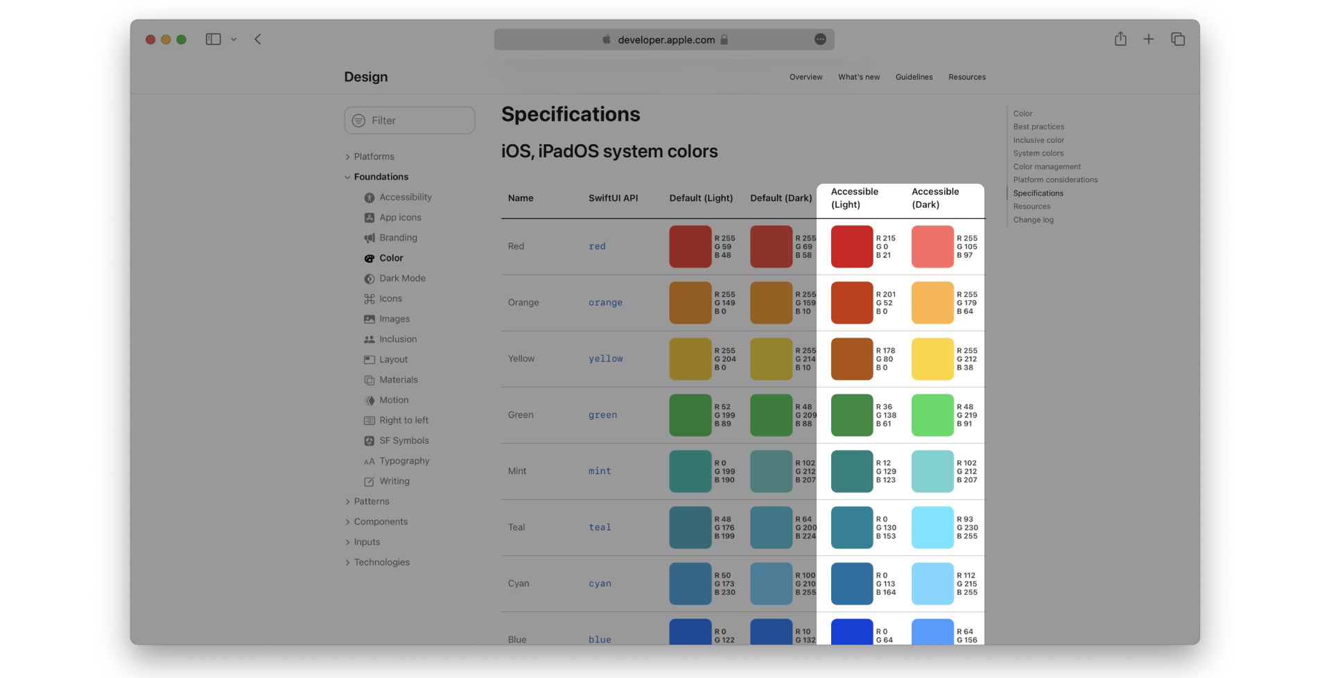
In the Apple ecosystem, developers have access to a range of system colors that automatically adapt to changes in accessibility settings, like Increase Contrast and Reduce Transparency.
These colors are carefully selected to meet accessibility guidelines and ensure they can be easily distinguished by users with visual impairments. Therefore, the Human Interface Guidelines advise on how to effectively incorporate them into an app and provide helpful recommendations on how to optimize their usage:
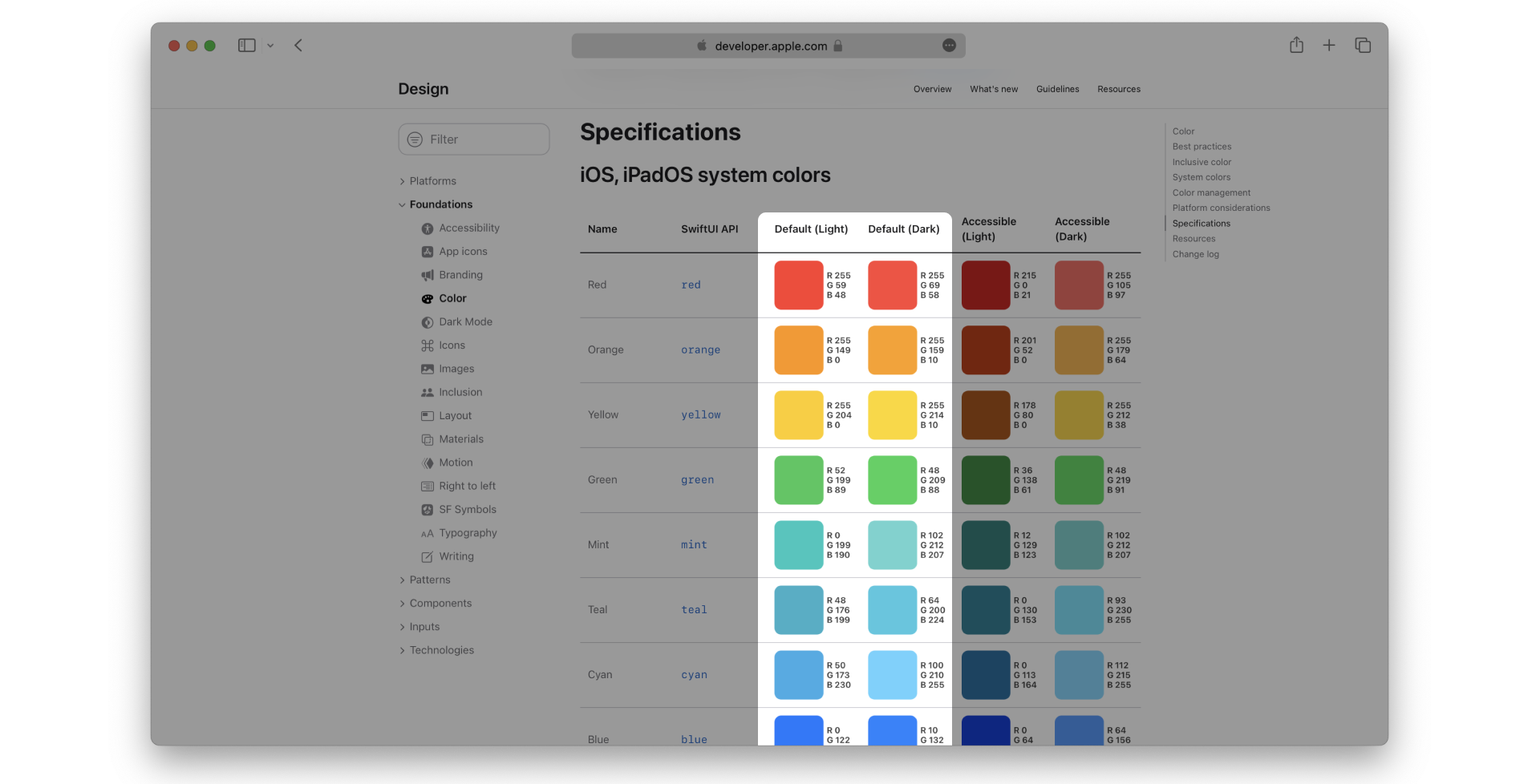
It's important to underline that color cannot be used arbitrarily because even if the development team likes a particular color combination or scheme, it could be ineffective or confusing for the users.
Because of that another critical concept when designing an app ensuring readability and accessibility is the Contrast Ratio.
Subscribe to become a free member or log in to proceed.
Why is the contrast ratio important?
Contrast ratio refers to the difference in brightness and color between foreground and background elements. To ensure that the color combination used is effective and legible for all users, thanks to Paul Arthur and Romedi Passini you can calculate the contrast difference between two colors using a formula based on Light Reflectance (LR) readings in percentages for each color involved.
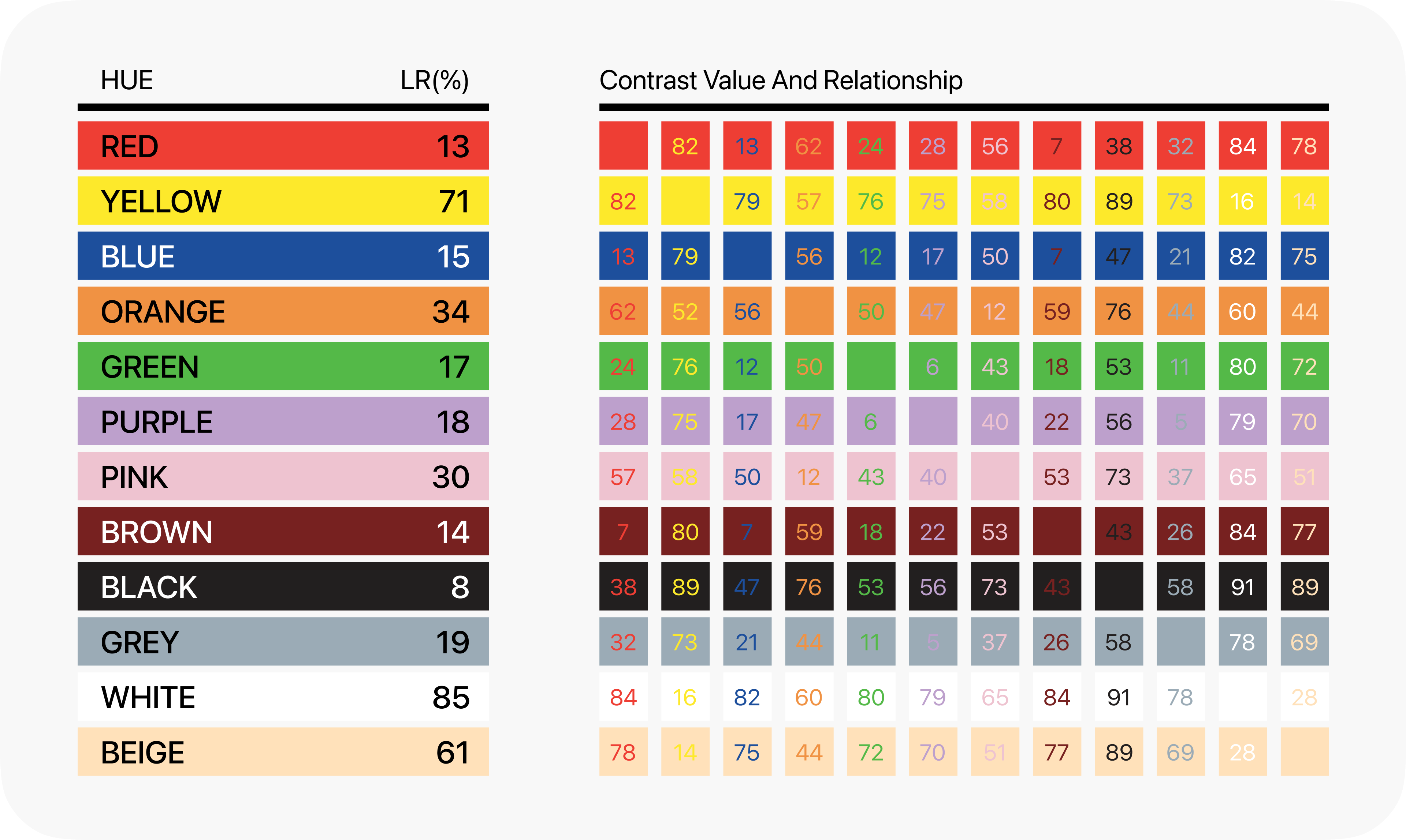
To calculate the brightness differential or contrast ratio, subtract the darkest color from the lightest, divide the difference by the lightest one, and multiply the result by 100:
A brightness differential of 70% (7.0:1) or higher ensures legibility, while less than 4.5:1 does not.
Based on the contrast ratio different categories describe the feeling when observing a certain combination of colors. A high contrast ratio ensures high visibility and perfect readability of information. On the other hand, a low contrast ratio may make the information difficult to read.
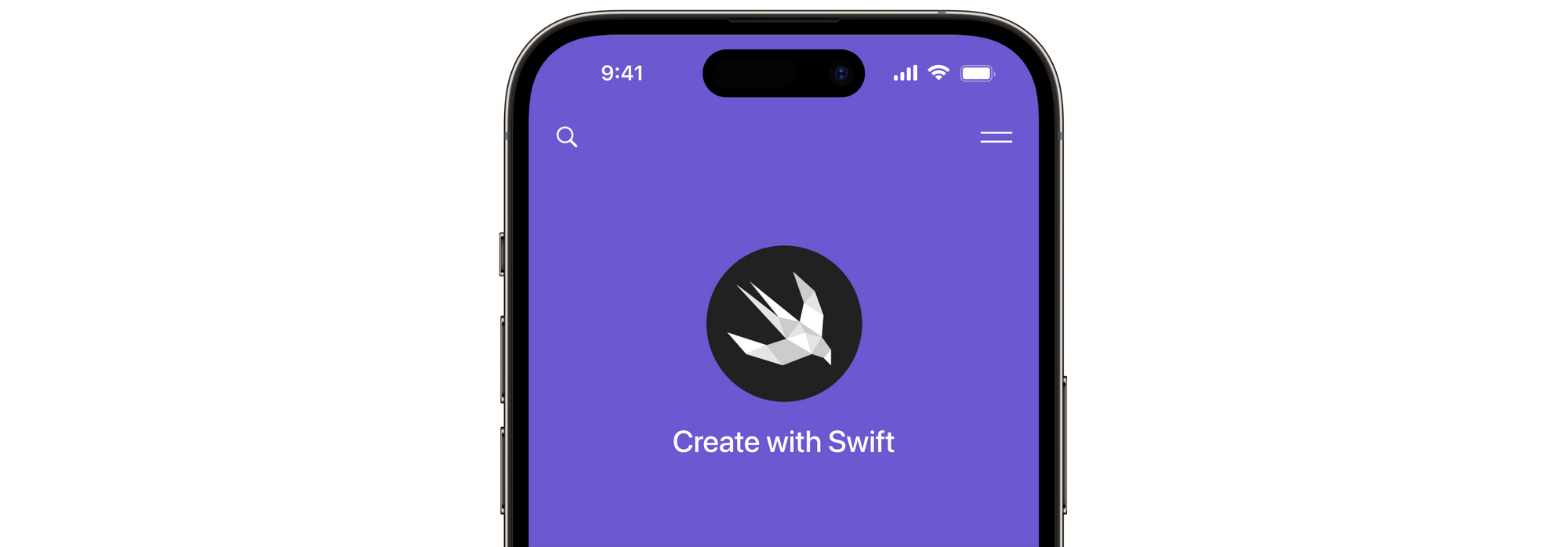
High Visibility
This state is characterized by high contrast between the background and foreground colors. The information is easily recognized, and users can quickly perceive it that's why it is crucial for users with low vision or color blindness.
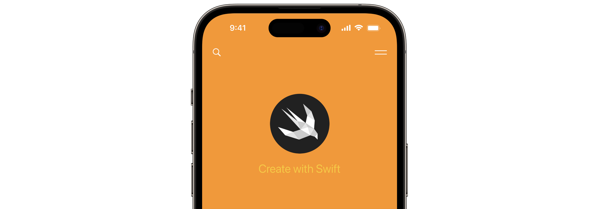
Contrast
The high contrast ratio in this state allows the information to be read perfectly.However, the contrast may not be as high as in the high visibility state but it still results suitable for users with low vision or color blindness. Still, it may not be as easy to perceive as in the high visibility state.
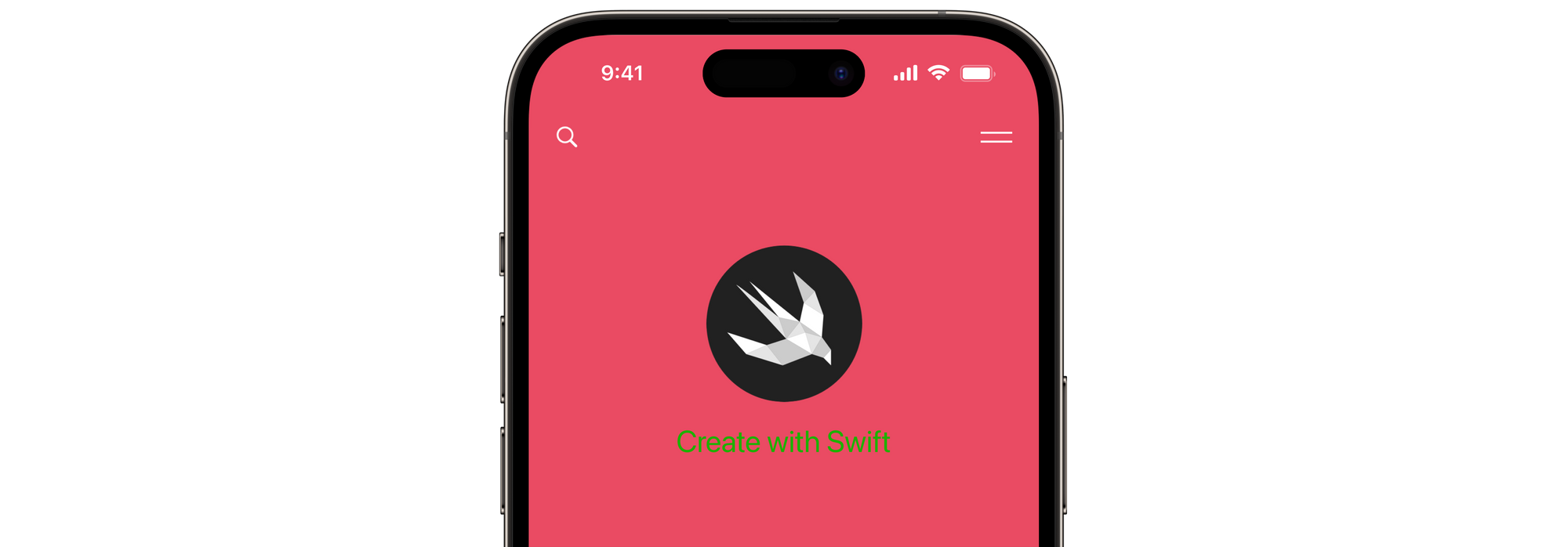
Low Visibility
This state is characterized by low contrast between the background and foreground colors. While the user can perceive the information, it may be difficult to read or distinguish that’s why this state is not suitable for users with low vision or color blindness, and designers should avoid using color combinations that result in low visibility.
Vibrate
In this state, the contrast between the background and foreground colors is so low that the user perceives elements that vibrate in relation to one another.This state can be particularly problematic for users with certain types of color blindness or visual impairments, as it can cause discomfort or confusion.
You can use a third-party color contrast checker tool to check the contrast ratio of your interfaces and ensure their compliance with accessibility guidelines. Alternatively, you can use the Accessibility Inspector, Xcode's built-in tool.
To learn more about the Accessibility Inspector and explore all the possibilities provided by this tool, read the article "Testing your app's accessibility with the Accessibility Inspector".
In conclusion, it's important to avoid using colors with similar hues or brightness levels next to each other, as this can make it difficult for people with color blindness to distinguish between them.
Thinking specifically about the Apple ecosystem, it is worth underlining that it offers a range of accessibility features that can help users with visual impairments to adjust the experience to suit their specific needs.
One such feature is the Increase Contrast setting, which enhances the visibility of elements on the screen by updating colors to high-contrast appearances. However, this requires developers to consider this while developing their apps. We discussed it in "Support Increase Contrast in your app to enhance Accessibility".
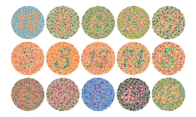
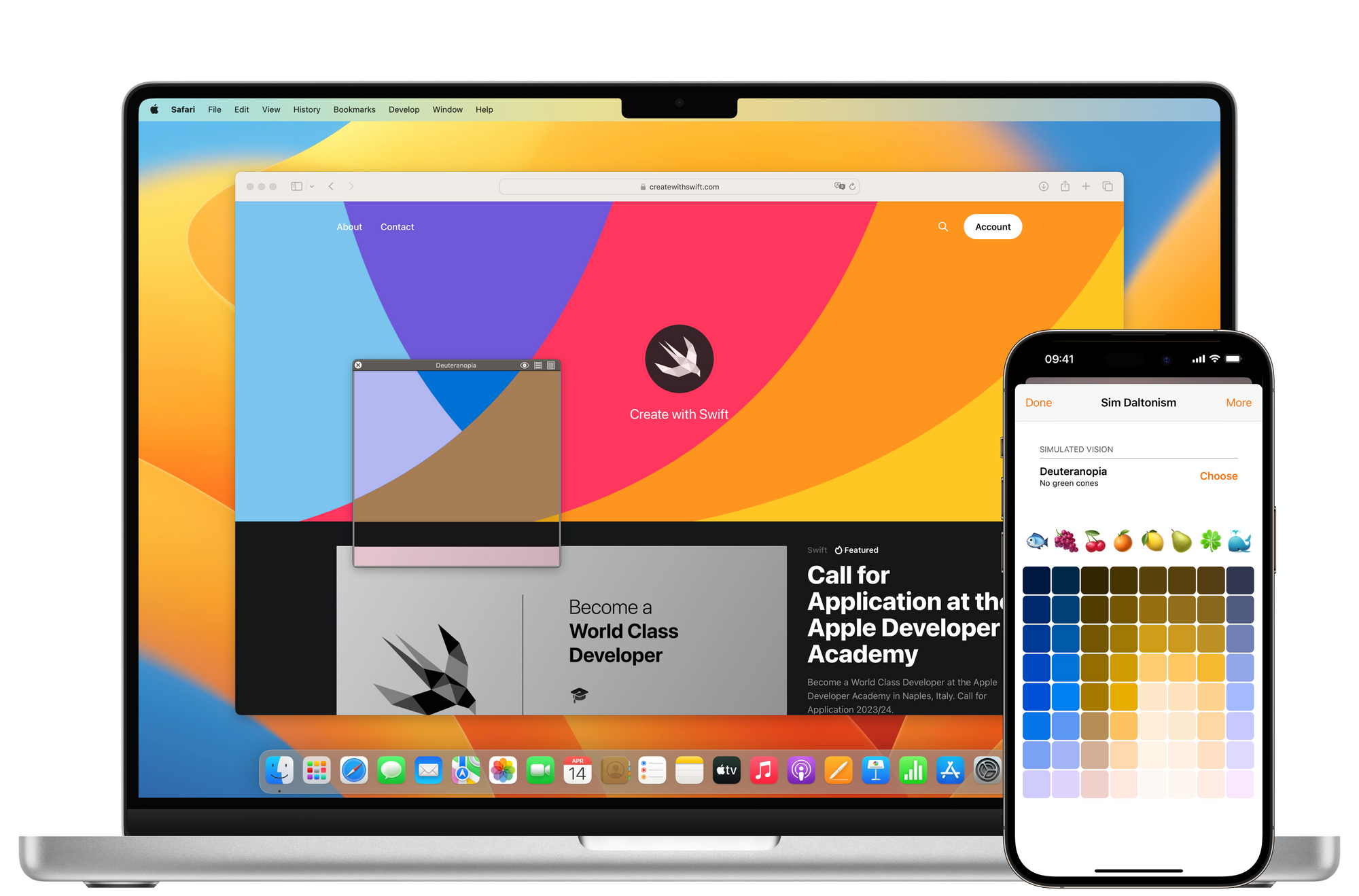
Color Blindness
Color blindness is a common genetic condition that impacts the perception and recognition of colors for millions of people worldwide.Some colors are impossible to distinguish for color-blind individuals, generating confusion and difficulty in using digital solutions that are not accessible. The most common types of color blindness are deuteranopia, which limits the perception of green (everything will appear more reddish), and tritanopia, which alters the perception of blue-yellow.
Luckily, in addition to the tools for checking contrast ratio, there are some to evaluate and view the screen from a color-blind person's point of view:
SimDaltonism.
By using this app, available in the App Store and App Store on Mac, you can ensure that their apps are accessible and readable by individuals with different types of color blindness.
While color can be a powerful tool for creating emphasis and conveying information, you can take advantage of other elements, symbols, and shapes, to take the accessibility of your interfaces to the next level.
Conclusions
Designing for users who have visual impairments is not only a matter of accessibility but also of empathy and inclusiveness. You must create apps with both the best practices for accessibility in mind as well as knowledge of the system's features, to create inclusive, accessible, and enjoyable products for everyone.