
Using Swift Charts on a SwiftUI app
Learn how to use the Swift Charts framework to present charts on a SwiftUI app.


Introduced at WWDC22, Swift Charts allows you to create rich charts in your SwiftUI application. With this framework, developers can represent data in different forms of visualization with just a few lines of code.
This tutorial will explore the Swift Charts framework to plot your data with the available chart views and how to customize them to represent data effectively.
We will begin by defining our data source and from there we will dive into the implementation process, step by step, guiding you through each stage of creating a chart based on your data.
By the end, you will be able to convert raw data into a clear and engaging manner making information easy to understand and interpret for users.
Before we start
To follow this tutorial you need a basic understanding of SwiftUI and be comfortable writing code using the Swift programming language.
Create a new SwiftUI app project on Xcode and follow the steps.
Step 1 - Define the data model
The first step in creating a chart is to identify the data that will be represented. In this case, we will use a model that stores the average weather for each month. This model will help us visualize the temperature variations throughout the year.
Let’s define a data structure that represents the average temperature for each month. Create a structure called AverageTemperature on a new Swift file.
import Foundation

// 2.
struct AverageTemperature: Identifiable {
    var id = UUID()
	// 3.
    var month: String
    var temperature: Double
}
AverageTemperature.swift
- Create a new file called
AverageTemperature.swift; - Create a new struct named
AverageTemperaturethat conforms to theIdentifiableprotocol; - Add the properties
monthandtemperatureas variables of the typeStringandDouble, respectively;
Step 2 - Create the data source
Once we have defined the AverageTemperature struct, we can create a ViewModel class to initialize an array to hold the temperature data.
import Foundation
import Observation

// 2.
@Observable
class ViewModel {
		// 3.
    var data: [AverageTemperature] = [
        AverageTemperature(month: "January", temperature: 10),
        AverageTemperature(month: "February", temperature: 12),
        AverageTemperature(month: "March", temperature: 14),
        AverageTemperature(month: "April", temperature: 16),
        AverageTemperature(month: "May", temperature: 18),
        AverageTemperature(month: "June", temperature: 21),
        AverageTemperature(month: "July", temperature: 24),
        AverageTemperature(month: "August", temperature: 25),
        AverageTemperature(month: "September", temperature: 24),
        AverageTemperature(month: "October", temperature: 21),
        AverageTemperature(month: "November", temperature: 15),
        AverageTemperature(month: "December", temperature: 11)
    ]
}
ViewModel.swift
- Create a new file called
ViewModel.swift; - Create an observable class named
ViewModel; - Create a new property called
dataas an array ofAvarageTemperatureand populate it;
Step 3 - Chart implementation
Now that we have created a data collection we need to define the type of chart with which we want to represent this data.
To do this, create a new SwiftUI view and import the Charts framework. In the view body, we will add the Chart view component, which will act as a container for the series of data we want to represent.
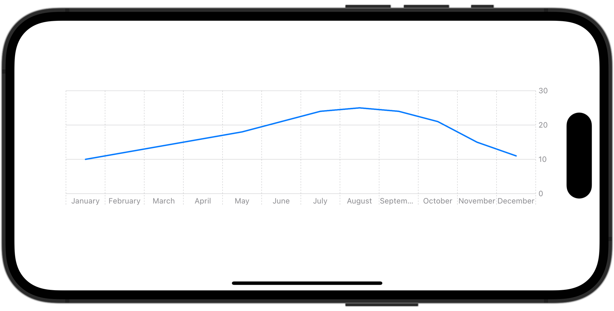
For this project, we will use a LineMark chart.
import SwiftUI
import Charts

struct ChartView: View {

    var dataCollection: ViewModel

    var body: some View {

        // 1.
        Chart(dataCollection.data) {
		    // 2.
            LineMark(
				// 3.
                x: .value("Month", $0.month),
                y: .value("Total", $0.temperature)
            )
        }
        .padding()
        .frame(height: 200)
    }
}
ChartView.swift
- The
Chartview creates a view that displays a chart. It can be composed of any number of data series and individual marks; - Using the
LineMarkchart type we represent our data using a sequence of connected line segments; - In the
LineMarkinitializer, we define that the value represented in the X-axis will be themonthand that the value represented in the Y-axis will be thetemperature. They were both defined in the first step of the tutorial;
The data used by the chart content is of the type PlottableValue which takes a label and a value.
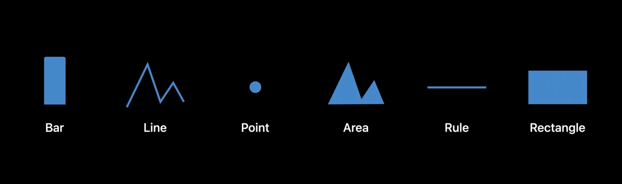
In addition to LineMark Swift Charts support a comprehensive collection of chart structures including PointMark, AreaMark, RectangleMark, and more. Try experimenting with the different visualizations to find the one that best suits your needs.
Customizing charts is crucial for effective data visualization. On Swift Charts we can modify axes, plot area, and the charts themselves to create an appealing and clear chart that communicates our data effectively.
Let’s see how we can further customize our chart to improve the way the data is rendered.
Step 4 - Customizing the X-axis
On our chart, the label on the x-axis represents each month. However, in some cases, the label is too long and we can’t read the text properly.
We can customize this, as well as other aspects of the x-axis, using the chartXAxis(content:) modifier.
Chart(dataCollection.data) {
    ...
}
// 1.
.chartXAxis {
    // 2.
    AxisMarks { value in
        // 2a.
        AxisValueLabel {
            if let month = value.as(String.self) {
                Text(month.prefix(3))
            }
        }

        // 2b.
        AxisTick(stroke: StrokeStyle(lineWidth: 1))
            .foregroundStyle(Color.gray)

        // 2c.
        AxisGridLine(centered: true).foregroundStyle(.gray)
    }

}

.padding()
.frame(height: 200)
- Use the
chartXAxis(content:)modifier to apply customization to the x-axis of a chart; - Using the
,AxisMarksstruct we configure the appearance of the chart's axes using visual marks. In this case, we are usingAxisValueLabel,AxisTickandlettersmarks:AxisValueLabel: used to display only the first three lettersmonth'sof the month valueAxisTick: used to display a divider between each labelAxisGridLine: used to customize the vertical lines of the chart
Step 5 - Customizing the Y-axis
As we did with the X-axis, we can use the chartYAxis(content:) modifier to customize the marks of the y-axis on the chart. In addition to that, we can also limit the range of y-axis values by employing the .chartYScale(domain:type:) modifier.
Chart {
	...
}
.chartXAxis { ... }

// 1.
.chartYAxis {
    AxisMarks { value in
        AxisValueLabel {
            if let temperature = value.as(Double.self) {
                Text("\\(temperature.formatted())°")
            }
        }

        AxisTick(stroke: StrokeStyle(lineWidth: 2))
            .foregroundStyle(Color.gray)

        AxisGridLine(centered: true, stroke: StrokeStyle(lineWidth: 0.5)).foregroundStyle(.gray)
    }
}
// 2.
.chartYScale(domain: 0...35)

.padding()
.frame(height: 200)
- Using the
chartYAxis(content:)to apply customization to the y-axis of a chart; - Using the
chartYScale(domain:type:)modifier we're constraining the chart's domain to span from 0 to 35, meaning that the minimum value on the axis will be 0 and the maximum will be 35;
Experiment with changing the range of the domain to see how it affects the plotted chart visually.
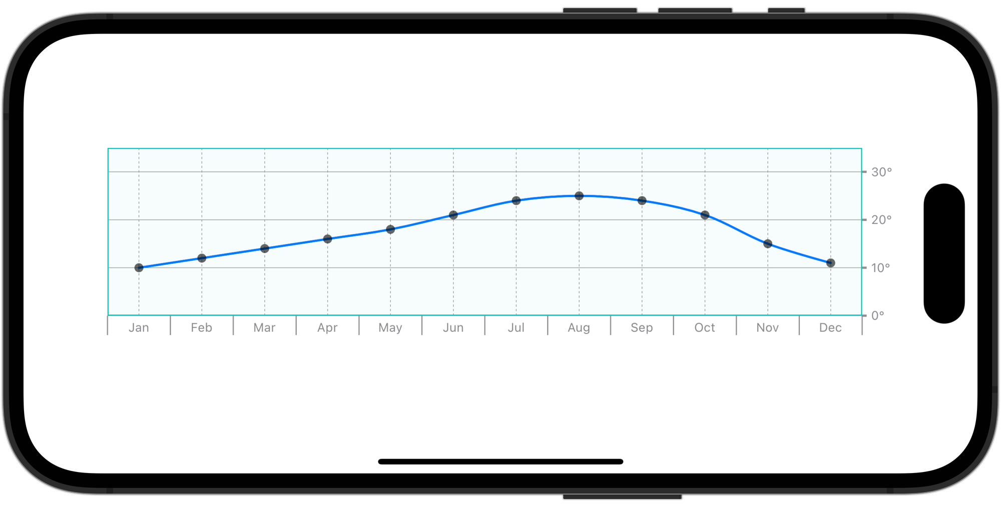
Step 6 - Customizing the plot area
We have customized the axes of the chart, now let’s work on customizing how the data is represented in the chart.
We will customize characteristics like the chart’s background, add symbols to each mark, and modify how the line and area marks are plotted.
Chart(dataCollection.data) {
    LineMark(
        x: .value("Month", $0.month),
        y: .value("Total", $0.temperature)
    )
    // 1.
    .symbol {
        Circle()
            .fill(Color.black.opacity(0.6))
            .frame(width: 8)
    }
}
.chartXAxis { ... }
.chartYAxis { ... }
.chartYScale(domain: 0...35)
.padding()
.frame(height: 200)
- Using the
.symbolmodifier we can add additional visual information that can improve the readability of our chart data. In this case, we added a circle to theLineMarkchart;
LineMark(
    x: .value("Month", $0.month),
    y: .value("Total", $0.temperature)
)
.symbol {
    Circle()
        .fill(Color.black.opacity(0.6))
        .frame(width: 8)
}
// 1.
.interpolationMethod(.catmullRom)
- Using the
.interpolationMethod(_:)modifier we can modify how the chart plots line and area marks. In this case, we used the.catmullRominterpolation method to make the line smoother;
Chart(dataCollection.data) {
    ...
}
.chartXAxis { ... }
.chartYAxis { ... }
.chartYScale(domain: 0...35)
// 1.
.chartPlotStyle { plotArea in
    plotArea
        .background(.mint.opacity(0.03))
        .border(.mint)
}

.padding()
.frame(height: 200)
- With the
chartPlotStyle(content:)modifier we can access the plot area and customize some of its characteristics like the chart’s background or the border;
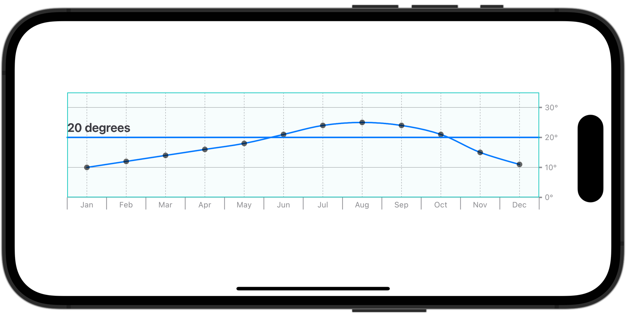
Step 7 - Adding multiple chart content in a Chart view
Sometimes we want to highlight a specific threshold on our charts. We can do that by combining different chart contents inside the same Chart view.
Let’s add a RuleMark in our chart to visualize the months in which the average temperature was higher than 20 degrees.
Chart(dataCollection.data) {
    LineMark(
        x: .value("Month", $0.month),
        y: .value("Total", $0.temperature)
    )
    .symbol { ... }
    .interpolationMethod(.catmullRom)

		// 1.
    RuleMark(y: .value("Temperature", 20.0))
				// 2.
				.annotation(alignment: .leading) {
            Text("20 degrees").bold()
                .foregroundStyle(.secondary)
        }
}
- Adding the
RuleMarkview inside theChartanchored on a value of the Y axis; - You can add a visual annotation to the mark with the
annotation(position:alignment:spacing:content:)modifier;
Final Result
The Swift Charts framework makes integrating charts on your SwiftUI applications a simple and straightforward process.
Now you are ready to create stunning charts with your data. If you want to go deeper into communicating information with clarity and visual appeal check the following resources from the Human Interface Guidelines.