
Customizing a Chart in Swift Charts
Learn how to customize the visuals of a chart using Swift Charts in a SwiftUI application.


In the tutorial Using Swift Charts on a SwiftUI app, we learned how to present a chart in a SwiftUI application using the Swift Charts framework.
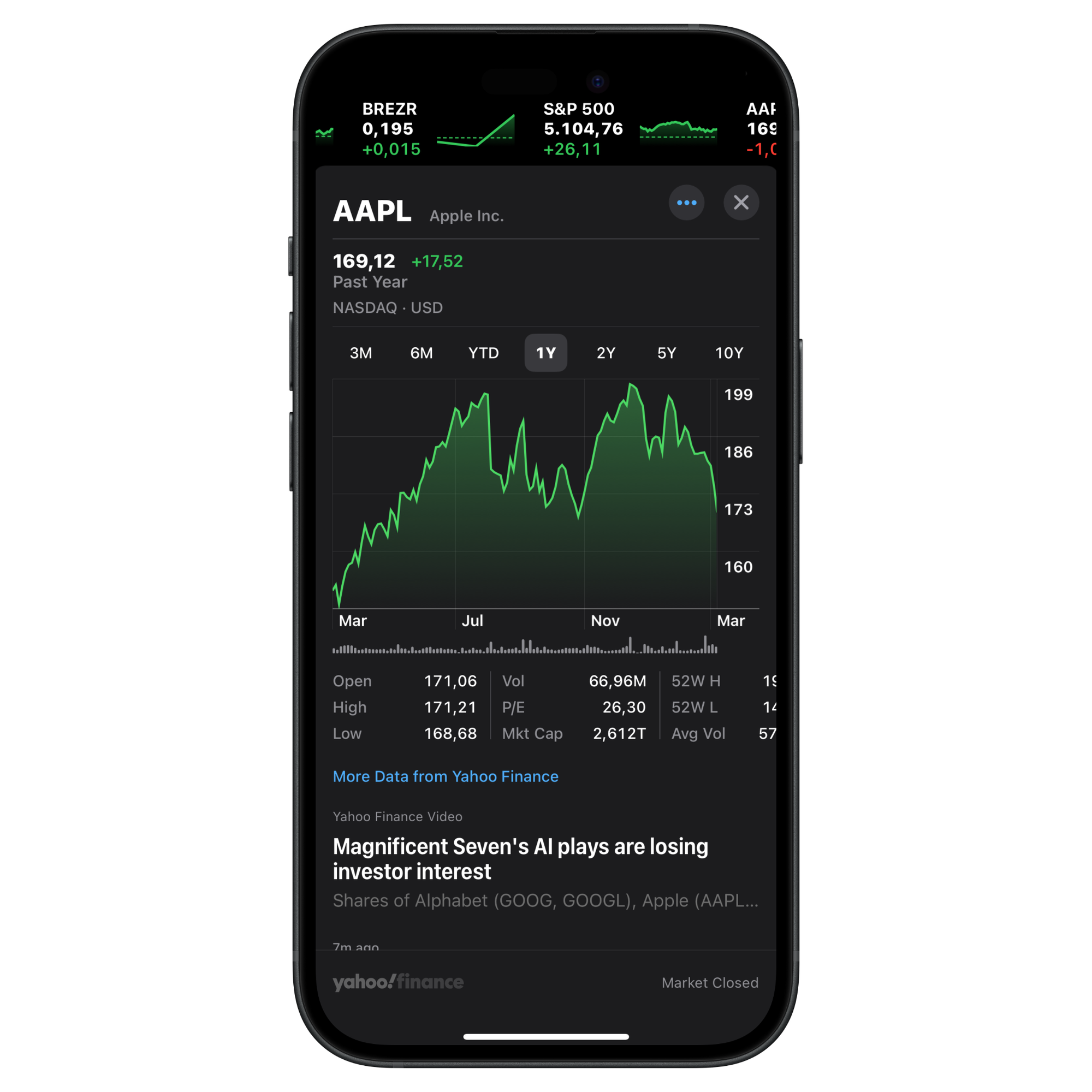
Once we start creating our charts we might start feeling the need to customize their appearance further to fit the visual language of our application. For example, the Stocks app from Apple presents the charts with a visual language closer to how they would look in the context of financial applications.
Let's see how to customize the area of a chart to show a gradient like the one on the Stocks app on the iPhone.
As a starting point we will use the project from the following tutorial, so if you haven’t already read it you can give it a look:

To achieve the desired visual effect we will combine a LineMark chart content with another type of chart content called AreaMark.
The AreaMark chart represents data as regions filled with color and can be initialized with the same x-axis and y-axis properties used in the tutorial mentioend before.
AreaMark(
    x: .value("Month", $0.month),
    y: .value("Total", $0.temperature)
)
Now to customize the appearance of the rendered chart let's use the foregroundStyle(_:) modifier and use a LinearGradient to customize the appearance of the chart.
AreaMark(
    x: .value("Month", $0.month),
    y: .value("Total", $0.temperature)
)
.foregroundStyle(
    LinearGradient(
        gradient: Gradient(colors: [
            Color.mint.opacity(0.8),
            Color.mint.opacity(0.1)
        ]),
        startPoint: .top,
        endPoint: .bottom
    )
)
Now zooming out and looking at the content of the Chart view we can see how this new chart content is placed alongside other visual representations of the data, integrated seamlessly with the existing ones.
Chart(dataCollection.data) {
    LineMark(
        x: .value("Month", $0.month),
        y: .value("Total", $0.temperature)
    )
    .symbol {
        Circle()
            .fill(Color.black.opacity(0.6))
            .frame(width: 8)
    }
    .interpolationMethod(.catmullRom)

    RuleMark(y: .value("Temperature", 20.0))
        .annotation(alignment: .leading) {
            Text("20 degrees").bold()
                .foregroundStyle(.secondary)
        }

    /// The new AreaMark with the applied style
    AreaMark(
        x: .value("Month", $0.month),
        y: .value("Total", $0.temperature)
    )
    .foregroundStyle(
        LinearGradient(
            gradient: Gradient(colors: [
                Color.mint.opacity(0.8),
                Color.mint.opacity(0.1)
            ]),
            startPoint: .top,
            endPoint: .bottom
        )
    )
}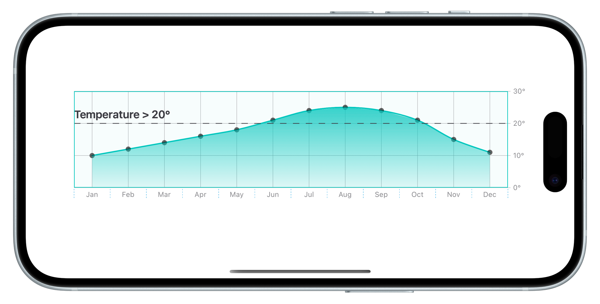
Combining different types of charts enhances their visual appeal and also improves their ability to convey information effectively to users. Integrating various chart elements such as LineMark, RuleMark, and AreaMark allows the showcasing of trends, highlighting specific values, and revealing deeper patterns within your data.