
Designing Humanist Data Visualization for Mobile
Explore how to design the visualization of data in your applications, aligning with your users' needs and goals.

We generate an astonishing 402.74 million terabytes of data every day. Videos alone account for more than half of global internet traffic. In this vast ecosystem, mobile apps play a dual role: they create data and they help make sense of it. From sharing photos with friends to analyzing where your money goes, mobile experiences turn raw information into understanding.
A progress ring on the wrist or a spending chart in the pocket isn’t just decorative; it translates numbers into meaning, glanceable and actionable. Data is everywhere, but making it feel clear and relevant on a small screen requires more than the right color palette. It demands intention, strategy, empathy, and a deep understanding of who the user is and what they need from the data.
Data Typologies and Goals
Using data in apps begins with research, collecting and structuring datasets, but the real challenge lies in how to visually translate it to users. Mobile devices present unique challenges, including small screens, outdoor glare, and constant multitasking. Someone might check an app quickly under sunlight or between meetings, expecting quick answers. Effective visualization begins by understanding both the type of data and the user’s goals.
Start by distinguishing between quantitative data (such as steps, money and temperature) and qualitative data (such as observations, notes and emotions). Then, define the intent: whether the goal is exploratory, helping users discover patterns, or explanatory, telling a focused, actionable story. After, decide if the visualization will show a snapshot in time or a trend over time.
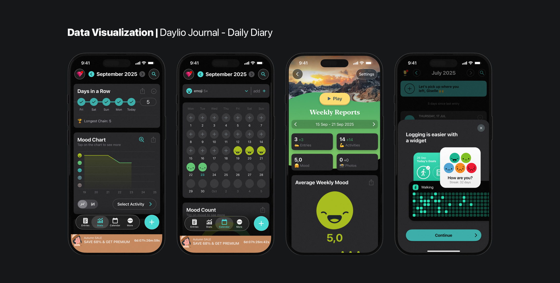
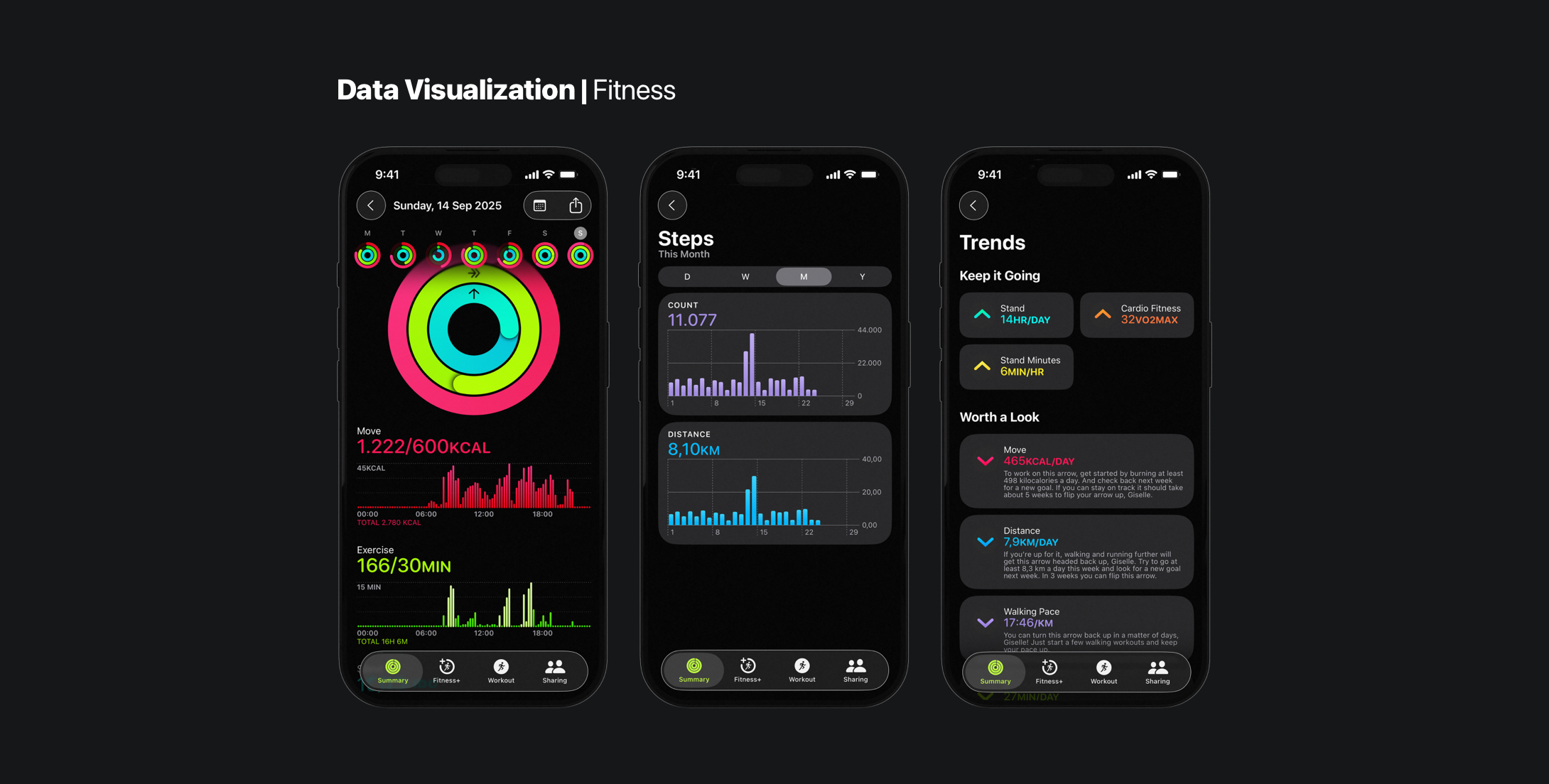
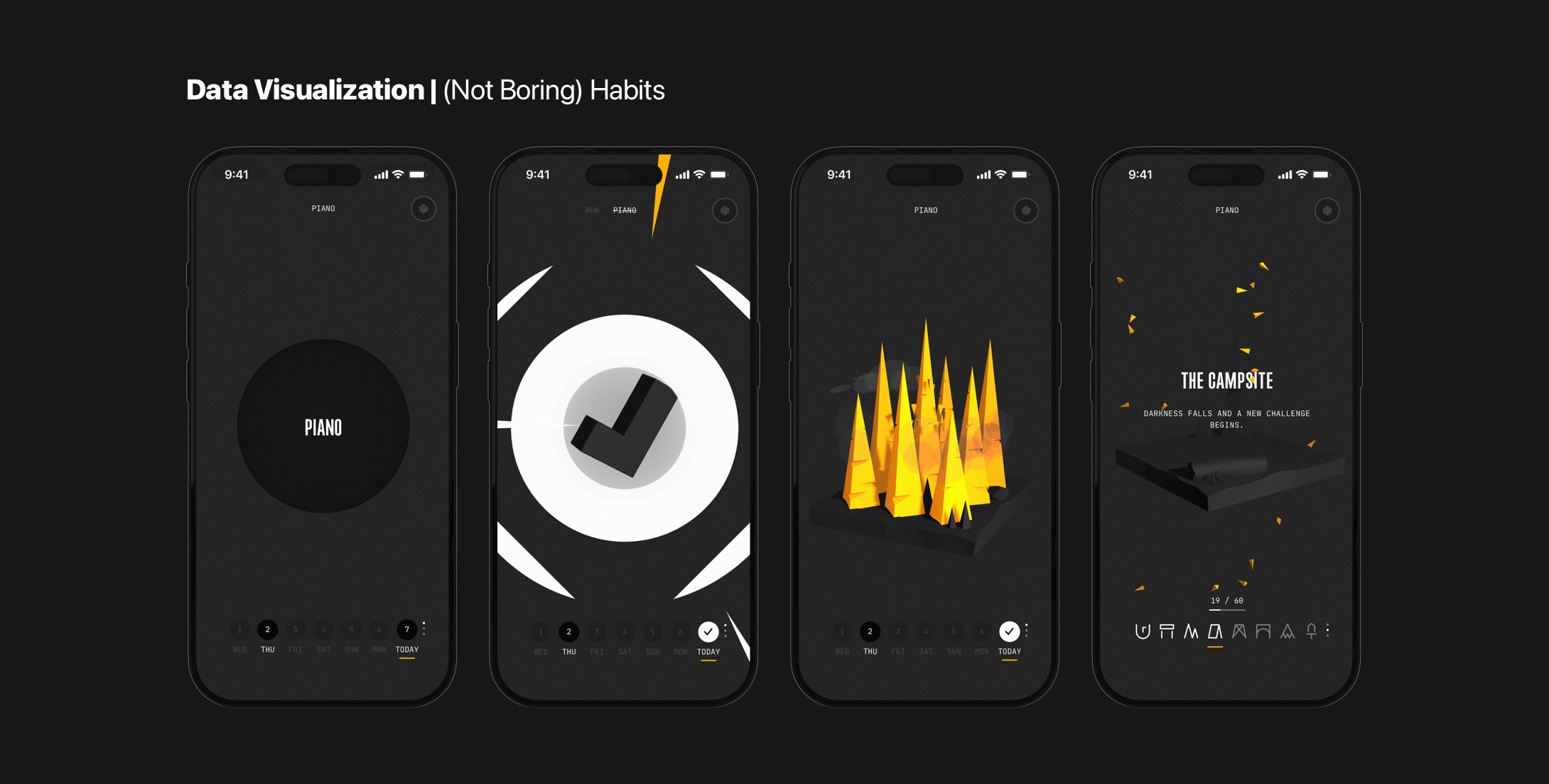
Connecting data types to user goals brings clarity and eases design direction. Comparing revenue across months, for example, starts with a bar chart. This helps create the initial shape the data visualization should follow, even if the final design won’t be a bar chart. Tracking daily mood or habits, sparklines, or radial progress rings, makes feedback intuitive and personal. Whatever the form, the visualization should serve the user’s purpose, not the data itself.
On mobile, every pixel counts. Visualizations should leverage native interactions, such as tap, swipe, and scroll. Avoid the hover effect, as it is typically associated with desktop interactions. Simplify complexity; heavy graphs can slow performance. Ensure graphs load quickly, remain legible in sunlight, use high contrast, guarantee screen reader support, and provide color-independent cues to ensure inclusivity.
Human-Centered Design Principles
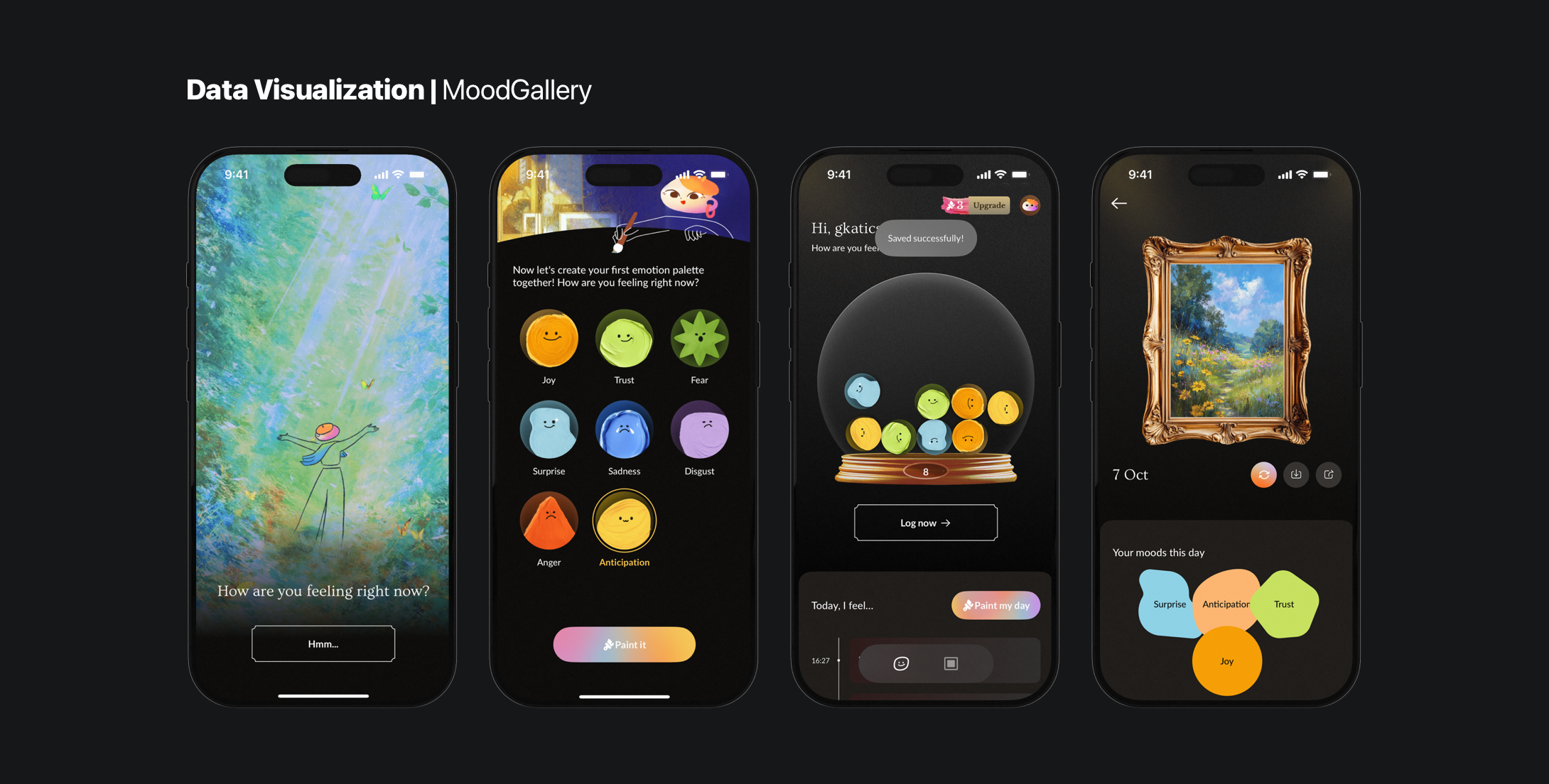
Humanist data visualization is a data-driven approach that focuses on storytelling. It emphasizes the human element behind the numbers, making it more relatable, emotional, and context-aware. It blends numbers with narrative, grounding information in lived experience. Instead of overwhelming people with values, it asks: What do people actually need to know?. On mobile, where attention is fleeting and space is scarce, this principle is essential.
In an experiment on crime statistics, 63% of listeners remembered the stories, while only 5% recalled statistics –highlighting that narrative makes data memorable. — Giorgia Lupi, Vanity Fair
A humanist approach recognizes that data is contextual and subjective. Numbers become memorable when they are framed as part of a story, giving them meaning. On mobile, the story is told with glanceable feedback, contextual messaging, and progressive disclosure –showing more details only when the user asks for them.
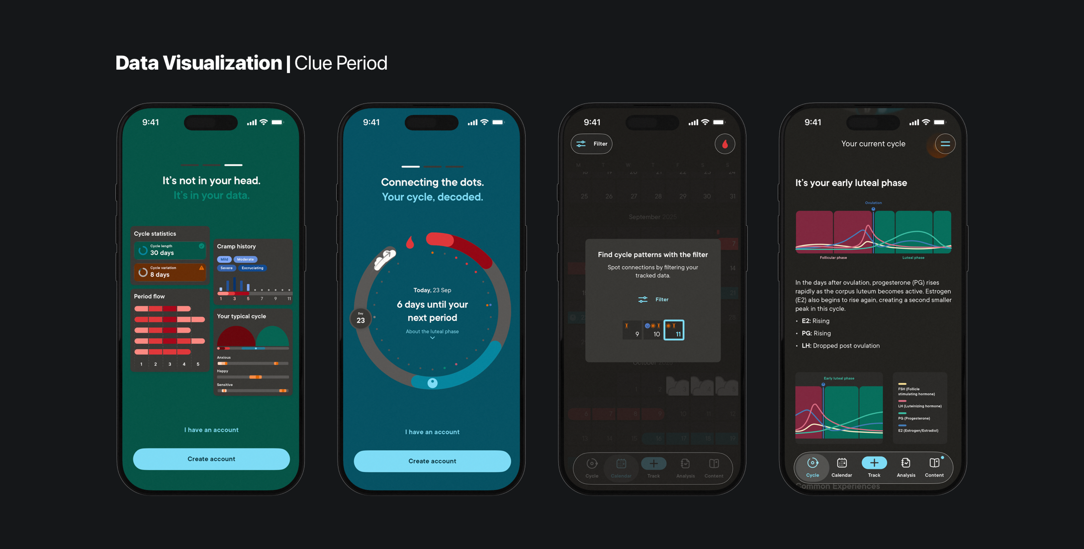
Human-centered visualization reduces cognitive load and personalizes meaning. A person with diabetes doesn’t want glucose readings; they want to know if today is better or worse than their usual baseline. It means designing for real people –supporting dynamic type, responsible color use, and touch-friendly elements.
Numbers alone tell only part of the story. To understand complex systems –like health or emotions– context and relationships among datasets are needed, not just isolated metrics. Warm Data captures this idea: it reflects the interplay between elements in a system, rather than the elements themselves.
Information that does not take into account the full scope of interrelationality in a system is likely to inspire misguided decision-making. — Nora Bateson
In mobile apps, Warm Data foster designers to create visualizations that feel human, intuitive, and actionable. For example, a mood-tracking app shouldn’t just display daily emotion scores; it should reveal how habits affect well-being, and contextualize feelings within daily routines. By embedding data in its proper context, users can create insights, not just information.
Ethical Visualization
Ethics are just as important. Mobile apps often handle sensitive personal data –from health to finances. Designers must represent information honestly. Misleading choices, exaggerating trends, or omitting context can distort meaning, leading users to misunderstandings. Uncertainty, too, should never be hidden.
On mobile, ethical visualization means clarity and agency. Allow users to tap in a data point to explore details, or pair graphs with plain-language explanations that make insights easy to grasp. Transparency empowers users to take ownership of their information and builds engagement.
Above all, protect trust. Keep users safe by guarding their data and identity. Be transparent, collect only what’s essential, and explain how the data will be used. Every data point you visualize carries meaning, so design with intention and be mindful of what users might infer from it.
Warm, human, and ethical visualization is about trust and empowerment. When design, storytelling, and context align, data becomes more than a chart; it becomes a mirror for understanding.
Making Numbers Work: Techniques for Mobile Visualization
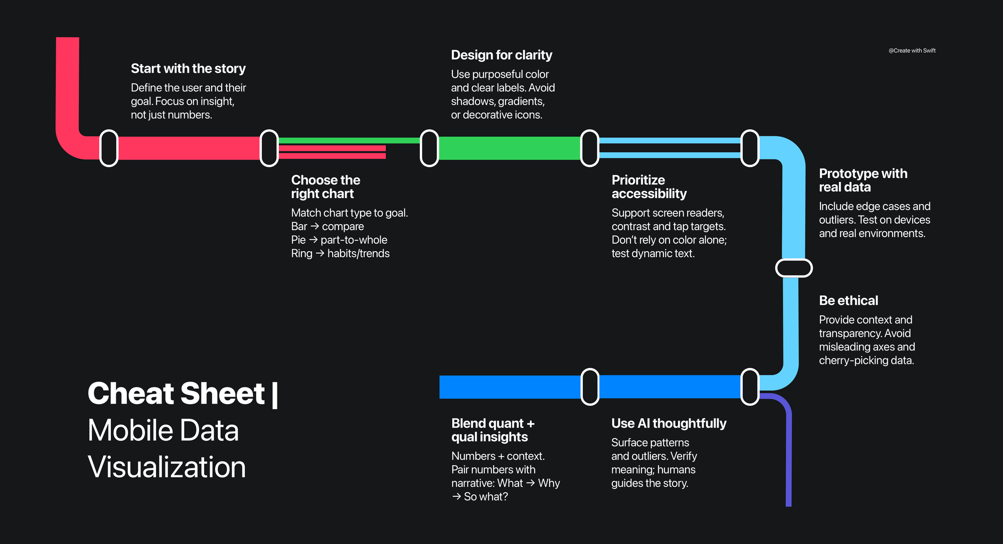
Every visualization tells a story. Before designing, ask: whose story am I telling? Who is the user reading this visualization? What does this person need to understand the numbers with ease? The goal is to guide attention toward patterns, comparisons, and insights, always with clarity and empathy.
With the concept of the stories, it’s time to make choices to present the data. Even the most complex datasets can be simplified through relationships. Comparing quantities, a bar chart is often the best start. Illustrating part-to-whole relationships is better represented with a pie chart. Tracking progress toward a habit or fitness goal? Radial rings or progress circles make information glanceable and intuitive.
Design choices should always support clarity. Use color purposefully; balancing contrast, harmony, and distinction –so users immediately understand what they’re seeing. Avoid decorative flourishes, shadows, gradients, or icons that don’t serve the story. Every element should have a reason to exist, reinforcing the narrative instead of distracting from it. Clear design choices reduce the risk of misinterpretation and keep your visual story clear.
Even at the prototype stage, use real data. Placeholder values rarely capture the nuance and messiness of the real world. Selecting meaningful samples –including edge cases and unexpected scenarios– will make the prototype behave much closer to the final product.
Test visualizations with edge cases, localization, and cultural context. This means not only translating words, but adjusting layouts for longer text strings, accounting for right-to-left languages, and respecting cultural differences in how dates, numbers, and colors are interpreted. These early tests help ensure the design remains clear, accurate, and culturally responsive long before it reaches users.
Finally, test visuals on real devices –across different screen sizes– and in real environments. Interaction with the design on an iPhone or iPad –swiping, scrolling, and tapping– often reveals sizing issues, spacing challenges, or interaction friction that a desktop mockup will never show. These real-world tests ensure that the visualization is not only accurate but also usable, intuitive, and meaningful in everyday mobile use. Data should not only look right –it should feel right in the user’s hand.
Integrating AI in Data Visualization
AI can accelerate the creation of visualizations. It can analyze large datasets, surfacing trends, revealing patterns that might be hard to spot manually, or suggest chart types. But it can’t tell stories. AI doesn’t understand why something matters. It lacks empathy, judgment, and context. And it can add bias or misinterpretation to the dataset.
Used wisely, AI is a collaborative partner that highlights patterns, catches anomalies, suggests correlations, and accelerates iteration. But humans must lead the narrative, verifying AI-generated visualizations for accuracy and clarity. Use AI as a partner for exploration, not automation.
The Information is Beautiful Awards showcase how engagement comes not from complexity, but from clarity and story. AI is a tool to amplify human insight, not replace it.
Tools & Resources
For designing visuals and turning them into interactive experiences, the right set of tools is needed. Here are some of the useful options for different stages of the workflow:
- Tableau & Looker Studio: Explore complex datasets and build real-time, interactive dashboards before adapting for mobile.
- Figma + plugins: Perfect for rapid prototyping. With a variety of plugins, quickly visualize data and iterate on designs. Some plugins:
- Piktochart: A web-based tool to create infographics, reports, and presentations. It’s especially useful for designers who want to combine charts with storytelling and visual design.
- Storybook & CodeSandbox: Practical steps for turning raw data into visual insight.
Guides
- Data Visualization Toolkit by DaSy Center: A comprehensive guide for turning raw data into compelling, actionable visualizations.
- Design Kit by IDEO.org: Explore human-centered design methods, including case studies for solving complex problems creatively.
Data is everywhere, but insight is rare
On mobile, data visualization isn’t just about displaying numbers –it’s about helping people understand, explore, and act. Every chart, ring, or sparkline tells a story, and human-centered design ensures that the story feels clear, meaningful, and worth engaging with.
By merging ethical visualization guidelines with storytelling principles, designers can transform raw metrics into insights that respect context, empower decision-making, and build trust. When ethical design meets narrative framing, data becomes insight. Mobile visualizations should be glanceable yet deep, simple yet rich, always shaped by the user’s goals, environment, and emotional context.
AI and automation can accelerate the process by scanning trends, identifying outliers, and suggesting patterns, but only empathy turns data into meaning. AI can’t replace human judgment, empathy, and storytelling skills. Technology should amplify understanding, not replace it.
Effective data visualization on mobile is more than numbers. It’s about connecting people to what matters most, making complex systems feel human. Turning everyday interactions with data into insightful, actionable experiences –right in the palm of your hand.
When data meets empathy, numbers become stories; and stories have the power to move people, guide choices, and shape the way we experience the world. Effective visualization connects people to what matters most –making complex systems feel human and stories feel personal.