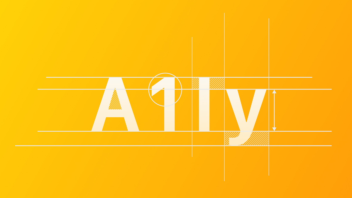
Extra Large Title text styles in visionOS
Learn how to use extraLargeTitle and extraLargeTitle2 for text hierarchy on visionOS applications.

Font size and weight are used to define the hierarchy of your application user interface. Within visionOS, the interface of your applications is taking a new dimension, outside of the frame of a device. The need to ensure that text is legible faces a new challenge since now you must consider factors like distance.
Using the font(_:) modifier in SwiftUI you can take advantage of several text styles made available in the framework, and now we have two more, exclusive for visionOS: extraLargeTitle and extraLargeTitle2.
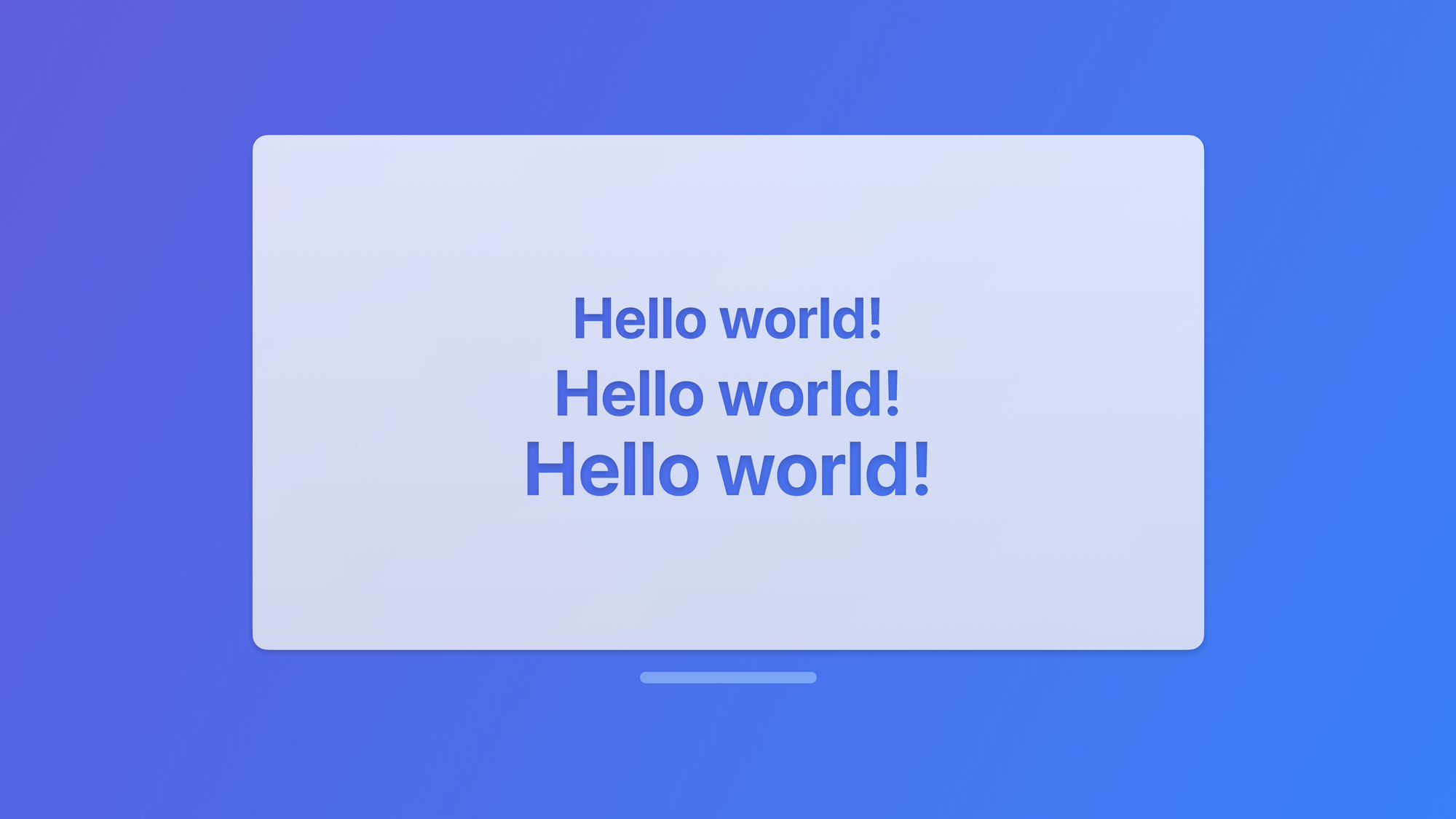
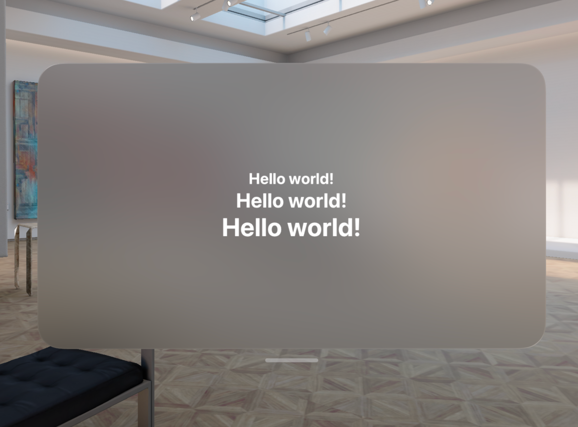
struct HelloView: View {

    var body: some View {
        // All platforms
        Text("Hello world!")
            .font(.largeTitle)

        // visionOS only
        Text("Hello world!")
            .font(.extraLargeTitle2)

        // visionOS only
        Text("Hello world!")
            .font(.extraLargeTitle)
    }

}
The new text styles will be rendered following the proper hierarchy on your app user interface when running on visionOS, just like the example below:
You can find more about typography on visionOS in the Apple Human Interface Guidelines. On the typography page, you can find more information under the Platform Considerations section.
Check the following article to better understand how typography affects usability and user experience on your app: