Ensure Visual Accessibility: Using Typography
Understand how Typography affects the usability and user experience of your app and how accessible it is.


When it comes to developing apps for the Apple ecosystem, typography may not be the first thing that comes to mind. However, it is a crucial element that can significantly impact user experience and perception of the app. The dynamic and ever-changing world of app development strongly emphasizes innovation and design, but the role of typography should not be underestimated.
From the choice of font to the spacing between characters and lines, typography can greatly affect the overall aesthetic appeal of the app but also its readability and, as a consequence, how accessible it is. A well-designed and thoughtfully executed typography can even enhance the usability and functionality of the app, making it easier for users to navigate and engage with the content. Therefore, developers and designers need to pay close attention to typography and consider it as an integral part of the app development process.
How Typography Impacts Accessibility
Creating an environment where users with different abilities can interact seamlessly with your app is the goal of accessibility, and typography is an essential aspect of achieving it. Appropriate font size, well-structured headings, proper line height and spacing are some of the typography considerations that can improve accessibility.
It is essential to take into account the experiences of all potential users at every stage of the design process, including those with visual impairments, like low vision, or cognitive impairments, like learning disabilities, aphasia, dyslexia, concentration difficulties, or low literacy. A clear and well-designed typography can make the difference between an app that can be used independently and one that frustrates the user experience. Therefore, it is crucial to maintain a balance between visual appeal and ease of understanding.
To achieve this, it is advisable to actively involve users in the design process through focus groups, user testing, surveys, and other methods, and make improvements based on their feedback. By improving accessibility, you can create a seamless user experience that meets people's needs, minimizes friction, and ensures that everyone can benefit from your offerings.
Typography Fundamentals and Accessibility
Reading text on paper versus a screen is a completely different experience for the eyes; letters on paper are clearer because the resolution is higher than on screens. This means that choosing an appropriate font for print versus screen requires different considerations to optimize readability.
As we have said before, typography is not just an aesthetic element, the layout and choice of fonts is a crucial aspect in designing an effective user experience and become even more essential if we evaluate the accessibility of typographic choices made in our app interfaces.
Precisely to fully understand the impact that a wrong typographic choice can have on our app, it is necessary to know a few elements that are at the base of typography.
Typeface and Fonts
When it comes to typography, the first step is to choose the typeface and font.
A typeface refers to a family of fonts, like Arial, Times New Roman, or Helvetica.
Fonts, on the other hand, are specific styles and variations within those families, such as Arial Italic or Helvetica Bold. In app design, it's essential to choose a typeface and font that aligns with the app's purpose.
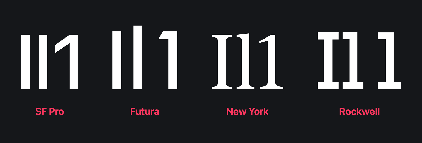
For example, common letters such as uppercase 'i', lowercase 'l', and digit '1' should be easily distinguishable from each other to avoid confusion.
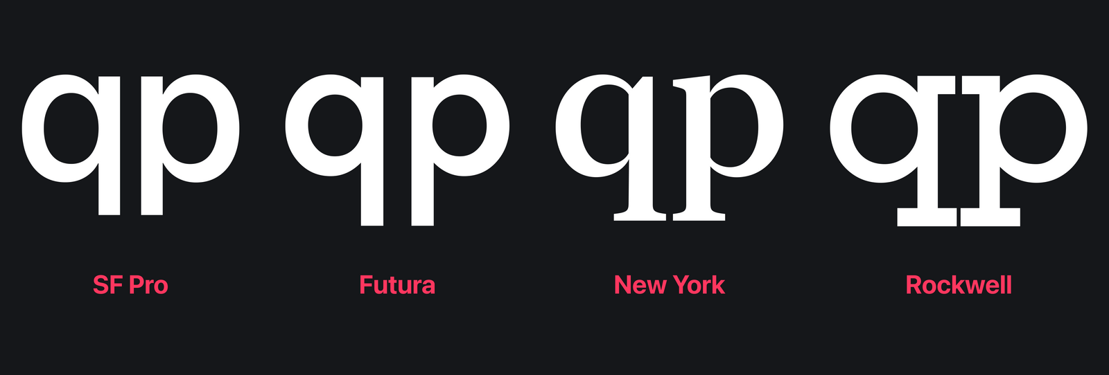
Additionally, characters with similar counters, such as lowercase 'o', 'p', and 'q', must be distinguishable when written consecutively to prevent visual strain on the reader.
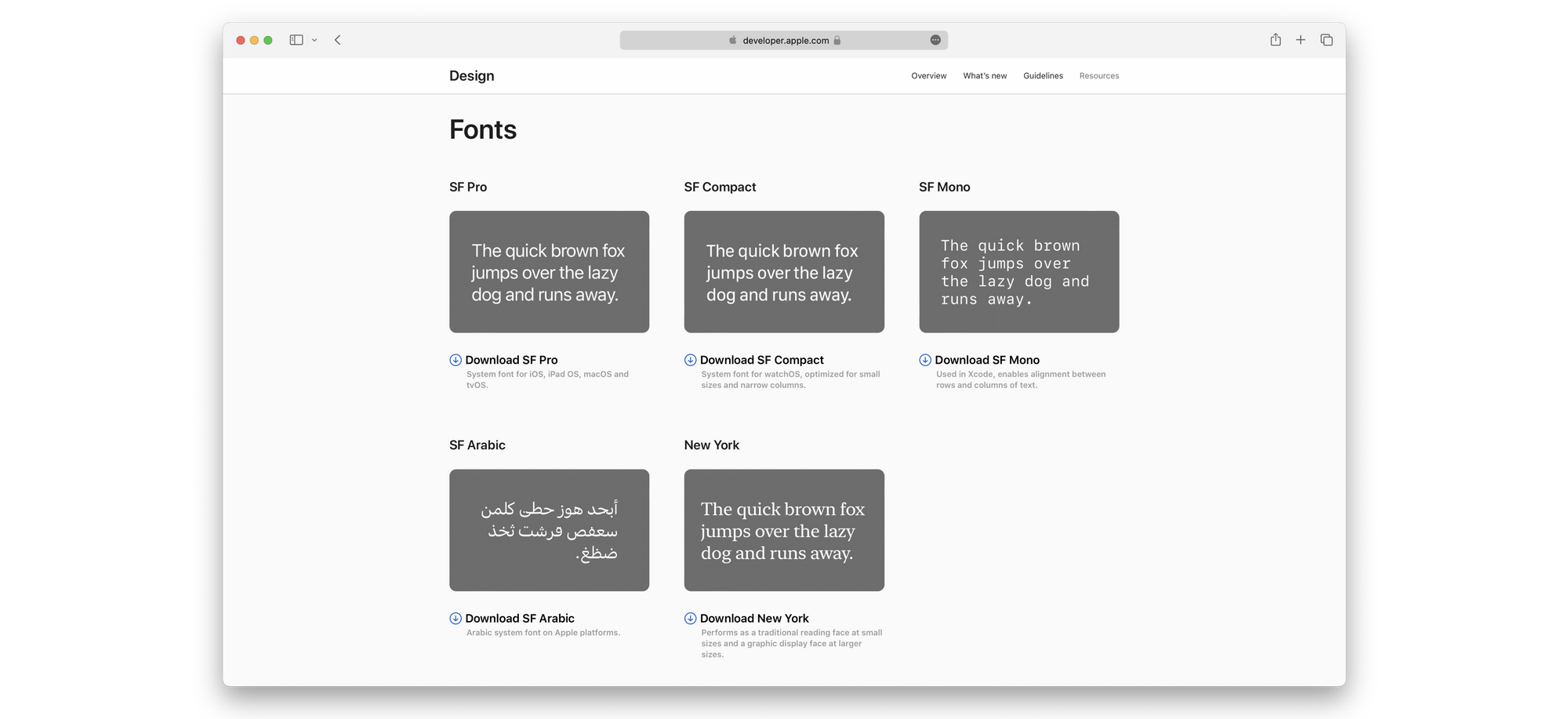
Apple has created system fonts like San Francisco to cater to its user-centric design philosophy, specifically designed for readability across all their devices.
An essential factor to consider while designing the interfaces is the font size because it's one of the ways in which you can ensure the accessibility of your app for all your users. Since not all users have the same visual acuity, providing the option to adjust text sizes according to their preferences is essential. The Apple ecosystem provides a useful feature called "dynamic type", which enables users to customize the system font size across different apps.
By incorporating dynamic type into your app, you can demonstrate your commitment to respecting users' preferences and ensuring that all content can be read comfortably.
As developers, we have to design and foresee this feature. If you want to know more about Dynamic Type, you can read our article about it.
 Domenico De Luca
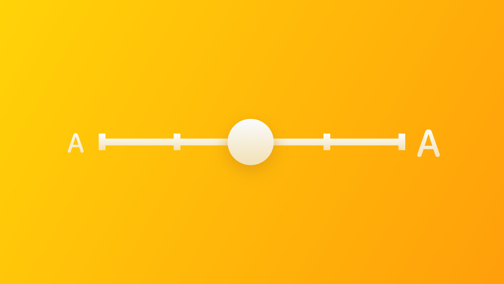
Line Spacing and Letter Spacing
In addition to font choice and size, line spacing (leading) and letter spacing (kerning) are crucial factors that impact the readability of text. Appropriate line spacing prevents text from feeling cluttered and helps users read and understand the content more easily. Similarly, proper letter spacing ensures that each character is clear and legible, avoiding any overlapping or excessive spacing issues.
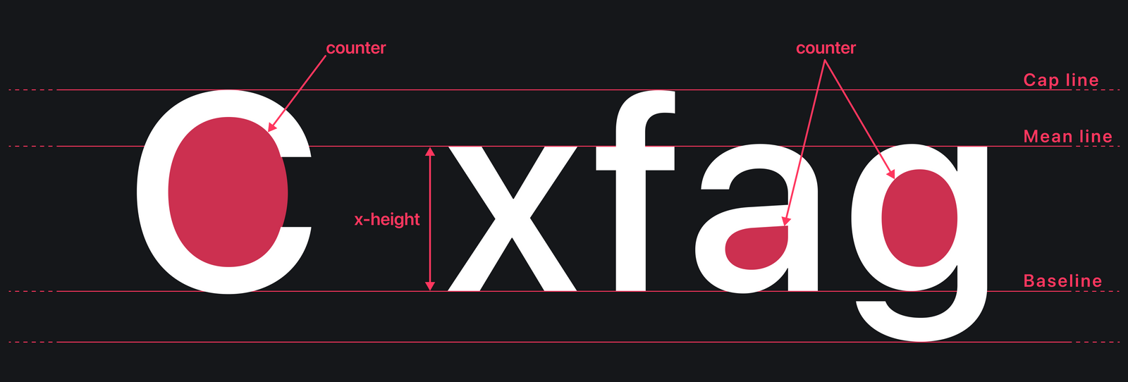
Large x-heights and Counters
x-height and Counter are two important factors affecting the legibility of a typeface on screen. It is the height of a lowercase x which should be considered in relation to the total height of the letters. The counter is the area fully or partly enclosed by a letter. It impacts the legibility because the more open spaces, the better the legibility.
Accessibility guidelines and best practices
Typography is a powerful tool for enhancing accessibility within your app. In this section, we delve into the symbiotic relationship between typography and accessibility, exploring how thoughtful typographic decisions can make your app more user-friendly and inclusive.
Color Contrast Matters
Color contrast is a fundamental aspect of accessible typography. Ensuring that there is sufficient contrast between text and background colors is critical for users with low vision or color blindness.
This parameter is crucial because it has a strong influence on the informational clarity of the screens the user will use. A high contrast ratio acts as an anchor of clarity for the user, as it gives the information both visibility and readability. On the other hand, an inappropriate contrast ratio compromises the information contained in the app, which becomes a cryptic enigma for users to understand and decode.
If you want to learn more about how to ensure visual accessibility through colour and contrast ratio, take a look at our article about it.
Domenico De Luca
Clarity and Visual Hierarchy
Designing the screens of an app means organizing the content and components in such a way that the user is always able to perform the necessary action without too much effort and in the shortest possible time.
This means that organising the content of our app in a way that is simple, correct and clear for our users not only allows us to create accessible solutions but also ensures a simple user experience for all users.
People rarely read Web pages word by word; instead, they scan the page, picking out individual words and sentences.
- Jacob Nielson
The scanability of the interface is very important because it is the ability to find and collect information at a glance. Just think of the fact that the user's eye scans the interface according to specific patterns, such as the F or E pattern, which says a lot about the way users look at the page on a subconscious level.
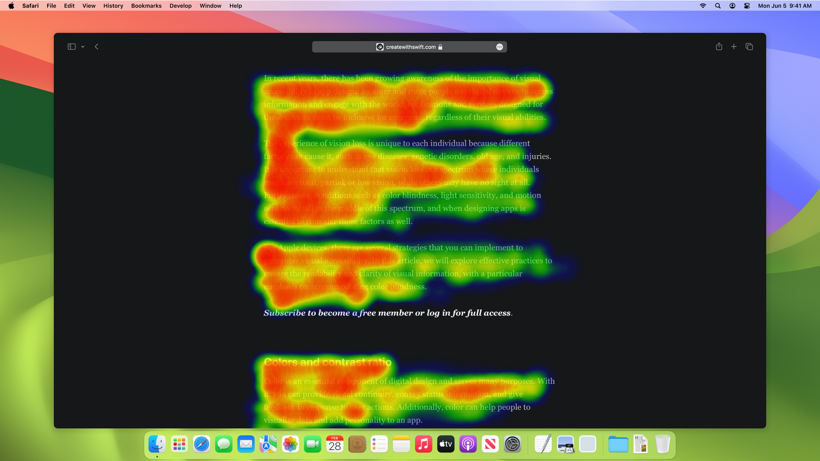
Knowing these patterns helps a lot when designing the user experience but equally, there are other factors of high importance to take into account, such as the white space (also known as negative space), the typographic hierarchy and the type and number of typefaces used.
White space and Margins
Negative space, also known as white space, is essential for improving the aesthetics and usability of an interface.
Every element has plenty of space, enabling the user to identify them without any hindrance. This creates an organized and visually appealing appearance. Furthermore, the use of white space ensures that the message is clear and easy to understand, as it reduces confusion and allows each element to be distinct.
When creating designs for mobile devices, it may be tempting to reduce margins as a result of the limited screen space available. However, this strategy can disrupt the visual hierarchy of text styles and blocks, leading to a negative user experience and visual chaos. It's important to maintain appropriate margins to ensure a visually pleasing and organized design.
To effectively manage complexity, it's crucial to strike a balance. By incorporating white space alongside content, you can create a harmonious environment that balances aesthetics, visual hierarchy and readability.
Typographic Hierarchy
We often come across different forms of hierarchical structures in our day-to-day activities. This type of organizational system plays a crucial role in aiding our brains to effectively categorize, prioritize, and absorb information.
When it comes to typography, it is essential to present information clearly and concisely by breaking it down into different levels. Doing so ensures that the intended message is effectively conveyed to the user. Through the use of appropriate fonts, sizes, and styles, we can create a visual hierarchy that guides the user's eyes from one level of importance to another.
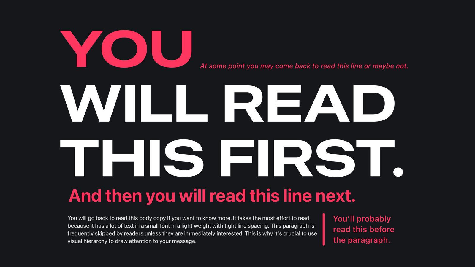
This technique helps to eliminate confusion and allows the user to quickly grasp the main message being conveyed. In essence, typography plays a significant role in enhancing the communication process by ensuring that the intended message is delivered clearly.
Minimum font size
If we analyse a typical use case, we would realise that people use mobile applications while they are on the move and outdoors. These conditions generate several associated challenges, such as the limited screen size or the glare from sunlight, and to these, we have to consider all the possible impairments in the visual spectrum of our users. Therefore, it is important to establish a minimum size for body text to ensure that the contents of the application are easily readable and accessible to all users.
According to the Human Interface Guidelines provided by Apple, it is advisable to set the minimum size for Body text at 17pt. It is important to note that these recommendations are based on the default fonts used by the system: San Francisco and New York.
If we decide to use different typefaces, the minimum font size can differ based on their unique characteristics. One such factor is the thickness of the strokes within the font, so fonts with a thin stroke will require a larger font size to ensure readability for body text.
In general, it is recommended to adhere to a minimum font size of 18pt for regular text and 14pt for bold text. This ensures that content is easily readable and accessible for all users, including those with visual impairments.
Number of typefaces used
When it comes to the moment in which you have to choose the typefaces, the ultimate goal is to ensure that it doesn't distract the users from the contents and the actions they have to perform. When designing the visual style of the app, prioritize readability and legibility over style.
Using too many typefaces can create a cluttered and confusing visual experience for the users, which can negatively impact their ability to understand and focus on the information. Therefore, it's best to avoid using too many fonts and instead opt for a simpler, more cohesive approach that enhances the overall usability and accessibility of the text.
Conclusion
App development requires careful attention to typography because it affects the user experience beyond aesthetics, being crucial in enhancing the user experience. With it, we can convey information, set the tone, and guide users through the interface, and this is especially true for iOS apps, where inclusivity and accessibility are paramount concerns.
Typography optimization serves as a bridge, connecting functionality and aesthetics with universal understanding. By incorporating this into our app, we can create a space where all users can seamlessly understand and appreciate the content we've created with care.