
Supporting Increase Contrast in your app to enhance Accessibility
Understand how to enhance the user experience of your app by supporting the Increase Contrast accessibility feature and leveraging one of the available environment values in SwiftUI.


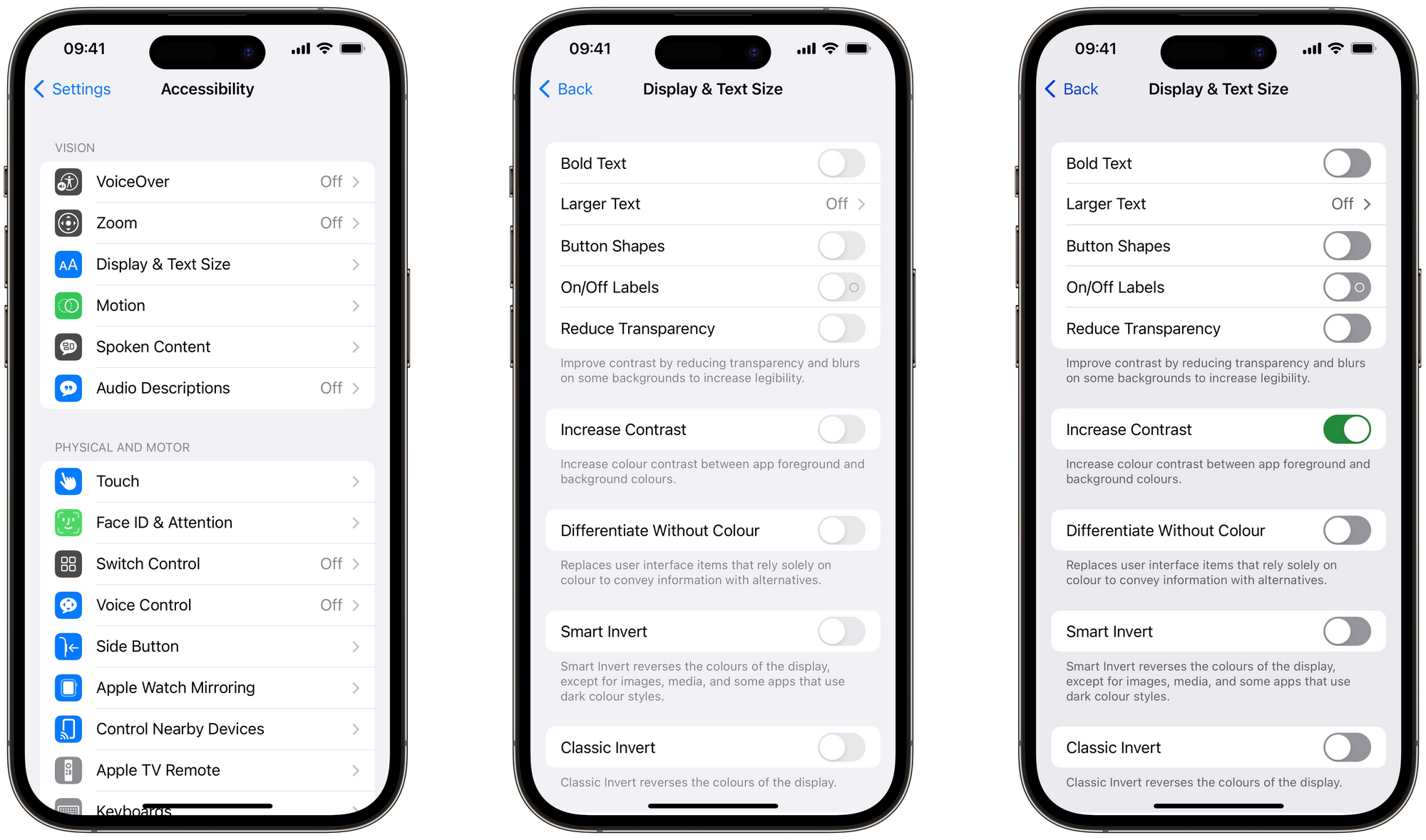
iOS offers a range of vision accessibility features that can help users with visual impairments to use their devices more effectively. One such feature is the Increase Contrast setting, which enhances the visibility of elements on the screen by updating colors to high-contrast appearances.
In the article "Understand how to use Colors and Contrast Ratio to ensure Visual Accessibility", we have seen how important it is to choose a color scheme with an ideal contrast ratio to ensure that your app is visually appealing but also visually accessible.
According to Apple's Human Interface Guidelines, it's recommended to use default system colors whenever possible. However, suppose you opt to use different colors (e.g., for branding purposes); In that case, it's crucial to not only ensure that they meet the minimum acceptable contrast ratio but also provide high contrast tints for these colors.
This article explains how to support Increase Contrast.
How to
We are going to support Increase Contrast in Judebox, the app created by Giovanni Monaco in the tutorial "Passing Data in SwiftUI via the View’s Environment".
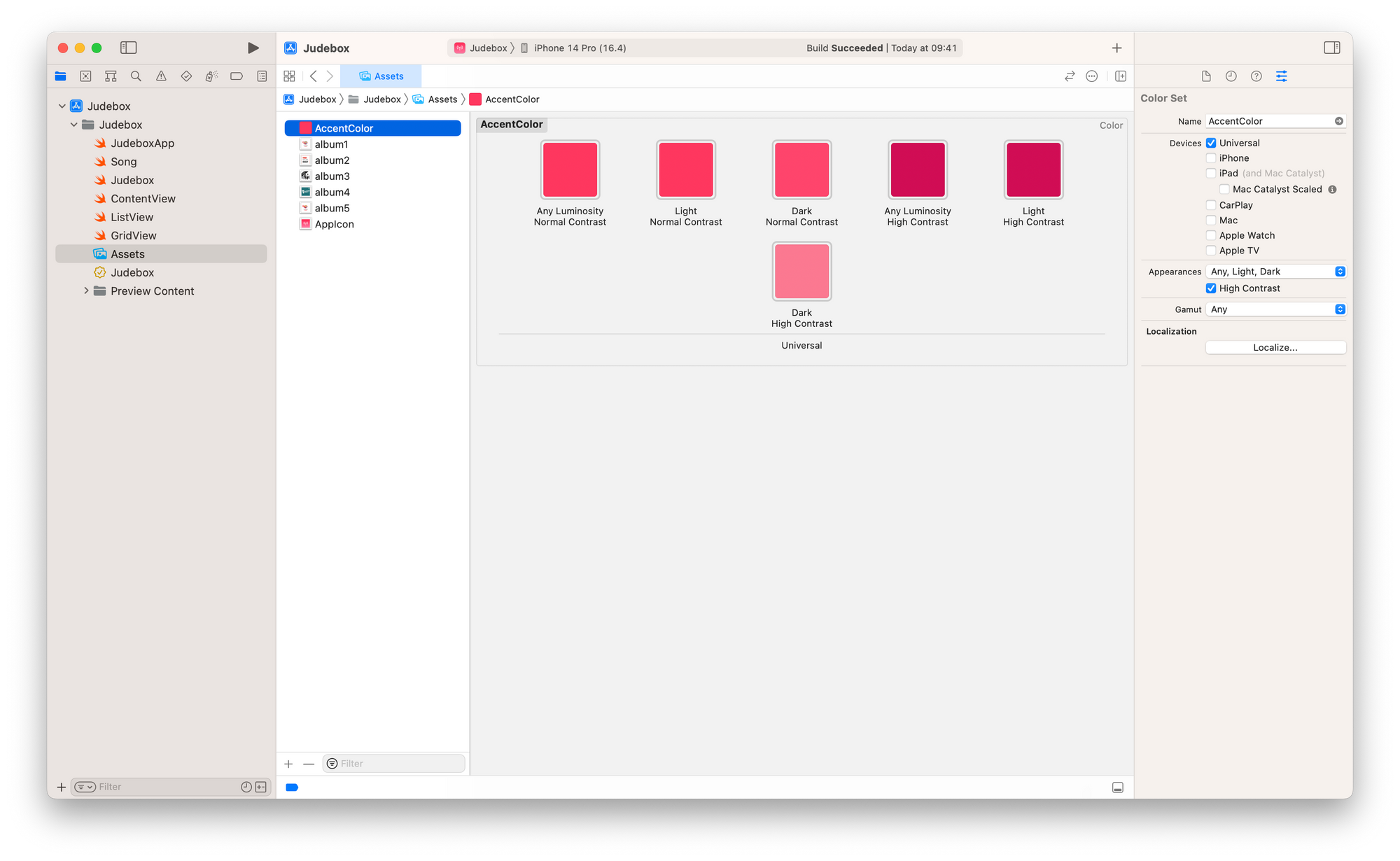
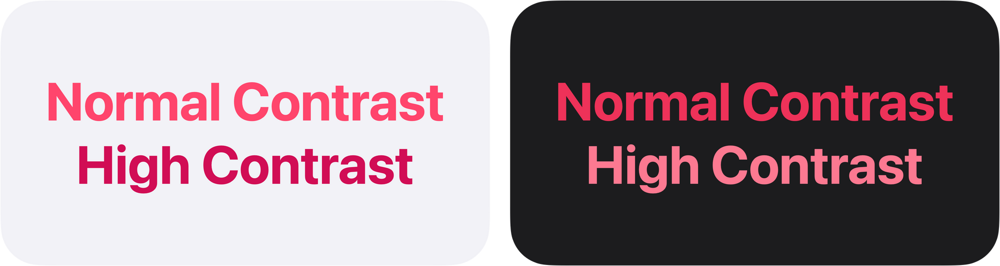
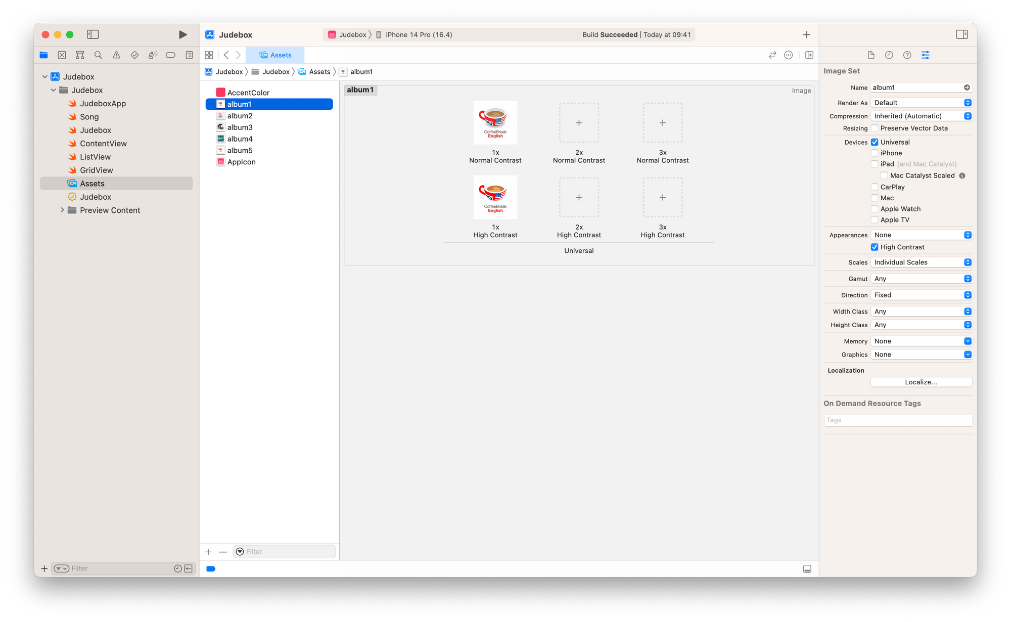
To support Increase Contrast, select the Color Set in the Assets Catalog and check the "High Contrast" option under "Appearances" in the Attribute Inspector panel in Xcode.
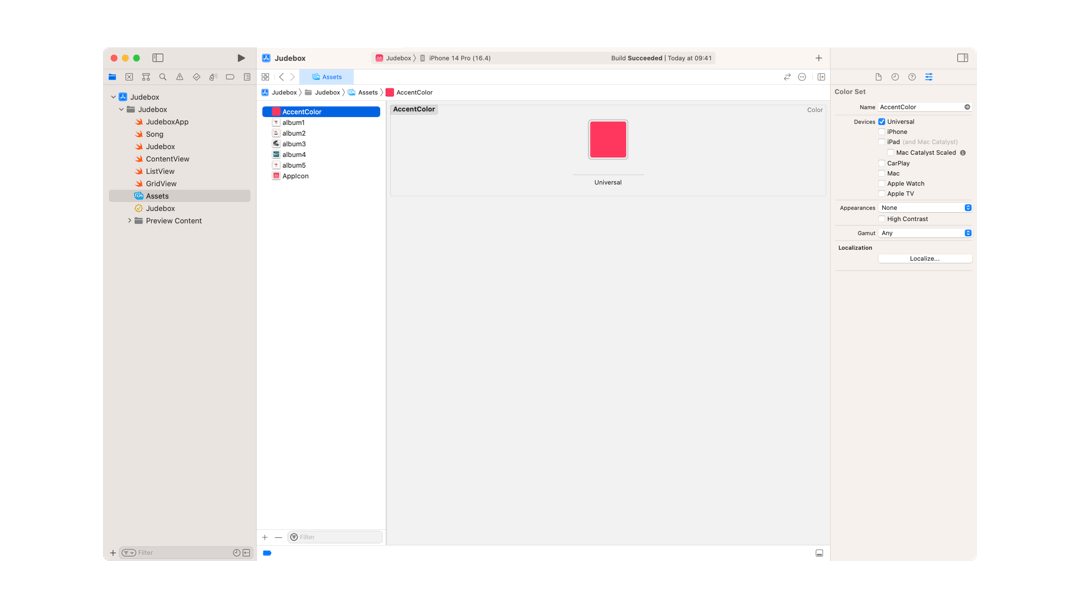
You must provide the High Contrast tint for all the other Color Sets you define.
You can provide "High Contrast" tints also for Dark Mode appearance
Other assets may be influenced by the Increase Contrast accessibility option: Symbols and Images.
Symbols
In the SF Symbols app, Apple provides a set of symbols that you can use in your app.
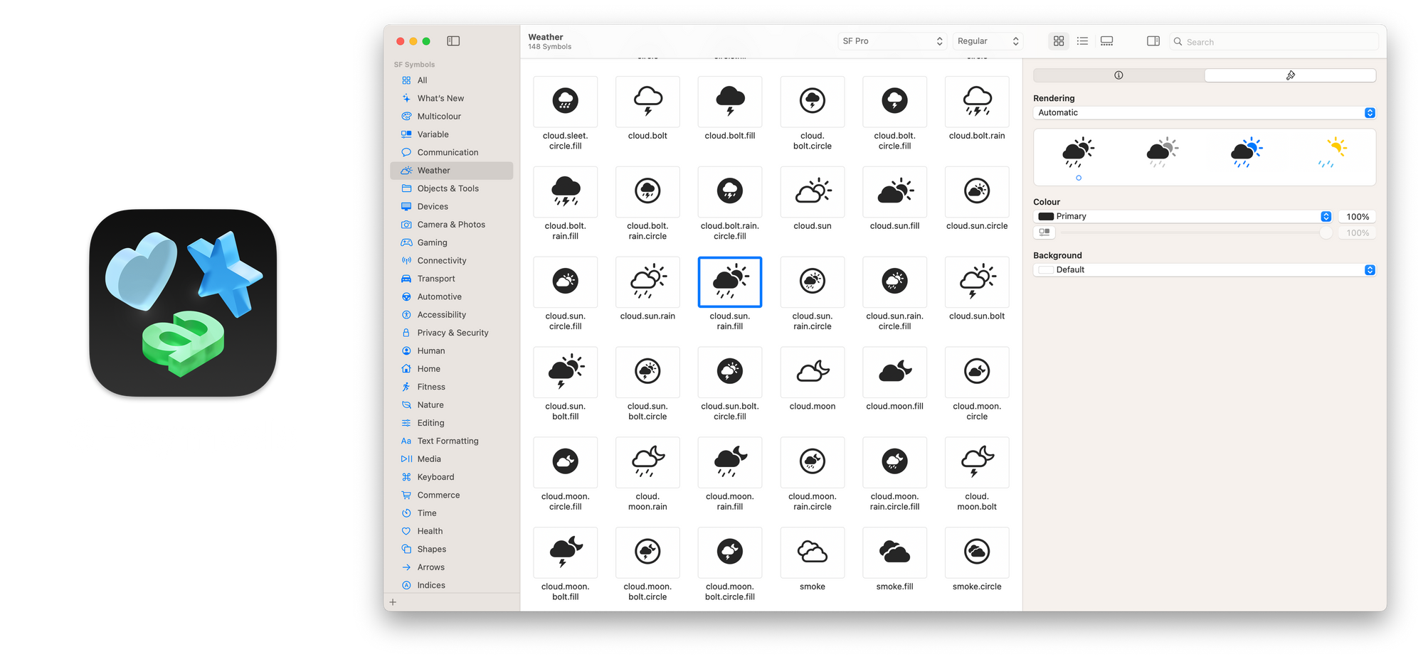
For SF Symbols all assistive technologies are already supported and if used with system-provided colors they automatically adapt to accessibility accommodations and appearance modes like Dark Mode.
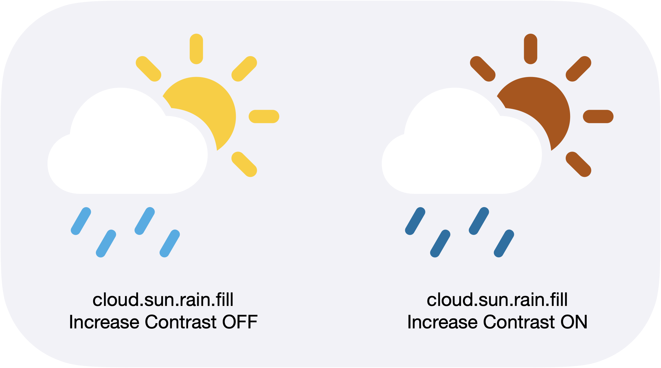
To ensure that symbols support Increase Contrast, use colors that have a high contrast tint.
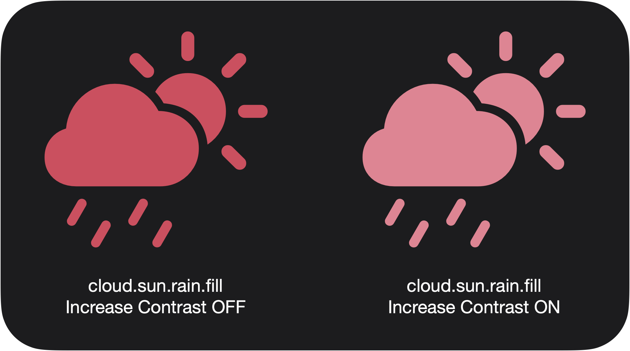
Having sufficient contrast between colors is important and you should make informed decisions when designing an app to ensure it but this cannot always be done with images.
Images
As for Color Sets, you can provide High Contrast versions of images for both Light Mode and Dark Mode.
Providing a high contrast version of images can help users with vision impairments see the image details.
However, sometimes the images may not be included in your assets as they are dynamically downloaded or displayed.
In such cases, you can dynamically increase the contrast of the images when Increase Contrast is enabled.
Color Scheme Contrast
When writing an app, you might need to read a device setting to adjust the view or its behaviors to match the user preferences.
In SwiftUI, we can use the @Environment property wrapper to read and observe values of the environment that the frameworks create for your app, such as current device locale (device language), color scheme (Light or Dark Mode), dynamic text sizes (preferred text sizes), enabled accessibility options, and many other predefined values, which are available in EnvironmentValues structure.
To check if the user has enabled the Increase Contrast setting, we can read the colorSchemeContrast value.
@Environment(\.colorSchemeContrast) private var colorSchemeContrast

var body: some View {
	Image(uiImage: UIImage(data: imageData) ?? UIImage(named: "placeholder")!)
    .contrast(colorSchemeContrast == .increased ? 1.2 : 1.0)
}Conclusion
Some users may not be aware of the Increase Contrast option, so make design choices to ensure a high contrast between colors however, it’s always great to give your users as many options as possible. You must create apps with both the best practices for accessibility in mind as well as knowledge of the system's features, to create inclusive, accessible, and enjoyable products for everyone.