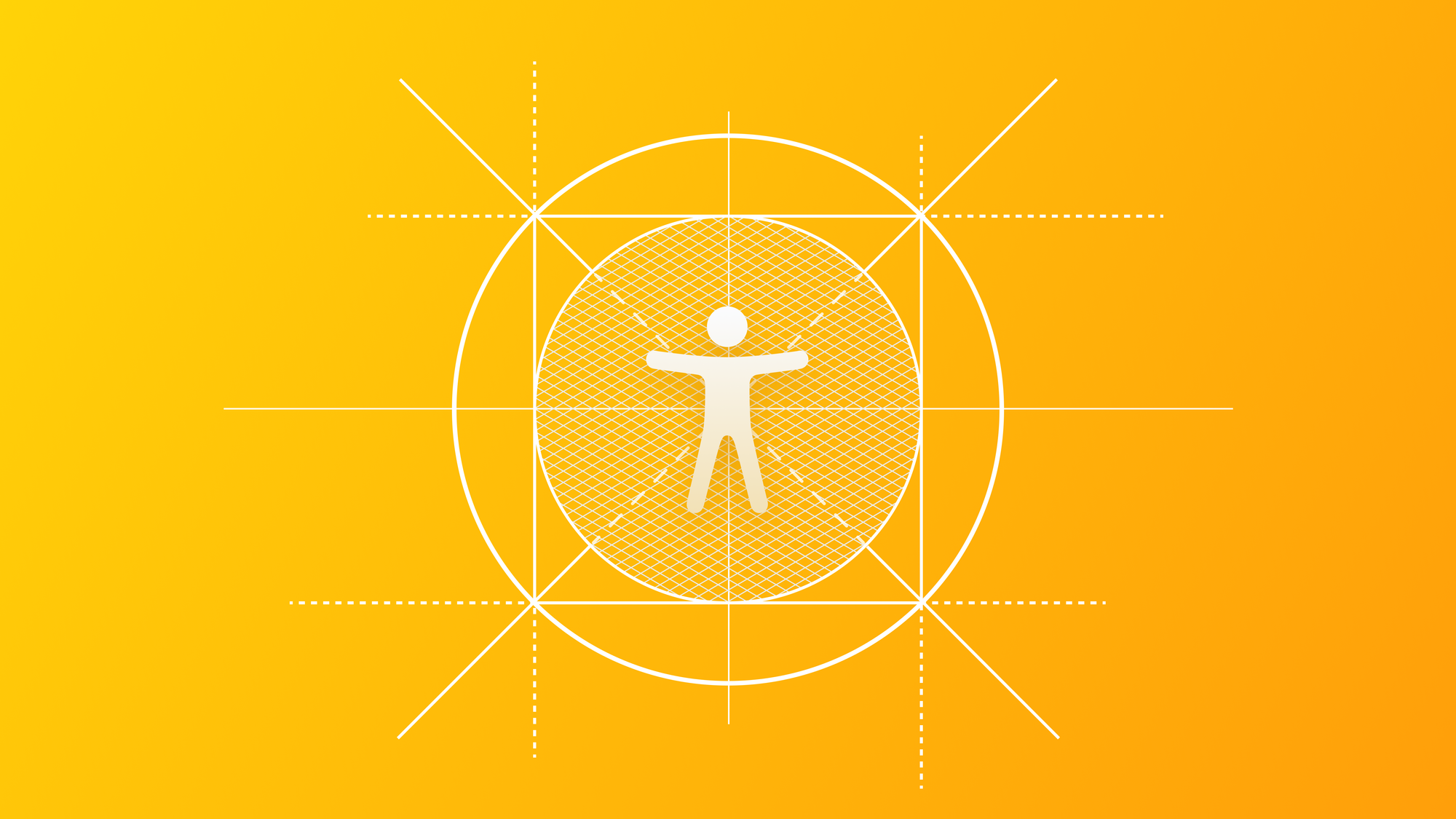
Ensure Visual Accessibility: Glyphs, Icons and Shapes
Understand how to properly use visual elements on your app's UI while keeping it accessible.

In our digital and visually driven world, effective communication relies not only on words and text but also on the influential language of visual elements.
Glyphs, symbols, shapes and icons are fundamental in conveying information, guiding our actions, and shaping our perceptions.
From road signs that steer us through traffic to the icons on our smartphones that help us to navigate and interact with digital interfaces, these visual components are the silent messengers of our daily lives.
Developers and designers wield the power of these visual elements to craft their messages. However, for users with visual or cognitive impairments, the communication path can be perceived as altered, making the use of these communication tools unusable and not accessible.
The Power of Visual Elements
In the world of iOS apps, visual elements are one of the keys to creating an unforgettable user experience. With their power to convey information, guide interaction, and create stunning interfaces, they're a great tool for designers and developers.
But, with great power comes great responsibility. We cannot simply choose a symbol or an icon because we find it suitable or because we like it, we must understand first the visual and the cognitive impact of our visual choice and contextualize it for the user who will use it.
By doing so, we can design interfaces that are not only visually captivating but also inclusive and accessible for all users. Before exploring how to design and use visual elements in an accessible way and what the visual and cognitive challenges the user faces, it is crucial to have a complete understanding of glyphs, icons, and shapes, including their distinctive features.
Symbols and Glyphs
Glyphs are topographical characters or symbols that represent real-world objects or concepts. They are often a combination of shapes and are simplified representations used as compact visual cues that convey meaning.
This is what happens also in the Apple ecosystem, where they play a crucial role in guiding users through the experience of the app.
For instance, the "Share" symbol typically consists of an upward-pointing arrow in a box, whereas the "Phone" symbol resembles a handset. They are characterized by their simplicity and designed to be instantly recognizable.
Key considerations for symbols:
- Clarity: Symbols should be unambiguous. Their meaning should be easily inferred by users, even if they are new to the interface.
- Consistency: Apple encourages the use of SF Symbols to maintain consistency across applications and platforms. Consistency helps users to apply prior acquired knowledge in new contexts.
- Accessibility Labels: Each symbol should have a corresponding accessibility label. This label, which can be read by the VoiceOver, should describe the symbol's meaning or function. For example, a symbol representing a send action should have an accessibility label that says "Send". If you wanna know more about accessibility labels, read this:
 Pasquale Vittorosi
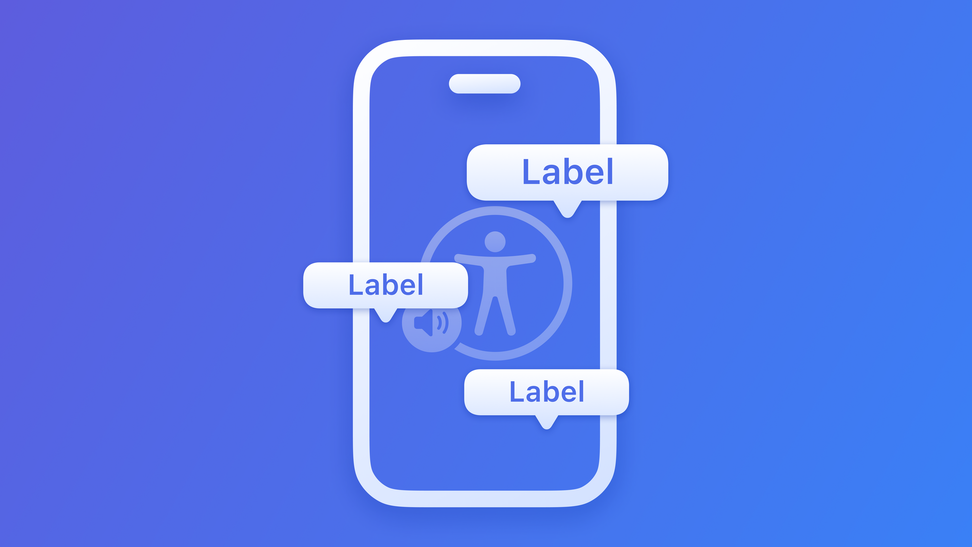
Icons
Icons can take on many forms, ranging from basic shapes with low detail to highly detailed illustrations filled with color.
For example, take a look at the iOS wallet app icon, which uses color and shading to great effect.
Alternatively, the phone app icon uses a distinctive shape and color to create an iconic glyph. In both cases, the glyph is a crucial component of the overall icon design.
Key considerations for icons:
- Simplicity and Clarity: Icons should be simple and clear, conveying their function or purpose without ambiguity.
- Consistency and Familiarity: Apple encourages designers to adhere to well-established iconography conventions. Consistency in using icons makes it easier for users to recognize and understand their functions.
- Scalability: Icons should be designed to scale gracefully on various devices and screen sizes, ensuring that they remain recognizable and usable.
Shapes
Shapes are basic geometric elements and act as building blocks for them in the context of generating glyphs and icons. In essence, a glyph is composed of a series of shapes and a set of several basic shapes defines the final meaning of the visual element.
cloud.sun.fill geometric deconstructionObviously, the use of shapes does not end with the generation of the glyph or symbol alone, but they have a direct impact on the layout of app interfaces, just think of buttons, clickable cards or circular shapes containing an image. Essentially, shapes provide a visual structure and can contribute to a harmonious and aesthetically pleasing design.
Key considerations for shapes:
- Proportion and Size: Shapes should be sized appropriately to maintain harmony within the interface. Consider how shapes interact with other elements on the screen and how they scale on various devices and screen sizes.
- Consistency: Consistency in the use of shapes helps users recognize patterns and hierarchies in the design. For instance, consistently using rectangular cards to display content can make the interface more predictable.
- Color and Contrast: Shapes often interact with color to create visual impact. Ensure that colors used within shapes have sufficient contrast, making them easily distinguishable, especially for users with low vision.
Visual encodings and marks
From what has been said so far, it is clear that visual elements play a crucial role in any design as they are created and implemented to be identified and understood by users.
Several characteristics impact this interpretation and apart from the shapes and meaning of the symbol, another important element to consider is the color contrast between the symbol and the background.
If you want to explore visual accessibility and understand how color and contrast ratio impacts the readability and usability of an app, read this:
Domenico De Luca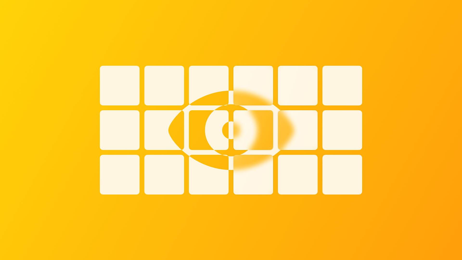
In addition, the position of the symbol in relation to the other information elements of the interface influences the visual hierarchy and the design of visual and cognitive information on the screen.
It's important to note that the ability to encode and decode visual information can vary among users, depending on their visual and cognitive abilities. Color-blind individuals may have difficulty perceiving specific combinations of colors, while those with visual impairments may struggle to recognize small or low-contrast visual elements.
Therefore, it's essential to consider the different needs of users when designing visual elements and to ensure that they are accessible to as many people as possible.
Challenges in Visual and Cognitive encoding
Visual elements may not be universally understood by all users, especially those who are facing cognitive and visual challenges. Due to these differences, the speed and accuracy of decoding may greatly vary from person to person. Therefore, providing enough time and support to those who need it, is imperative to ensure that everyone can comprehend, access and use the information being conveyed.
It is fundamental to realize that the main challenge for those who design the interfaces of an app is to know as much as possible about their users, in this way designers and developers can structure a user experience tailored to users’ needs, while at the same time trying to respect and adapt the design choices to those key considerations which we spoke about earlier.
As mentioned, however, it is essential to start with the users and thus understand what challenges, in this case visual and cognitive, they face when interacting with these visual elements.
Visual challenges and technologies
Blind and low-vision individuals heavily rely on assistive technologies, such as screen readers and screen magnifiers, to access visual information. These tools are designed to convert visual elements into audible information or to enlarge images so that visually impaired users can access digital content. To achieve this goal, it is crucial to provide alternative text descriptions for visual elements that are incorporated into digital content.
Alternative text descriptions are short, concise descriptions that explain the content and function of an image or graphic. These descriptions are read aloud by screen readers, providing blind users with an understanding of the visual element and its relevance to the content. Without proper alternative text descriptions, blind and low-vision users may miss out on critical information, making it challenging for them to understand the intended meaning of the content and significantly affecting their overall experience.
Incorporating alternative text descriptions is essential for ensuring equal access to digital content for all users. It helps to create a more inclusive and accessible digital environment, enabling visually impaired individuals to navigate and understand digital content with ease.
Cognitive challenges
When designing visual elements, take into consideration individuals with cognitive disabilities who may find it difficult to understand complex symbols or dense visual information.
To improve accessibility for these users, visual elements should be designed with simplicity in mind, avoiding information overload. This can be achieved by using clear and intuitive colors, shapes, and symbols that are easy to understand. Additionally, designers should consider the context in which the visual elements will be presented, as well as the specific needs of the target audience.
By considering these factors, designers can create visually appealing and accessible content that is inclusive and beneficial for all users, including those with cognitive disabilities.
Conclusion
It is evident from what has been written so far that these visual elements are the silent messengers that transcend language barriers, simplifying complex concepts and guiding our daily actions. So it’s important to explore the remarkable power of these visual elements, their significance in design and communication and their actual impact on accessibility.
Universality and Versatility
One of the most compelling aspects of glyphs, shapes, and symbols is their universality. Unlike words or phrases, which can be language-specific and require translation, these visual elements often have cross-cultural and cross-linguistic recognition. This makes them powerful tools for reaching global audiences and breaking down communication barriers.
Communication Efficiency
Glyphs, shapes, and symbols excel at distilling complex ideas into simple, easily digestible visuals. For instance, a heart icon conveys the concept of love, a checkmark means completion or approval, a magnifying glass for search, or a shopping cart for purchases.
In design, their efficiency in conveying information is invaluable, especially in a world where attention spans are increasingly limited. This approach reduces the cognitive load on users and ensures that information is readily accessible to a broad audience.
Sensory Neutrality
Another advantage of glyphs, shapes, and symbols is their sensory neutrality. While words and phrases are auditory or phonetic by nature, visual elements can be processed without the need for sound or language. This is particularly important for individuals with visual or hearing impairments.
Inclusive Potential
The power of glyphs, shapes, and symbols is amplified when they are designed with accessibility in mind. When these elements are created to be clear, well-contrasted, and meaningful, they become inclusive tools for all individuals, regardless of their abilities. In essence, visual accessibility ensures that the full spectrum of users can benefit from the communicative potential of these elements.
Adhere to Accessibility guidelines
Familiarize yourself with accessibility standards such as the Web Content Accessibility Guidelines (WCAG) and design your symbols in accordance with these guidelines. These standards offer specific criteria for accessibility, and adhering to them is a reliable way to ensure that your visual elements are inclusive.
Stay Informed and Evolve
The field of accessibility is continuously evolving. Stay informed about the latest developments, tools, and technologies that can enhance the accessibility of your designs. Embrace new solutions and best practices to create visual elements that cater to an ever-widening audience.