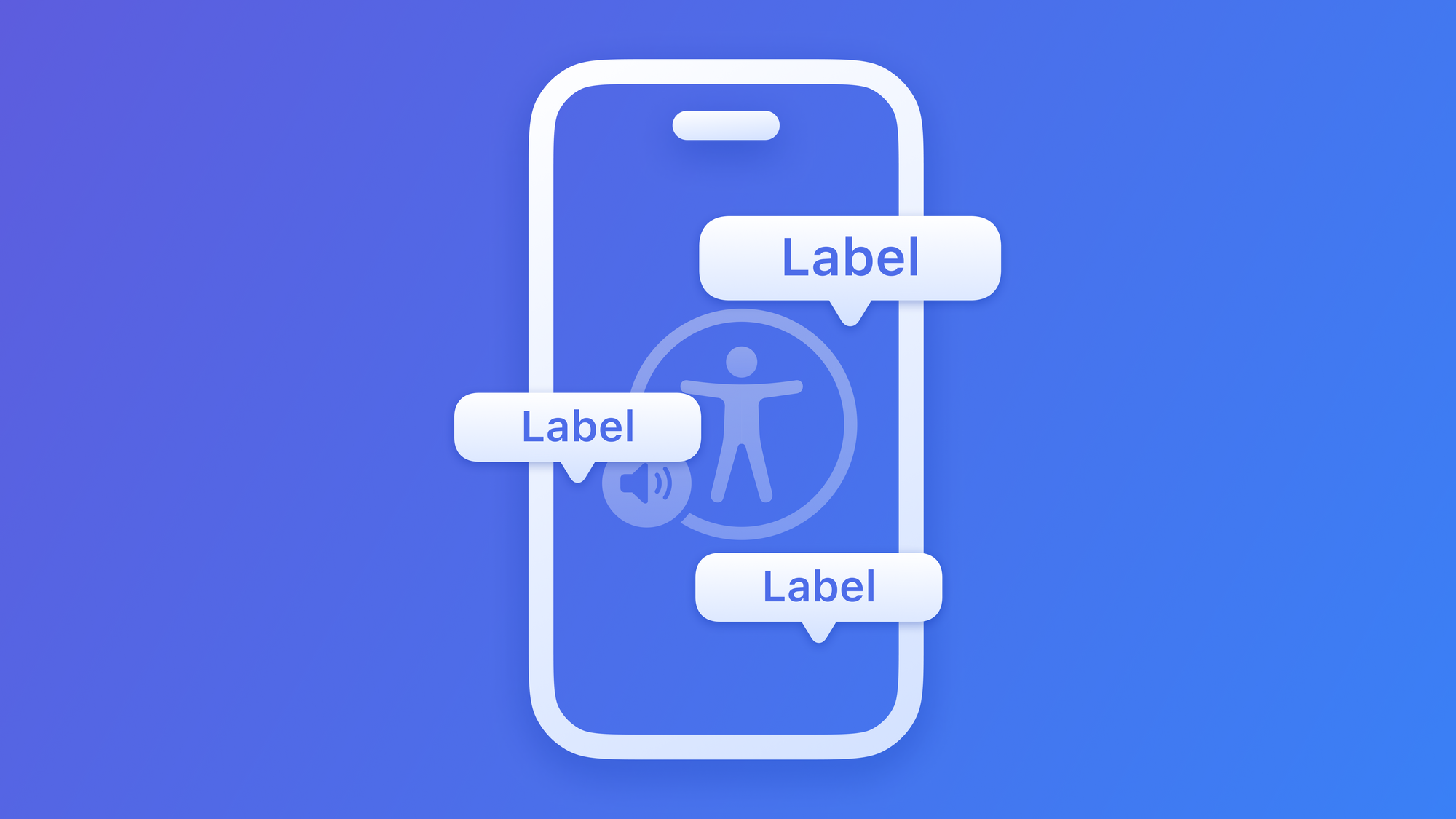
Preparing your App for VoiceOver: use Accessibility Label
Ensure the interface elements of your app are properly identified for assistive technologies


Consider the accessibility label as the accessibility element’s descriptive name. According to the official Apple Documentation, an accessibility element’s label is:
“A succinct label in a localized string that identifies the accessibility element”
Apple Developer Documentation
Accessibility labels are fundamental for assistive technologies:
- It is the first thing that VoiceOver will read
- It’s the label that Voice Control will display and listen for
- It's the label that Full Keyboard Access will look for with the Find feature
How to use them
UIKit and SwiftUI can often infer the label from native components, but you can also provide or change the inferred label when needed.
SwiftUI
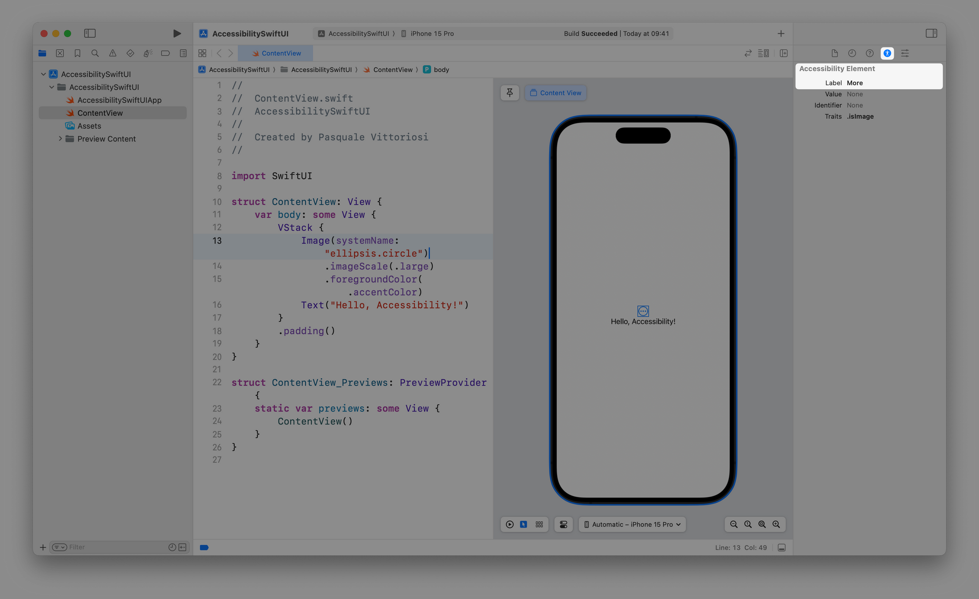
You can use the .accessibilityLabel() modifier to provide an accessibility label for a view.
Button(action: {}) {
    Image("Logo")
}
.accessibilityLabel("Button")
Adding an accessibility label to an interface component in SwiftUI
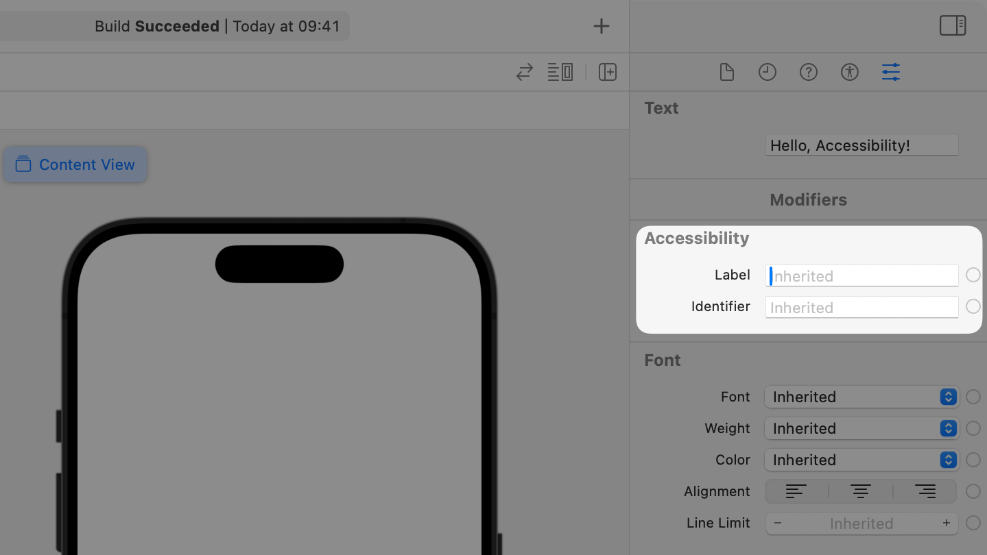
Or you can use the Label field in the Accessibility section of the Attribute Inspector in the Xcode's right Inspectors panel once a component is selected.
UIKit
You can use the accessibilityLabel property to set the accessibility label of the component.
myButtonOutlet.accessibilityLabel = "Button"Adding an accessibility label to an interface component in UIKit
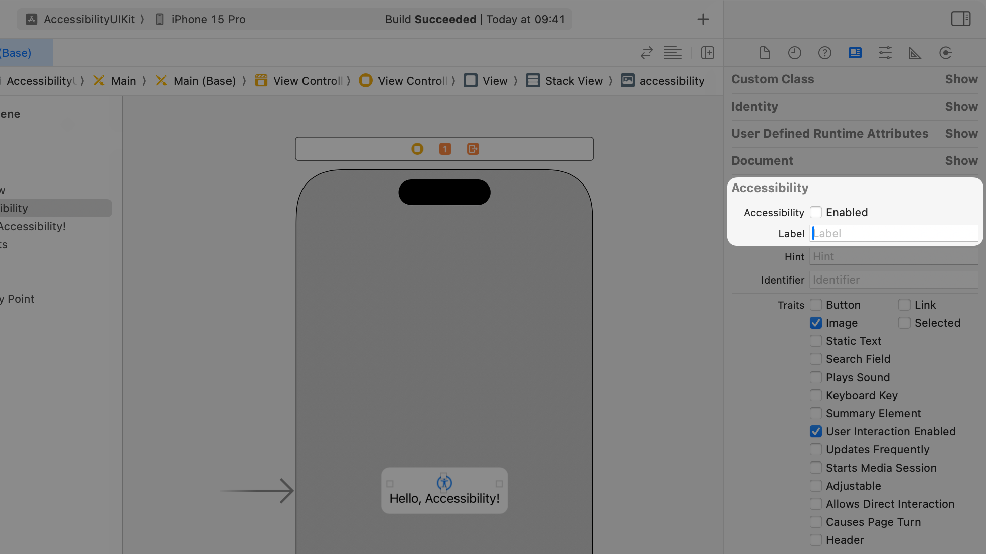
Or you can use the Accessibility section of the Identity Inspector in the Xcode's right Inspectors panel once a component is selected.
When to use them
Freeform app with VoiceOver enabled
Elements have no text that can be used to infer the label
Examples are Images or Symbols. In the Freeform app, on the video above, the "New Board" and "More" buttons on the navigation bar have no text, they are represented only by a symbol.
Let's assume that the Freeform app uses the SF Symbol ellipsis.circle for the "More" button, the label "More" is the default inferred one.
ellipsis.circle via the Accessibility InspectorFor the "New Board" button the SF Symbol used is the square.and.pencil one. This symbol has "Compose" as the default accessibility label. Since VoiceOver reads it as "New Board" we can assume that in the implementation of the element the developers changed the accessibility label associated with the button.
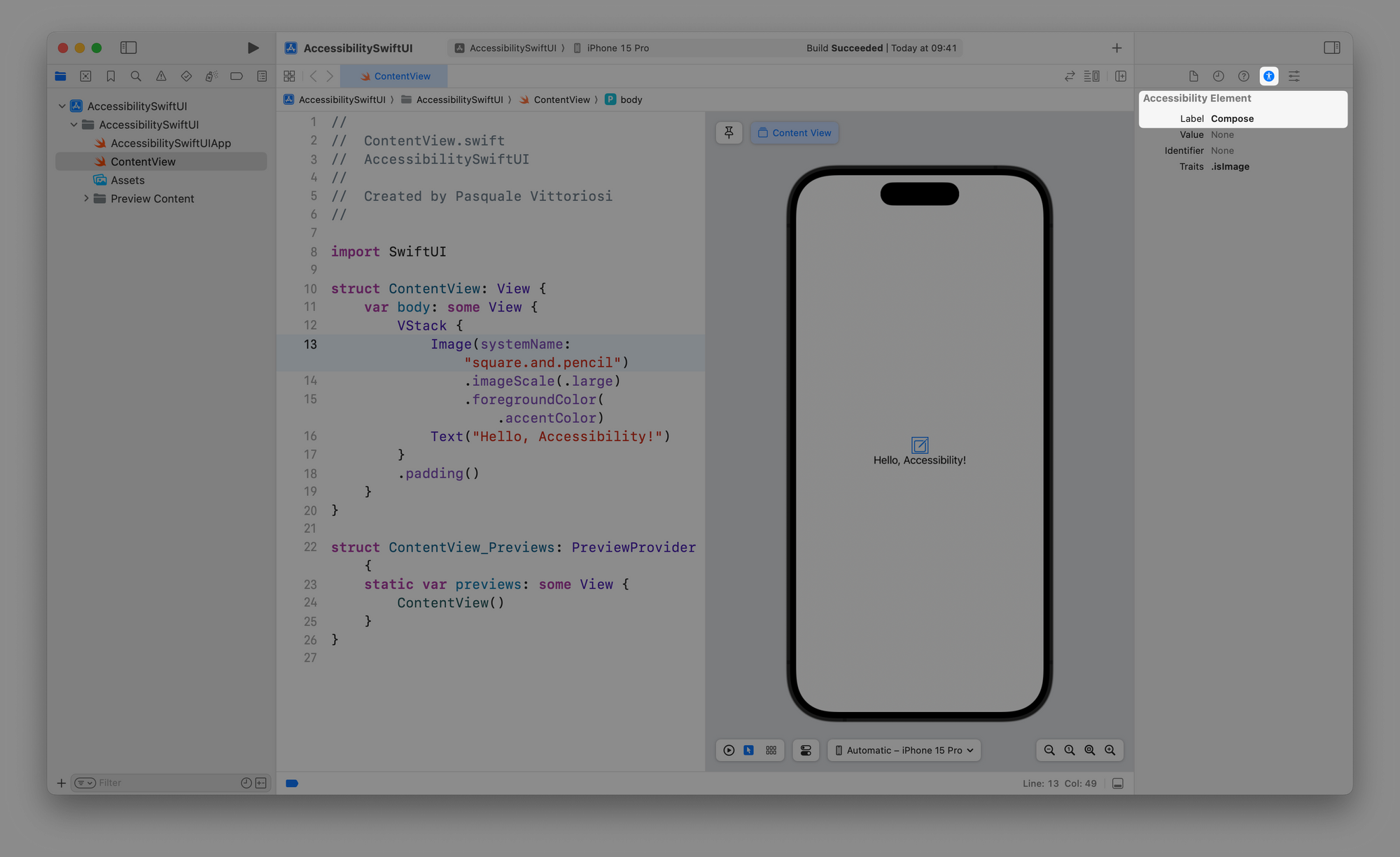
square.and.pencil via the Accessibility InspectorAnother example can be the label of the SF Symbol heart.fill. The inferred Accessibility Label is "Love" but it is often used as "Liked" or "Favorite". In this case, the Accessibility Label should be changed by the developer.
The same applies also to images for example.
The label of an image isn't descriptive enough
The inferred Accessibility Label of an image is the name of the image in the Assets folder in your Xcode project.
The inferred accessibility label is too long or not meaningful
It is a good practice to keep Accessibility Labels short and descriptive.
The Accessibility Elements are created by combining views
When creating accessibility elements by combining multiple views, developers have the option to either allow assistive technologies to access each element individually or to assign a collective accessibility label to the newly formed composite element to add context or to simplify the information present in it.
For instance, in the Freeform app, we can assume that the Accessible Elements for a board listed in the All Boards area of the app are created by composing the image of the board with its name.
By assigning an Accessibility Label to this composite element, more information than what's visible on the screen is added. VoiceOver, when reading a board item on the All Boards area, announces 'Board <board title> <board creation date>'. The word 'Board' isn't explicitly inferred from any text on the interface, while the Image of the board is ignored and the element is presented as a single Accessible Element to the user.
Freeform app with VoiceOver enabled - Accessibility Label of a combined view
When not to use them
The interface element is a decorative element
These elements should be hidden from the Accessibility tree. In the Freeform app, when there are no boards the SF Symbol square.fill.on.square.fill has no label and is hidden from the assistive technologies, since the information is already provided by the text element "No Boards".
Freeform app with VoiceOver enabled - Decorative elements hidden from the Accessibility Tree
To give additional information about the element
In the "New Board" button, represented on the interface of the Freeform app by the SF Symbol NAME on the navigation bar, the accessibility label accessed by the assistive technologies reads "New Board" not "New Board button". The information about what type of interface element it is, "button", comes from the trait of the element.
Summarizing:
- To give hints: To provide additional information about the interface element usage, use Accessibility Hint.
- To give suggestions: To provide information about the kind of action that can be performed on the element use Accessibility Traits.
Compliance with Web Content Accessibility Guidelines
In the WCAG 2.2 (Web Content Accessibility Guidelines), the industry-standard accessibility reference, we can see the following guidelines:
Guideline 1.1 Text Alternatives
"Provide text alternatives for any non-text content so that it can be changed into other forms people need, such as large print, braille, speech, symbols or simpler language."
Guideline 1.3 Adaptable
"Create content that can be presented in different ways (for example simpler layout) without losing information or structure."
Guideline 1.4 Distinguishable
"Make it easier for users to see and hear content including separating foreground from background."
You can comply with these guidelines by providing accessibility labels for the elements of your app to support assistive technologies.