
Understanding typography in visionOS
Optimize text readability in visionOS leveraging font, color, and vibrancy

visionOS introduces a new layer to typography, where spatial considerations play a crucial role. Unlike traditional displays, text needs to be legible from varying distances and contexts. Font size and weight become the main factors in establishing a clear typographic hierarchy that remains legible across varying distances and contexts.
System font and extra large titles
The system font in visionOS, SF Pro, features exceptional legibility across the different Apple operating systems. The text's default color is white, leveraging high contrast against darker backgrounds for optimal readability.
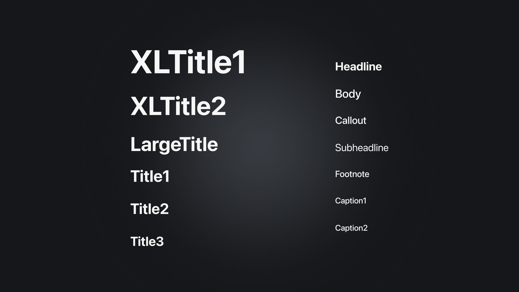
However, vibrant materials within visionOS can sometimes challenge this clarity. For this reason, font weights have been subtly adjusted for improved contrast.
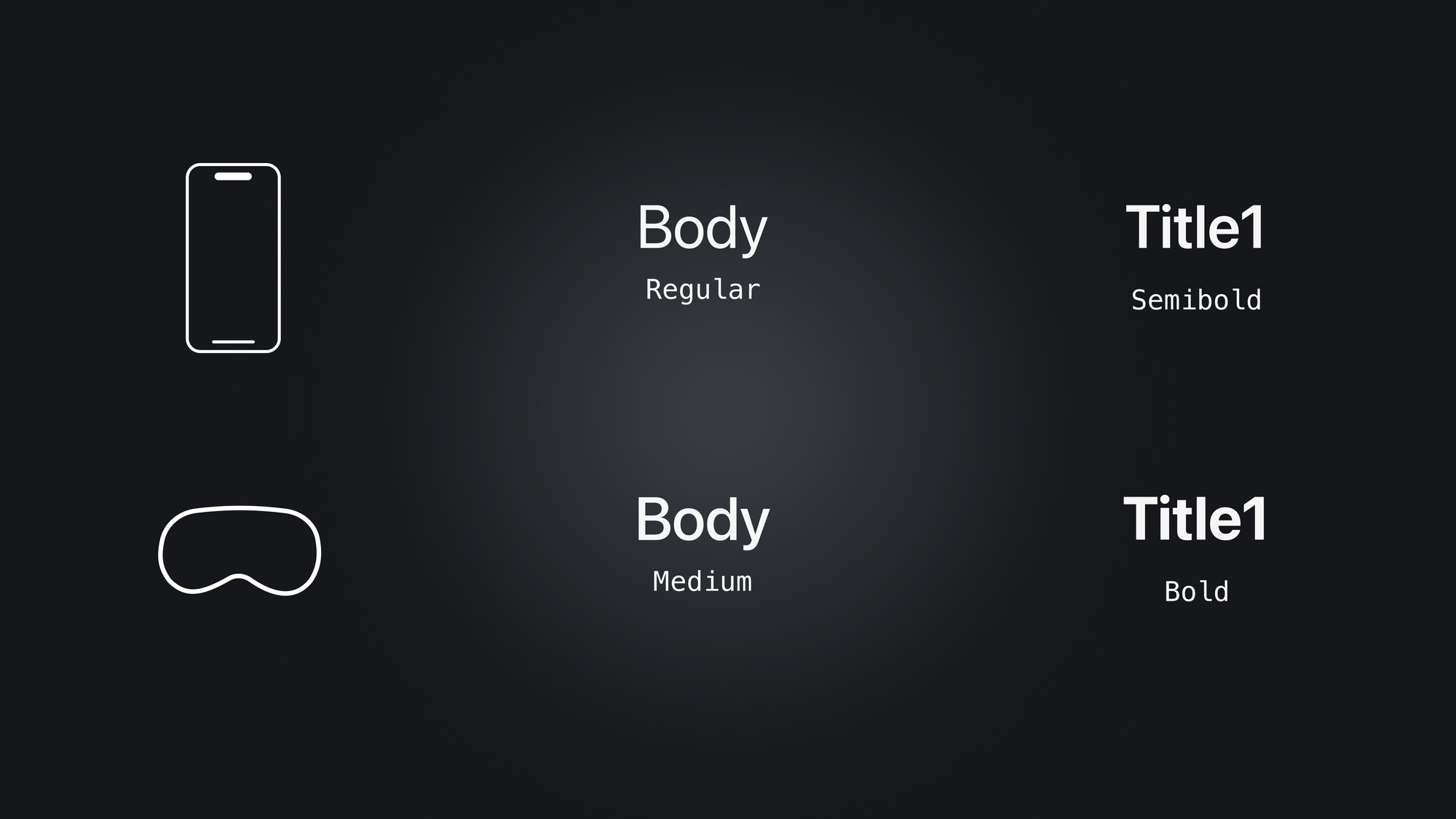
For instance, body text on iOS uses a regular weight font, while visionOS utilizes a medium weight for better visibility. Similarly, titles use bold instead of semibold. Additionally, tracking (spacing between letters) slightly increased to enhance legibility.
For a deeper dive into ensuring legibility and contrast using materials and text in visionOS, check this article:
 Emanuele Agosta
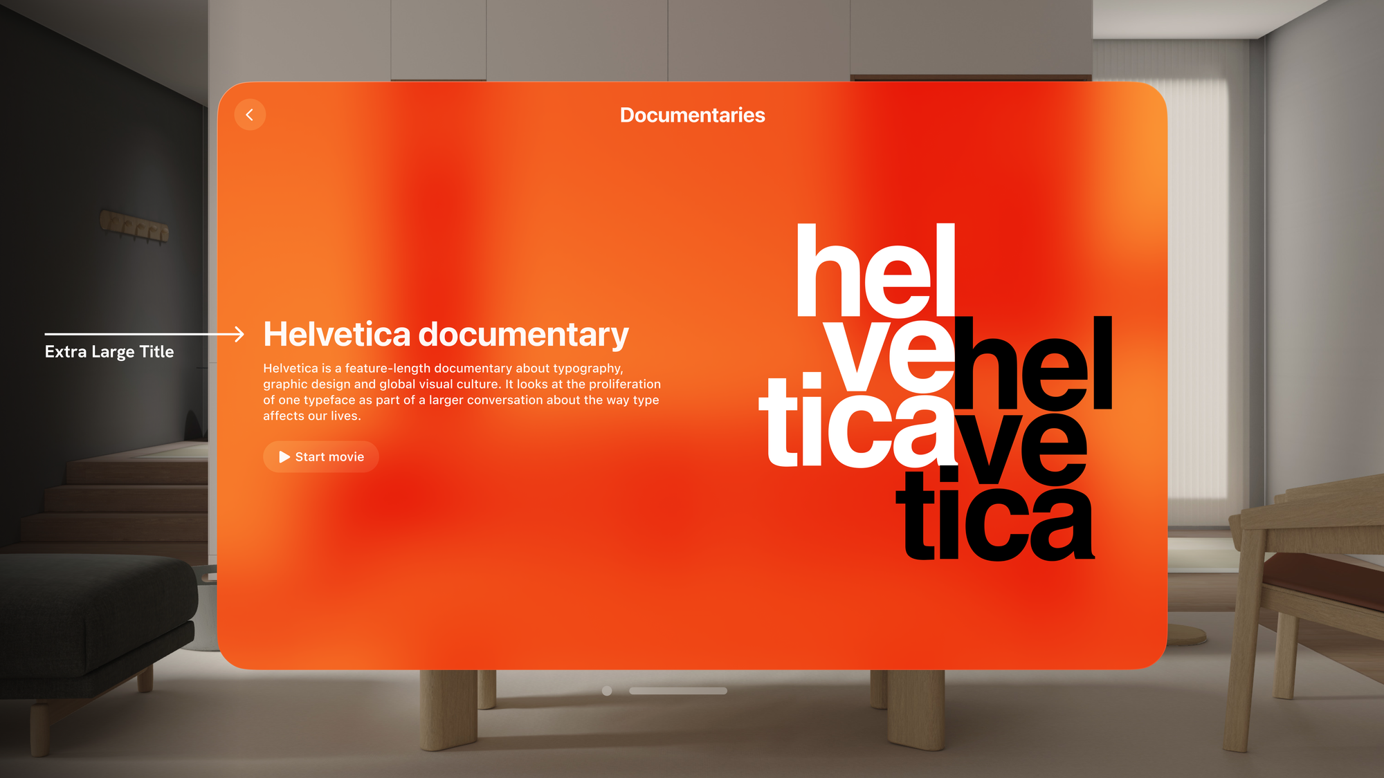
visionOS introduces two new font styles for specific contexts: Extra Large Title 1 and Extra Large Title 2. These are ideal for prominent, attention-grabbing headings in wide, editorial-style layouts.
While windows in visionOS can scale up to incredible sizes, custom fonts that are smaller or lightweight can still pose readability challenges. To address this, consider increasing the weight of your chosen font or opting for a system font designed for optimal legibility.
For detailed information on utilizing extraLargeTitle and extraLargeTitle2 for text hierarchy, explore this article:
Tiago Gomes Pereira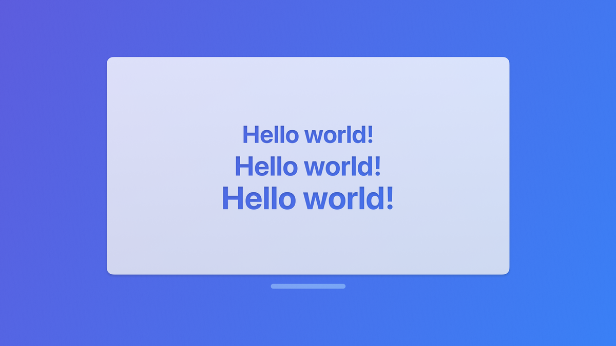
Text contrast, color and vibrancy
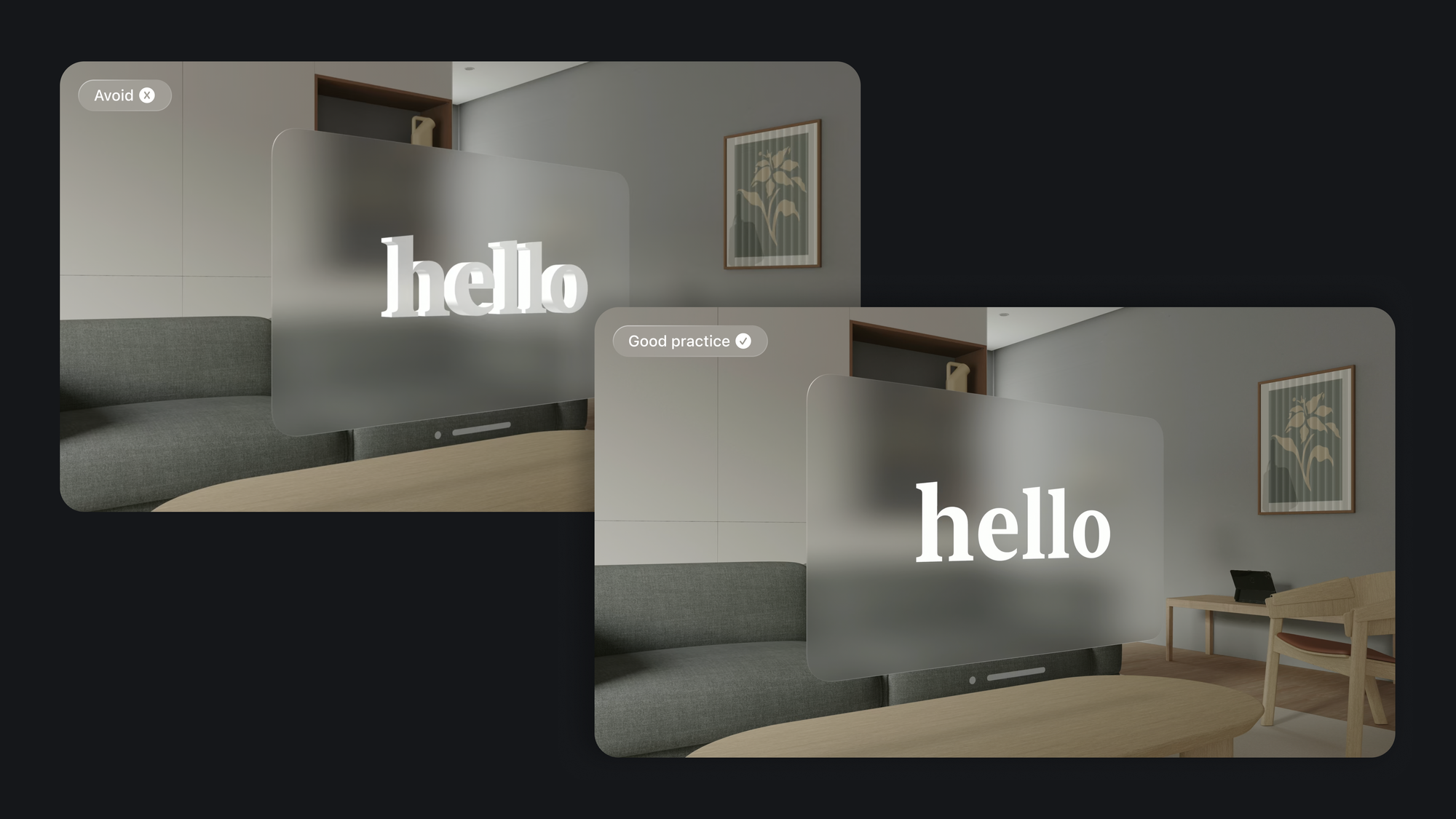
Depth is a core design principle in visionOS, but it doesn't apply to all interface elements. 3D text, for instance, can be visually distracting and difficult to read. Therefore, prioritize using 2D text for better clarity. 3D text can often appear warped or challenging to read, especially from different angles or distances.
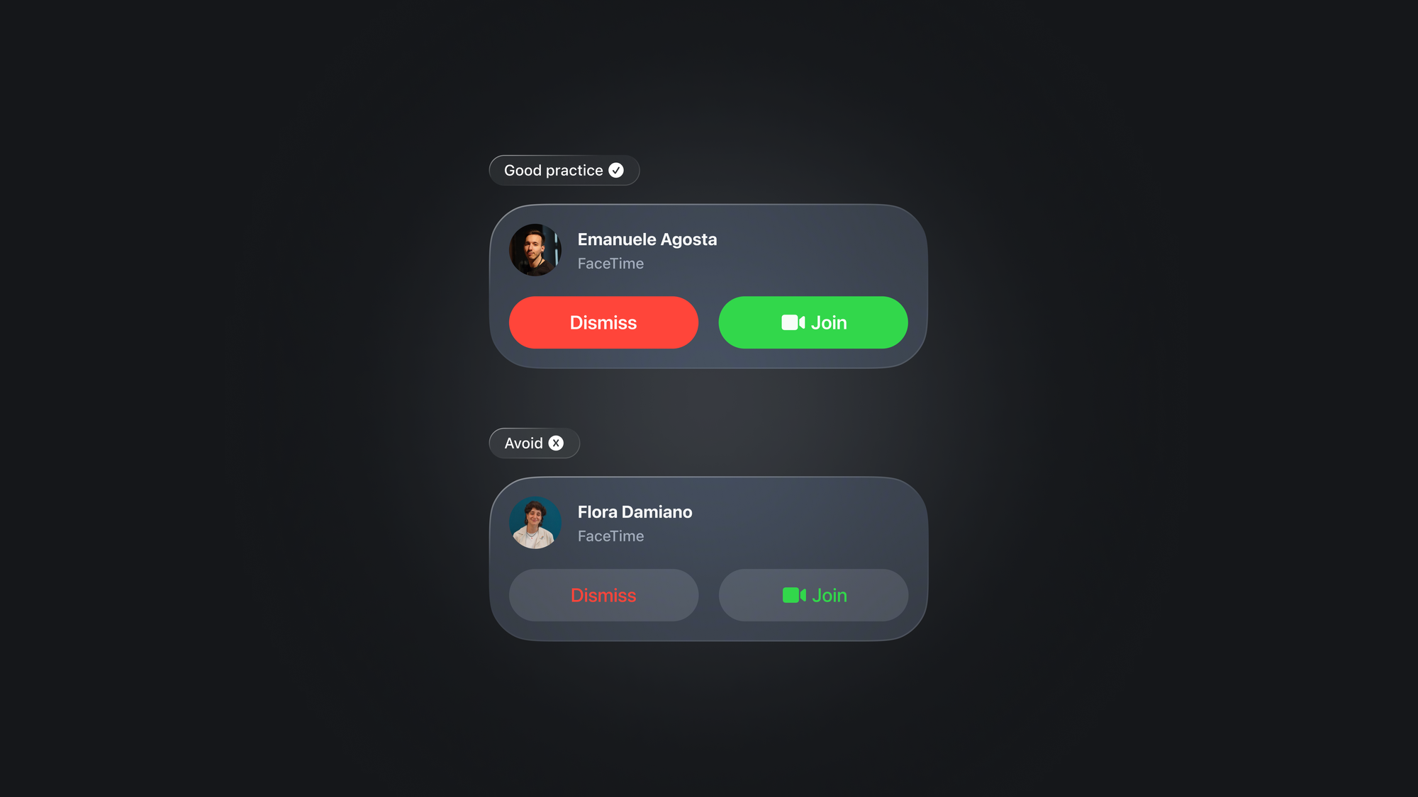
Contrast is crucial in making your text stand out against various backgrounds. As stated before, by default visionOS utilizes white text with the standard dark background, enhancing readability. If you choose a different text color, ensure thorough testing across various contexts to guarantee clarity. System colors can be effective for backgrounds or buttons, but avoid using them for text itself, as it can compromise readability.
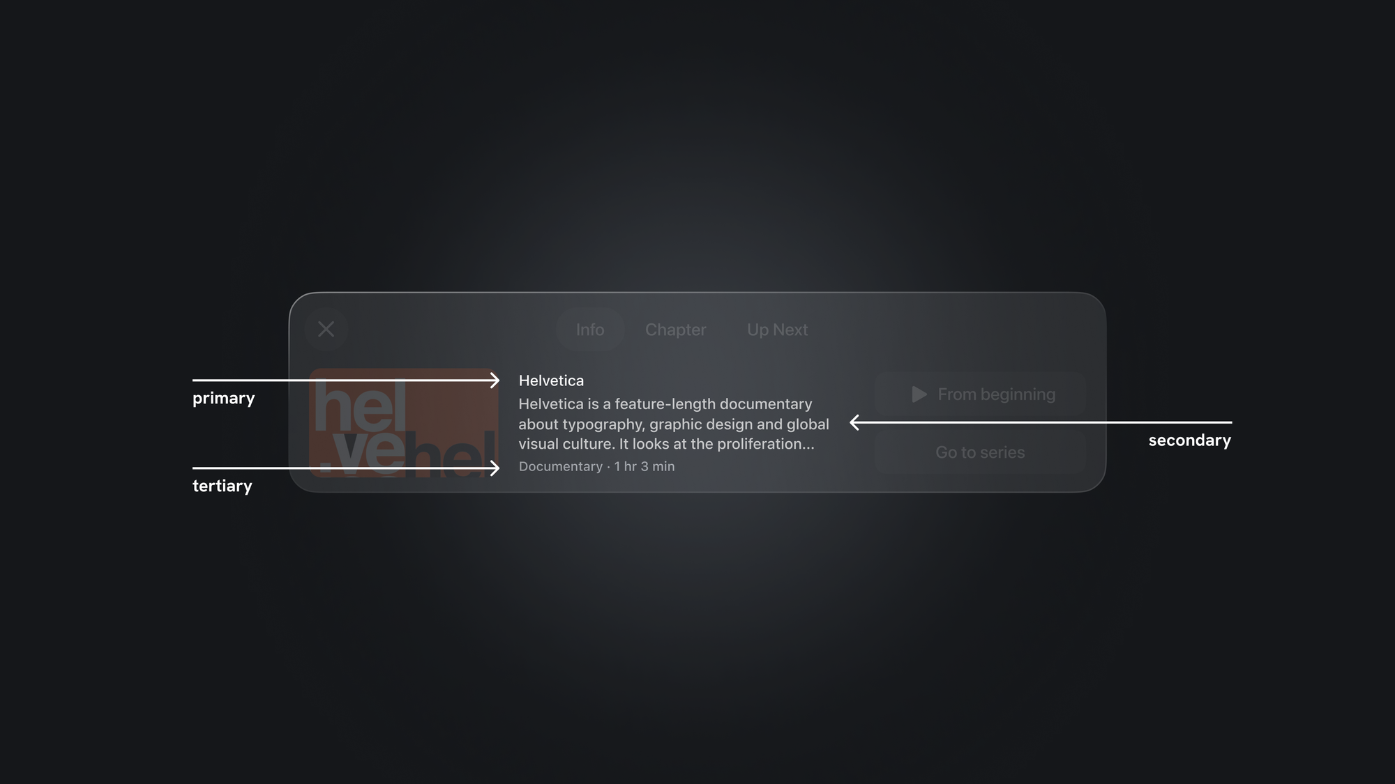
Vibrancy effects offer an additional layer of enhancing contrast and legibility. Vibrancy improves depth perception within your application. visionOS categorizes vibrancy into primary, secondary, and tertiary modes, each tailored to optimize the visibility and hierarchy of text, symbols, and fills:
- Use
.primaryfor standard text. - Use
.secondaryfor descriptive text like footnotes and subtitles. - Use
.tertiaryfor inactive elements, only when high legibility isn't crucial.
To learn how typography influences the usability, user experience, and accessibility of your app, explore these resources: